Artificial intelligence has changed digital creativity in ways that felt impossible just a few years ago. Today, AI can generate realistic portraits, cinematic landscapes, anime characters, product designs, and even paintings that look hand-crafted by professional artists.
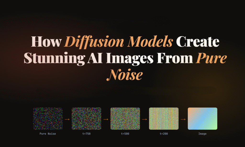
These models power popular AI image generators like OpenAIDALL·E, Stability AIStable Diffusion, and Google Imagen. What makes them fascinating is that they create detailed images starting from nothing but random noise.
Yes, literally noise.
In this guide, you’ll learn:
What Diffusion Models are
How they work step by step
Why they outperform older AI approaches
The mathematics behind the process
How text prompts become images
Real-world applications
Simple Python code examples
Challenges and future improvements
Everything is explained in a simple, beginner-friendly way with practical examples and easy-to-follow explanations.
What Are Diffusion Models?
Diffusion Models are a type of generative AI model designed to create new data, especially images, by gradually transforming random noise into meaningful visual content.
Think of it like sculpting.
An artist starts with a rough block of stone and slowly shapes it into a statue. Similarly, Diffusion Models begin with a chaotic noisy image and gradually refine it until a recognizable image appears.
The process happens in two stages:
Forward Diffusion Process Noise is gradually added to training images until they become pure static.
Reverse Diffusion Process The AI learns how to reverse the noise step-by-step to reconstruct realistic images.
That reverse process is where the magic happens.
Basically, for image generation, the model learns two things:
How to slowly destroy an image by adding noise
How to rebuild the image from that noise
During training, the model repeatedly sees images with different noise levels added to them. Over time, it learns how to predict and remove the noise accurately.
Once training is complete, the model can start from pure random static and generate entirely new images.
The name comes from physics: diffusion describes how particles spread from a concentrated point into a uniform distribution — like a drop of ink dispersing in water.
Diffusion models don’t “draw” an image directly. They learn to remove noise, one tiny step at a time, until a clean image emerges from what started as static.
Why Diffusion Models Became So Popular
Before Diffusion Models, GANs (Generative Adversarial Networks) dominated AI image generation. GANs produced impressive results but had several limitations:
Training instability
Mode collapse issues
Difficulty generating highly detailed scenes
Limited prompt understanding
Diffusion Models solved many of these problems.
Key Advantages of Diffusion Models
Better Image Quality
Diffusion-based systems generate sharper and more realistic images.
Stable Training
They are generally easier to train compared to GANs.
Strong Prompt Understanding
Modern Diffusion Models connect language and vision effectively.
Diverse Outputs
The same prompt can produce many unique results.
Scalable Architecture
They work well with massive datasets and larger neural networks.
Understanding the Core Idea With a Simple Analogy
Imagine placing a photograph into water and adding drops of ink repeatedly.
At first, the image is still visible.
Then it becomes blurry.
Eventually, it turns into complete chaos.
Now imagine training an AI to reverse that process perfectly.
The AI learns:
how much noise was added
where details originally existed
how edges, textures, and shapes should look
This is essentially how Diffusion Models work.
The Two Main Processes in Diffusion Models
1. Forward Diffusion Process
The forward process destroys the image slowly.
Mathematically, noise is added over many time steps.
The equation looks like this:
At every step:
a small amount of noise is added
the image becomes less recognizable
eventually only random static remains
After thousands of steps, the original image disappears completely.
2. Reverse Diffusion Process
This is where the AI generates images.
The model learns how to remove noise gradually.
Starting from random noise:
it predicts what the cleaner image should look like
removes a little noise
repeats the process many times
Eventually, a realistic image appears.
This reverse process is powered by deep neural networks trained on millions of images.
How Diffusion Models Learn During Training
Training teaches the model to predict noise accurately.
The process looks like this:
Take a real image
Add noise at different levels
Ask the AI to predict the added noise
Compare prediction with actual noise
Improve the model through optimization
Over time, the AI becomes extremely good at reconstructing images from noisy inputs.
The Role of Neural Networks : U-Net
Most modern Diffusion Models use a neural network called a U-Net.
The U-Netarchitecture originally developed for medical image segmentation. The name comes from its shape: an encoder that compresses the input to a lower-resolution representation, followed by a decoder that brings it back to full resolution, with skip connections tying together the corresponding encoder and decoder layers at each scale.
The U-Net architecture helps the model:
understand image structures
preserve details
recover textures
maintain object consistency
It processes images at multiple resolutions simultaneously.
This allows the model to generate:
smooth faces
detailed hair
realistic lighting
accurate shadows
complex environments
How Text Prompts Become Images
One of the most impressive features of modern Diffusion Models is text-to-image generation.
For example:
“A futuristic cyberpunk city at night with neon rain.”
The AI converts that sentence into visual understanding.
Step-by-Step Prompt Processing
Step 1: Text Encoding
A language model converts the prompt into numerical vectors.
Step 2: Semantic Understanding
The AI learns relationships between words and visual patterns.
For example:
“cat” relates to fur, whiskers, ears
“sunset” relates to warm colors
“cyberpunk” relates to neon lighting and futuristic architecture
Step 3: Guided Image Generation
The diffusion process uses those text embeddings to guide image creation.
This is called conditioning.
What Is Latent Diffusion?
Modern systems like Stable Diffusion use Latent Diffusion Models (LDMs).
Instead of working directly on large images, the model compresses images into a smaller hidden representation called latent space.
Benefits include:
faster training
lower memory usage
improved efficiency
reduced computational cost
The process becomes:
Compress image into latent space
Perform diffusion there
Decode back into full image
This innovation made AI image generation practical for consumer GPUs.
Simple Python Example of Diffusion Models
Let’s look at a simple Python example using the Hugging Face Diffusers library.
Very high values can sometimes create oversaturated or distorted images.
Real-World Applications of Diffusion Models
Diffusion Models are transforming multiple industries.
Digital Art
Artists create concept art, illustrations, and fantasy scenes quickly.
Gaming
Studios generate textures, characters, and environments faster.
Marketing
Brands produce AI-generated advertisements and social media graphics.
Film Production
Filmmakers use AI for storyboarding and visual ideation.
Fashion Design
Designers experiment with clothing concepts instantly.
Medical Imaging
Researchers use diffusion techniques for image reconstruction and enhancement.
Architecture
Architects generate building concepts and interior visualizations.
Challenges and Limitations of Diffusion Models
Despite their power, Diffusion Models still face challenges.
High Computational Cost
Training requires enormous GPU resources.
Slow Generation Speed
Image creation involves many denoising iterations.
Bias in Training Data
Models may reproduce unwanted societal biases.
Copyright Concerns
Training datasets can contain copyrighted material.
Prompt Sensitivity
Small wording changes may produce very different outputs.
Ethical Considerations
AI-generated imagery raises important ethical questions.
These include:
misinformation
deepfakes
artist compensation
synthetic media transparency
Responsible AI development requires:
transparency
safety guardrails
dataset accountability
watermarking systems
Leading AI organizations continue researching safer generative systems.
Future of Diffusion Models
The future looks incredibly promising.
Researchers are improving:
generation speed
video generation
3D object creation
real-time rendering
controllable outputs
multimodal AI systems
We are already seeing:
AI-generated movies
real-time editing tools
interactive creative assistants
AI-powered design workflows
Diffusion Models will likely become a core part of digital creativity across industries.
Frequently Asked Questions
Are Diffusion Models better than GANs?
In many cases, yes.
Diffusion Models generally produce:
more stable results
better detail quality
stronger prompt alignment
However, GANs can still be faster for some tasks.
Why do Diffusion Models start with noise?
Starting from noise allows the model to learn a flexible generative process capable of producing highly diverse outputs.
What is Stable Diffusion?
Stable Diffusion is an open-source latent diffusion model for generating images from text prompts.
Can Diffusion Models generate videos?
Yes.
Modern diffusion-based systems now support:
video generation
animation
frame interpolation
motion synthesis
Do Diffusion Models understand language?
Not directly like humans.
They learn statistical relationships between text and images using massive datasets.
Conclusion
Diffusion Models have fundamentally changed how machines create visual content.
What once required expert artists and expensive software can now be generated from a simple text prompt in seconds.
The idea is surprisingly elegant:
destroy images with noise
teach AI to reverse the destruction
generate entirely new visuals from randomness
That simple concept powers some of the most advanced AI systems in the world today.
As computing power improves and research advances, Diffusion Models will continue reshaping art, design, entertainment, and digital creativity for years to come.
Have you ever wondered what actually powers ChatGPT, Google Translate, or GitHub Copilot under the hood?
The answer is almost always the same: the Transformer architecture. It’s one of those rare inventions in computer science that didn’t just improve things a little — it completely rewrote the rules.
In this post, we’re going to break down the Transformer architecture from the ground up, without drowning you in intimidating math. Whether you’re a curious beginner or a developer looking to solidify your fundamentals, this guide is for you. Let’s dig in.
What Is the Transformer Architecture?
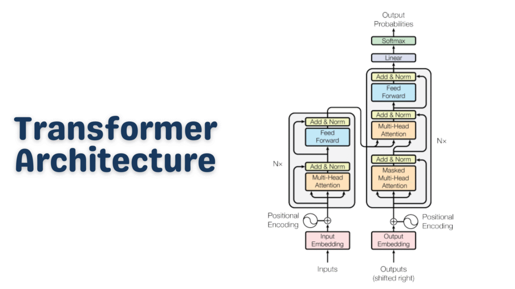
The Transformer architecture is a deep learning model design introduced in the landmark 2017 paper “Attention Is All You Need” by Vaswani et al. at Google. Before Transformers, most natural language processing (NLP) tasks relied on Recurrent Neural Networks (RNNs) and LSTMs (Long Short-Term Memory networks).
Those older models had a fundamental problem: they processed text word by word, in sequence. That means to understand the last word of a long sentence, the model had to “remember” everything that came before it — a bit like trying to recall the beginning of a movie after watching four hours of sequels.
The Transformer architecture threw that sequential approach out the window. Instead, it processes all words simultaneously and uses a clever mechanism called attention to understand relationships between words — no matter how far apart they are in a sentence.
That single change made everything faster, smarter, and more scalable.
Why Does Transformer Architecture Matter So Much?
Here’s a quick reality check: virtually every powerful AI language model you’ve heard of is built on the Transformer architecture.
ChatGPT → GPT-4 (Transformer-based)
Google Gemini → Transformer-based
Meta LLaMA → Transformer-based
BERT, T5, RoBERTa → All Transformer variants
GitHub Copilot → Powered by Codex (Transformer-based)
This isn’t a coincidence. The Transformer architecture solved problems that had been bottlenecking AI research for years — scalability, long-range dependencies, and parallelism. That’s why it became the standard almost overnight.
The Big Picture: How a Transformer Works
Before we go deep, let’s look at the 30,000-foot view.
Imagine you’re asking an AI: “What is the capital of France?”
Here’s what happens inside a Transformer:
Your text gets broken into tokens (small pieces of text)
Each token is converted into a vector (a list of numbers) — this is called an embedding
The model adds positional information so it knows word order
A series of encoder and/or decoder layers process these vectors
Inside each layer, an attention mechanism figures out which words relate to which
The output is a prediction — in this case, “Paris”
Simple, right? Now let’s zoom into each piece.
Tokenization: Breaking Text Into Pieces
Before the Transformer architecture can do anything, your text needs to be converted into tokens.
Tokens aren’t always full words. They can be sub-words, characters, or punctuation marks, depending on the tokenizer. For example:
Python
from transformers import GPT2Tokenizertokenizer = GPT2Tokenizer.from_pretrained("gpt2")text = "Transformer architecture is amazing!"tokens = tokenizer.encode(text)print(tokens)# Output: [8291, 16354, 10959, 318, 4998, 0]decoded = tokenizer.decode(tokens)print(decoded)# Output: Transformer architecture is amazing!
Here,
We load a pre-trained GPT-2 tokenizer
We pass in a sentence and get back a list of integer IDs
Each integer maps to a specific token in the model’s vocabulary
The model never “reads” raw text — it only works with these numbers
This is the very first step in the Transformer pipeline. The richer and more consistent your tokenization, the better your model will perform.
Embeddings: Giving Numbers Meaning
Once we have token IDs, we convert them into embedding vectors — dense arrays of floating-point numbers that represent meaning.
Think of embeddings like coordinates on a map. Words with similar meanings cluster near each other in this high-dimensional space. “King” and “Queen” would be close together. “King” and “Broccoli” would be far apart.
Python
import torchimport torch.nn as nnvocab_size = 50000# Number of unique tokensembed_dim = 512# Size of each embedding vectorembedding_layer = nn.Embedding(vocab_size, embed_dim)# Simulate a batch of 2 sentences, each with 10 tokenstoken_ids = torch.randint(0, vocab_size, (2, 10))embeddings = embedding_layer(token_ids)print(embeddings.shape)# Output: torch.Size([2, 10, 512])
vocab_size is the total number of unique tokens the model knows
embed_dim = 512 means each token becomes a 512-dimensional vector
The output shape [2, 10, 512] means: 2 sentences × 10 tokens each × 512 numbers per token
These embeddings are learned during training — the model figures out the best numerical representation for each token by itself.
Positional Encoding: Telling the Model “Where” a Word Is
Here’s a subtle but critical issue: since the Transformer architecture processes all tokens at once (in parallel), it has no built-in sense of word order. “Dog bites man” and “Man bites dog” would look identical to it without some extra help.
That’s where positional encoding comes in. We add a special signal to each embedding that encodes its position in the sequence.
The original Transformer paper used sine and cosine functions for this:
Python
import torchimport mathdefpositional_encoding(seq_len, embed_dim): pe = torch.zeros(seq_len, embed_dim) position = torch.arange(0, seq_len).unsqueeze(1).float()# Division term creates different frequencies for each dimension div_term = torch.exp( torch.arange(0, embed_dim, 2).float() * (-math.log(10000.0) / embed_dim) )# Even indices → sine, Odd indices → cosine pe[:, 0::2] = torch.sin(position * div_term) pe[:, 1::2] = torch.cos(position * div_term)return pepe = positional_encoding(seq_len=10, embed_dim=512)print(pe.shape)# Output: torch.Size([10, 512])
Why sine and cosine?
They produce unique patterns for every position
The model can generalize to sequences longer than what it saw during training
Nearby positions have similar encodings, which helps the model understand proximity
You simply add this positional encoding to your embeddings before passing them into the Transformer layers. The model then bakes position awareness into everything it computes.
The Heart of It All: The Attention Mechanism
This is where the magic lives. The self-attention mechanism is the defining feature of the Transformer architecture — and the reason it leaves RNNs in the dust.
Self-attention lets every token in a sequence “look at” every other token and decide: “How relevant is that word to understanding me?”
For example, in the sentence:
“The bank by the river flooded after the rain.”
When the model processes the word “bank”, attention lets it look at “river” and “flooded” to understand that “bank” here means a riverbank — not a financial institution. That’s context-awareness in action.
Query, Key, and Value — The QKV Framework
Attention is computed using three matrices: Query (Q), Key (K), and Value (V).
Here’s the intuition:
Query: “What am I looking for?”
Key: “What do I have to offer?”
Value: “What information do I actually carry?”
Python
import torchimport torch.nn.functional as Fdefscaled_dot_product_attention(Q, K, V):""" Q: Query matrix → shape [batch, seq_len, d_k] K: Key matrix → shape [batch, seq_len, d_k] V: Value matrix → shape [batch, seq_len, d_v] """ d_k = Q.size(-1) # Dimension of the key vectors# Step 1: Compute raw attention scores (dot product of Q and K) scores = torch.matmul(Q, K.transpose(-2, -1))# Step 2: Scale to prevent huge values (which cause vanishing gradients) scores = scores / math.sqrt(d_k)# Step 3: Convert scores to probabilities with softmax attention_weights = F.softmax(scores, dim=-1)# Step 4: Multiply weights by values to get the output output = torch.matmul(attention_weights, V)return output, attention_weights# Quick testbatch_size, seq_len, d_k = 2, 10, 64Q = torch.rand(batch_size, seq_len, d_k)K = torch.rand(batch_size, seq_len, d_k)V = torch.rand(batch_size, seq_len, d_k)output, weights = scaled_dot_product_attention(Q, K, V)print(output.shape) # torch.Size([2, 10, 64])print(weights.shape) # torch.Size([2, 10, 10]) ← attention map
This function implements scaled dot-product attention, a core idea behind Transformer models like GPT and BERT.
It works by comparing each query (Q) with all keys (K) using a dot product to measure similarity. These scores are then scaled (to keep values stable), passed through a softmax to turn them into probabilities, and used to weight the values (V).
The result is that each element in the sequence gathers relevant information from other elements, allowing the model to focus on what matters most.
The output of attention for each token is a weighted blend of all other tokens’ information, where the weights tell us how much to pay attention to each one.
Multi-Head Attention: Looking From Many Angles
One attention head is great, but different heads can learn to focus on different types of relationships simultaneously.
One head might focus on syntax. Another might focus on coreference (who “she” refers to). Another might track sentiment. This is Multi-Head Attention.
Python
import torch.nn as nnimport mathclassMultiHeadAttention(nn.Module):def__init__(self, embed_dim, num_heads):super().__init__()assert embed_dim % num_heads == 0, "embed_dim must be divisible by num_heads"self.num_heads = num_headsself.head_dim = embed_dim // num_heads # Each head gets a slice of the embeddingself.embed_dim = embed_dim# Single projection matrices for all heads combined (efficient!)self.W_q = nn.Linear(embed_dim, embed_dim)self.W_k = nn.Linear(embed_dim, embed_dim)self.W_v = nn.Linear(embed_dim, embed_dim)self.W_o = nn.Linear(embed_dim, embed_dim) # Final output projectiondefsplit_heads(self, x):"""Reshape from [batch, seq, embed_dim] → [batch, heads, seq, head_dim]""" batch, seq, _ = x.size() x = x.view(batch, seq, self.num_heads, self.head_dim)return x.transpose(1, 2)defforward(self, x):# Project input to Q, K, V Q = self.split_heads(self.W_q(x)) K = self.split_heads(self.W_k(x)) V = self.split_heads(self.W_v(x))# Scaled dot-product attention for all heads at once d_k = Q.size(-1) scores = torch.matmul(Q, K.transpose(-2, -1)) / math.sqrt(d_k) weights = torch.softmax(scores, dim=-1) attn_output = torch.matmul(weights, V)# Merge heads back: [batch, heads, seq, head_dim] → [batch, seq, embed_dim] batch, _, seq, _ = attn_output.size() attn_output = attn_output.transpose(1, 2).contiguous() attn_output = attn_output.view(batch, seq, self.embed_dim)# Final linear projectionreturnself.W_o(attn_output)# Test itmha = MultiHeadAttention(embed_dim=512, num_heads=8)x = torch.rand(2, 10, 512) # [batch=2, seq_len=10, embed_dim=512]out = mha(x)print(out.shape)# Output: torch.Size([2, 10, 512])
This implements multi-head attention, an extension of scaled dot-product attention.
Instead of performing attention once, the input is projected into multiple smaller “heads,” each learning different relationships in the data. Attention is computed in parallel across these heads, and the results are then combined and projected back to the original dimension.
This allows the model to capture diverse patterns (e.g., syntax, context, long-range dependencies) more effectively than a single attention operation.
What to notice:
num_heads=8 means we split the 512-dim embedding into 8 heads of 64 dims each
Each head runs attention independently on its own slice
The results are concatenated and passed through a final linear layer
The output shape is identical to the input — clean and composable
Feed-Forward Network: Processing Each Token Individually
After attention, each token’s representation passes through a small feed-forward network (FFN) — independently and identically for every position.
Think of this as a per-token “thinking step” where the model deepens its understanding after gathering context via attention.
The FFN expands the dimensionality (typically 4×), applies a non-linearity, then contracts back. This expansion gives the model extra “room to think” before compressing its insight back into the embedding.
Layer Normalization & Residual Connections
You’ve probably noticed that deep neural networks can be tricky to train — gradients explode or vanish, and small errors compound. The Transformer architecture tackles this with two simple but powerful tricks: residual connections and layer normalization.
The x + sub_layer(x) pattern means the model adds the sub-layer’s output to its original input. If the sub-layer learns nothing useful, the input passes through unchanged — a built-in safety net that makes training much more stable.
Why layer normalization?
It normalizes the values inside each layer to have a mean of 0 and a standard deviation of 1. This keeps numbers in a healthy range throughout the network and speeds up training significantly.
Encoder vs. Decoder: Two Flavors of Transformer
The original Transformer architecture had both an encoder and a decoder, each serving a distinct role.
The Encoder
Reads the input and builds a rich contextual understanding of it. It uses bidirectional attention — every token can attend to every other token freely. Models like BERT are encoder-only.
Best for: Classification, named entity recognition, question answering (extractive)
The Decoder
Generates output one token at a time. It uses masked self-attention — when generating token #5, it can only look at tokens 1–4, not future ones. GPT models are decoder-only.
Best for: Text generation, autocomplete, creative writing, code generation
Encoder-Decoder (Seq2Seq)
Uses both halves together. The encoder processes the input; the decoder generates the output while attending to the encoder’s output. T5 and the original translation Transformers fall here.
Best for: Translation, summarization, question generation
Putting It All Together: A Minimal Transformer
Here’s a simplified but complete Transformer encoder that strings together everything we’ve covered:
Python
classSimpleTransformerEncoder(nn.Module):def__init__(self,vocab_size,embed_dim,num_heads,ff_dim,num_layers,max_seq_len,dropout=0.1 ):super().__init__()self.embedding = nn.Embedding(vocab_size, embed_dim)self.positional_encode = nn.Embedding(max_seq_len, embed_dim) # Learned positional encodingself.layers = nn.ModuleList([ TransformerBlock(embed_dim, num_heads, ff_dim, dropout)for _ inrange(num_layers) ])self.norm = nn.LayerNorm(embed_dim)self.dropout = nn.Dropout(dropout)defforward(self, token_ids): batch, seq_len = token_ids.shape# Create position indices [0, 1, 2, ..., seq_len-1] positions = torch.arange(seq_len, device=token_ids.device).unsqueeze(0)# Combine token embeddings + positional embeddings x = self.dropout(self.embedding(token_ids) + self.positional_encode(positions) )# Pass through each Transformer blockfor layer inself.layers: x = layer(x)returnself.norm(x) # Final normalization# Build a small modelmodel = SimpleTransformerEncoder(vocab_size = 10000,embed_dim = 256,num_heads = 8,ff_dim = 1024,num_layers = 4,max_seq_len = 128)# Simulate a batch of token IDstoken_ids = torch.randint(0, 10000, (2, 20)) # Batch of 2, length 20output = model(token_ids)print(output.shape)# Output: torch.Size([2, 20, 256])# Count parameterstotal_params = sum(p.numel() for p in model.parameters())print(f"Total parameters: {total_params:,}")# Output: Total parameters: ~7,000,000
What you’re seeing:
vocab_size=10000 → 10,000 unique tokens
embed_dim=256 → each token is a 256-dim vector
num_heads=8 → 8 parallel attention heads
num_layers=4 → 4 stacked Transformer blocks
The output is [2, 20, 256] — contextual representations for every token
Stack more layers, add more heads, and use bigger embeddings — that’s essentially how you scale from this toy model to something like GPT-4.
Common Transformer Variants You Should Know
The Transformer architecture has spawned an entire family of specialized models.
The core Transformer architecture is the same backbone in all of them — the differences are in training objectives, scale, and fine-tuning strategies.
Key Strengths of the Transformer Architecture
Let’s summarize why this architecture won:
Parallelism — Processes all tokens simultaneously, making it GPU-friendly and fast to train.
Long-range dependencies — Attention connects any two tokens regardless of distance, solving the “forgetting” problem of RNNs.
Scalability — Adding more layers, heads, and parameters consistently improves performance (the famous “scaling laws”).
Transfer learning — Pre-train once on massive data, fine-tune cheaply on specific tasks.
Versatility — The same architecture works for text, images, audio, code, protein sequences, and more.
Limitations Worth Knowing
No architecture is perfect. Here are the honest trade-offs:
Quadratic attention cost — Standard attention scales as O(n²) with sequence length. Long documents get expensive fast. (Solutions: Longformer, Flash Attention, sparse attention)
Data hungry — Transformers need massive datasets to shine. They don’t learn well from small data.
No inherent world model — They learn statistical patterns, not true reasoning or causality.
High compute cost — Training large Transformers requires significant hardware and energy.
Researchers are actively working on all of these. Flash Attention 2, Mixture of Experts (MoE), and State Space Models (like Mamba) are just a few of the innovations pushing past these limits.
Quick Recap: The Transformer Architecture at a Glance
Here’s everything we covered, condensed:
Python
Raw Text ↓Tokenization → Convert text to integer token IDs ↓Token Embeddings → Map IDs to dense vectors ↓Positional Encoding → Add position signals to preserve word order ↓[Transformer Block] × N ├── Multi-Head Self-Attention → Learn contextual relationships ├── Add & Norm (Residual) → Stability + gradient flow ├── Feed-Forward Network → Per-token processing └── Add & Norm (Residual) → Stability + gradient flow ↓Final Layer Norm ↓Task-Specific Head → Classification / Generation / etc. ↓Output
Frequently Asked Questions
Q: Do I need to build a Transformer from scratch to use one?
No! Libraries like Hugging Face Transformers let you load and fine-tune pre-trained models in just a few lines of code. Building from scratch is purely for learning.
Q: What’s the difference between BERT and GPT?
BERT is encoder-only and reads the full sentence bidirectionally — great for understanding. GPT is decoder-only and generates text left-to-right — great for generation.
Q: How many parameters does a real LLM have?
GPT-2 has 1.5 billion. GPT-3 has 175 billion. LLaMA 3 comes in 8B, 70B, and 405B variants. Our example above had ~7 million — tiny by comparison.
Q: Is the Transformer architecture here to stay?
For the foreseeable future, yes. While alternatives like Mamba (State Space Models) show promise for certain tasks, Transformers remain the dominant architecture in production AI systems worldwide.
Conclusion
The Transformer architecture is arguably the most important breakthrough in AI of the past decade. It replaced slow, sequential models with a parallel, attention-driven design that scales beautifully — and it’s the foundation upon which the entire modern AI ecosystem is built.
If you’ve made it this far, you now understand:
How tokenization and embeddings work
Why positional encoding matters
How self-attention (Q, K, V) computes context
What multi-head attention adds
How feed-forward layers and residuals stabilize training
The difference between encoder-only, decoder-only, and seq2seq models
How to build a minimal Transformer encoder in PyTorch
The best way to cement this knowledge? Clone a Hugging Face model, fine-tune it on a task you care about, and observe everything we discussed in action.
The Transformer changed everything. Now you know why.
Large Language Models, or LLMs, power many of the AI tools people use every day. They write emails, answer questions, generate code, and even help with research. The idea behind an LLM is simple: it learns patterns in language and uses those patterns to generate meaningful responses.
This guide explains how an LLM works in a clear, practical way. You’ll also see a Kotlin example to connect theory with real-world use.
What Is an LLM?
An LLM (Large Language Model) is an AI system trained to understand and generate text.
It processes language by learning from massive datasets that include books, articles, and web pages. Through this training, an LLM learns:
Sentence structure
Word relationships
Contextual meaning
It uses this knowledge to produce text that feels natural and relevant.
How Does an LLM Actually Work?
Let’s simplify the process.
1. Training on Large Text Datasets
An LLM learns by analyzing huge volumes of text. During training, it identifies patterns such as:
Which words commonly appear together
How sentences are structured
How meaning changes with context
This process builds a statistical understanding of language.
2. Tokenization: Breaking Text Into Pieces
Before processing text, an LLM converts it into tokens.
Tokens can represent:
Whole words
Parts of words
Symbols or punctuation
Example:
"Learning LLMs is fun"
Might be split into:
["Learning", "LL", "Ms", "is", "fun"]
This structure allows the LLM to process text efficiently.
3. Context Awareness
An LLM reads surrounding words to determine meaning.
Example:
“He deposited money in the bank”
“She sat near the river bank”
The surrounding words guide the correct interpretation.
4. Predicting the Next Token
Prediction drives the entire system.
Given:
“The sky is”
The LLM evaluates probabilities and selects the most likely continuation, such as:
blue
clear
cloudy
It repeats this process token by token to form complete responses.
5. Fine-Tuning and Alignment
Developers refine an LLM after initial training.
This includes:
Human feedback
Safety adjustments
Task-specific tuning
These steps improve accuracy, clarity, and usefulness.
Why LLMs Matter
LLMs handle a wide range of language tasks with a single system.
They support:
Writing and editing content
Answering questions
Translating languages
Generating and explaining code
Automating customer interactions
Their flexibility makes them valuable across industries.
Real-World Applications of LLMs
LLMs appear in many tools and platforms:
Chatbots and virtual assistants
Coding assistants
Search engines
Content generation tools
Educational platforms
They help teams save time and improve productivity.
Kotlin Example: Calling an LLM API
This example shows how to send a request to an LLM using Kotlin.
Let’s be real — animations can feel intimidating at first. But once you understand how Jetpack Compose thinks about them, everything clicks into place.
Unlike the old View-based animation system (which involved XML files, ObjectAnimator, and a lot of boilerplate), Jetpack Compose animations are built right into the UI framework — they’re reactive, composable, and surprisingly intuitive.
Whether you’re building a simple button press effect or a complex multi-step transition, Compose gives you the right tool for every situation. This guide walks through every layer of the animation API — from the simplest one-liners to advanced choreography — with real, working code and honest explanations of why things work the way they do.
Prerequisites: Basic Kotlin knowledge and familiarity with Compose fundamentals (composables, state) is helpful but not mandatory. Every concept is explained from the ground up.
Why Jetpack Compose Animations Are a Game-Changer
Before Compose, adding animations to Android apps meant wrestling with AnimatorSet, writing XML animation resources, dealing with lifecycle issues, and hoping nothing crashed on API 21. It was doable, but painful.
Jetpack Compose animations completely rethink this. Because Compose is a declarative UI framework, animations are just another form of state change. You describe what the UI should look like, and Compose figures out how to smoothly get there. That mental model shift makes everything easier.
Here’s a quick side-by-side comparison:
How Compose Thinks About Animation
Think of it like this:
When state changes → Compose automatically animates the UI between old and new values.
Example:
Button size = small → user clicks → state changes → button grows smoothly
You don’t manually trigger animation frames. Compose does it for you.
Understanding this mental model will make everything else click. In Compose, your UI is a function of state:
UI = f(state) — When state changes, Compose re-renders the UI. Animations are just a smooth interpolation between two states over time. You don’t “run” an animation — you change state and tell Compose how to animate the transition.
The animation system in Compose has three layers, and it’s worth knowing which layer you’re working at:
Layer 1 — High-level APIs:AnimatedVisibility, AnimatedContent, Crossfade. These handle the most common cases with zero configuration needed.
Layer 2 — Value-based APIs:animate*AsState, updateTransition, InfiniteTransition. These animate specific values (Float, Dp, Color, etc.) that you then apply in your composables.
Layer 3 — Low-level APIs:Animatable, coroutine-based. Full manual control for complex sequencing, interruptions, or physics-based motion.
The golden rule: start at the highest level that solves your problem. Only go deeper when you genuinely need more control. Most production animations live happily in layers 1 and 2.
The Core Building Blocks
Before writing any animations, it helps to understand the main APIs you’ll actually use:
1. animate*AsState
For simple, one-off animations tied to a single value.
2. updateTransition
For animating multiple values based on the same state.
3. AnimatedVisibility
For showing and hiding composables with animation.
4. AnimatedContent
For switching between UI states.
5. rememberInfiniteTransition
For looping animations.
You don’t need all of them at once. Most real screens use 1–2 of these consistently.
animate*AsState — Your First Animation
This is the most common animation API you’ll use in everyday Jetpack Compose development. The idea is beautifully simple: instead of setting a value directly, you animate towards that value. Compose smoothly interpolates between the old value and the new one whenever the target changes.
There are ready-made variants for the most common types: animateDpAsState, animateFloatAsState, animateColorAsState, animateSizeAsState, animateIntAsState, animateOffsetAsState, and more.
Let’s say you have a card that expands when selected. Here’s how that looks with a Jetpack Compose animation:
Kotlin
@ComposablefunExpandableCard() {// Track whether the card is selectedvar isExpanded byremember { mutableStateOf(false) }// Animate the height based on expanded stateval cardHeight byanimateDpAsState( targetValue = if (isExpanded) 200.dp else80.dp, animationSpec = spring( dampingRatio = Spring.DampingRatioMediumBouncy, stiffness = Spring.StiffnessMedium ), label = "cardHeight"// helps the debugger identify this animation )Card( modifier = Modifier .fillMaxWidth() .height(cardHeight) // use the animated value here .clickable { isExpanded = !isExpanded }, elevation = CardDefaults.cardElevation(8.dp) ) {Box( modifier = Modifier.padding(16.dp) ) {Text("Tap me to expand!") } }}
Here, animateDpAsState watches isExpanded. Every time you tap the card, isExpanded flips, which gives animateDpAsState a new targetValue. Compose then smoothly interpolates the height from its current value to the new target. You didn’t write a single frame of the animation — Compose handled it all.
2. animateColorAsState — Smooth Color Transitions
Color animations are incredibly satisfying. Here’s a toggle button that shifts between two colours smoothly:
Kotlin
@ComposablefunToggleButton() {var isActive byremember { mutableStateOf(false) }// Colour interpolates between green and greyval buttonColor byanimateColorAsState( targetValue = if (isActive) Color(0xFF4ADE80) elseColor(0xFF334155), animationSpec = tween(durationMillis = 400), label = "buttonColor" )// Text colour also animatesval textColor byanimateColorAsState( targetValue = if (isActive) Color.Black else Color.White, animationSpec = tween(durationMillis = 400), label = "textColor" )Button( onClick = { isActive = !isActive }, colors = ButtonDefaults.buttonColors(containerColor = buttonColor) ) {Text( text = if (isActive) "Active ✓"else"Inactive", color = textColor, fontWeight = FontWeight.Bold ) }}
3. animateFloatAsState — Alpha, Rotation, Scale
animateFloatAsState is incredibly versatile because so many visual properties are floats — opacity, rotation, scale, and more. Here’s a smooth fade-and-scale animation for an icon:
Always prefer graphicsLayer { } over Modifier.alpha() or Modifier.scale() for animated properties. graphicsLayer runs on the RenderThread and doesn’t trigger recomposition for each frame, making it significantly more performant.
AnimatedVisibility — Show & Hide with Style
AnimatedVisibility is probably the most commonly used high-level Jetpack Compose animation API. It wraps a composable and animates its entrance and exit automatically. You just toggle a boolean.
The real power of AnimatedVisibility is how you can combine enter/exit transitions using the + operator. Here are all the available transitions you can mix and match:
fadeIn / fadeOut
slideInHorizontally / slideOutHorizontally
slideInVertically / slideOutVertically
expandIn / shrinkOut
expandHorizontally / shrinkHorizontally
expandVertically / shrinkVertically
scaleIn / scaleOut
Using AnimatedVisibility Inside a List
One important nuance: when using AnimatedVisibility inside a LazyColumn, always provide stable key values so Compose can track item identity across recompositions:
Important: Without stable keys, Compose can’t track item identity across recompositions, and your exit animations will be silently skipped.
AnimatedContent — Swapping Composables Smoothly
AnimatedContent is like a supercharged version of AnimatedVisibility. Instead of showing or hiding content, it animates between different pieces of content as its target state changes. Think of it as an animated when expression.
A great example: a loading/content/error state machine where you want each state to visually transition into the next.
Kotlin
sealedclassUiState {objectLoading : UiState()dataclassSuccess(valdata: String) : UiState()objectError : UiState()}@ComposablefunStatefulScreen(uiState: UiState) {AnimatedContent( targetState = uiState, transitionSpec = {// New content fades in + slides up// while old content fades out + slides down (fadeIn(animationSpec = tween(300)) +slideInVertically { it / 2 }) .togetherWith(fadeOut(animationSpec = tween(200)) +slideOutVertically { -it / 2 } ) }, label = "stateTransition" ) { state ->when (state) {is UiState.Loading ->LoadingSpinner()is UiState.Success ->SuccessContent(state.data)is UiState.Error ->ErrorMessage() } }}
Key insight: Inside AnimatedContent‘s lambda, the state parameter is the target state being transitioned to. Both the entering and exiting composables exist simultaneously during the transition — that’s how the cross-fade and slide works.
Animating a Counter
A really satisfying use of AnimatedContent is an animated number counter. The number slides up when increasing and slides down when decreasing:
Kotlin
@ComposablefunAnimatedCounter(count: Int) {AnimatedContent( targetState = count, transitionSpec = {if (targetState > initialState) {// Counting up: slide in from bottom, slide out to topslideInVertically { it } + fadeIn() togetherWithslideOutVertically { -it } + fadeOut() } else {// Counting down: slide in from top, slide out to bottomslideInVertically { -it } + fadeIn() togetherWithslideOutVertically { it } + fadeOut() } }, label = "counter" ) { targetCount ->Text( text = "$targetCount", style = MaterialTheme.typography.displayMedium, fontWeight = FontWeight.Bold ) }}
Crossfade — The Simplest Content Switch
When you just need to fade between two pieces of content (no sliding, no scaling), Crossfade is the right tool. It’s essentially a simplified AnimatedContent with a hardcoded fade transition — perfect for tab content swaps.
When you have multiple animated values that all change together based on the same state, updateTransition is the right tool. It creates a single transition object that you can attach multiple animated properties to — all synchronized, all driven by the same state.
Think of it as a conductor for your animation orchestra.
Why updateTransition over multiple animate*AsState? Because all child animations share the same progress. They all start and finish together, which means your animations are inherently synchronized. With separate animate*AsState calls, timing can drift if the state changes rapidly.
InfiniteTransition — Looping Animations Forever
InfiniteTransition is for animations that run continuously — loading spinners, pulsing indicators, shimmer effects, breathing animations. Once started, they loop until the composable leaves the composition.
Shimmer placeholders are a staple of modern app design. Here’s how to build one from scratch using InfiniteTransition and a gradient — as a reusable Modifier extension:
Animatable is the lowest-level animation primitive in Compose. It’s coroutine-based, which means you control exactly when animations start, stop, or get interrupted. Use it when the high-level APIs don’t give you enough control — for example, when you need animations triggered by gestures, sequenced one after another, or interrupted mid-flight.
Kotlin
@ComposablefunShakeOnErrorField(hasError: Boolean) {// Animatable holds the current value and lets us animate it imperativelyval offsetX = remember { Animatable(0f) }// LaunchedEffect runs in a coroutine - perfect for AnimatableLaunchedEffect(hasError) {if (hasError) {// Sequence of animations: shake left, right, left, right, settlerepeat(4) { offsetX.animateTo( targetValue = if (it % 2 == 0) 10felse -10f, animationSpec = tween(durationMillis = 50) ) } offsetX.animateTo(0f) // settle back to centre } }TextField(value = "", onValueChange = {}, isError = hasError, modifier = Modifier .offset(x = offsetX.value.dp) .fillMaxWidth() )}
Animatable for Gesture-Driven Motion
One of Animatable‘s superpowers is handling interruptions gracefully. If a new gesture starts while an animation is running, you can snapTo the current gesture position without a jarring jump:
Kotlin
@ComposablefunDraggableCard() {val offsetX = remember { Animatable(0f) }val scope = rememberCoroutineScope()Card( modifier = Modifier .offset { IntOffset(offsetX.value.roundToInt(), 0) } .pointerInput(Unit) {detectHorizontalDragGestures( onDragStart = {// Stop any running animation when user grabs the card scope.launch { offsetX.stop() } }, onDragEnd = { scope.launch {// Spring back to centre when finger lifts offsetX.animateTo( targetValue = 0f, animationSpec = spring( dampingRatio = Spring.DampingRatioMediumBouncy ) ) } }, onHorizontalDrag = { _, dragAmount -> scope.launch { offsetX.snapTo(offsetX.value + dragAmount) } } ) } ) {Text("Drag me!", modifier = Modifier.padding(24.dp)) }}
Springs, Tweens & Easing Curves Explained
Every Jetpack Compose animation needs an animationSpec — it defines how the animation moves from A to B. There are several types, and picking the right one makes a huge difference in how your UI feels.
spring() — Physics-Based & Interruptible
Springs are the default for most interactive animations because they feel natural and handle interruptions gracefully. A spring has two key parameters:
// Snappy, no bounce — good for UI chrome (drawers, panels)spring( dampingRatio = Spring.DampingRatioNoBouncy, stiffness = Spring.StiffnessMedium)// Playful bounce - good for FABs, chips, selection indicatorsspring( dampingRatio = Spring.DampingRatioMediumBouncy, stiffness = Spring.StiffnessMedium)// Slow, floaty - good for hero transitions, large-format elementsspring( dampingRatio = Spring.DampingRatioLowBouncy, stiffness = Spring.StiffnessVeryLow)
tween() — Duration-Based with Easing
Use tween when you need precise control over timing — particularly for coordinated multi-step animations where things need to arrive at specific moments.
Kotlin
// Standard eased animation — most general-purpose usetween(durationMillis = 300, easing = FastOutSlowInEasing)// Linear - good for progress bars, shimmer effectstween(durationMillis = 1200, easing = LinearEasing)// Delayed start - for staggered entrance animationstween(durationMillis = 400, delayMillis = 150, easing = EaseOutBack)// Custom cubic bezier easing curvetween( durationMillis = 500, easing = CubicBezierEasing(0.25f, 0.1f, 0.25f, 1f))
keyframes() — Frame-Precise Control
keyframes lets you define exactly what value the animation should hit at specific points in time. It’s like an animator’s timeline — perfect when you need a bouncy overshoot or a stutter effect.
Kotlin
val size byanimateDpAsState( targetValue = targetSize, animationSpec = keyframes { durationMillis = 60040.dp at 0// start at 40dp80.dp at 100// shoot up to 80dp at 100ms60.dp at 300// bounce back to 60dp at 300ms70.dp at 500// settle towards 70dp }, label = "bounceSize")
Quick Reference Table
Gesture-Driven Animations
The best mobile animations respond directly to touch. Gesture-driven Jetpack Compose animations feel alive because they track the user’s finger position — they don’t just trigger on events, they continuously follow input.
Here’s a swipe-to-dismiss card commonly seen in notification screens and task managers:
Kotlin
@ComposablefunSwipeToDeleteCard(onDismiss: () -> Unit) {val offsetX = remember { Animatable(0f) }val scope = rememberCoroutineScope()val density = LocalDensity.current// Threshold: 40% of screen width triggers dismissval screenWidth = with(density) { LocalConfiguration.current.screenWidthDp.dp.toPx() }val threshold = screenWidth * 0.4f// Derive alpha from position for a natural fade-out as you swipeval alpha = (1f - (abs(offsetX.value) / threshold)).coerceIn(0f, 1f)Box( modifier = Modifier .offset { IntOffset(offsetX.value.roundToInt(), 0) } .alpha(alpha) .pointerInput(Unit) {detectHorizontalDragGestures( onDragEnd = { scope.launch {if (abs(offsetX.value) > threshold) {// Fly off screen, then call onDismiss offsetX.animateTo( targetValue = if (offsetX.value > 0) screenWidth else -screenWidth, animationSpec = tween(200) )onDismiss() } else {// Snap back if under threshold offsetX.animateTo(0f, spring(Spring.DampingRatioMediumBouncy)) } } }, onHorizontalDrag = { _, dragAmount -> scope.launch { offsetX.snapTo(offsetX.value + dragAmount) } } ) } ) {Card(modifier = Modifier.fillMaxWidth()) {Text("Swipe me to dismiss →", modifier = Modifier.padding(24.dp)) } }}
Shared Element Transitions (Compose 1.7+)
Shared element transitions are one of the most visually impressive patterns in mobile UI — a card expands into a detail screen, or an image flies from a list into a full-screen view. In the old View system, this was notoriously painful. In Compose 1.7+, it’s finally approachable.
Requires:androidx.compose.animation:animation:1.7.0+ and using SharedTransitionLayout with Navigation Compose or manual visibility management.
The key concept: Both composables reference the same key in rememberSharedContentState. Compose automatically detects this and morphs the element from its position/size in the source to its position/size in the destination. The element literally flies across the screen.
Performance Tips & Best Practices
Smooth animations are 60fps animations. Here’s how to make sure your Jetpack Compose animations never drop a frame.
Use graphicsLayer for Transform Animations
Always animate transforms (scale, rotation, alpha, translation) using graphicsLayer rather than layout modifiers. graphicsLayer runs on the RenderThread and doesn’t cause recomposition.
Kotlin
// Causes recomposition every frame — avoid for animated valuesModifier.scale(animatedScale) // triggers layout pass// Runs on RenderThread - no recomposition neededModifier.graphicsLayer { scaleX = animatedScale scaleY = animatedScale}
Always Provide the label Parameter
The label parameter on every animation API might seem optional, but it makes the Animation Inspector in Android Studio actually usable. Always provide it — it takes two seconds and saves minutes of debugging.
Use animateItem() for LazyList Reordering (Compose 1.7+)
Animating height or width inside a LazyColumn item forces a full list measurement pass each frame. Use graphicsLayer { scaleY = ... } as an approximation, or use AnimatedVisibility‘s built-in expandVertically/shrinkVertically which is optimised for this.
Respect Reduce Motion
Check LocalAccessibilityManager.current.isAnimationEnabled and respect the system’s “Reduce Motion” setting. Some users have vestibular disorders that make motion sickness a real issue.
Test on Real Devices
Emulators lie about performance. Always test animations on a mid-range physical device — if it’s smooth there, you’re good everywhere.
A staggered entrance is when list items animate in one after another with a slight delay between each. It’s the difference between an “okay” app and a polished one:
A button that transforms into a loading indicator on click — combining multiple animations under one updateTransition:
Kotlin
enumclassButtonState { Idle, Loading, Success }@ComposablefunAnimatedProgressButton( state: ButtonState, onClick: () -> Unit) {val transition = updateTransition(state, label = "btnTransition")val width by transition.animateDp(label = "btnWidth") {when (it) { ButtonState.Idle ->200.dp ButtonState.Loading ->56.dp // collapses to a circle ButtonState.Success ->200.dp } }val color by transition.animateColor(label = "btnColor") {when (it) { ButtonState.Idle ->Color(0xFF6366F1) // indigo ButtonState.Loading ->Color(0xFF475569) // grey ButtonState.Success ->Color(0xFF4ADE80) // green } }Surface( modifier = Modifier .width(width) .height(56.dp) .clickable(enabled = state == ButtonState.Idle) { onClick() }, shape = RoundedCornerShape(28.dp), color = color ) {Box(contentAlignment = Alignment.Center) {when (state) { ButtonState.Idle ->Text("Submit", color = Color.White) ButtonState.Loading ->CircularProgressIndicator( modifier = Modifier.size(24.dp), color = Color.White, strokeWidth = 2.dp ) ButtonState.Success ->Icon(Icons.Default.Check, null, tint = Color.White) } } }}
Conclusion
From simple one-liner animate*AsState calls to choreographed multi-step transitions and gesture-driven physics — you now have the full picture of how Jetpack Compose animations work and when to use each API.
The biggest takeaway? Start at the highest API level that solves your problem, and only go deeper when you genuinely need more control. Most apps live happily in the AnimatedVisibility and animate*AsState layer, and that’s completely fine.
Now the best thing to do is open Android Studio and start experimenting. Animations are one of those things that click much faster in practice than in theory. Build something, ship it, and enjoy watching your users smile.
Good UI motion doesn’t call attention to itself. It just feels right.
If your animations feel stiff or robotic, chances are you’re using fixed-duration transitions. Real-world motion doesn’t work like that. Things accelerate, slow down, and sometimes bounce a little. That’s where Jetpack Animation Spring comes in.
Let’s walk through what it is, why it matters, and how to use it in compose projects without overcomplicating things.
Why UI Motion Matters More Than You Think
There’s a specific feeling you get from a well-made app — a card that snaps into place just right, or a button that bounces back a little when you tap it. It’s hard to pin down, but you know it when you feel it. That feeling almost always comes from physics-based animation.
Most of us start with tween animations: move from point A to point B in 300 milliseconds. Simple, predictable, and completely fine. But tweens move in straight lines. Nothing in the physical world actually does that.
That’s the gap Jetpack Animation Spring fills. It gives your UI a sense of mass and momentum — things overshoot slightly, then settle. It’s a small change that makes a noticeable difference.
Tween Animation
Moves from A to B in a fixed time. Feels robotic. Can’t react to mid-gesture interruptions naturally. Ignores real-world physics entirely.
Spring Animation
Moves based on force and resistance. Overshoots slightly, then settles. Can be interrupted mid-flight and still feels smooth. Mimics how real objects move.
Google’s Material Design guidelines call for spring-based animations on interactive elements because they respond more naturally to user input. It’s worth understanding how they work.
What Exactly Is Jetpack Animation Spring?
Jetpack Animation Spring is part of the Jetpack Compose animation APIs. It lets you drive animations with physics instead of timers — no manual easing curves, no hardcoded durations.
A spring animation behaves like a real spring. Pull one end and let go — it doesn’t stop dead at the resting point. It overshoots, oscillates back, and gradually settles. The exact behavior is controlled by two values:
How stiff the spring is (does it snap back quickly or slowly?)
How much damping there is (does it bounce a lot or settle immediately?)
In Compose, all of this is exposed through the spring() function. You pass a spring config to any animation call and Compose takes care of the rest.
Key insight: Unlike tween animations, spring animations are duration-independent. They don’t have a fixed end time — they run until the value reaches its target and the velocity drops to near zero. This makes them perfect for interruption-friendly interactions.
The Physics Behind Spring Animation
Under the hood, every spring in Compose is a damped harmonic oscillator. Which sounds more intimidating than it is. The model has two moving parts:
A spring pulls the object toward the target. A damper slows the object down. The interplay between these two forces creates the characteristic spring motion.
Damping Ratio — How Bouncy Is It?
The damping ratio controls how fast the oscillation dies out — think of it as friction:
Stiffness — How Fast Does It Get There?
Stiffness controls how aggressively the spring pulls the value toward the target. A high stiffness means fast, snappy motion. A low stiffness means a slow, gentle glide.
Setting Up Spring Animation in Jetpack Compose
Make sure you have the Compose animation dependency in your build.gradle.kts. If you’re using the Compose BOM you probably already have it, but here it is explicitly:
Kotlin
// In your app-level build.gradle.ktsdependencies {// Core Compose Animationimplementation("androidx.compose.animation:animation:1.6.0")// Compose UI (already included with most BOM setups)implementation("androidx.compose.ui:ui:1.6.0")}
Here’s a simple example — a box that slides horizontally when a button is clicked:
Kotlin
@ComposablefunSimpleSpringExample() {// Step 1: Track whether the box is in its "moved" statevar moved byremember { mutableStateOf(false) }// Step 2: Create an animated float valueval offsetX byanimateFloatAsState( targetValue = if (moved) 200felse0f, animationSpec = spring( dampingRatio = Spring.DampingRatioMediumBouncy, stiffness = Spring.StiffnessLow ), label = "boxOffset" )Column( modifier = Modifier.fillMaxSize(), horizontalAlignment = Alignment.CenterHorizontally, verticalArrangement = Arrangement.Center ) {// Step 3: Apply the offset to the BoxBox( modifier = Modifier .size(80.dp) .offset(x = offsetX.dp) .background( color = Color(0xFF5B8DEE), shape = RoundedCornerShape(16.dp) ) )Spacer(modifier = Modifier.height(32.dp))Button(onClick = { moved = !moved }) {Text(if (moved) "Spring Back!"else"Move with Spring!") } }}
1.mutableStateOf(false) — This is a simple boolean that tells Compose whether the box should be at position 0 or position 200. When it changes, Compose re-composes and the animation kicks off automatically.
2.animateFloatAsState()— This is the magic function. It watches the targetValue and whenever it changes, it smoothly animates the float from its current value to the new target using the provided animationSpec.
3.spring(dampingRatio, stiffness) — This is the Jetpack Animation Spring config. Medium bouncy damping with low stiffness means the box moves slowly but overshoots its target before settling back.
4.offset(x = offsetX.dp) — We apply the animated value as the X offset of the Box. Every frame, Compose recalculates this value based on the spring physics and redraws the UI. No manual frame handling needed!
Understanding SpringSpec Parameters in Depth
The spring() function takes three parameters. Most people only use the first two, but the third one is worth knowing:
This one often gets overlooked! The visibilityThreshold tells Compose: “Stop animating when the value is this close to the target.”
Means, it defines “when the animation is close enough to stop”
Because spring animations mathematically never fully stop (they asymptotically approach the target), Compose needs a cutoff.
Kotlin
// For a Dp value — stop when within 0.5dp of targetspring( dampingRatio = Spring.DampingRatioLowBouncy, stiffness = Spring.StiffnessMedium, visibilityThreshold = 0.5.dp)// For a Float - stop when within 0.01f of targetspring<Float>( dampingRatio = Spring.DampingRatioNoBouncy, stiffness = Spring.StiffnessMediumLow, visibilityThreshold = 0.01f)// For an Offset - stop when within 1px in both X and Yspring( dampingRatio = Spring.DampingRatioMediumBouncy, stiffness = Spring.StiffnessHigh, visibilityThreshold = Offset(1f, 1f))
Offset → Offset(1f, 1f) → Stop when X and Y are within 1 pixel
It’s a performance optimization that prevents the animation from running indefinitely due to tiny floating-point movements.
Tip: For pixel-level animations, always set a sensible visibilityThreshold. Without it, your spring might technically run for dozens of extra frames on tiny sub-pixel oscillations — wasting battery for no visible benefit.
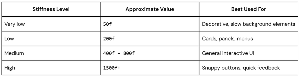
Built-in Spring Presets You Should Know
Compose ships a set of named constants in the Spring object. These are good defaults — you can always tweak from there, but they cover most use cases out of the box.
Damping Ratio Constants
1. NoBouncy
1.0f — Critically damped. Reaches target smoothly without overshooting. Great for practical, functional UI.
2. LowBouncy
0.75f — Slight overshoot. Very subtle and tasteful. Works for most interactive elements.
3. MediumBouncy
0.5f — Noticeable overshoot. Feels playful and lively. Perfect for FABs, pop-ups, and cards.
4. HighBouncy
0.2f — Very bouncy! Eye-catching but use sparingly. Great for celebrations or onboarding animations.
Stiffness Constants
Kotlin
// Compose's named stiffness constants:Spring.StiffnessVeryLow // ≈ 50f — very slow, dreamySpring.StiffnessLow // ≈ 200f — slow and smoothSpring.StiffnessMediumLow // ≈ 400f — default-ish, general useSpring.StiffnessMedium // ≈ 500f — standard interactiveSpring.StiffnessHigh // ≈1500f — snappy and sharp
Watch out: Combining a very high stiffness with a high bouncy damping ratio can make your UI feel chaotic. A high-stiffness spring that also bounces a lot will snap back and forth very quickly — which is rarely the intended effect. Aim for balance.
Real-World Use Cases with Code
Here are the three patterns I reach for most often in real projects.
Use Case 1: Bouncy FAB Appearance
A FAB that just fades in feels flat. Scale it in with a bouncy spring and it feels like it’s jumping out at you. Two lines to change:
When isVisible flips to true, the scale springs from 0f to 1f. With HighBouncy damping, the FAB overshoots past 1.0 before bouncing back to its final size. Modifier.scale() applies the current value every frame — no extra work needed.
Use Case 2: Drag-and-Release with Spring Snap
Drag something sideways, release it, and it springs back to center. This is one of those interactions that feels obvious once you’ve seen it — and it’s straightforward to build:
Kotlin
@ComposablefunSpringSnapCard() {// Animatable gives us full control - we can "snap" or animate to valuesval offsetX = remember { Animatable(0f) }val scope = rememberCoroutineScope()Box( modifier = Modifier .fillMaxSize() .padding(24.dp), contentAlignment = Alignment.Center ) {Card( modifier = Modifier .size(width = 300.dp, height = 180.dp) .offset(x = offsetX.value.dp) .pointerInput(Unit) {detectHorizontalDragGestures(// While dragging: follow the finger directly onHorizontalDrag = { _, dragAmount -> scope.launch { offsetX.snapTo(offsetX.value + dragAmount) } },// On release: spring back to center! onDragEnd = { scope.launch { offsetX.animateTo( targetValue = 0f, animationSpec = spring( dampingRatio = Spring.DampingRatioMediumBouncy, stiffness = Spring.StiffnessMedium ) ) } } ) } ) {Box( modifier = Modifier.fillMaxSize(), contentAlignment = Alignment.Center ) {Text( text = "Drag me sideways! <---->", style = MaterialTheme.typography.bodyLarge ) } } }}@Preview(showBackground = true)@ComposablefunSpringSnapCardPreview() {CenteredPreview {SpringSnapCard() }}
The key pattern: snapTo() during the drag (no animation, just follow the finger), then animateTo() with a spring on release. The spring picks up from whatever velocity the drag left behind, so fast flicks feel different from slow drags.
Use Case 3: Animated Color with Spring
Spring works on colors too. Here’s a button that animates both color and scale on press — layering two springs gives it a more tactile feel:
Kotlin
@ComposablefunSpringColorButton() {var isPressed byremember { mutableStateOf(false) }// Animate between two colors using springval bgColor byanimateColorAsState( targetValue = if (isPressed)Color(0xFF34D399) // green when pressedelseColor(0xFF5B8DEE), // blue when idle animationSpec = spring( dampingRatio = Spring.DampingRatioLowBouncy, stiffness = Spring.StiffnessMedium ), label = "buttonColor" )val scale byanimateFloatAsState( targetValue = if (isPressed) 0.94felse1f, animationSpec = spring( dampingRatio = Spring.DampingRatioMediumBouncy, stiffness = Spring.StiffnessHigh ), label = "buttonScale" )Box( modifier = Modifier .scale(scale) .clip(RoundedCornerShape(14.dp)) .background(bgColor) .pointerInput(Unit) {detectTapGestures( onPress = { isPressed = truetryAwaitRelease() isPressed = false } ) } .padding(horizontal = 32.dp, vertical = 16.dp), contentAlignment = Alignment.Center ) {Text( text = "Press & Hold Me", color = Color.White, fontWeight = FontWeight.SemiBold ) }}
The scale spring uses high stiffness so it reacts instantly. The color spring uses medium stiffness so it transitions a little more slowly. That difference in timing is subtle, but it’s what stops the button from feeling like one flat animation.
Using Animatable with Spring for Full Control
For most UI state changes, animateFloatAsState() is all you need. But sometimes you want to trigger an animation imperatively — not in response to a state flip, but from a coroutine, a gesture callback, or a side effect. That’s what Animatable is for.
You hold a reference to it, then call animateTo(), snapTo(), or updateBounds() directly. Spring specs work the same way:
Kotlin
@ComposablefunAnimatableSpringExample() {// Create an Animatable — this is our "controllable" valueval rotation = remember { Animatable(0f) }val scope = rememberCoroutineScope()Column( modifier = Modifier.fillMaxSize(), horizontalAlignment = Alignment.CenterHorizontally, verticalArrangement = Arrangement.Center ) {Icon( imageVector = Icons.Default.Favorite, contentDescription = null, tint = Color.Red, modifier = Modifier .size(72.dp) .graphicsLayer { rotationZ = rotation.value } )Spacer(Modifier.height(24.dp))Button( onClick = { scope.launch {// Snap to 20° instantly (no animation) — simulate a "flick" rotation.snapTo(20f)// Then spring back to 0° with a bouncy spring rotation.animateTo( targetValue = 0f, animationSpec = spring( dampingRatio = Spring.DampingRatioHighBouncy, stiffness = Spring.StiffnessMediumLow ) ) } } ) {Text("Wobble the Heart! ❤️") } }}
The snapTo() → animateTo() pattern is useful any time you want a “jolt” effect. Instantly displace the value, then spring it back. The icon appears to recoil from the tap rather than just changing state.
animateXAsState vs Animatable: If the animation is tied to a state variable, use animateXAsState(). If you need to fire it manually from a coroutine, gesture handler, or event callback, use Animatable.
Pro Tips & Common Mistakes
Do: Always Provide a Label
Since Compose 1.4, animated state APIs have a label parameter. Always fill it in. Android Studio’s Animation Inspector (also known as Animation Preview) uses these labels to identify animations during debugging — it makes your life significantly easier when inspecting overlapping animations.
Kotlin
// Good — label helps the Animation Inspector identify thisval scale byanimateFloatAsState( targetValue = targetScale, animationSpec = spring(...), label = "cardScale"// ← always add this!)// Bad — anonymous, hard to debugval scale byanimateFloatAsState(targetValue = targetScale)
Do: Use Spring for Gestures and Interruptions
If the user can reverse or redirect a motion mid-way — swipe back, lift a finger early, change direction — spring is the right tool. It reads the current velocity at the moment of interruption and continues from there. A tween would just reset and start over, which looks broken.
Don’t: Use Spring Where Duration Matters
Springs have no fixed end time. That’s a feature when you’re animating interactions, but a problem for things like progress bars or choreographed transitions where you need precise timing. Use tween() there.
Kotlin
// Use tween for progress bars (duration matters)val progress byanimateFloatAsState( targetValue = loadingProgress, animationSpec = tween(durationMillis = 2000, easing = LinearEasing), label = "loadingProgress")// Use spring for interactive gestures (feel matters)val cardOffset byanimateFloatAsState( targetValue = dragOffset, animationSpec = spring(Spring.DampingRatioMediumBouncy), label = "cardDrag")
Don’t: Assume a Spring Will Finish in N Milliseconds
This one bites people. A developer adds a 300ms delay() after kicking off a spring animation, expecting it to be done. It’s not — a slow spring can run for 800ms or more. Use finishedListener to know when it actually settles.
Kotlin
// React to animation end correctly using finishedListenerval offsetX byanimateFloatAsState( targetValue = if (moved) 200felse0f, animationSpec = spring(Spring.DampingRatioLowBouncy), label = "cardOffset", finishedListener = { finalValue ->// This fires when the spring fully settles Log.d("Spring", "Settled at: $finalValue")// Trigger your next action here, not after a hardcoded delay })// Wrong — delay doesn't know when spring settlesscope.launch { moved = truedelay(300) // spring might still be running!doNextThing()}
Frequently Asked Questions
Q. Can I use Jetpack Animation Spring with the old View-based Android system?
Yes. The SpringAnimation class in androidx.dynamicanimation brings the same physics model to View-based UIs. The API looks different from Compose’s spring(), but the underlying math is identical. For new projects, stick with the Compose API — it’s cleaner and integrates with state automatically.
Q. Is Jetpack Animation Spring bad for performance?
Not in practice. Compose batches and optimizes recompositions, so the overhead is minimal for typical UI. If you’re animating something heavy — large composables, complex layouts — wrap it in graphicsLayer. Transformations inside graphicsLayer (scale, rotation, translation, alpha) run on the RenderThread and skip recomposition entirely.
Q. Can I animate multiple properties with spring at the same time?
Yes — each animateXAsState() call is independent, so you can stack as many as you need in one composable. If multiple properties need to stay in sync (start at the same time, driven by the same state change), use updateTransition() instead. It groups them under a single transition so they move together.
Q. What is the difference between spring() and tween() in Compose?
Physics vs time. tween() moves from A to B over a fixed duration. spring() is duration-free — it runs until the value settles, driven by stiffness and damping. Use springs for anything the user can touch or interrupt. Use tweens where timing needs to be exact.
Conclusion
Jetpack Animation Spring is one of those tools that quietly improves your app. It doesn’t add features, but it makes everything feel better.
You don’t need complex setups. Just adjust damping and stiffness until it feels right.
Once you start using it in the right places, it’s hard to go back.
Most apps today deal with sensitive data in some form. Tokens, user credentials, payment info, encryption keys. If all of that lives only in app memory, it’s easier to extract than you might think.
Instead of trusting software alone, you let dedicated hardware handle key storage and cryptographic operations. On Android and other devices, that’s often TPM 2.0 (or similar hardware). On Apple devices, it’s the Secure Enclave.
If you’re using Kotlin Multiplatform, you can design this cleanly without duplicating logic across platforms.
Let’s walk through how it actually fits together.
What “Hardware-Backed Security” Really Means
Software-only protection is useful, but it has limits. If malware, root access, or a compromised OS gets in, software-held keys can be exposed more easily.
Hardware-backed systems reduce that risk by keeping keys inside a protected chip or secure execution area. The main app can ask for a cryptographic operation, but it should never see the raw secret.
This is why TPM 2.0 and Secure Enclave are so valuable. They are built to protect keys, verify device state, and make attacks harder even when the surrounding system is not fully trusted.
At a practical level, it means:
Keys are generated inside secure hardware
They never leave that environment
Your app can use them, but can’t extract them
So even if someone reverse engineers your app or dumps memory, the critical material isn’t there.
TPM 2.0 in Practice (Android and Beyond)
TPM 2.0 stands for Trusted Platform Module 2.0. It is a hardware root of trust commonly found on PCs and laptops (on Windows/Linux), and it is used for secure key storage, platform integrity checks, and device attestation.
A TPM can generate keys, store them securely, and perform operations without exposing the private material to normal application memory. It is especially useful for boot integrity, device authentication, and encryption workflows tied to system trust.
Think of TPM 2.0 as a locked vault inside the machine. The app can request a signature or decryption, but it cannot simply open the vault and copy the key.
You usually don’t talk to TPM 2.0 directly on Android. Instead, you go through the Android Keystore system, which uses secure hardware when available.
What you get:
Hardware-isolated key storage
Built-in enforcement (like requiring biometrics)
Protection against key export
From your app’s point of view, you’re just asking the system to generate and use keys. The hardware layer is handled underneath.
Secure Enclave on iOS and macOS
Secure Enclave is Apple’s isolated security subsystem used on Apple devices for protecting sensitive operations. It is commonly used for biometrics, key protection, and secure cryptographic actions.
Like TPM 2.0, it keeps secrets away from normal app memory and the main operating system. The difference is that Secure Enclave is more tightly integrated into Apple’s hardware and software stack, which makes it feel more seamless for iOS and macOS developers.
In practice, Secure Enclave is often the best place to anchor sensitive app secrets on Apple platforms. For user-facing apps, this can support safer authentication, credential storage, and cryptographic signing.
Apple’s Secure Enclave works similarly, but it’s more tightly integrated.
Keys are created inside the enclave
Biometric checks happen there
The OS never exposes raw key material
If you’ve used Face ID or Touch ID to unlock something securely, you’ve already used it.
Where Kotlin Multiplatform Helps
Kotlin Multiplatform is a great choice when you want shared business logic but still need access to platform-specific security features. You can keep your common encryption flow, data models, and validation logic in shared code, then call Android and Apple native APIs for hardware-backed key handling.
This gives you the best of both worlds:
Shared security logic in common code.
Platform-native key storage on Android and Apple.
Less duplicated code across apps.
A cleaner path to consistent behavior.
For many teams, Kotlin Multiplatform is the right balance between reuse and platform control.
Recommended architecture
A good design separates responsibilities clearly.
Common module: serialization, policy checks, encryption orchestration.
Android module: Android Keystore or TPM-backed flows where available.
Apple module: Keychain and Secure Enclave-backed APIs where available.
Shared interface: a small API that hides platform differences.
This approach keeps your common code simple and testable while allowing each platform to use its strongest security primitive.
Instead of writing separate security flows for Android and iOS, you define a shared contract and implement it per platform.
You’re not trying to abstract the hardware itself. You’re abstracting how your app uses it.
Setting Up the Multiplatform Architecture
To keep our project clean, we use the expect/actual mechanism. We define a common “blueprint” in our shared module and then provide the “real” implementation for each platform.
Note: For simplicity, only Android and iOS are discussed here, but this is not limited to those platforms — we can implement it on other platforms and desktops as well (see the bonus section below).
actual classPlatformSecureKeyManager actual constructor() :AndroidSecureKeyManager()
iOS:
Kotlin
actual classPlatformSecureKeyManager actual constructor() :IOSSecureKeyManager()
Now the rest of your app just depends on SecureKeyManager.
Bonus: Implementing TPM 2.0 (Windows/Desktop)
For Windows or Linux desktop targets, Kotlin Multiplatform uses Kotlin/Native to talk to system C-libraries. On Windows, we typically interact with the NCrypt (Next Generation Cryptography) library to access the TPM 2.0.
The Windows Implementation
In your desktopMain or mingwMain, you would use cinterop to call the Windows CNG (Cryptography Next Generation) API:
Kotlin
import kotlinx.cinterop.*import platform.windows.*classWindowsTPMProvider : SecureKeyManager {// Using the Microsoft Platform Crypto Provider specifically targets the TPMprivateval MS_PLATFORM_CRYPTO_PROVIDER = "Microsoft Platform Crypto Provider"overridefungenerateKey(alias: String) {memScoped {val hProvider = alloc<NCRYPT_PROV_HANDLEVar>()val hKey = alloc<NCRYPT_KEY_HANDLEVar>()// 1. Open the TPM Storage ProviderNCryptOpenStorageProvider(hProvider.ptr, MS_PLATFORM_CRYPTO_PROVIDER, 0)// 2. Create a new RSA or ECC key persisted in hardwareNCryptCreatePersistedKey( hProvider.value, hKey.ptr, BCRYPT_RSA_ALGORITHM, // You can also use BCRYPT_ECDSA_P256_ALGORITHM alias,0,0 )// 3. Finalize the key to "burn" it into the TPMNCryptFinalizeKey(hKey.value, 0)// Clean up handlesNCryptFreeObject(hKey.value)NCryptFreeObject(hProvider.value) } }overridefunencrypt(data: ByteArray): ByteArray {// Implementation would involve NCryptOpenKey using the alias// followed by NCryptEncrypt// For hardware-backed keys, the TPM handles the actual mathreturntodo("NCryptEncrypt implementation") }overridefundecrypt(data: ByteArray): ByteArray {// Implementation would involve NCryptOpenKey using the alias// followed by NCryptDecryptreturntodo("NCryptDecrypt implementation") }}
The Provider: By using MS_PLATFORM_CRYPTO_PROVIDER, you are explicitly telling Windows to bypass the software-based providers and use the TPM 2.0 chip. If the device lacks a TPM, this call will fail, allowing you to handle the error gracefully.
NCryptFinalizeKey: In the Windows CNG (Cryptography Next Generation) API, a key isn’t “real” until you finalize it. This is the moment the TPM 2.0 generates the key material internally.
Memory Management: Since this is Kotlin Multiplatform targeting Windows (Native), we use memScoped and alloc. This ensures that pointers used for Windows C-headers are cleaned up properly, preventing memory leaks in your security layer.
Where This Is Actually Useful
This setup shows up in a few common places:
Storing auth tokens securely
Encrypting local database values
Managing private keys for end-to-end encryption
Adding biometric protection to sensitive actions
You don’t need to over-engineer it. Even using hardware-backed storage for one critical key is a big improvement.
Things That Trip People Up
Some common mistakes:
Assuming all devices have hardware-backed storage
Forgetting to handle fallback paths
Treating encryption as useful without secure key storage
Not testing biometric-required flows properly
Also worth noting: emulators don’t behave the same as real devices here.
A Few Practical Tips
Always prefer hardware-backed keys when available
Require user authentication for sensitive operations
Don’t cache decrypted data longer than needed
Keep your abstraction small and focused
You don’t need a huge framework. Just a clean boundary and correct usage.
Conclusion
You don’t interact with TPM 2.0 or Secure Enclave directly most of the time. The platform APIs handle that. Your job is to use them correctly and structure your code so it stays maintainable.
That’s where Kotlin Multiplatform helps. You define the contract once, plug in the platform specifics, and keep the rest of your app clean.
If you’re already sharing business logic across platforms, adding this layer is a natural next step.
If you’ve been exploring cross-platform development with Kotlin, you’ve probably come across the debate: Kotlin Multiplatform vs Kotlin Native. At first glance, they can feel similar. Both let you use Kotlin beyond Android. Both promise code reuse. But they solve different problems.
In this guide, we’ll break down Kotlin Multiplatform & Kotlin Native to help you understand the real-world differences in 2026.
First, What Is Kotlin?
Kotlin is a modern programming language created by JetBrains. It’s concise, safe, and fully interoperable with Java.
Kotlin Multiplatform is about how you structure your codebase.
Kotlin Multiplatform vs Kotlin Native: Core Difference
Here’s the simplest way to understand it:
Kotlin Native = a compiler/runtime technology
Kotlin Multiplatform = a development framework/approach
They are not competitors. They work together.
How They Work Together
When comparing Kotlin Multiplatform vs Kotlin Native, it’s important to know this:
Kotlin Multiplatform uses Kotlin Native under the hood for iOS and other native targets.
So:
You write shared code using Kotlin Multiplatform
That shared code gets compiled using Kotlin Native (for iOS, etc.)
Real-World Example
Imagine you’re building a mobile app:
With Kotlin Multiplatform:
Business logic (API calls, validation) is shared
UI is written separately (SwiftUI for iOS, Jetpack Compose for Android)
With Kotlin Native:
The shared code gets compiled into native iOS binaries
Key Differences Table
When Should You Use Kotlin Multiplatform?
Choose Kotlin Multiplatform if:
You want to share business logic across platforms
You’re building Android + iOS apps
You want flexibility in UI development
You care about reducing duplicate code
Example Use Cases:
Fintech apps
E-commerce apps
APIs and SDKs
When Should You Use Kotlin Native?
Choose Kotlin Native if:
You need a fully native application
You are building:
CLI tools
System-level software
Performance-critical modules
You don’t need cross-platform sharing
Performance: Kotlin Multiplatform vs Kotlin Native
This is a common question.
Kotlin Native produces true native binaries, so performance is excellent
Kotlin Multiplatform inherits that performance when targeting native platforms
However:
KMP adds a layer of architecture complexity
Native-only projects may be simpler for small apps
Developer Experience in 2026
Things have improved a lot.
Kotlin Multiplatform:
Better tooling in Android Studio
Improved iOS integration
Faster builds
More stable libraries
Kotlin Native:
Improved memory management (no more freezing issues like early versions)
Better debugging tools
Common Misconception
Many developers think:
“Kotlin Multiplatform & Kotlin Native is a choice between two competing tools.”
That’s not true.
You don’t choose one over the other… You use them together..!
A Simple Mental Model
Think of it like this:
Kotlin Multiplatform = the blueprint
Kotlin Native = the engine that runs part of that blueprint
FAQ
Q: What is the difference between Kotlin Multiplatform and Kotlin Native? Kotlin Multiplatform is a framework for sharing code across platforms, while Kotlin Native is a compiler that turns Kotlin code into native binaries. Kotlin Multiplatform often uses Kotlin Native for iOS and other native targets.
Q: Can Kotlin Multiplatform work without Kotlin Native? Partially. It can target JVM and JS without Kotlin Native, but for iOS or native platforms, Kotlin Native is required.
Q: Which is better in 2026? Neither is “better.” Kotlin Multiplatform is the higher-level solution, and Kotlin Native is part of how it works.
Conclusion
The debate around Kotlin Multiplatform vs Kotlin Native often comes from misunderstanding their roles.
If you remember just one thing, let it be this:
Kotlin Multiplatform helps you share code
Kotlin Native helps you run code natively
Together, they form a powerful toolkit for modern app development in 2026.
Good UI doesn’t just look nice, it moves well. Small, thoughtful animations help users understand what changed and why. In Jetpack Compose, AnimatedContent makes this surprisingly easy.
This guide walks you through how it works, when to use it, and how to keep things clean and performant.
What is AnimatedContent?
AnimatedContent is a composable in Jetpack Compose that automatically animates between different UI states.
Instead of abruptly switching content, it smoothly transitions from one state to another.
Think of it like this:
Without AnimatedContent → content just changes
With AnimatedContent → content transforms into the next state
When Should You Use AnimatedContent?
Use AnimatedContent when:
You switch between UI states (loading → success → error)
You update text, numbers, or layouts dynamically
You want smooth transitions without managing animations manually
Adding smooth motion to your Android app doesn’t just make it look “cool” — it guides the user’s eye and makes the interface feel responsive and alive. If you’ve ever felt overwhelmed by complex animation frameworks, I have great news: AnimatedVisibility in Jetpack Compose is here to do the heavy lifting for you.
In this guide, I’ll walk you through how to use AnimatedVisibility step by step. We’ll keep things simple, practical, and easy to follow. By the end, you’ll know how to create clean, engaging UI transitions without overcomplicating your code.
What is AnimatedVisibility?
AnimatedVisibility is a composable in Jetpack Compose that lets you show or hide UI elements with animation.
Instead of instantly appearing or disappearing, your UI components can:
Fade in or out
Slide in or out
Expand or shrink
This creates a smoother and more natural user experience.
Why Use AnimatedVisibility?
Here’s why developers love using AnimatedVisibility:
Makes UI feel modern and responsive
Improves user experience with smooth transitions
Easy to implement with minimal code
Highly customizable animations
If you’re building dropdowns, alerts, expandable cards, or onboarding flows, AnimatedVisibility is incredibly useful.
Basic Example of AnimatedVisibility
Let’s start with a simple example.
Step 1: Add a Toggle State
Kotlin
var isVisible byremember { mutableStateOf(false) }
This state controls whether the UI is visible or not.
Step 2: Use AnimatedVisibility
Kotlin
Column {Button(onClick = { isVisible = !isVisible }) {Text("Toggle Visibility") }AnimatedVisibility(visible = isVisible) {Text("Hello! I appear with animation.") }}
Here,
When the button is clicked, isVisible changes
AnimatedVisibility reacts to that change
The text appears or disappears with a default animation
By default, it uses a combination of fade and expand animations.
Adding Custom Animations
The real power of AnimatedVisibility comes from customization.
Let’s combine everything into a practical example.
Expandable Card
Kotlin
@ComposablefunExpandableCard() {var expanded byremember { mutableStateOf(false) }Column(modifier = Modifier.padding(16.dp)) {Button(onClick = { expanded = !expanded }) {Text("Show Details") }AnimatedVisibility( visible = expanded, enter = fadeIn() + expandVertically(), exit = fadeOut() + shrinkVertically() ) {Text( text = "Here are more details about this item. This section expands smoothly.", modifier = Modifier.padding(top = 8.dp) ) } }}@Preview(showBackground = true)@ComposablefunExpandableCardPreview() {CenteredPreview {ExpandableCard() }}
Clean separation of state and UI
Smooth transition enhances usability
Easy to reuse in different parts of your app
AnimatedVisibility with LazyColumn
Using AnimatedVisibility inside a LazyColumn is a great way to create smooth, modern list interactions. Think expandable list items, animated insert/remove, or showing extra details per row.
You’d typically combine AnimatedVisibility with LazyColumn when:
Expanding/collapsing list items
Showing extra details on click
Animating conditional content inside rows
Here’s a simple example where each item expands when clicked.
To get the most out of AnimatedVisibility, keep these tips in mind:
1. Keep Animations Subtle
Avoid overly complex animations. Simple transitions feel more professional.
2. Use Meaningful Motion
Animations should guide the user, not distract them.
3. Manage State Properly
Use remember and mutableStateOf correctly to avoid unexpected behavior.
4. Combine Animations Carefully
Too many combined effects can feel heavy. Stick to 1–2 transitions.
5. Test on Real Devices
Animations may feel different on slower devices. Always test performance.
Common Mistakes to Avoid
Here are a few pitfalls when working with AnimatedVisibility:
Forgetting to control state properly
Overusing animations in every component
Using heavy animations inside large lists
Not handling re-composition efficiently
Keep things simple and intentional.
When Should You Use AnimatedVisibility?
Use AnimatedVisibility when you need to:
Show/hide UI elements dynamically
Create expandable layouts
Improve onboarding screens
Add feedback to user actions
Build interactive components
If visibility changes are part of your UI, this composable is the right tool.
Conclusion
AnimatedVisibility is one of the easiest ways to bring life into your Jetpack Compose UI.
You don’t need complex animation frameworks or tons of code. With just a few lines, you can create smooth, engaging transitions that feel natural and polished.
Start small. Try a simple fade or slide. Then experiment with combinations as you get comfortable.
If you’ve ever wanted to write code once and run it across multiple platforms without dragging along a heavy runtime, Kotlin Native is worth a look.
It lets you take Kotlin beyond the JVM and compile it into real native binaries. That changes how your apps start, run, and scale across platforms.
Let’s break it down in a simple, practical way.
What Is Kotlin Native?
Kotlin Native is a technology that compiles Kotlin code directly into native machine code.
So instead of this:
Kotlin → bytecode → JVM → runs on device
You get this:
Kotlin → native binary → runs on OS
Normally, Kotlin runs on the JVM, where your code is compiled into bytecode and executed by the Java Virtual Machine.
Kotlin Native skips the JVM entirely. It uses LLVM to compile Kotlin into a standalone executable (like a .exe on Windows or a framework on iOS) that runs directly on the operating system.
This means there’s no JVM runtime or bytecode layer involved — just your compiled program running natively on the platform.
Why Kotlin Native Matters
Most cross-platform tools rely on some kind of bridge or runtime. Kotlin Native skips that.
Here’s what that gives you in practice:
Cross-platform without rewriting logic
You can reuse core logic across iOS, desktop, and other platforms, while still building native UIs.
No runtime dependency
Your app is compiled ahead of time. It runs as a standalone executable.
Faster startup
Since there’s no runtime to spin up, apps launch quickly.
Same Kotlin language
You’re still writing Kotlin. No need to switch mental models.
How Kotlin Native Works
Kotlin Native uses ahead-of-time (AOT) compilation. In the Kotlin Native ecosystem, the compiler handles things differently:
Backend: It uses LLVM, the same powerful technology used by languages like Swift and C++.
Interoperability: It “talks” natively to C, Objective-C, and Swift.
No Garbage Collector (Traditional): It uses a specialized memory management system designed to be efficient across different platforms.
In simple terms:
You write Kotlin code
The Kotlin Native compiler turns it into machine code
You get a platform-specific binary
That binary runs directly on the OS
No extra runtime involved.
A Simple Kotlin Example
Kotlin
funmain() {println("Hello, Kotlin Native!")}
main() is the entry point
println() prints to the console
When compiled with Kotlin Native, this becomes a native executable
Nothing special in the syntax. That’s the point.
Let’s See Some Code!
Working with Functions in Kotlin Native
To understand how Kotlin Native feels, let’s look at a simple example. Imagine we want a shared piece of code that says “Hello” but identifies which platform it’s running on.
The “Expect” and “Actual” Pattern
Kotlin uses a unique system to handle platform-specific features.
Kotlin
// This goes in the "Common" folderexpect fungetPlatformName(): Stringfungreet(): String {return"Hello from Kotlin Native on ${getPlatformName()}!"}
expect: This tells the compiler, “I promise I will provide the actual implementation for this function on every specific platform (iOS, Windows, etc.).”
Now, here is how the iOS-specific implementation might look:
Kotlin
// This goes in the "iosMain" folderimport platform.UIKit.UIDeviceactual fungetPlatformName(): String {return UIDevice.currentDevice.systemName() + " " + UIDevice.currentDevice.systemVersion}
actual: This is the real implementation.
Notice the import platform.UIKit.UIDevice? This is Kotlin Native talking directly to Apple’s UIKit! You are using Kotlin to access iOS system APIs.
Memory Management in Kotlin Native
This used to be one of the trickier parts of Kotlin Native. Older versions had strict rules around sharing objects between threads, requiring object freezing and making concurrency restrictive.
That’s changed. Kotlin Native now has a more relaxed memory model, allowing you to share data across threads more naturally without fighting the system.
It also uses a garbage collector, so you don’t need manual memory management like in C++.
It’s still not identical to JVM behavior, but it’s much easier to work with than before. While concurrency is more flexible now, you’re responsible for ensuring thread safety when working with shared mutable state.
For advanced scenarios like C interop, kotlinx.cinterop provides access to raw pointers—but this is rarely needed in typical development.
Where Kotlin Native Fits
You’ll rarely use Kotlin Native by itself. It’s usually part of Kotlin Multiplatform.
Typical use cases:
Sharing business logic between Android and iOS
Writing cross-platform libraries
Building lightweight backend tools
Working on embedded or edge devices
The main idea is simple: write logic once, reuse it where it makes sense.
Advantages of Kotlin Native
Fast startup
No runtime dependency
Smaller footprint
Can interop with C libraries
Good fit for performance-sensitive code
Limitations to Know
It’s not a silver bullet.
Ecosystem is smaller than JVM
Some libraries won’t work out of the box
Debugging can feel rough at times
Build times can be slow
Most of these are improving, but they’re still worth keeping in mind.
When Should You Use Kotlin Native?
Use it when:
You’re building a cross-platform app with shared logic
You need native performance
You’re targeting iOS alongside Android
Skip it if:
Your app is Android-only
You rely heavily on JVM-specific libraries
Getting Started
A simple way to begin:
Set up a Kotlin Multiplatform project
Add native targets (iOS, macOS, etc.)
Write shared Kotlin code
Compile using Kotlin Native
If you’re using IntelliJ IDEA, most of this is already streamlined.
Tips for Beginners
Start with small examples
Focus on shared logic first
Avoid pulling in too many dependencies early
Test on real targets when possible
Conclusion
Kotlin Native isn’t trying to replace everything — it fills a powerful gap. It lets you share logic across platforms while keeping native performance and experience.
If you already know Kotlin, expanding to iOS and desktop is more accessible than ever.
It’s time to think beyond Android development — and start thinking in terms of native, cross-platform efficiency.
