
Animations in the old View system were a lot of ceremony. You’d set up an ObjectAnimator, attach a listener, call start(), remember to cancel on detach, and hope nothing leaked. For something as simple as fading a view, it felt disproportionate.
Compose takes a different approach. Instead of imperative animation commands, you describe what you want the UI to look like for a given state — and the animate*AsState family handles the transition automatically. No start/cancel lifecycle. No listeners unless you need them.
What Is animate*AsState?
animate*AsState is a group of composable functions that smoothly animate a value whenever its target changes. Feed it a target, and it produces a frame-by-frame animated value you can plug directly into your UI.
The * is a wildcard — there’s a variant for each value type you’re likely to animate:
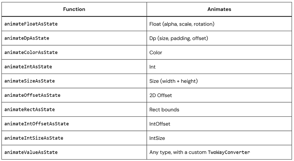
They all follow the same pattern, so once you’ve used one, the others are trivial.
The Mental Model
The key shift from the View system: you don’t start animations. You change state.
State changes → animate*AsState detects the new target → interpolates toward it each frame
When isExpanded flips from false to true, you don’t tell anything to animate. You just update state, and the animated value catches up on its own. If the state changes again mid-flight, the animation redirects smoothly from wherever it currently is.
This is different from ValueAnimator, which needs explicit start/cancel calls and doesn’t know about your UI state at all.
animateFloatAsState: Fading a Box
Start here — it’s the simplest case.
@Composable
fun FadeExample() {
    var isVisible by remember { mutableStateOf(true) }

    val alpha by animateFloatAsState(
        targetValue = if (isVisible) 1f else 0f,
        label = "alpha animation"
    )

    Column(
        horizontalAlignment = Alignment.CenterHorizontally,
        modifier = Modifier.padding(24.dp)
    ) {
        Box(
            modifier = Modifier
                .size(100.dp)
                .graphicsLayer { this.alpha = alpha }
                .background(Color(0xFF6650A4))
        )
        Spacer(modifier = Modifier.height(16.dp))
        Button(onClick = { isVisible = !isVisible }) {
            Text(if (isVisible) "Hide" else "Show")
        }
    }
}


@Preview(showBackground = true)
@Composable
fun FadeExamplePreview() {
    FadeExample()
}
isVisible is boolean. When it toggles, animateFloatAsState picks up the new target and eases alpha toward it over several frames. Each frame triggers a recomposition, which re-reads the updated alpha — that’s the full animation loop.
The label parameter is optional, but set it anyway. It appears in the Android Studio Animation Inspector and makes debugging significantly less painful.
animateColorAsState: Transitioning Colors
Color is one of the more visually rewarding things to animate because even a 300ms cross-fade reads as deliberate and polished.
@Composable
fun ColorToggleExample() {
    var isActive by remember { mutableStateOf(false) }

    val backgroundColor by animateColorAsState(
        targetValue = if (isActive) Color(0xFF6650A4) else Color(0xFFECECEC),
        animationSpec = tween(durationMillis = 500),
        label = "background color"
    )

    val textColor by animateColorAsState(
        targetValue = if (isActive) Color.White else Color.Black,
        animationSpec = tween(durationMillis = 500),
        label = "text color"
    )

    Box(
        contentAlignment = Alignment.Center,
        modifier = Modifier
            .fillMaxWidth()
            .height(120.dp)
            .background(backgroundColor, shape = RoundedCornerShape(16.dp))
            .clickable { isActive = !isActive }
    ) {
        Text(
            text = if (isActive) "Active" else "Inactive",
            color = textColor,
            fontSize = 20.sp,
            fontWeight = FontWeight.SemiBold
        )
    }
}


@Preview(showBackground = true)
@Composable
fun ColorToggleExamplePreview() {
    CenteredPreview {
        ColorToggleExample()
    }
}
Both the background and text colors animate in sync. You don’t coordinate them — they just share the same state source (isActive), so they naturally stay in step.

The animationSpec = tween(durationMillis = 500) is where you control how the animation plays out. More on that below.
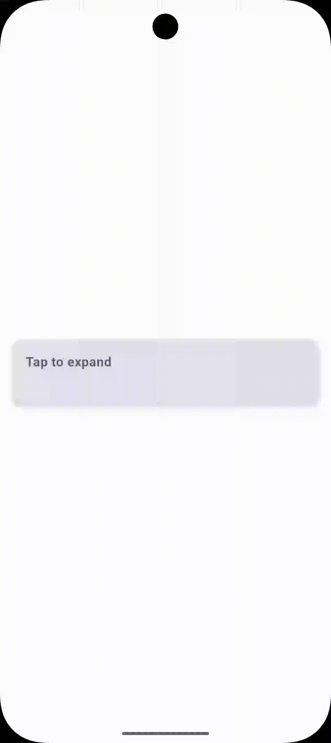
animateDpAsState: Expandable Cards
animateDpAsState works on any Dp value — height, width, padding, corner radius. A common use case is an expandable card:
@Composable
fun ExpandableCardExample() {
    var isExpanded by remember { mutableStateOf(false) }

    val cardHeight by animateDpAsState(
        targetValue = if (isExpanded) 200.dp else 80.dp,
        animationSpec = spring(
            dampingRatio = Spring.DampingRatioMediumBouncy,
            stiffness = Spring.StiffnessLow
        ),
        label = "card height"
    )

    Card(
        modifier = Modifier
            .fillMaxWidth()
            .height(cardHeight)
            .clickable { isExpanded = !isExpanded },
        elevation = CardDefaults.cardElevation(defaultElevation = 4.dp)
    ) {
        Column(modifier = Modifier.padding(16.dp)) {
            Text(
                text = "Tap to ${if (isExpanded) "collapse" else "expand"}",
                fontWeight = FontWeight.Bold,
                fontSize = 16.sp
            )
            if (isExpanded) {
                Spacer(modifier = Modifier.height(12.dp))
                Text(
                    text = "The card height is driven by animateDpAsState. " +
                           "The spring spec adds a slight overshoot on open.",
                    fontSize = 14.sp,
                    color = Color.Gray
                )
            }
        }
    }
}
Using spring instead of tween here adds a small overshoot when the card opens — the physics-based easing makes it feel more physical than a plain duration curve.
Animation Specs
animationSpec controls the character of the animation. There are three you’ll reach for regularly.
tween — Fixed Duration
val size by animateDpAsState(
    targetValue = targetSize,
    animationSpec = tween(
        durationMillis = 400,
        delayMillis = 100,
        easing = FastOutSlowInEasing
    ),
    label = "size"
)
Pick tween when you need precise timing — UI tests, coordinated sequences, or matching a transition to an audio cue.
Common easing options:
FastOutSlowInEasing— decelerates into the final position (good for elements entering the screen)LinearOutSlowInEasing— starts at constant speed, slows at the end (good for exits)FastOutLinearInEasing— accelerates throughout (for emphasis)EaseInOut— smooth on both ends, feels the most naturalLinearEasing— constant speed; fine for loaders, rarely right for UI transitions
spring — Physics-Based
val offsetX by animateFloatAsState(
    targetValue = targetPosition,
    animationSpec = spring(
        dampingRatio = Spring.DampingRatioMediumBouncy,  // How much it overshoots
        stiffness = Spring.StiffnessLow                  // How fast it moves
    ),
    label = "offset"
)
spring doesn’t have a fixed duration — it settles based on physics. The two parameters to tune:
Damping ratio (controls overshoot):
NoBouncy(1f) — glides in cleanly, no overshootLowBouncy(0.75f) — barely noticeable bounceMediumBouncy(0.5f) — clear bounce, works well for cards and buttonsHighBouncy(0.2f) — exaggerated overshoot, use it deliberately
Stiffness (controls speed):
VeryLow— slow, floatyLow— relaxedMedium— balanced defaultHigh— snappyVeryHigh— nearly instant
keyframes — Custom Intermediate Values
val scale by animateFloatAsState(
    targetValue = if (isPressed) 0.9f else 1f,
    animationSpec = keyframes {
        durationMillis = 300
        1f at 0       // frame 0ms
        1.1f at 100   // slightly overshoots at 100ms
        0.95f at 200  // settles low
        1f at 300     // lands at resting scale
    },
    label = "press scale"
)
Use keyframes for custom press effects or anything where you need control over intermediate values. It’s more verbose, but it gives you exact control over the curve at each timestamp.
Combining Multiple Animations: Like Button
Each animate*AsState call handles exactly one value. When you need several properties to animate at once, you just stack them. They all read from the same state and run concurrently without any coordination code.
@Composable
fun AnimatedLikeButton() {
    var isLiked by remember { mutableStateOf(false) }

    val scale by animateFloatAsState(
        targetValue = if (isLiked) 1f else 0.85f,
        animationSpec = spring(
            dampingRatio = Spring.DampingRatioHighBouncy,
            stiffness = Spring.StiffnessMedium
        ),
        label = "like scale"
    )

    val heartColor by animateColorAsState(
        targetValue = if (isLiked) Color(0xFFE91E63) else Color.Gray,
        animationSpec = tween(durationMillis = 200),
        label = "heart color"
    )

    val iconSize by animateDpAsState(
        targetValue = if (isLiked) 36.dp else 28.dp,
        animationSpec = spring(dampingRatio = Spring.DampingRatioMediumBouncy),
        label = "icon size"
    )

    IconButton(
        onClick = { isLiked = !isLiked },
        modifier = Modifier.graphicsLayer { scaleX = scale; scaleY = scale }
    ) {
        Icon(
            imageVector = if (isLiked) Icons.Filled.Favorite else Icons.Outlined.FavoriteBorder,
            contentDescription = if (isLiked) "Unlike" else "Like",
            tint = heartColor,
            modifier = Modifier.size(iconSize)
        )
    }
}
On tap:
- The icon swaps (state change, instant)
- Color fades from gray to pink over 200ms (
tween) - Scale bounces with a spring (
HighBouncy) - Icon size bumps up with a softer spring (
MediumBouncy)
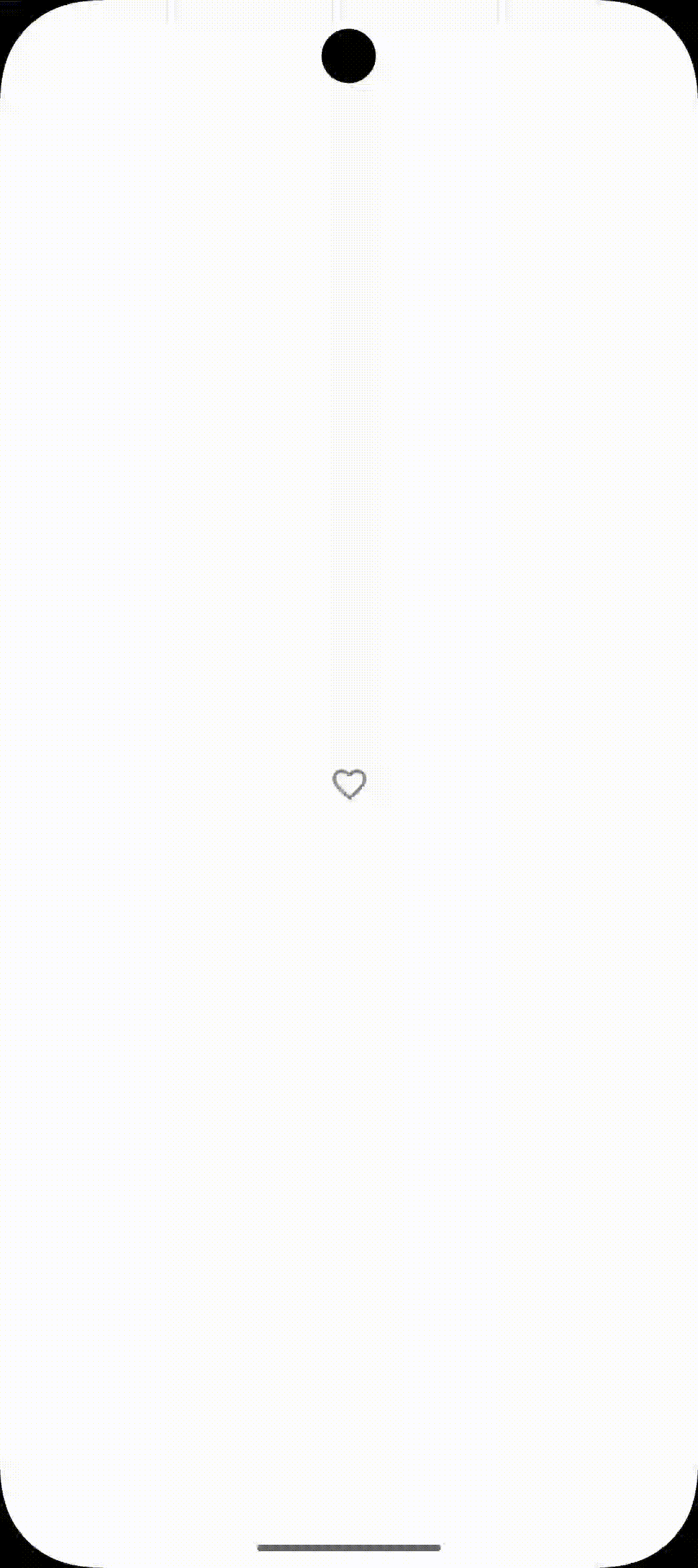
Three independent animations, one state variable, no coordinator.
Rotation
The .rotate() modifier accepts a Float, so animateFloatAsState drops right in. Useful for expand/collapse arrows and spinners.
@Composable
fun RotatingArrow() {
    var isExpanded by remember { mutableStateOf(false) }

    val rotation by animateFloatAsState(
        targetValue = if (isExpanded) 180f else 0f,
        animationSpec = tween(durationMillis = 300, easing = EaseInOut),
        label = "arrow rotation"
    )

    Row(
        modifier = Modifier
            .fillMaxWidth()
            .clickable { isExpanded = !isExpanded }
            .padding(16.dp),
        horizontalArrangement = Arrangement.SpaceBetween,
        verticalAlignment = Alignment.CenterVertically
    ) {
        Text("Show details", fontWeight = FontWeight.Medium)
        Icon(
            imageVector = Icons.Default.KeyboardArrowDown,
            contentDescription = "Expand",
            modifier = Modifier.rotate(rotation)
        )
    }
}
Slide-In with Offset
Banner notifications, bottom bars, toast-style messages — offset animation handles all of these. Start the composable off-screen and animate it into position.
@Composable
fun SlideInNotification(
    message: String,
    isVisible: Boolean
) {
    val offsetY by animateDpAsState(
        targetValue = if (isVisible) 0.dp else (-80).dp,
        animationSpec = spring(
            dampingRatio = Spring.DampingRatioLowBouncy,
            stiffness = Spring.StiffnessMedium
        ),
        label = "notification offset"
    )

    Surface(
        modifier = Modifier
            .fillMaxWidth()
            .offset(y = offsetY),
        color = Color(0xFF4CAF50),
        shadowElevation = 6.dp,
        shape = RoundedCornerShape(bottomStart = 12.dp, bottomEnd = 12.dp)
    ) {
        Text(
            text = message,
            modifier = Modifier.padding(16.dp),
            color = Color.White,
            fontWeight = FontWeight.Medium
        )
    }
}

@Preview(showBackground = true)
@Composable
fun SlideInNotificationInteractivePreview() {
    CenteredPreview {
        var isVisible by remember { mutableStateOf(false) }

        Column(horizontalAlignment = Alignment.CenterHorizontally) {
            SlideInNotification(
                message = "This is a notification. Hello from animation",
                isVisible = isVisible
            )

            Spacer(modifier = Modifier.height(16.dp))

            Button(onClick = { isVisible = !isVisible }) {
                Text("Toggle")
            }
        }
    }
}
When isVisible becomes true, the banner animates from its current offset to 0.dp, sliding down into view with a slight bounce. When set to false, it animates back to -80.dp, sliding out upward.
Reacting When an Animation Finishes
If you need to trigger something after the animation settles — navigate, update a flag, kick off the next step — use finishedListener:
@Composable
fun AnimationWithCallback() {
    var isMoved by remember { mutableStateOf(false) }
    var statusText by remember { mutableStateOf("Ready") }

    val offsetX by animateDpAsState(
        targetValue = if (isMoved) 200.dp else 0.dp,
        animationSpec = tween(durationMillis = 600),
        label = "move animation",
        finishedListener = { finalValue ->
            // Called once - when the animation fully settles
            statusText = if (finalValue == 200.dp) "Moved!" else "Back home!"
        }
    )

    Column(horizontalAlignment = Alignment.CenterHorizontally) {
        Box(
            modifier = Modifier
                .size(60.dp)
                .offset(x = offsetX)
                .background(Color(0xFF6650A4), shape = CircleShape)
        )
        Spacer(modifier = Modifier.height(16.dp))
        Text(text = statusText)
        Spacer(modifier = Modifier.height(8.dp))
        Button(onClick = { isMoved = !isMoved }) {
            Text(if (isMoved) "Move back" else "Move right")
        }
    }
}
finishedListener fires once, with the final settled value. It does not fire on every frame — that’s what makes it safe to use for side effects.

Performance: Use graphicsLayer for Visual Transforms
For scale, alpha, and rotation, avoid stacking individual modifiers. Batch them in a single graphicsLayer block:
// Prefer this — all transforms applied in one pass on the render thread
Modifier.graphicsLayer {
    scaleX = scale
    scaleY = scale
    alpha = alpha
    rotationZ = rotation
}

// Avoid this for pure visual properties
Modifier
    .scale(scale)
    .alpha(alpha)
    .rotate(rotation)
graphicsLayer applies visual transformations during the draw phase, avoiding layout changes and reducing the cost of recomposition for purely visual updates. This makes it especially efficient for animations like alpha, translation, and scale—particularly in lists or frequently updated UI.
Keep targetValue Simple
If the logic for computing your target value is complex, extract it before passing it in:
// Fine
val scale by animateFloatAsState(
    targetValue = if (isExpanded) 1.2f else 1f,
    label = "scale"
)

// Better to extract first than inline a big when block
val targetScale = when {
    isExpanded && isSelected -> 1.3f
    isExpanded -> 1.15f
    isSelected -> 1.05f
    else -> 1f
}

val scale by animateFloatAsState(targetValue = targetScale, label = "scale")
When Not to Use animate*AsState
animate*AsState is the right tool when you’re animating a single value in response to a state flip. Reach for something else when:
- You’re animating multiple values that need to stay in sync as a unit →
updateTransition - You need an infinitely repeating animation →
rememberInfiniteTransition - You’re tracking a pointer/drag gesture and need manual control →
Animatable - The composable is entering or leaving the composition →
AnimatedVisibility
The last one trips people up most often. animate*AsState can only animate a composable that’s already in the tree. If you’re using if (condition) { MyComposable() } and condition becomes false, MyComposable is gone — there’s nothing left to animate. Wrap it in AnimatedVisibility instead.
Full Example: Custom Animated Toggle
Here’s everything from this article working together in a single component — a toggle row with animated track color, thumb position, and a subtle press scale:
@Composable
fun AnimatedSettingsToggle(
    label: String,
    description: String,
    isEnabled: Boolean,
    onToggle: (Boolean) -> Unit
) {
    var isPressed by remember { mutableStateOf(false) }

    val trackColor by animateColorAsState(
        targetValue = if (isEnabled) Color(0xFF6650A4) else Color(0xFFCAC4D0),
        animationSpec = tween(durationMillis = 250),
        label = "track color"
    )

    val thumbOffset by animateDpAsState(
        targetValue = if (isEnabled) 20.dp else 2.dp,
        animationSpec = spring(
            dampingRatio = Spring.DampingRatioMediumBouncy,
            stiffness = Spring.StiffnessMedium
        ),
        label = "thumb offset"
    )

    val rowScale by animateFloatAsState(
        targetValue = if (isPressed) 0.98f else 1f,
        animationSpec = tween(durationMillis = 100),
        label = "row press scale"
    )

    Row(
        modifier = Modifier
            .fillMaxWidth()
            .graphicsLayer {
                scaleX = rowScale
                scaleY = rowScale
            }
            .clickable(
                indication = null,
                interactionSource = remember { MutableInteractionSource() }
            ) {
                isPressed = true
                onToggle(!isEnabled) // toggle value
                isPressed = false
            }
            .padding(horizontal = 16.dp, vertical = 12.dp),
        horizontalArrangement = Arrangement.SpaceBetween,
        verticalAlignment = Alignment.CenterVertically
    ) {
        Column(modifier = Modifier.weight(1f)) {
            Text(
                text = label,
                fontWeight = FontWeight.SemiBold,
                fontSize = 16.sp
            )
            Text(
                text = description,
                fontSize = 13.sp,
                color = Color.Gray
            )
        }

        Spacer(modifier = Modifier.width(16.dp))

        Box(
            modifier = Modifier
                .width(48.dp)
                .height(28.dp)
                .background(trackColor, shape = RoundedCornerShape(50))
                .padding(horizontal = 2.dp),
            contentAlignment = Alignment.CenterStart
        ) {
            Box(
                modifier = Modifier
                    .size(24.dp)
                    .offset(x = thumbOffset)
                    .background(Color.White, shape = CircleShape)
            )
        }
    }
}

@Preview(showBackground = true)
@Composable
fun AnimatedSettingsTogglePreview() {
    var isEnabled by remember { mutableStateOf(false) }

    CenteredPreview {
        AnimatedSettingsToggle(
            label = "Wi-Fi",
            description = "Enable wireless connectivity",
            isEnabled = isEnabled,
            onToggle = { }
        )
    }
}
Three animate*AsState calls, no third-party library, no animation framework — just state and a handful of composable functions.

Common Mistakes
Animating inside a LazyColumn without stable keys. Each item gets its own animation instance, which is correct — but if your remember isn’t keyed to the item’s identity, Compose may reuse the state for a different item when the list scrolls. Always key your remember calls to something stable and unique per item.
Expecting finishedListener to fire on every frame. It fires once, when the animation settles. If you want per-frame callbacks, you need Animatable with a custom coroutine loop.
Using animate*AsState for enter/exit animations. When a composable leaves the composition, it’s gone — animate*AsState has nothing to animate. Use AnimatedVisibility for any case where the composable needs to animate out before being removed.
Conclusion
animate*AsState in Jetpack Compose is one of those APIs you end up using all the time.
It keeps animation logic simple and close to your UI state, which is exactly how Compose is meant to work.
Start with small interactions. Once you get comfortable, you’ll naturally move to more advanced animation APIs when needed.