Jetpack Compose

Jetpack Compose UI Components

The Ultimate Guide to Jetpack Compose UI Components

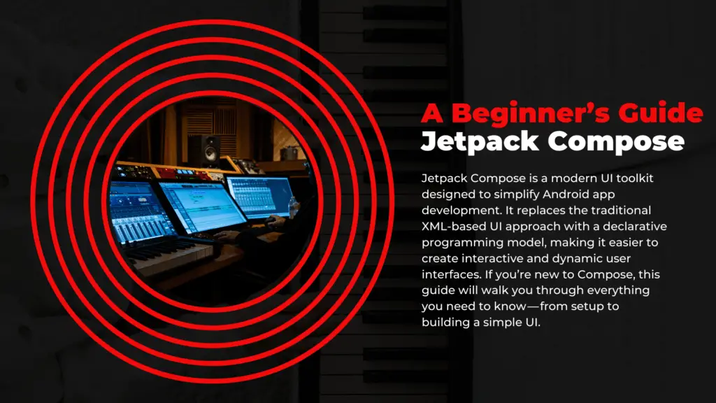
Jetpack Compose has revolutionized Android UI development by providing a declarative approach to building modern and dynamic user interfaces. If you’re new to Jetpack Compose or looking for a comprehensive guide on UI components, this blog will walk you through the essential elements used to create stunning Android apps. From basic text displays to complex interactive components, we’ve got it all covered.

Why Jetpack Compose?

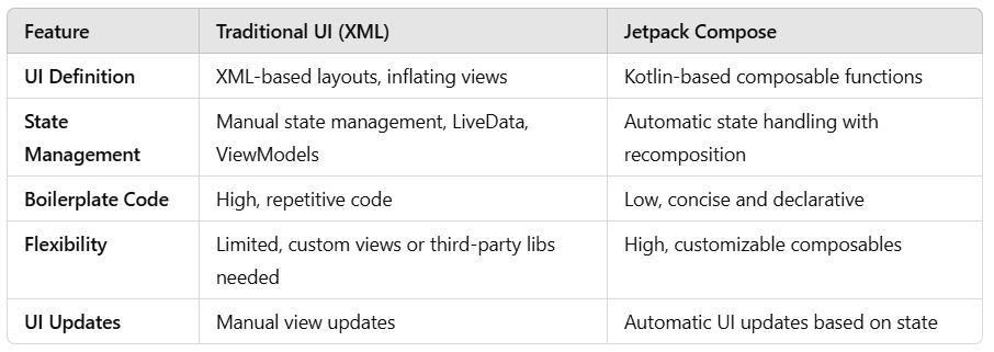
Jetpack Compose simplifies UI development by allowing developers to create interfaces with less boilerplate code while improving performance and maintainability. Key benefits include:

  • Declarative UI: Define UI components with a reactive programming model.
  • Interoperability: Easily integrates with existing Views.
  • State Management: Works seamlessly with LiveData, Flow, and ViewModel.
  • Customization: Highly flexible and adaptable for various design needs.

Now, let’s explore the core UI components available in Jetpack Compose!

Basic UI Components

These foundational elements are the building blocks of any Compose-based UI.

1. Text

The Text composable is used to display text on the screen.

Kotlin
Text(text = "Hello, Jetpack Compose!")

2. Button

A simple button for user interactions.

Kotlin
Button(onClick = { /* Handle click */ }) {
    Text("Click Me")
}

3. OutlinedButton

A button with an outlined border.

Kotlin
OutlinedButton(onClick = { /* Handle click */ }) {
    Text("Outlined Button")
}

4. IconButton

A button designed to hold an icon.

Kotlin
IconButton(onClick = { /* Handle click */ }) {
    Icon(Icons.Default.Favorite, contentDescription = "Favorite")
}

5. FloatingActionButton (FAB)

A circular button often used for primary actions.

Kotlin
FloatingActionButton(onClick = { /* Handle click */ }) {
    Icon(Icons.Default.Add, contentDescription = "Add")
}

Input Components

Capture user input effectively with these components.

1. TextField

Enables users to enter text.

Kotlin
var text by remember { mutableStateOf("") }
TextField(value = text, onValueChange = { text = it }, label = { Text("Enter text") })

2. Checkbox

Used for boolean input.

Kotlin
var checked by remember { mutableStateOf(false) }
Checkbox(checked = checked, onCheckedChange = { checked = it })

3. Switch

A toggle switch for binary states.

Kotlin
var switched by remember { mutableStateOf(false) }
Switch(checked = switched, onCheckedChange = { switched = it })

4. RadioButton

For mutually exclusive options.

Kotlin
RadioButton(selected = true, onClick = { /* Handle selection */ })

Selection Components

1. DropdownMenu

A dropdown for multiple options.

Kotlin
DropdownMenu(expanded = true, onDismissRequest = { /* Handle dismiss */ }) {
    DropdownMenuItem(text = { Text("Option 1") }, onClick = { /* Handle click */ })
}

2. Slider

For selecting values within a range.

Kotlin
var sliderValue by remember { mutableStateOf(0f) }
Slider(value = sliderValue, onValueChange = { sliderValue = it }, valueRange = 0f..100f)

Layout Components

Create structured layouts using these flexible components.

1. Column

Arranges elements vertically.

Kotlin
Column {
    Text("Item 1")
    Text("Item 2")
}

2. Row

Arranges elements horizontally.

Kotlin
Row {
    Text("Left")
    Spacer(modifier = Modifier.width(8.dp))
    Text("Right")
}

3. Box

For overlaying components.

Kotlin
Box {
    Text("Hello in a Box!")
}

4. Card

A container with elevation and rounded corners.

Kotlin
Card(elevation = 4.dp) {
    Text("This is a card!")
}

List & Lazy Components

Efficiently display lists using these components.

1. LazyColumn

A vertically scrolling list optimized for performance.

Kotlin
LazyColumn {
    items(10) { index ->
        Text("Item #$index")
    }
}

2. LazyRow

A horizontally scrolling list.

Kotlin
LazyRow {
    items(10) { index ->
        Text("Item #$index")
    }
}

Dialogs & Notifications

1. AlertDialog

A pop-up dialog box.

Kotlin
AlertDialog(
    onDismissRequest = { /* Handle dismiss */ },
    confirmButton = {
        Button(onClick = { /* Confirm action */ }) { Text("OK") }
    },
    title = { Text("Dialog Title") },
    text = { Text("This is a dialog message.") }
)

2. Snackbar

Temporary notification messages.

Kotlin
val snackbarHostState = remember { SnackbarHostState() }
SnackbarHost(hostState = snackbarHostState)

Other UI Components

1. ProgressIndicator

Indicates loading states.

Kotlin
CircularProgressIndicator()

LinearProgressIndicator(progress = 0.5f)

2. Surface

For defining background and themes.

Kotlin
Surface(color = Color.Gray) {
    Text("Styled Surface")
}

Conclusion

Jetpack Compose simplifies UI development, providing a modern and scalable approach to building Android apps. By mastering these core UI components, you can create highly interactive and visually appealing applications with minimal effort.

Mastering Jetpack Compose

Mastering Jetpack Compose: The Ultimate Guide to Navigation, State Management, Animations, and More

Jetpack Compose is revolutionizing Android UI development, offering a declarative, efficient, and intuitive approach to building beautiful applications. Whether you’re just starting or looking to refine your expertise, this guide will help you understand key aspects such as navigation, state management, animations, custom composables, performance optimization, and theming in Jetpack Compose.

Navigation in Jetpack Compose

Setting Up Navigation

Jetpack Compose replaces traditional Fragment-based navigation with NavHost and NavController. First, add the dependency:

Kotlin
implementation("androidx.navigation:navigation-compose:2.7.5")

Basic Navigation Example

Kotlin
@Composable
fun MyApp() {
    val navController = rememberNavController()
    NavHost(navController, startDestination = "home") {
        composable("home") { HomeScreen(navController) }
        composable("details") { DetailsScreen() }
    }
}

@Composable
fun HomeScreen(navController: NavController) {
    Column {
        Text("Home Screen")
        Button(onClick = { navController.navigate("details") }) {
            Text("Go to Details")
        }
    }
}

@Composable
fun DetailsScreen() {
    Text("Details Screen")
}

Passing Data Between Screens

To pass arguments:

Kotlin
composable("details/{userId}") { backStackEntry ->
    val userId = backStackEntry.arguments?.getString("userId")
    DetailsScreen(userId)
}

Navigate with:

Kotlin
navController.navigate("details/123")

State Management in Jetpack Compose

Jetpack Compose follows unidirectional data flow (UDF). Here are the key approaches to managing state:

Using remember and mutableStateOf (Local State)

Kotlin
@Composable
fun Counter() {
    var count by remember { mutableStateOf(0) }
    
    Column {
        Text("Count: $count")
        Button(onClick = { count++ }) {
            Text("Increment")
        }
    }
}

Using ViewModel (Recommended for Shared State)

Add ViewModel dependency:

Kotlin
implementation("androidx.lifecycle:lifecycle-viewmodel-compose:2.7.0")
Kotlin
class CounterViewModel : ViewModel() {
    var count by mutableStateOf(0)
        private set

    fun increment() {
        count++
    }
}

@Composable
fun CounterScreen(viewModel: CounterViewModel = viewModel()) {
    Column {
        Text("Count: ${viewModel.count}")
        Button(onClick = { viewModel.increment() }) {
            Text("Increment")
        }
    }
}

Animations in Jetpack Compose

Simple Animation Example

Kotlin
@Composable
fun AnimatedBox() {
    var expanded by remember { mutableStateOf(false) }
    val size by animateDpAsState(if (expanded) 200.dp else 100.dp, label = "")

    Box(
         modifier = Modifier
            .size(size)
            .background(Color.Blue)
            .clickable { expanded = !expanded }
    )
}

Advanced Animation with AnimatedVisibility

Kotlin
@Composable
fun AnimatedText(visible: Boolean) {
    AnimatedVisibility(visible) {
        Text("Hello, Jetpack Compose!", fontSize = 24.sp)
    }
}

Custom Composables

Reusable Button Composable

Kotlin
@Composable
fun CustomButton(text: String, onClick: () -> Unit) {
    Button(onClick = onClick) {
        Text(text)
    }
}

@Composable
fun ExampleUsage() {
    CustomButton(text = "Click Me") {
        println("Button Clicked!")
    }
}

Performance Optimization in Compose

Avoid Unnecessary Recompositions

Use remember to store expensive calculations:

Kotlin
@Composable
fun ExpensiveOperation() {
    val result = remember { computeSomethingExpensive() }
    Text("Result: $result")
}

Use LaunchedEffect for Side Effects

Kotlin
@Composable
fun TimerEffect() {
    LaunchedEffect(Unit) {
        delay(1000L)
        println("Executed after 1 second")
    }
}

Theming and Styling with Material3

Setting Up Material3

Add the dependency:

Kotlin
implementation("androidx.compose.material3:material3:1.2.0")

Defining a Custom Theme

Define colors in Color.kt:

Kotlin
val PrimaryColor = Color(0xFF6200EE)
val SecondaryColor = Color(0xFF03DAC5)

And apply them in Theme.kt:

Kotlin
val myColorScheme = lightColorScheme(
    primary = PrimaryColor,
    secondary = SecondaryColor
)

@Composable
fun MyTheme(content: @Composable () -> Unit) {
    MaterialTheme(
        colorScheme = myColorScheme,
        typography = Typography(),
        content = content
    )
}

Conclusion

Jetpack Compose is an exciting evolution in Android UI development, simplifying layouts, interactions, and performance optimizations. Mastering navigation, state management, animations, and theming allows you to build more efficient, maintainable, and beautiful Android applications.

Scaffold in Jetpack Compose

Using Scaffold in Jetpack Compose: A Comprehensive Guide

Jetpack Compose has completely revolutionized Android UI development by providing a more declarative and functional approach to building user interfaces. One of the most useful composables in Jetpack Compose is Scaffold, which serves as a foundation for structuring your app’s UI. It allows you to easily incorporate common UI elements such as the Top App Bar, Bottom Navigation, Floating Action Button (FAB), and a Navigation Drawer while maintaining proper layout management.

If you’re new to Scaffold or want to understand it in-depth, this guide will walk you through everything you need to know, from its purpose and usage to best practices and real-world examples.

What is Scaffold in Jetpack Compose?

Scaffold is a high-level composable that provides a consistent layout structure for your app’s screen. It helps developers efficiently organize essential UI elements without having to manually handle padding, margins, and overlapping views. By default, Scaffold ensures that UI components do not interfere with each other, making layout management much simpler.

Key Features of Scaffold

  • Top App Bar: Displays a title, actions, and navigation button.
  • Bottom App Bar: Provides a space for bottom navigation or actions.
  • Floating Action Button (FAB): A prominent button for primary actions.
  • Drawer Content: A slide-out navigation drawer.
  • Content Slot: The main screen content, properly adjusted to accommodate other elements.

How to Use Scaffold in Jetpack Compose?

Now, let’s dive into the implementation of Scaffold and see how it helps structure an app’s UI.

Basic Scaffold Implementation

Here’s a simple example of how to use Scaffold in Jetpack Compose:

Kotlin
@Composable
fun MyScaffoldExample() {
    Scaffold(
        topBar = {
            TopAppBar(
                title = { Text("My App") },
                backgroundColor = MaterialTheme.colorScheme.primary
            )
        },
        bottomBar = {
            BottomAppBar {
                Text("Bottom Bar", modifier = Modifier.padding(16.dp))
            }
        },
        floatingActionButton = {
            FloatingActionButton(onClick = { /* Handle click */ }) {
                Icon(Icons.Default.Add, contentDescription = "Add")
            }
        },
        floatingActionButtonPosition = FabPosition.End, // Positions FAB at the end
        isFloatingActionButtonDocked = true, // Dock FAB in BottomAppBar if present
        drawerContent = {
            Column(modifier = Modifier.fillMaxSize()) {
                Text("Drawer Item 1", modifier = Modifier.padding(16.dp))
                Text("Drawer Item 2", modifier = Modifier.padding(16.dp))
            }
        }
    ) { paddingValues ->
        // Main content
        Box(
            modifier = Modifier
                .fillMaxSize()
                .padding(paddingValues),
            contentAlignment = Alignment.Center
        ) {
            Text("Hello, Compose!")
        }
    }
}

Understanding Each Parameter in Scaffold

Let’s break down each component used in the Scaffold setup:

1. Top App Bar

The TopAppBar provides a header for the screen, which usually includes the app title, action buttons, and a navigation button (like a hamburger menu for drawers).

Kotlin
TopAppBar(
    title = { Text("My App") },
    backgroundColor = MaterialTheme.colorScheme.primary
)

2. Bottom App Bar

The BottomAppBar is useful when you need navigation elements or action buttons at the bottom.

Kotlin
BottomAppBar {
    Text("Bottom Bar", modifier = Modifier.padding(16.dp))
}

3. Floating Action Button (FAB)

The FAB is used for primary actions like adding a new item.

Kotlin
FloatingActionButton(onClick = { /* Handle click */ }) {
    Icon(Icons.Default.Add, contentDescription = "Add")
}

4. Drawer Content

The drawerContent parameter allows adding a navigation drawer, which can be accessed by swiping from the left or clicking a menu button.

Kotlin
Column(modifier = Modifier.fillMaxSize()) {
    Text("Drawer Item 1", modifier = Modifier.padding(16.dp))
    Text("Drawer Item 2", modifier = Modifier.padding(16.dp))
}

5. Content Slot

The content lambda is where your main UI resides. It automatically adjusts padding to prevent overlapping with the top bar, bottom bar, or FAB.

Kotlin
Box(
    modifier = Modifier
        .fillMaxSize()
        .padding(paddingValues),
    contentAlignment = Alignment.Center
) {
    Text("Hello, Compose!")
}

Best Practices When Using Scaffold

  • Use paddingValues correctly: Always apply paddingValues in your content to prevent UI elements from being obstructed.
  • Optimize for different screen sizes: Ensure the layout adapts well on both phones and tablets.
  • Keep the UI simple: Avoid cluttering the screen with too many elements.
  • Use Material Design principles: Stick to design guidelines for a better user experience.

When to Use Scaffold?

You should use Scaffold when your app requires:

  • A consistent layout structure with a TopAppBar, BottomAppBar, and FAB.
  • A navigation drawer for better user experience.
  • An adaptive UI that properly handles padding and layout overlaps.

Conclusion

Jetpack Compose’s Scaffold is a powerful tool for structuring your app’s UI effortlessly. By using Scaffold, you can ensure a clean, organized, and well-structured layout while handling common UI components efficiently. Whether you are building a simple app or a complex UI, Scaffold simplifies the process and aligns with modern Material Design guidelines.

Jetpack Compose: A Beginner's Guide

Getting Started with Jetpack Compose: A Beginner’s Guide

Jetpack Compose is a modern UI toolkit designed to simplify Android app development. It replaces the traditional XML-based UI approach with a declarative programming model, making it easier to create interactive and dynamic user interfaces. If you’re new to Compose, this guide will walk you through everything you need to know—from setup to building a simple UI.

Why Jetpack Compose?

Jetpack Compose brings several advantages over traditional Android UI development:

  • Less Boilerplate Code: No need to write complex XML layouts.
  • Declarative UI: Define UI components based on state, making them easier to update.
  • Improved Performance: Compose draws everything directly, removing unnecessary layout passes.
  • Seamless Integration with Kotlin: Designed to work natively with Kotlin and Coroutines.
  • Better Maintainability: UI components are modular and reusable.

Setting Up Compose in Your Project

Before you start, ensure that you have:

  • The latest version of Android Studio (recommended: Giraffe or later)
  • Kotlin support enabled in your project

Add Dependencies

In your project’s build.gradle (Module: app), add the necessary Jetpack Compose dependencies:

Kotlin
android {
    composeOptions {
        kotlinCompilerExtensionVersion = "1.5.4"
    }
}

dependencies {
    implementation("androidx.compose.ui:ui:1.5.4")
    implementation("androidx.compose.material:material:1.5.4")
    implementation("androidx.compose.ui:ui-tooling-preview:1.5.4")
    implementation("androidx.lifecycle:lifecycle-runtime-ktx:2.6.2")
}

Once added, sync your project to fetch dependencies.

Understanding Composable Functions

At the core of Jetpack Compose are @Composable functions, which define UI components.

Kotlin
@Composable
fun Greeting(name: String) {
    Text(text = "Hello, $name!")
}

To display this function in an activity, use setContent inside onCreate:

Kotlin
class MainActivity : ComponentActivity() {
    override fun onCreate(savedInstanceState: Bundle?) {
        super.onCreate(savedInstanceState)
        setContent {
            Greeting("Compose")
        }
    }
}

Previewing UI in Android Studio

Jetpack Compose allows you to preview UI components without running the app. Use the @Preview annotation:

Kotlin
@Preview(showBackground = true)
@Composable
fun PreviewGreeting() {
    Greeting("Android")
}

Click on Build & Refresh in the preview window to see your UI instantly.

Common UI Components in Jetpack Compose

Jetpack Compose offers built-in UI elements like Text, Button, Column, Row, Image, etc. Here are some of the most used ones:

Text Component

Kotlin
@Composable
fun SimpleText() {
    Text(text = "Hello, Compose!", fontSize = 24.sp)
}

Button Component

Kotlin
@Composable
fun ClickableButton() {
    Button(onClick = { /* Handle click */ }) {
        Text("Click Me")
    }
}

Layouts: Column & Row

Jetpack Compose provides flexible layout components.

Column Layout (Vertical List)

Kotlin
@Composable
fun ColumnExample() {
    Column {
        Text("Item 1")
        Text("Item 2")
    }
}

Row Layout (Horizontal List)

Kotlin
@Composable
fun RowExample() {
    Row {
        Text("Item 1")
        Text("Item 2")
    }
}

Managing State in Jetpack Compose

Jetpack Compose uses State to manage dynamic content. The UI automatically updates when the state changes.

Kotlin
@Composable
fun Counter() {
    var count by remember { mutableStateOf(0) }

    Column {
        Text(text = "Count: $count")
        Button(onClick = { count++ }) {
            Text("Increase")
        }
    }
}
  • remember { mutableStateOf(0) } stores and updates the UI state.
  • Clicking the button increases the counter, and the UI updates instantly.

Theming with Material Design

Jetpack Compose supports Material Design principles out of the box.

Kotlin
@Composable
fun MyAppTheme(content: @Composable () -> Unit) {
    MaterialTheme {
        content()
    }
}

You can further customize colors, typography, and shapes using the MaterialTheme system.

Conclusion

Jetpack Compose is a game-changer for Android UI development, offering a cleaner, more efficient way to build interactive applications. With its declarative approach, built-in state management, and seamless integration with Kotlin, it’s an excellent choice for modern Android apps.

  • Less boilerplate
  • More readable code
  • Better performance
  • Faster development

Now that you have a solid understanding of the basics, why not start building your own Compose UI?

Compose Preview

Jetpack Compose Preview & Hilt Dependency Injection: Common Issues, Solutions, and Best Practices

In modern Android development, Jetpack Compose has simplified UI development, and Hilt has made dependency injection more streamlined. However, when working with Jetpack Compose Previews, you may encounter a common issue: Hilt dependency injection does not work in the context of Compose Previews.

In this detailed blog, we’ll break down the problem, explore why PreviewActivity doesn’t support Hilt, and show the best practices for managing dependencies during Compose Previews. We’ll also explore alternatives to using Hilt in previews while maintaining a smooth development experience.

What Are Compose Previews and Why Do We Use Them?

Before diving into the problem and solution, let’s first clarify what Compose Previews are and why they are useful:

  • Compose Previews allow developers to see their UI components directly in Android Studio without needing to run the entire app on a device or emulator.
  • Previews are a design-time tool for visualizing how your Composables will look under different states, layouts, and conditions.
  • The goal is to quickly iterate on your UI, test multiple configurations (like different themes, device sizes), and make changes to the UI without running the full app.

Compose Preview Limitations

While Compose Previews are powerful, they have some limitations:

  • Hilt Injection is Not Supported: By design, Hilt requires a dependency graph that is only created during runtime. Since Compose Previews are rendered before the app starts, there is no running application context where Hilt can inject dependencies.
  • No ViewModel Injection: Since Previews don’t have the full Android lifecycle, they also don’t support @HiltViewModel or other lifecycle-dependent mechanisms.

The Problem: PreviewActivity and Hilt

What is PreviewActivity?

  • PreviewActivity is a special activity used by Android Studio’s tooling to render Compose Previews.
  • It is part of the Compose Tooling and does not run as part of your actual application.
  • Since Hilt dependency injection relies on the app’s runtime environment to manage dependency graphs, and PreviewActivity does not have access to that runtime context, it cannot inject dependencies using Hilt.

Why the Error Occurs:

When you try to use Hilt in a preview and attempt to inject dependencies (such as ViewModels or services), Hilt encounters the following issue:

“Given component holder class androidx.compose.ui.tooling.PreviewActivity does not implement interface dagger.hilt.internal.GeneratedComponent

This error arises because PreviewActivity is not part of the app’s dependency graph, and Hilt cannot find any components to inject during preview rendering.

How to Handle Dependency Injection in Compose Previews

Now that we understand the problem, let’s look at the best practices for working around this limitation. Since Hilt cannot be used directly in Compose Previews, we will focus on methods that allow you to test your UI components effectively without Hilt.

Best Practice 1: Use Mock Dependencies

The most effective way to handle dependencies in Compose Previews is to use mock data or mock dependencies instead of relying on real Hilt dependencies. Since Compose Previews are for UI visualization and not real runtime behavior, mocking allows you to bypass the need for Hilt.

Mocking Dependencies in Previews

1. Create Mock Dependencies: For each service, ViewModel, or data source you need in your Composables, create a mock or simplified version of it.

Kotlin
class MockViewModel : ViewModel() {
    val sampleData = "Mock data for preview"
}

2. Use the Mock in Your Composable: When writing your Composables, pass the mocked data or services to the composable function.

Kotlin
@Composable
fun MyComposable(viewModel: MockViewModel) {
    Text(text = viewModel.sampleData)
}

3. Use @Preview with Mock Data: In the Preview function, instantiate the mock data directly.

Kotlin
@Preview(showBackground = true)
@Composable
fun MyComposablePreview() {
    MyComposable(viewModel = MockViewModel()) // Use mock data
}

Here,

  • Previews are meant for UI design, not for running real business logic or testing interactions.
  • By passing mock data, you can visualize the UI without needing real data or services.
  • This approach keeps previews lightweight and fast.

Best Practice 2: Use Default Arguments for Dependencies

Another approach is to use default arguments for dependencies in your Composables. This way, you can make sure that your Composables work both in the preview environment (with mock data) and in the app’s runtime (with Hilt-injected dependencies).

Default Arguments for Dependencies

1. Update Your Composables: Modify your Composables to use default arguments where appropriate.

Kotlin
@Composable
fun MyComposable(viewModel: MyViewModel = MockViewModel()) {
    Text(text = viewModel.sampleData)
}

2. Use @Preview with the Default Argument: In the Preview function, you don’t need to provide any dependencies explicitly because the MockViewModel will be used by default

Kotlin
@Preview(showBackground = true)
@Composable
fun MyComposablePreview() {
    MyComposable() // Use the default (mock) ViewModel
}

Here,

  • You can keep the same Composable for both Preview and Runtime by passing mock dependencies for previews.
  • In runtime, Hilt will inject the real ViewModel.

Best Practice 3: Use a Conditional DI Approach

If you are working with dependencies that are required for runtime but should be mocked in the preview, you can use a conditional DI approach where you check if you’re in the preview mode and inject mock data accordingly.

Kotlin
@Composable
fun MyComposable(viewModel: MyViewModel = if (BuildConfig.DEBUG) MockViewModel() else viewModel()) {
    Text(text = viewModel.sampleData)
}

@Preview
@Composable
fun MyComposablePreview() {
    MyComposable() // Will use MockViewModel in Preview
}

Best Practice 4: Avoid Hilt in Previews Entirely

Another strategy is to decouple your ViewModels or services from Hilt for the purposes of previews. This can be done by using interfaces or abstract classes for dependencies, which can then be mocked for preview.

Kotlin
interface DataProvider {
    fun getData(): String
}

class RealDataProvider : DataProvider {
    override fun getData(): String {
        return "Real Data"
    }
}

class MockDataProvider : DataProvider {
    override fun getData(): String {
        return "Mock Data for Preview"
    }
}

@Composable
fun MyComposable(dataProvider: DataProvider) {
    Text(text = dataProvider.getData())
}

@Preview(showBackground = true)
@Composable
fun MyComposablePreview() {
    MyComposable(dataProvider = MockDataProvider()) // Use mock provider for preview and for actual real provider
}

The last two approaches are quite self-explanatory, so I’ll skip further explanation and insights. Let’s directly jump to the final conclusion.

Conclusion

Hilt cannot be used in Jetpack Compose Previews because Previews don’t have access to the runtime dependency graph that Hilt creates. To work around this limitation, you can:

  1. Use Mock Dependencies: Simplify your Composables to accept mock data or services for previews.
  2. Use Default Arguments: Make your dependencies optional, allowing mock data to be injected in previews.
  3. Conditional Dependency Injection: Use a flag to determine whether to use mock data or real dependencies.
  4. Decouple Hilt Dependencies: Abstract dependencies behind interfaces so they can be easily mocked during previews.

By following these best practices, you can effectively handle dependencies in Compose Previews without running into issues with Hilt.

happy UI composeing..!

Recomposition

State and Recomposition in Jetpack Compose: A Comprehensive Guide

Jetpack Compose has revolutionized Android UI development by introducing a declarative UI paradigm. At its core, Compose relies on two fundamental concepts: State and Recomposition. These concepts are crucial for building efficient, responsive, and reactive user interfaces.

What is State in Jetpack Compose?

State is any value that can change over time and affect the UI. In the context of UI development:

  • State represents any piece of data that can change over time and impacts the UI.
  • For example: A counter value in a button click scenario, a text field’s current input, or the visibility of a UI component( something like loading spinner).
  • Example:
Kotlin
var count by remember { mutableStateOf(0) }

I have a question: Is State quite similar to a regular Kotlin variable?

To answer this, we first need to understand what recomposition is and how it works. Once we understand that, we’ll be able to see the difference between state and regular Kotlin variables.

So, What is recomposition?

In Jetpack Compose, we build apps using hierarchies of composable functions. Each composable function takes data as input and uses it to create parts of the user interface, which are then displayed on the screen by the Compose runtime system.

Typically, the data passed between composable functions comes from a state variable declared in a parent function. If the state value changes in the parent, the child composables relying on that state must also reflect the updated value. Compose handles this with a process called recomposition.

Recomposition happens whenever a state value changes. Compose detects this change, identifies the affected composable functions, and calls them again with the updated state value.

Why is recomposition efficient?

Instead of rebuilding the entire UI tree, Compose uses intelligent recomposition. This means only the functions that actually use the changed state value are recomposed. This approach ensures that updates are fast and efficient, avoiding unnecessary processing.

In short, Compose efficiently updates only the parts of the UI affected by state changes, keeping performance smooth and responsive.

Now, back to our question: What’s the difference between a state variable and a regular Kotlin variable?

At first glance, a state variable in Jetpack Compose might seem similar to a regular Kotlin variable, which can also hold changing values during an app’s execution. However, state differs from a regular variable in two important ways:

  1. Remembering the state variable value: When you use a state variable inside a composable function (a UI function in Jetpack Compose), its value should be remembered between function calls. This means that the state doesn’t get reset every time the composable function is called again. If it were a normal variable, it would get reset each time the function is called, but for state variables, Jetpack Compose makes sure they “remember” their previous values so the UI stays consistent.
  2. Implications of changing a state variable: When you change the value of a state variable, it triggers a rebuild of not just the composable function where the state is defined, but also all the composable functions that depend on that state. This means that the entire UI tree (the hierarchy of composables) can be affected, and parts of it may need to be redrawn to reflect the new state. This is different from a regular function where changes in local variables only affect that specific function.

Let’s compare how state behaves differently from a regular Kotlin variable in code.

Kotlin
@Composable
fun Counter() {
    // State variable that remembers its value
    var count by remember { mutableStateOf(0) }

    Button(onClick = { count++ }) {
        Text("Clicked $count times")
    }
}

Here,

  • count is a state variable. Its value is “remembered” across recompositions.
  • When count changes (on clicking the button), the UI updates automatically.

On the other hand, with a regular Kotlin variable…

Kotlin
@Composable
fun Counter() {
    // Regular Kotlin variable
    var count = 0

    Button(onClick = { count++ }) {
        Text("Clicked $count times")
    }
}

Here,

  • count is a regular Kotlin variable.
  • When the button is clicked, count is incremented, but it doesn’t “remember” its previous value.
  • As a result, the composable doesn’t re-render with the updated value because the value of count is reset every time the composable is called.

In short: State in composables is “sticky” (it remembers its value), and changing the state affects the UI by causing relevant parts to be updated automatically. These two differences make state a powerful tool for managing dynamic and reactive UIs in Compose.

Mutable vs Immutable State

  • Mutable State: Can change over time (e.g., mutableStateOf)
  • Immutable State: Cannot change once initialized (e.g., val)

Why is State Important?

State drives how your UI looks and behaves. In Compose:

  • State updates trigger recompositions (UI updates).
  • Compose ensures the UI is always consistent with the current state.

Conclusion

State and Recomposition are foundational concepts in Jetpack Compose. Properly managing state and understanding how recomposition works can lead to efficient and scalable Android applications.

Understanding these concepts is not just about syntax but about building a mental model for how Jetpack Compose interacts with state changes. Start experimenting with small examples, and you’ll soon master the art of managing state in Compose effectively.

enableEdgeToEdge()

Understanding enableEdgeToEdge() in Jetpack Compose: A Comprehensive Guide

In modern Android development, user interface (UI) design has evolved to provide more immersive and visually engaging experiences. One of the ways this is achieved is through edge-to-edge UI, where the content extends to the edges of the screen, including areas that are typically reserved for system UI elements such as the status bar and navigation bar.

Jetpack Compose, Android’s modern UI toolkit, allows developers to easily implement edge-to-edge UI with the enableEdgeToEdge() function. In this blog post, we’ll dive deep into what enableEdgeToEdge() is, how to use it effectively, and the implications it has for your app’s design.

What is enableEdgeToEdge()?

The function enableEdgeToEdge() is part of Jetpack Compose’s toolkit, enabling edge-to-edge UI. This concept refers to making your app’s content extend all the way to the edges of the device’s screen, eliminating any unnecessary padding around the system bars.

By default, Android provides some padding around the system bars (like the status bar at the top and the navigation bar at the bottom) to ensure that UI elements are not hidden behind them. However, in some apps (especially media-rich apps, games, or apps with a focus on visual appeal), this padding might be undesirable. That’s where enableEdgeToEdge() comes in.

Key Benefits of enableEdgeToEdge()

  1. Immersive Experience:
    • This approach is often used in media apps, games, or apps that want to provide a full-screen experience. For example, when watching a movie or playing a game, you want the content to take up every inch of the screen, without being obstructed by the status bar or navigation controls.
  2. Maximizing Screen Real Estate:
    • With phones becoming more sophisticated and offering more screen space, it’s essential to use every available pixel for displaying content. By removing the default padding around the system bars, you’re ensuring that users are using the maximum screen area possible.
  3. Polished and Modern UI:
    • Edge-to-edge design feels fresh and modern, particularly in a time when users expect sleek, minimalistic designs. It also allows your app to blend seamlessly with the rest of the system’s visual language.

How to Use enableEdgeToEdge()

In Jetpack Compose, enabling edge-to-edge UI is simple and straightforward. Here’s how to set it up in your app:

1. Basic Usage

You can enable edge-to-edge UI by calling the enableEdgeToEdge() function within your Compose UI hierarchy. This function is often used in the onCreate() method of your activity or in your MainActivity.

Kotlin
import android.os.Bundle
import androidx.activity.ComponentActivity
import androidx.activity.compose.setContent
import androidx.compose.foundation.layout.fillMaxSize
import androidx.compose.material3.*
import androidx.compose.runtime.Composable
import androidx.compose.ui.tooling.preview.Preview
import androidx.compose.ui.Modifier
import androidx.compose.foundation.background
import androidx.compose.ui.graphics.Color

class MainActivity : ComponentActivity() {
    override fun onCreate(savedInstanceState: Bundle?) {
        super.onCreate(savedInstanceState)
        // Enable edge-to-edge UI
        enableEdgeToEdge()

        setContent {
            MyEdgeToEdgeApp()
        }
    }
}

@Composable
fun MyEdgeToEdgeApp() {
    Scaffold(
        topBar = {
            TopAppBar(title = { Text("Edge to Edge UI") })
        }
    ) { paddingValues ->
        Box(modifier = Modifier.fillMaxSize()) {
            Text(
                text = "This is a full-screen, edge-to-edge UI",
                modifier = Modifier
                    .background(Color.LightGray)
                    .fillMaxSize()
            )
        }
    }
}

@Preview(showBackground = true)
@Composable
fun PreviewMyEdgeToEdgeApp() {
    MyEdgeToEdgeApp()
}

In this code:

  • The enableEdgeToEdge() function is called inside the onCreate() method, right before setting the content view.
  • Scaffold is used as a layout container, and the Box is set to fill the maximum available size of the screen.
  • The Text is then rendered with a background and takes up the full screen.

2. Handling System Bars (Status Bar, Navigation Bar)

Once you enable edge-to-edge, you may need to adjust the layout to ensure that UI components don’t get hidden under the status or navigation bar. Jetpack Compose gives you flexibility to manage this.

For instance, you may want to add padding to ensure your content isn’t obscured by the status bar or navigation bar. You can do this by using WindowInsets to account for the system UI:

Kotlin
import androidx.compose.foundation.layout.padding
import androidx.compose.foundation.layout.systemBars
import androidx.compose.material3.Text
import androidx.compose.ui.Modifier

@Composable
fun EdgeToEdgeWithInsets() {
    Box(
        modifier = Modifier
            .fillMaxSize()
            .padding(
                top = WindowInsets.systemBars.top,
                bottom = WindowInsets.systemBars.bottom
            )
    ) {
        Text("Content goes here!", modifier = Modifier.padding(16.dp))
    }
}

Here,

  • We use WindowInsets.systemBars to get the safe area insets for the system bars (status and navigation bars).
  • Padding is applied to ensure that content doesn’t overlap with the system bars.

Best Practices for Edge-to-Edge UI

While edge-to-edge UI is visually appealing, there are a few things to keep in mind to ensure a smooth user experience:

  1. Safe Area Insets:
    • Always account for safe areas (areas that are not overlapped by system bars) when positioning UI elements. This prevents important content from being obscured.
  2. Gesture Navigation:
    • Modern Android devices often use gesture-based navigation instead of traditional navigation buttons. Make sure to account for the bottom edge of the screen where gestures are detected.
  3. Status Bar and Navigation Bar Color:
    • When enabling edge-to-edge UI, consider customizing the color of your status bar and navigation bar to match your app’s design. Use SystemUiController in Jetpack Compose to change the status bar and navigation bar colors to blend seamlessly with the content.

Kotlin
import androidx.compose.ui.graphics.Color
import androidx.compose.ui.platform.LocalContext
import com.google.accompanist.systemuicontroller.rememberSystemUiController

@Composable
fun CustomStatusBar() {
    val systemUiController = rememberSystemUiController()
    systemUiController.setStatusBarColor(Color.Transparent)
}

Challenges to Consider

Overlapping Content:

  • In some cases, especially on devices with notches, curved edges, or unusual screen shapes, your content might end up being cut off. Always test on different devices to ensure the layout is not disrupted.

Accessibility:

  • Some users may have accessibility features enabled, such as larger font sizes or screen magnifiers. Be mindful of how your layout behaves with these features.

Device-Specific UI:

  • Devices like foldables or those with punch-hole cameras require special handling to avoid content being hidden in the camera notch area. Make sure your app handles all edge cases.

Conclusion

enableEdgeToEdge() in Jetpack Compose offers a simple and effective way to create immersive, modern, and visually appealing Android UIs. By removing the default padding around system bars, you can leverage the full screen real estate and create seamless, full-screen experiences in your apps.

However, it’s important to test and adjust your app’s layout for different devices, screen sizes, and system configurations. When used correctly, edge-to-edge UI can elevate the user experience, making your app feel more polished and in line with current design trends.

happy UI composing..!

Jetpack Compose

Jetpack Compose: From Traditional Android UI Toolkit Drawbacks to Powerful Modern UI Toolkit Core Features

Android development has experienced tremendous evolution over the years. Among the most significant changes has been the shift in how developers build user interfaces (UIs). Traditionally, Android developers relied on XML-based layouts for UI creation. While this method served its purpose, it came with several limitations and inefficiencies. Enter Jetpack Compose, a revolutionary UI toolkit that eliminates many of the challenges developers faced with traditional Android UI frameworks.

In this blog, we will explore the drawbacks of traditional Android UI toolkits and how Jetpack Compose addresses these issues with its powerful, modern core features. By the end of this post, you’ll understand why Jetpack Compose is a game-changer for Android UI development and how it can streamline your development process.

Traditional Android UI Toolkit: Drawbacks and Limitations

Before we dive into the core features of Jetpack Compose, let’s first take a look at the challenges that Android developers have faced with traditional UI toolkits.

1. Complex XML Layouts

In traditional Android development, UI elements are defined in XML files, which are then “inflated” into the activity or fragment. This approach introduces several complexities:

  • Verbose Code: XML layouts tend to be verbose, requiring extensive boilerplate code to define simple UI elements.
  • Separation of UI and Logic: With XML layouts, UI components are separated from the logic that controls them. This makes it harder to manage and maintain the app’s UI, especially as the app grows.
  • Difficulty in Dynamic Changes: Updating UI components dynamically (e.g., changing a button’s text or visibility) requires cumbersome logic and manual updates to the views, leading to more maintenance overhead.

2. View Binding and FindViewById

Before the introduction of View Binding and Kotlin Extensions, Android developers used the findViewById() method to reference views from XML layouts in their activities. This approach has several drawbacks:

  • Null Safety: Using findViewById() can result in null pointer exceptions if a view doesn’t exist in the layout, leading to potential crashes.
  • Repetitive Code: Developers have to call findViewById() for each UI element they want to reference, resulting in repetitive and error-prone code.
  • Complexity in Managing State: Managing UI state and dynamically updating views based on that state required a lot of boilerplate code and manual intervention.

3. Hard to Maintain Complex UIs

As apps grow in complexity, managing and maintaining the UI becomes more difficult. Developers often need to manage multiple layout files and ensure that changes to one layout do not break others. This becomes especially challenging when dealing with screen sizes, orientations, and platform variations.

4. Limited Flexibility in Layouts

XML layouts are not particularly flexible when it comes to defining complex layouts with intricate customizations. This often requires developers to write custom views or use third-party libraries, adding extra complexity to the project.

The Rise of Jetpack Compose: Modern UI Toolkit

Jetpack Compose is a declarative UI toolkit that allows Android developers to create UIs using Kotlin programming language. Unlike traditional XML-based layouts, Jetpack Compose defines the UI within Kotlin code, making it easier to work with and more dynamic. By leveraging Kotlin’s power, Jetpack Compose provides a more modern, flexible, and efficient way to develop Android UIs.

Now, let’s take a deep dive into how Jetpack Compose overcomes the drawbacks of traditional Android UI toolkits and why it’s quickly becoming the go-to choice for Android development.

1. Declarative UI: Simplicity and Flexibility

One of the key principles behind Jetpack Compose is the declarative approach to UI development. In traditional Android development, you would have to describe the layout of UI elements and the logic separately (in XML and Java/Kotlin code). In Jetpack Compose, everything is done inside the Kotlin code, making it much simpler and more cohesive.

With Jetpack Compose, you describe the UI’s appearance by defining composable functions, which are functions that define how UI elements should look based on the app’s current state. Here’s a simple example of a button in Jetpack Compose:

Kotlin
@Composable
fun GreetingButton(onClick: () -> Unit) {
    Button(onClick = onClick) {
        Text("Click Me!")
    }
}

The declarative nature allows for UI elements to be modified easily by changing the state, reducing the complexity of managing UI components manually.

2. No More findViewById or View Binding

One of the pain points of traditional Android UI development was the need to reference views using findViewById() or even use View Binding. These approaches added complexity and could result in null pointer exceptions or repetitive code.

With Jetpack Compose, there is no need for findViewById() because all UI elements are created directly in Kotlin code. Instead of manually referencing views, you define UI components using composables. Additionally, since Jetpack Compose uses state management, the UI automatically updates when the state changes, so there’s no need for manual intervention.

3. Less Boilerplate Code

Jetpack Compose significantly reduces the need for boilerplate code. In traditional XML-based development, a UI element like a button might require multiple lines of code across different files. In contrast, Jetpack Compose reduces it to just a few lines of Kotlin code, which leads to cleaner and more maintainable code.

For instance, creating a TextField in Jetpack Compose is extremely simple:

Kotlin
@Composable
fun SimpleTextField() {
    var text by remember { mutableStateOf("") }
    TextField(value = text, onValueChange = { text = it })
}

As you can see, there’s no need for complex listeners or setters—everything is managed directly within the composable function.

4. Powerful State Management

State management is an essential aspect of building dynamic UIs. In traditional Android UI toolkits, managing state across different views could be cumbersome. Developers had to rely on LiveData, ViewModels, or other complex state management tools to handle UI updates.

Jetpack Compose, however, handles state seamlessly. It allows developers to use state in a much more intuitive way, with mutableStateOf and remember helping to store and manage state directly within composables. When the state changes, the UI automatically recomposes to reflect the new state, saving developers from having to manually refresh views.

Kotlin
@Composable
fun Counter() {
    var count by remember { mutableStateOf(0) }
    Button(onClick = { count++ }) {
        Text("Count: $count")
    }
}

This simple, dynamic approach to state management is one of the core reasons why Jetpack Compose is considered a powerful modern toolkit.

5. Customizable and Reusable Components

Jetpack Compose encourages the creation of reusable UI components. Composables can be easily customized and combined to create complex UIs without sacrificing maintainability. In traditional Android development, developers often need to write custom views or use third-party libraries to achieve flexibility in their layouts.

In Jetpack Compose, developers can create custom UI components effortlessly by combining smaller composables and applying modifiers to adjust their behavior and appearance. For example:

Kotlin
@Composable
fun CustomCard(content: @Composable () -> Unit) {
    Card(modifier = Modifier.padding(16.dp), elevation = 8.dp) {
        content()
    }
}

This flexibility allows for more scalable and maintainable UI code, which is particularly beneficial as the app grows.

Jetpack Compose vs. Traditional UI: The Key Differences

Core Features of Jetpack Compose

  1. Declarative UI: Build UIs by defining composables, leading to a cleaner and more intuitive way of designing apps.
  2. State Management: Automatic UI recomposition based on state changes, reducing manual updates.
  3. Reusable Components: Easy to create modular, reusable, and customizable UI elements.
  4. Kotlin Integration: Leverages Kotlin’s features for more concise, readable, and maintainable code.
  5. No XML: Eliminates the need for XML layouts, improving development speed and reducing errors.

Conclusion

Jetpack Compose is not just another Android UI toolkit; it is a game-changing approach to UI development. It addresses the drawbacks of traditional Android UI toolkits by providing a declarative, flexible, and efficient way to build user interfaces. By eliminating the need for XML layouts, simplifying state management, and promoting reusability, Jetpack Compose empowers developers to create modern Android UIs faster and with less complexity.

As Android development continues to evolve, Jetpack Compose is poised to be the future of UI design, and adopting it now can help streamline your development process and lead to better, more maintainable apps.

Jetpack Compose

Why Jetpack Compose Doesn’t Rely on Annotation Processing (And How It Achieves Its Magic)

If you’ve dived into Jetpack Compose for Android development, you’ve probably noticed something curious: composable functions are marked with @Composable, but Compose doesn’t seem to use traditional annotation processing like some other libraries. So, what’s going on under the hood?

In this post, we’ll explore why Jetpack Compose avoids annotation processing and how it leverages a compiler plugin instead to make your UI declarative, efficient, and easy to work with.

Let’s unravel the magic!

The Annotation Processing Era

In “classic” Android development, many libraries rely on annotation processing (APT) to generate code at compile time. Think of libraries like Dagger, Room, or ButterKnife. These libraries scan your code for annotations (e.g., @Inject, @Database, or @BindView) and generate the necessary boilerplate code to make everything work.

How Annotation Processing Works

  1. You add annotations to your code (e.g., @Inject).
  2. During compilation, annotation processors scan your code.
  3. The processor generates new source files (like Dagger components).
  4. The compiler processes these new files to produce the final APK.

This approach has worked well for years, but it has some downsides:

  • Slow Build Times: Annotation processing can significantly increase compile times.
  • Complex Boilerplate: You often end up with lots of generated code.
  • Limited Capabilities: Annotation processing can’t deeply modify or transform existing code—it can only generate new code.

Jetpack Compose: A New Paradigm

Jetpack Compose introduces a declarative UI paradigm where the UI is described as a function of state. Instead of imperative code (“do this, then that”), you write composable functions that declare what the UI should look like based on the current state.

Kotlin
@Composable
fun Greeting(name: String) {
    Text("Hello, $name!")
}

Notice the @Composable annotation? This tells the Compose system that Greeting is a composable function. But here’s the twist: this annotation isn’t processed by traditional annotation processing tools like KAPT.

Why Jetpack Compose Avoids Annotation Processing

Why Jetpack Compose Avoids Annotation Processing

Performance

Annotation processing can slow down your build because it requires scanning the code and generating additional files. In large projects, this can become a bottleneck.

Jetpack Compose uses a Kotlin (compose) compiler plugin that hooks directly into the compilation process. This approach is:

  • Faster: Reduces the need for extra steps in the build process.
  • Incremental: Supports incremental compilation, speeding up development.

Powerful Transformations

Compose needs to do some heavy lifting behind the scenes:

  • Track state changes for recomposition.
  • Optimize UI updates to avoid unnecessary redraws.
  • Inline functions and manage lambda expressions efficiently.

Traditional annotation processors can only generate new code; they can’t deeply transform or optimize existing code. The Compose compiler plugin can!

Simplified Developer Experience

With annotation processing, you often need to:

  • Manage generated code.
  • Understand how annotations work internally.
  • Handle build errors caused by annotation processing.

Compose’s compiler plugin takes care of the magic behind the scenes. You just write @Composable functions, and the compiler handles the rest. No boilerplate, no fuss.

How the Compose Compiler Plugin Works

Instead of generating new files like annotation processors, the Compose compiler plugin works directly with the Kotlin compiler to:

  • Analyze composable functions marked with @Composable.
  • Transform the code to enable state tracking and recomposition.
  • Optimize performance by skipping UI updates when the underlying state hasn’t changed.

When you write.

Kotlin
@Composable
fun Greeting(name: String) {
    Text("Hello, $name!")
}

The compiler plugin processes this code and adds logic to efficiently handle changes to name. If name doesn’t change, Compose skips recomposing the Text element. The system ensures that only the necessary UI components are updated, making the UI more responsive.

You get all these optimizations without managing any generated code yourself!

Benefits of This Approach

  1. Faster Builds: No extra annotation processing steps are required.
  2. Less Boilerplate: You don’t need to manage or worry about generated code.
  3. Cleaner Code: Focus on your UI, not on complex annotations.
  4. Powerful Optimizations: The compiler plugin does much more than traditional annotation processing—optimizing performance, tracking state changes, and managing recomposition.

Conclusion

Jetpack Compose’s use of a compiler plugin instead of traditional annotation processing is a key reason it’s so powerful. It embraces modern development practices, focusing on performance, simplicity, and developer experience.

So, the next time you write a @Composable function, remember: there’s no annotation processing magic happening. Instead, a smart compiler plugin is making our life easier, transforming your UI into an efficient, declarative representation of state.

happy UI composing..!

@Composable

Why You Can’t Use @Composable as a Type Parameter Constraint in Jetpack Compose (Yet)

Jetpack Compose has transformed Android UI development with its declarative approach, making UI code more intuitive, easier to maintain, and highly customizable. However, developers occasionally encounter limitations that may seem puzzling, especially when working with composable functions and generics. One such limitation is the inability to use @Composable as a constraint on a generic type...

Membership Required

You must be a member to access this content.

View Membership Levels

Already a member? Log in here
error: Content is protected !!