If you’ve ever needed to use an existing C library in a Kotlin project, you’ve probably run into the gap between modern Kotlin and low-level native code. That’s where Kotlin Native CInterop comes in.
This guide breaks it down in a practical way. No fluff, just what you need to understand how it works and how to use it.
What is Kotlin Native CInterop?
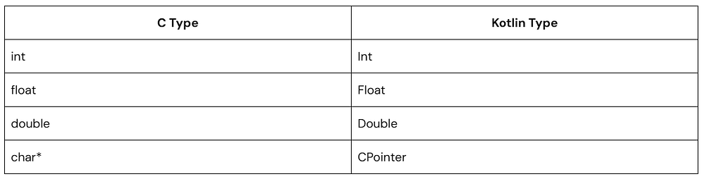
Kotlin Native CInterop is a tool that lets you call C (and Objective-C) code directly from Kotlin/Native.
In simple terms:
You reuse existing C libraries
Kotlin generates bindings for you
You call native functions like regular Kotlin functions
It handles a lot of the heavy lifting, including type mapping and function access.
When Should You Use Kotlin Native CInterop?
Use it when:
You need system-level APIs written in C
You want to reuse a stable C library
You’re building with Kotlin Multiplatform
Performance matters and native code already exists
Common examples include crypto libraries, OS-level APIs, or legacy integrations.
How It Works (Quick Overview)
The workflow is straightforward:
Provide a C header file
Create a .def file
Kotlin generates bindings
Call the functions in Kotlin
Once set up, it feels surprisingly natural.
Step-by-Step Setup
1. Create a C Library
Kotlin
// math_utils.h#ifndef MATH_UTILS_H#define MATH_UTILS_Hint add(int a, int b);int multiply(int a, int b);#endif// math_utils.c#include "math_utils.h"int add(int a, int b) {return a + b;}int multiply(int a, int b) {return a * b;}
2. Create a Definition File
D
headers = math_utils.hcompilerOpts = -I.
Save it as: math.def
This tells Kotlin Native CInterop what to process.
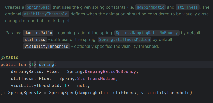
When you start working with animations in Jetpack Compose, the spring() API feels intuitive at first—until you notice something odd: animations don’t seem to fully stop. They get very, very close to the target value… but technically never reach it.
That’s where visibilityThreshold quietly does some of the most important work.
This article walks you through what it is, why it matters, and how to use it correctly across different data types like Dp, Float, and Offset. Along the way, we’ll build real composable examples you can run and experiment with.
Why Spring Animations Need a Stopping Condition
Spring animations simulate real physics, Instead of moving linearly from point A to point B, they behave like a spring:
They move toward the target
Overshoot (depending on damping)
Oscillate
Gradually settle
From a math perspective, they never fully stop — they just get closer over time.
In UI, that’s not useful. We need a clear stopping point. Compose handles this using a threshold.
What is visibilityThreshold?
visibilityThreshold defines the minimum difference between the current animated value and the target value at which the animation is considered finished.
In simple terms:
If the remaining distance is smaller than the threshold → animation stops
If not → animation continues
How It Works for Different Types
Different types need different thresholds because “closeness” depends on the unit.
Animations in the old View system were a lot of ceremony. You’d set up an ObjectAnimator, attach a listener, call start(), remember to cancel on detach, and hope nothing leaked. For something as simple as fading a view, it felt disproportionate.
Compose takes a different approach. Instead of imperative animation commands, you describe what you want the UI to look like for a given state — and the animate*AsState family handles the transition automatically. No start/cancel lifecycle. No listeners unless you need them.
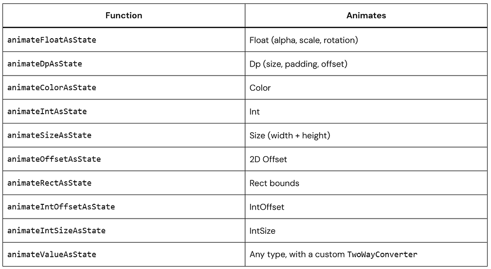
What Is animate*AsState?
animate*AsState is a group of composable functions that smoothly animate a value whenever its target changes. Feed it a target, and it produces a frame-by-frame animated value you can plug directly into your UI.
The * is a wildcard — there’s a variant for each value type you’re likely to animate:
They all follow the same pattern, so once you’ve used one, the others are trivial.
The Mental Model
The key shift from the View system: you don’t start animations. You change state.
State changes → animate*AsState detects the new target → interpolates toward it each frame
When isExpanded flips from false to true, you don’t tell anything to animate. You just update state, and the animated value catches up on its own. If the state changes again mid-flight, the animation redirects smoothly from wherever it currently is.
This is different from ValueAnimator, which needs explicit start/cancel calls and doesn’t know about your UI state at all.
isVisible is boolean. When it toggles, animateFloatAsState picks up the new target and eases alpha toward it over several frames. Each frame triggers a recomposition, which re-reads the updated alpha — that’s the full animation loop.
The label parameter is optional, but set it anyway. It appears in the Android Studio Animation Inspector and makes debugging significantly less painful.
animateColorAsState: Transitioning Colors
Color is one of the more visually rewarding things to animate because even a 300ms cross-fade reads as deliberate and polished.
Both the background and text colors animate in sync. You don’t coordinate them — they just share the same state source (isActive), so they naturally stay in step.
The animationSpec = tween(durationMillis = 500) is where you control how the animation plays out. More on that below.
animateDpAsState: Expandable Cards
animateDpAsState works on any Dp value — height, width, padding, corner radius. A common use case is an expandable card:
Kotlin
@ComposablefunExpandableCardExample() {var isExpanded byremember { mutableStateOf(false) }val cardHeight byanimateDpAsState( targetValue = if (isExpanded) 200.dp else80.dp, animationSpec = spring( dampingRatio = Spring.DampingRatioMediumBouncy, stiffness = Spring.StiffnessLow ), label = "card height" )Card( modifier = Modifier .fillMaxWidth() .height(cardHeight) .clickable { isExpanded = !isExpanded }, elevation = CardDefaults.cardElevation(defaultElevation = 4.dp) ) {Column(modifier = Modifier.padding(16.dp)) {Text( text = "Tap to ${if (isExpanded) "collapse"else"expand"}", fontWeight = FontWeight.Bold, fontSize = 16.sp )if (isExpanded) {Spacer(modifier = Modifier.height(12.dp))Text( text = "The card height is driven by animateDpAsState. " +"The spring spec adds a slight overshoot on open.", fontSize = 14.sp, color = Color.Gray ) } } }}
Using spring instead of tween here adds a small overshoot when the card opens — the physics-based easing makes it feel more physical than a plain duration curve.
Animation Specs
animationSpec controls the character of the animation. There are three you’ll reach for regularly.
Pick tween when you need precise timing — UI tests, coordinated sequences, or matching a transition to an audio cue.
Common easing options:
FastOutSlowInEasing — decelerates into the final position (good for elements entering the screen)
LinearOutSlowInEasing — starts at constant speed, slows at the end (good for exits)
FastOutLinearInEasing — accelerates throughout (for emphasis)
EaseInOut — smooth on both ends, feels the most natural
LinearEasing — constant speed; fine for loaders, rarely right for UI transitions
spring — Physics-Based
Kotlin
val offsetX byanimateFloatAsState( targetValue = targetPosition, animationSpec = spring( dampingRatio = Spring.DampingRatioMediumBouncy, // How much it overshoots stiffness = Spring.StiffnessLow // How fast it moves ), label = "offset")
spring doesn’t have a fixed duration — it settles based on physics. The two parameters to tune:
Damping ratio (controls overshoot):
NoBouncy(1f) — glides in cleanly, no overshoot
LowBouncy(0.75f) — barely noticeable bounce
MediumBouncy(0.5f) — clear bounce, works well for cards and buttons
HighBouncy(0.2f) — exaggerated overshoot, use it deliberately
Stiffness (controls speed):
VeryLow— slow, floaty
Low — relaxed
Medium — balanced default
High — snappy
VeryHigh — nearly instant
keyframes — Custom Intermediate Values
Kotlin
val scale byanimateFloatAsState( targetValue = if (isPressed) 0.9felse1f, animationSpec = keyframes { durationMillis = 3001f at 0// frame 0ms1.1f at 100// slightly overshoots at 100ms0.95f at 200// settles low1f at 300// lands at resting scale }, label = "press scale")
Use keyframes for custom press effects or anything where you need control over intermediate values. It’s more verbose, but it gives you exact control over the curve at each timestamp.
Combining Multiple Animations: Like Button
Each animate*AsState call handles exactly one value. When you need several properties to animate at once, you just stack them. They all read from the same state and run concurrently without any coordination code.
Banner notifications, bottom bars, toast-style messages — offset animation handles all of these. Start the composable off-screen and animate it into position.
When isVisible becomes true, the banner animates from its current offset to 0.dp, sliding down into view with a slight bounce. When set to false, it animates back to -80.dp, sliding out upward.
Reacting When an Animation Finishes
If you need to trigger something after the animation settles — navigate, update a flag, kick off the next step — use finishedListener:
finishedListener fires once, with the final settled value. It does not fire on every frame — that’s what makes it safe to use for side effects.
Performance: Use graphicsLayer for Visual Transforms
For scale, alpha, and rotation, avoid stacking individual modifiers. Batch them in a single graphicsLayer block:
Kotlin
// Prefer this — all transforms applied in one pass on the render threadModifier.graphicsLayer { scaleX = scale scaleY = scale alpha = alpha rotationZ = rotation}// Avoid this for pure visual propertiesModifier .scale(scale) .alpha(alpha) .rotate(rotation)
graphicsLayer applies visual transformations during the draw phase, avoiding layout changes and reducing the cost of recomposition for purely visual updates. This makes it especially efficient for animations like alpha, translation, and scale—particularly in lists or frequently updated UI.
Keep targetValue Simple
If the logic for computing your target value is complex, extract it before passing it in:
Kotlin
// Fineval scale byanimateFloatAsState( targetValue = if (isExpanded) 1.2felse1f, label = "scale")// Better to extract first than inline a big when blockval targetScale = when { isExpanded && isSelected ->1.3f isExpanded ->1.15f isSelected ->1.05felse->1f}val scale byanimateFloatAsState(targetValue = targetScale, label = "scale")
When Not to Use animate*AsState
animate*AsState is the right tool when you’re animating a single value in response to a state flip. Reach for something else when:
You’re animating multiple values that need to stay in sync as a unit → updateTransition
You need an infinitely repeating animation → rememberInfiniteTransition
You’re tracking a pointer/drag gesture and need manual control → Animatable
The composable is entering or leaving the composition → AnimatedVisibility
The last one trips people up most often. animate*AsState can only animate a composable that’s already in the tree. If you’re using if (condition) { MyComposable() } and condition becomes false, MyComposable is gone — there’s nothing left to animate. Wrap it in AnimatedVisibility instead.
Full Example: Custom Animated Toggle
Here’s everything from this article working together in a single component — a toggle row with animated track color, thumb position, and a subtle press scale:
Three animate*AsState calls, no third-party library, no animation framework — just state and a handful of composable functions.
Common Mistakes
Animating inside a LazyColumn without stable keys. Each item gets its own animation instance, which is correct — but if your remember isn’t keyed to the item’s identity, Compose may reuse the state for a different item when the list scrolls. Always key your remember calls to something stable and unique per item.
Expecting finishedListener to fire on every frame. It fires once, when the animation settles. If you want per-frame callbacks, you need Animatable with a custom coroutine loop.
Using animate*AsState for enter/exit animations. When a composable leaves the composition, it’s gone — animate*AsState has nothing to animate. Use AnimatedVisibility for any case where the composable needs to animate out before being removed.
Conclusion
animate*AsState in Jetpack Compose is one of those APIs you end up using all the time.
It keeps animation logic simple and close to your UI state, which is exactly how Compose is meant to work.
Start with small interactions. Once you get comfortable, you’ll naturally move to more advanced animation APIs when needed.
If you’ve been building UI with Jetpack Compose for more than a week, you already know the drill. You write a clean Composable — maybe a PrimaryButton, or a UserProfileCard — and then you immediately have to write something like this below it:
But think about how many Composables you build across a full project. Ten screens, each with five or six components — that’s fifty-plus preview functions you’re hand-typing (or copy-pasting and then refactoring). The mental cost isn’t the typing itself; it’s the context switching. You just nailed your component logic, and now you have to stop, copy the function name, jump below, paste, rename, and restructure. It breaks the creative flow completely.
The good news: Android Studio already has a built-in system designed exactly for this. You just need to set it up once.
Quick answer for the impatient: Go to Settings → Editor → Live Templates, create a new template with the abbreviation prev (or use the one already available in Android Studio), and paste the template code from the next section. That’s it. The rest of this post goes deeper into why and when to use each approach.
Live Templates — The Fastest Fix You’re Not Using
Live Templates are one of Android Studio’s most underused features. They’re essentially smart text snippets that expand when you type a short abbreviation and press Tab. IntelliJ has had them for years — Android Studio inherits them from the same codebase. Kotlin developers who come from other editors sometimes have no idea this exists.
For @Preview specifically, the goal is: you type prev, hit Tab, and the entire preview scaffold appears with your cursor already positioned inside it, ready to fill in any needed parameters.
Setting Up Your First Preview Live Template
Here’s the exact step-by-step process — no skipping ahead:
1. Open Settings
On macOS press ⌘ ,.
On Windows/Linux go to File → Settings.
In the search bar, type “Live Templates” to jump straight to it.
2. Create a new Template Group
In the Live Templates panel, click the + button on the right → select Template Group→ name it something like Compose. This keeps things organized and separate from Android Studio’s built-in templates.
3. Add a new Live Template
With your new Compose group selected, click + again → this time select Live Template.
4. Fill in the abbreviation and description
Set Abbreviation to prev and give it a Description like “Compose @Preview function”. The description shows up in autocomplete hints, so keep it readable.
5. Paste the template text
This is the core part. Paste the code below exactly as shown — the $VARIABLE$ syntax is how Android Studio knows where to place your cursor and what to ask you to fill in.
The $COMPOSABLE_NAME$ variable is smart — when you tab into the template, Android Studio highlights every occurrence at once. Type the name once and it fills in both places simultaneously (the function name and the call inside it). The $END$ marker tells the editor where to park your cursor after you’re done naming — right inside the parentheses where you’d add parameters.
If you want, you can wrap it in your existing app theme or a Material theme like this:
At the bottom of the template editor, click Define and check Kotlin. Without this step, the template won’t activate inside .kt files.
7. Hit OK and test it
Open any Kotlin file, type prev, and press Tab. The scaffold should appear.
What It Looks Like In Practice
Before & After
Kotlin
// You write this composable first:@ComposablefunUserProfileCard( name: String, avatarUrl: String, isOnline: Boolean) {// ... your component logic}// Then type "prev" + Tab, type "UserProfileCard", Tab again:@Preview(showBackground = true)@ComposablefunUserProfileCardPreview() {UserProfileCard(// ← cursor lands here, ready for sample data )}
One thing to remember: The template inserts the composable name as a plain text call. If your Composable has required parameters, Android Studio won’t auto-fill them — you’ll need to add sample data yourself. That’s expected and by design; previews should use meaningful placeholder values, not auto-generated garbage.
Multi-Variant Previews: Light, Dark, and Different Screen Sizes
A single light-mode preview is fine for early development. But before you ship anything, you want to see your component in at least two states: light theme and dark theme. You might also want to check it on a compact phone screen vs a larger device. Doing this manually every time is even more tedious than writing a basic preview.
There are two solid ways to handle this in Compose. The cleaner of the two is a custom annotation that stacks multiple @Preview declarations — this keeps your composable files lean and consistent across your entire project.
Approach A: Custom Multi-Preview Annotation
Create a single annotation class in a shared file (something like PreviewAnnotations.kt in your UI module’s utils package):
Between these two approaches, the custom annotation (Approach A) is better for teams and larger projects. It lives in source control, everyone uses the same preview config automatically, and updating it once updates every preview across the codebase. Live Templates are per-developer and per-machine — great for solo work, less ideal for shared codebases.
Note: Instead of defining custom @DevicePreviews like above, you can use the built-in@PreviewScreenSizes.
File Templates: Scaffold Both the Composable and Preview at Once
Live Templates solve the in-file boilerplate problem. But what if your workflow always starts with creating a new file? If you find yourself doing File → New → Kotlin File/Class and then manually typing the @Composable and @Preview blocks from scratch, File Templates take this even further.
A File Template is a pre-defined structure that Android Studio uses when you create a new file through the right-click menu. You can define your own and make “New Composable File” a real option.
1. Open Settings → File and Code Templates
Navigate to Editor → File and Code Templates. You’ll see the default list of templates on the left (Kotlin File, Interface, Class, etc.).
2. Click + to create a new template
Name it something like Composable, set the extension to kt.
3. Paste the template body
Use the $NAME variable — Android Studio prompts the user to fill this in when they create the file.
After saving this, right-clicking any package in your project tree will show New → Composable in the menu. You type the component name once, and you get a file with proper package declaration, imports, a blank composable, and its preview — all ready to go.
Which Approach Should You Actually Use?
The honest answer: it depends on your context. Here’s a clear breakdown to help you decide without overthinking it.
For most individual developers: start with a Live Template. It takes five minutes, pays off immediately, and you don’t need to touch it again. If you’re working on a team or a long-lived codebase, invest the extra ten minutes to set up a custom @DevicePreviews annotation and commit it to the repo. That way the entire team benefits without any individual setup.
Conclusion
The friction of writing @Preview boilerplate is real, but it’s entirely self-imposed. Android Studio has the tools to make this near-instant — you just need to spend fifteen minutes setting them up once. A Live Template handles the basic case in two keystrokes. A custom annotation handles multi-variant previews for teams. File Templates handle the new-file workflow.
Pick the one that fits your current workflow and set it up today. The next time you build a Composable, you’ll feel the difference immediately.
Animations are one of those things that feel easy until you actually try to wire them into a real screen. You start with a simple fade or size change, and suddenly you’re juggling state, re-composition, and timing issues that don’t behave the way you expected.
I ran into this while building a product listing screen. Small interactions like expanding cards, animating filters, and handling loading states quickly became messy. That’s when the Jetpack Compose Animation System started to make sense — not as a set of APIs, but as a model tied directly to state.
This post breaks that down in a practical way.
What the Jetpack Compose Animation System Actually Is
The core idea is straightforward:
Your UI depends on state, and animations happen when that state changes.
You don’t trigger animations manually. You describe what the UI should look like for a given state, and Compose handles the transition.
Instead of writing something like “start animation on click”, you write:
if expanded → height = 200dp
if collapsed → height = 100dp
When the state changes, Compose animates between those values.
Understanding this mental model will make everything else click. In Compose, your UI is a function of state:
UI = f(state) — When state changes, Compose re-renders the UI. Animations are just a smooth interpolation between two states over time. You don’t “run” an animation — you change state and tell Compose how to animate the transition.
The animation system in Compose has three layers, and it’s worth knowing which layer you’re working at:
Layer 1 — High-level APIs:AnimatedVisibility, AnimatedContent, Crossfade. These handle the most common cases with zero configuration needed.
Layer 2 — Value-based APIs:animate*AsState, updateTransition, InfiniteTransition. These animate specific values (Float, Dp, Color, etc.) that you then apply in your composables.
Layer 3 — Low-level APIs:Animatable, coroutine-based. Full manual control for complex sequencing, interruptions, or physics-based motion.
The golden rule: start at the highest level that solves your problem. Only go deeper when you genuinely need more control. Most production animations live happily in layers 1 and 2.
The Core Building Blocks
Before writing any animations, it helps to understand the main APIs you’ll actually use:
1. animate*AsState
For simple, one-off animations tied to a single value.
2. updateTransition
For animating multiple values based on the same state.
3. AnimatedVisibility
For showing and hiding composables with animation.
4. AnimatedContent
For switching between UI states.
5. rememberInfiniteTransition
For looping animations.
You don’t need all of them at once. Most real screens use 1–2 of these consistently.
Why This Model Works Well
Once you lean into this approach, a few things improve right away:
No need to manage animation lifecycle
No manual cancellation logic
UI stays consistent with state
Less glue code
This becomes especially useful when multiple properties change together. You don’t coordinate them manually. You just describe the end result.
Your First Real Animation
Let’s build something practical: a card that expands when clicked.
The Jetpack Compose Animation System feels strange at first because it flips the mental model. You’re not telling the UI how to animate. You’re describing how it should look in different states.
Once that clicks, animations become predictable.
Start small:
Animate size
Then color
Then combine them
After a few screens, you’ll stop thinking about “animations” entirely and just think in terms of state transitions.
Most Android performance improvements land as a framework update or a new API. This one is different. Starting with Android 15, Google added support for a 16 KB page size on ARM64 devices — and with Android 16, it’s becoming a hard requirement for apps that target new hardware.
If you haven’t looked into this yet, now is a good time. Apps that ship 4 KB-aligned native libraries will fail to load on 16 KB page-size devices. The failure isn’t graceful — it’s an UnsatisfiedLinkError and a crash.
This guide covers what the change is, which apps are affected, how to check your own APK, and what to actually do about it.
Memory Pages: A Quick Refresher
The OS doesn’t allocate memory one byte at a time — it works in fixed-size blocks called pages. For decades, Android (like most Linux systems) used a 4 KB page size. That made sense when RAM was limited and apps were simpler.
Modern flagship devices are a different story. They have multiple gigabytes of RAM, 64-bit ARM processors, and apps that load dozens of native libraries at startup. Managing all of that in 4 KB chunks means more page table entries, more TLB pressure, and more overhead on every app launch.
16 KB pages reduce that overhead. The OS manages fewer, larger chunks — fewer page faults at startup, fewer TLB misses during execution, and less kernel bookkeeping overall.
Why Google Made the Change
The performance case is real:
Faster cold starts. Fewer pages need to be mapped during app startup. Google’s benchmarks showed cold launch improvements of up to 30% on devices running a 16 KB page-size kernel.
Better TLB efficiency. The TLB (Translation Lookaside Buffer) is a small hardware cache that maps virtual addresses to physical memory. With 16 KB pages, each TLB entry covers four times more memory, which means fewer misses on cache-heavy operations.
Less kernel overhead. Fewer pages means a smaller page table. The kernel spends less time on memory management and more time running your code.
Industry alignment. Apple has used 16 KB pages on ARM devices for years. The mainline Linux kernel has progressively added support too. Android isn’t ahead of the curve here — it’s catching up.
Where Things Stand in 2026
Android 15 introduced 16 KB page size support in the emulator so developers could start testing.
Android 16 is expected to require 16 KB compliance for apps targeting API 36 on supported hardware.
Pixel 9 and later are expected to ship with kernels configured for 16 KB pages.
Play Console already shows warnings for apps that bundle 4 KB-aligned .so files when targeting API 35+.
The install base of 16 KB devices is still small, but it will grow quickly as new flagships ship. Getting ahead of this now is much easier than scrambling when Play starts rejecting updates.
Does This Affect Your App?
It depends entirely on whether your app includes native code.
Pure Kotlin or Java apps
You’re largely fine. The Android Runtime handles .dex alignment automatically, so managed code isn’t affected. The one thing to watch is third-party SDKs — they sometimes bundle native .so files you didn’t write and may not have checked.
Apps with NDK or native libraries
This is where the requirement has real teeth. If your app includes:
Native libraries (.so files) built with the NDK
Pre-built .so files from third-party SDKs
A game engine like Unity or Cocos2d
Audio, video, or image processing libraries with native bindings
…then every one of those .so files needs to be compiled with 16 KB-aligned ELF segments. If any aren’t, the OS on a 16 KB device will refuse to load them.
Check Your APK
Before touching any build config, find out where you actually stand.
Use readelf on your .so files
Bash
# Unzip the APKunzipyour-app.apk-dapp-contents# Inspect a native libraryreadelf-lapp-contents/lib/arm64-v8a/libyourlibrary.so | grepLOAD
Look at the alignment column on the right side of each LOAD segment line:
0x4000 = 16384 bytes = 16 KB compliant
0x1000 = 4096 bytes = 4 KB needs recompiling
Compliant output:
LOAD  0x000000 ... 0x001abc 0x001abc R   0x4000
LOAD  0x002000 ... 0x005def 0x005def R E 0x4000
Non-compliant output:
LOAD 0x000000 ... 0x001abc 0x001abc R 0x1000
Do this for every .so in the APK, not just the ones you wrote. Third-party libraries need to pass too.
Run AGP’s built-in lint check
Android Gradle Plugin 8.5+ includes a lint check specifically for this. Run:
./gradlew lint
Look for warnings tagged PageSizeAlignment. They’ll call out each non-compliant library by name.
Fix Your Own Native Libraries
If you maintain native code with the NDK, the fix is a single linker flag.
With CMake
CMake
# CMakeLists.txtcmake_minimum_required(VERSION 3.22.1)project(MyNativeLib)add_library( mynativelib SHARED src/main/cpp/mynativelib.cpp)# Tell the linker to align ELF LOAD segments to 16 KB boundariestarget_link_options(mynativelib PRIVATE "-Wl,-z,max-page-size=16384")find_library(log-lib log)target_link_libraries( mynativelib ${log-lib})
The flag -Wl,-z,max-page-size=16384 passes max-page-size=16384 directly to the linker. It sets the alignment of every LOAD segment in the output .so to 16 KB. That’s all the change requires on your end.
After rebuilding, re-run the readelf check to confirm the alignment value changed from 0x1000 to 0x4000.
One thing worth knowing: a 16 KB-aligned .so runs fine on 4 KB devices too. The extra alignment padding is harmless on older hardware. You don’t need separate builds — one .so covers both.
Kotlin: What You Need to Handle
Kotlin doesn’t control ELF alignment, but there are places where Kotlin code loads native libraries and should handle failures gracefully.
Safe native library loading
System.loadLibrary() throws UnsatisfiedLinkError if a .so fails to load — which on a 16 KB device usually means the library isn’t aligned. Without handling this, the app just crashes.
Kotlin
// NativeLibraryLoader.ktobjectNativeLibraryLoader {privateconstval TAG = "NativeLibraryLoader"/** * Loads a native library and returns false (instead of crashing) * if it fails. On 16 KB page-size devices, an UnsatisfiedLinkError * usually means the .so wasn't compiled with max-page-size=16384. */funloadSafely(libraryName: String): Boolean {returntry { System.loadLibrary(libraryName) Log.d(TAG, "Loaded: lib$libraryName.so")true } catch (e: UnsatisfiedLinkError) { Log.e( TAG,"Failed to load lib$libraryName.so — possible 16 KB alignment issue. " +"Recompile with: -Wl,-z,max-page-size=16384", e )false } catch (e: SecurityException) { Log.e(TAG, "Security exception loading lib$libraryName.so", e)false } }}
Use it in your Activity or Application:
Kotlin
// MainActivity.ktclassMainActivity : AppCompatActivity() {overridefunonCreate(savedInstanceState: Bundle?) {super.onCreate(savedInstanceState)setContentView(R.layout.activity_main)val loaded = NativeLibraryLoader.loadSafely("mynativelib")if (!loaded) {showCompatibilityError() } }privatefunshowCompatibilityError() { AlertDialog.Builder(this) .setTitle("Compatibility Issue") .setMessage("A required component couldn't load on this device. " +"Try updating the app to get the latest compatibility fixes." ) .setPositiveButton("OK", null) .show() }}
This avoids a crash and gives the user a message they can actually act on, instead of a silent ANR.
Detecting page size at runtime
Sometimes you need to know which page size the device is using — for example, to decide whether to enable a feature backed by a library you haven’t fully audited yet.
Kotlin
// PageSizeDetector.ktimport android.system.Osimport android.system.OsConstants/** * Reads the system page size at runtime using the POSIX sysconf API. * Returns 4096 on standard devices, 16384 on 16 KB page-size devices. */objectPageSizeDetector {fungetPageSizeInBytes(): Long {return Os.sysconf(OsConstants._SC_PAGESIZE) }funis16KBPageSize(): Boolean {returngetPageSizeInBytes() == 16384L }fundescription(): String {returnwhen (getPageSizeInBytes()) {4096L->"4 KB"16384L->"16 KB"else->"${getPageSizeInBytes()} bytes (unknown)" } }}
Log it at startup — it takes one line and has saved debugging time more than once when a crash report comes in from an unfamiliar device:
When you see a crash log from a device you can’t reproduce locally, the page size entry tells you whether you’re looking at an alignment problem or something else entirely.
Auditing bundled native libraries at debug time
This helper scans your app’s native library directory and lists every .so it finds. It won’t tell you the alignment directly (use readelf for that), but it gives you a complete list to work through — which matters when you’re auditing a project with a lot of dependencies.
Kotlin
// SdkCompatibilityChecker.ktimport java.io.File/** * Lists all native libraries bundled in the APK at runtime. * Run this in debug builds to build your audit list. * For actual alignment verification, use readelf on each file. */objectSdkCompatibilityChecker {privateconstval TAG = "SdkCompatibilityChecker"funfindNativeLibraries(context: android.content.Context): List<String> {val nativeLibDir = File(context.applicationInfo.nativeLibraryDir)if (!nativeLibDir.exists() || !nativeLibDir.isDirectory) { Log.w(TAG, "No native library directory found.")returnemptyList() }return nativeLibDir .listFiles { file -> file.name.endsWith(".so") } ?.map { it.name } ?: emptyList() }funauditAndLog(context: android.content.Context) {val libs = findNativeLibraries(context)if (libs.isEmpty()) { Log.i(TAG, "No native libraries found.")return } Log.w(TAG, "Found ${libs.size} native libraries — verify each with readelf:") libs.forEach { Log.w(TAG, " -> $it") } }}
Wire it into your Application class behind a BuildConfig.DEBUG check:
Every debug run now logs a full list of native libraries. Paste it into a spreadsheet, mark which ones you own, and track the audit from there.
Test on a 16 KB Emulator
You don’t need a physical device for this. Android Studio ships with 16 KB emulator images.
Create the emulator
Open Android Studio → Device Manager
Click Create Device
Pick a Pixel 8 or later hardware profile
On the system image screen, select an image labelled “16k page size” (available for API 35 and API 36)
Finish the setup and start the emulator
Confirm it’s configured correctly
adb shell getconf PAGE_SIZE
16384 means you’re on a 16 KB device. 4096 means something went wrong with the AVD setup.
What to watch for when running your app
Crash on launch → a native library failed to load; check Logcat for the library name
UnsatisfiedLinkError in Logcat → that specific .so is 4 KB aligned
App runs normally → you’re compliant
Dealing With Third-Party Libraries You Can’t Recompile
Your code might be clean, but one of your dependencies is shipping a 4 KB-aligned .so that you have no control over.
Option 1 — Contact the vendor. File a GitHub issue or support ticket referencing the Android 16 KB page size requirement. Most major SDKs (Firebase, Google Play Services, Crashlytics) are already compliant. Smaller or older SDKs may need a nudge.
Option 2 — Gate the feature at runtime. While you wait for the vendor to ship a fix, use PageSizeDetector to disable the feature on affected devices:
Kotlin
// FeatureManager.ktobjectFeatureManager {/** * Returns false on 16 KB page-size devices if the underlying * native library hasn't been verified as compliant yet. * Flip this to true once your SDK vendor ships a fix. */funisNativeFeatureEnabled(): Boolean {if (PageSizeDetector.is16KBPageSize()) { Log.w("FeatureManager", "Skipping native feature on 16 KB device — awaiting SDK update.")returnfalse }returntrue }}
Option 3 — Write a Kotlin fallback. For features where a fallback is feasible, have two paths: the native implementation for standard devices, and a pure Kotlin path for 16 KB devices until the library is updated.
Kotlin
// ImageProcessor.ktclassImageProcessor {/** * Uses the fast native path on verified devices, falls back to * Kotlin on 16 KB page-size devices until the native library is updated. */funprocessImage(bitmap: android.graphics.Bitmap): android.graphics.Bitmap {returnif (FeatureManager.isNativeFeatureEnabled()) {processImageNative(bitmap) // C++ via JNI } else {processImageKotlin(bitmap) // Pure Kotlin fallback } }privateexternalfunprocessImageNative( bitmap: android.graphics.Bitmap ): android.graphics.BitmapprivatefunprocessImageKotlin( bitmap: android.graphics.Bitmap ): android.graphics.Bitmap {val copy = bitmap.copy(bitmap.config, true)// apply transformationsreturn copy }}
This keeps the app working on all devices. The Kotlin path is slower, but it beats a crash.
Google Play Requirements
Play Console already flags 4 KB-aligned libraries as warnings when you target API 34 or lower. However, for API 35 (Android 15) and above, 16 KB compliance is now mandatory for all new apps and updates. While Google initially allowed extensions, as of 2026, non-compliant apps with native code will face immediate rejection during the upload process.
Check Play Console → Release → App bundle explorer → [Select Version] → Supported page sizes for any warnings or “Not Supported” labels regarding native library alignment. Deal with them immediately to ensure your releases are not blocked.
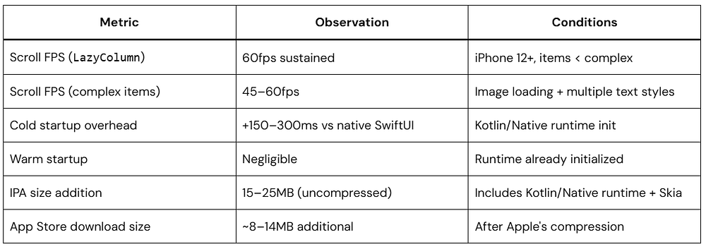
Real Performance Numbers
The gains are genuine but not uniform across all app types:
Metric
4 KB Pages
16 KB Pages
Cold app launch
Baseline
Up to 30% faster
TLB miss rate
Higher
Lower
Kernel page table size
Larger
Smaller
Memory fragmentation
More
Less
App RAM footprint
Baseline
Marginally higher
The trade-off: small allocations get rounded up to the next 16 KB boundary, so there’s a slight increase in memory usage. For most apps it’s a few hundred KB at most — well worth the startup speed improvement.
Migration Checklist
Kotlin
Android 16 KB Page Size - Pre-ship Checklist=============================================□ Unzipped APK and located all .so files under lib/arm64-v8a/□ Ran readelf -l on each .so - confirmed LOAD alignment is0x4000□ Added -Wl,-z,max-page-size=16384 to CMakeLists.txt or Android.mk□ Rebuilt native libraries - re-verified alignment with readelf□ Audited all third-party .so files - opened tickets with non-compliant vendors□ Added NativeLibraryLoader with UnsatisfiedLinkError handling□ Added PageSizeDetector and logging to Application.onCreate()□ Added SdkCompatibilityChecker to debug builds□ Created a 16k page size AVD in Android Studio□ Ran the app on the 16k emulator - no crashes, no UnsatisfiedLinkError□ Ran ./gradlew lint - no PageSizeAlignment warnings□ Checked Play Console - no native library alignment warnings
FAQ
Does this affect all Android devices right now?
No. The 16 KB page size requires specific kernel and hardware support. Older devices will keep using 4 KB pages. But as Pixel 9 and later devices ship with 16 KB kernels, the affected install base will grow steadily.
My app is pure Kotlin with no NDK. Do I need to do anything?
Probably not. ART handles alignment for managed code automatically. Just double-check your Gradle dependencies for any SDKs that bundle .so files — those are the only risk for a pure Kotlin app.
Will a 4 KB-aligned .so actually crash the app?
Yes. On a 16 KB page-size device, System.loadLibrary() will throw UnsatisfiedLinkError if the .so isn’t properly aligned. That’s an app crash unless you catch it.
Can one .so file work on both 4 KB and 16 KB devices?
Yes. A library compiled with -Wl,-z,max-page-size=16384 works fine on 4 KB devices — the extra alignment is just padding that gets ignored. You don’t need separate builds for different page sizes.
What about Unity?
Unity generates native .so files, so yes, it’s affected. Unity has been shipping fixes in recent LTS versions. Make sure you’re on an up-to-date Unity LTS release and rebuild your project after upgrading.
Conclusion
The Android 16 KB page size change is the kind of requirement that’s easy to ignore until it starts causing crashes on new hardware. The fix is straightforward if you own your native code — it’s one linker flag and a rebuild. The harder work is tracking down third-party SDKs that haven’t updated yet and building a plan for those.
Start by running the readelf check on your APK today. If everything comes back as 0x4000, you’re done. If not, the checklist above has every step you need.
If you’ve worked with Android long enough, you already know this: emulator performance isn’t just about speed, it’s about consistency.
A fast emulator that behaves unpredictably is worse than a slightly slower one that’s stable.
This guide focuses on Android Emulator Settings that hold up in real-world development. Not just for solo projects, but for teams, CI pipelines, and production-grade workflows.
How to Think About Emulator Performance
Before changing settings, it helps to understand what actually impacts emulator performance.
There are three main bottlenecks:
CPU virtualization overhead
Memory pressure (host + emulator)
GPU rendering pipeline
Most “tuning tips” online ignore this and suggest arbitrary numbers. In practice, performance tuning should be constraint-driven, not guesswork.
Core Android Emulator Settings That Make a Difference
Let’s go through the settings that consistently make a difference.
CPU Allocation: Less Is Often More
A common mistake is over-allocating CPU cores.
What works in practice:
2 cores → stable baseline (recommended for most cases)
3–4 cores → only if profiling shows CPU bottlenecks
Why this matters: The emulator runs inside a virtualized environment. Giving it too many cores can increase context switching and hurt overall system responsiveness.
Rule of thumb: If your host machine slows down, your emulator will too.
RAM Allocation: Avoid Starving the Host
This is where people usually overdo it.
Start with 2–4 GB
Increase only if you see real issues (UI lag, memory errors)
Giving the emulator too much RAM can slow down everything else on your system, which ends up hurting performance overall.
VM Heap Size
This one gets confused with RAM, but it’s not the same thing.
VM Heap controls how much memory an app inside the emulator can use, not the emulator itself.
Default value is usually fine
Increase only if you’re testing memory-heavy apps (large bitmaps, video, complex Compose UIs)
If you set it too high without a reason:
You won’t see real benefits
You may hide memory issues that show up on real devices
Practical note: If your app only runs after increasing VM Heap, that’s a signal to fix memory usage, not raise limits.
Watch for:
OutOfMemoryError
Frequent GC activity in Logcat
UI stutter caused by memory pressure
System Images: x86_64 vs ARM (Context Matters in 2026)
For most desktop environments:
x86_64 images → still the default for performance
However:
On Apple Silicon (ARM hosts), ARM images can perform better due to reduced translation overhead.
Takeaway: Choose the image based on your host architecture, not habit.
Hardware Acceleration: Non-Negotiable
Without hardware acceleration, nothing else will save you.
Windows → WHPX / Hyper-V
Linux → KVM
macOS → Hypervisor.framework
If virtualization isn’t enabled in BIOS/UEFI, performance will collapse.
GPU Rendering: Prefer Hardware, Validate When Needed
Set graphics to:
Hardware (GLES 2.0 or 3.0)
This improves:
UI responsiveness
Frame rendering
Animation smoothness
When to switch to software:
Debugging rendering issues
Investigating device-specific GPU bugs
Resolution and Device Profile
Higher resolution increases GPU load.
Practical setup:
Use 720p or 1080p for daily development
Use higher resolutions only for layout validation
Avoid treating the emulator like a flagship device unless required.
Quick Boot vs Cold Boot: Know the Trade-Off
Quick Boot is convenient, but not always safe.
Use Quick Boot when:
Iterating during development
You need faster startup
Use Cold Boot when:
Running tests
Debugging inconsistent behavior
Working in CI environments
Snapshots can introduce subtle state issues that are hard to trace.
Settings for CI/CD and Teams Environments
This is where things usually break if you’re not careful.
Jetpack Compose continues to evolve, and one of the most interesting updates is the new Ripple API. If you’ve been building modern Android UIs, you’ve probably used ripple effects to give users visual feedback when they tap on buttons, cards, or other interactive elements. That subtle wave animation plays a big role in making interactions feel responsive and intuitive.
With the latest updates, Google has refined how ripple indications work in Compose. The new approach makes ripple effects more efficient, more customizable, and better aligned with Material Design 3.
In this article, we’ll explore what changed, why these updates matter, and how you can start using the new Ripple API in Jetpack Compose in your apps.
What’s Covered in This Guide
We’ll walk through:
What ripple effects are in Jetpack Compose
Why the ripple API was updated
How the new Ripple API works
How to implement it using Kotlin
Best practices for customizing ripple behavior
By the end, you’ll have a clear understanding of how the new ripple system works and how to apply it effectively in your Compose UI.
What Is Ripple in Jetpack Compose?
Ripple is the touch feedback animation shown when a user taps or presses a UI component.
For example:
Buttons
Cards
List items
Icons
Navigation items
When the user taps an element, a circular wave spreads from the touch point.
This animation improves:
User experience
Accessibility
Visual feedback
Interaction clarity
In Material Design, ripple is the default interaction effect.
In Jetpack Compose, ripple is typically used with clickable modifiers.
Kotlin
Modifier.clickable { }
By default, this modifier automatically adds ripple feedback.
Why the Ripple API Changed
For a long time, ripple effects in Jetpack Compose were implemented through the Indication system, typically using rememberRipple(). While this approach worked well, it came with a few limitations.
Composition overhead: Since rememberRipple() was a composable function, it participated in the recomposition cycle. In some cases, this introduced unnecessary overhead for something that should ideally remain lightweight.
Memory usage: Each usage created new state objects, which could increase memory usage when ripple effects were applied across many UI components.
Tight coupling with Material themes: The implementation was closely tied to Material 2 and Material 3. This made it less flexible for developers building custom design systems or UI frameworks.
To address these issues, the ripple implementation has been redesigned using the Modifier.Node architecture. This moves ripple handling closer to the rendering layer, allowing it to be drawn more efficiently without triggering unnecessary recompositions.
As a result, the updated API makes ripple behavior:
More performant
More consistent with Material 3
Easier to customize
Better aligned with the modern Indication system
Overall, this change simplifies how ripple effects are handled while improving performance and flexibility for Compose developers.
Old Ripple Implementation (Before the Update)
Before the New Ripple API in Jetpack Compose, developers often used rememberRipple().
interactionSource → tracks user interactions (press, hover, focus)
Although this worked well, it required extra setup for customization.
The New Ripple API in Jetpack Compose
The New Ripple API in Jetpack Compose simplifies ripple creation and aligns it with Material3 design system updates.
The ripple effect is now managed through Material ripple APIs and better indication handling.
In most cases, developers no longer need to manually specify ripple.
Default Material components automatically apply ripple.
Kotlin
Button(onClick = { }) {Text("Click Me")}
This button already includes ripple.
However, when working with custom layouts, you may still need to configure ripple manually.
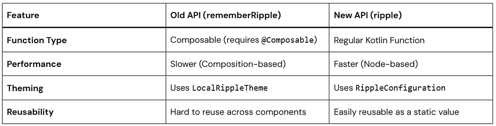
Key Changes from Old to New
Key changes in Compose Ripple APIs (1.7+)
rememberRipple() is deprecated. Use ripple() instead. The old API relied on the legacy Indication system, while ripple() works with the new node-based indication architecture.
RippleTheme and LocalRippleTheme are deprecated. Material components no longer read LocalRippleTheme. For customization use RippleConfiguration / LocalRippleConfiguration or implement a custom ripple.
Many components now default interactionSource to null, allowing lazy creation of MutableInteractionSource to reduce unnecessary allocations.
The indication system moved to the Modifier.Node architecture. Indication#rememberUpdatedInstance was replaced by IndicationNodeFactory for more efficient rendering.
Key Differences at a Glance:
Basic Example Using the New Ripple API
Let’s start with a simple example by creating a clickable Box with a ripple effect. This demonstrates how touch feedback appears when a user interacts with a UI element.
Before looking at the new approach, here’s how ripple was typically implemented in earlier versions of Compose.
The previous implementation relied on rememberRipple(), which has now been replaced by the updated ripple API.
Using the New Ripple API:
Here’s how you can implement the same behavior using the updated ripple system.
Kotlin
@ComposablefunRippleBox() {val interactionSource = remember { MutableInteractionSource() } // Or pass null to lazy-init Box( modifier = Modifier .size(120.dp) .background(Color.LightGray) .clickable( interactionSource = interactionSource, indication = ripple(), // From material3 or material onClick = {} ) ){Text("Tap me!") }}
In many cases you can simply pass interactionSource = null, which allows Compose to lazily create it only when needed.
Understanding the Key Components
MutableInteractionSource
Kotlin
val interactionSource = remember { MutableInteractionSource() }
MutableInteractionSource emits interaction events such as:
Press
Focus
Hover
Drag
Indications like ripple observe these events to trigger animations.
clickable modifier
Kotlin
Modifier.clickable()
This makes the composable interactive and triggers ripple on tap.
ripple()
Kotlin
indication = ripple()
ripple() is the new ripple API in Jetpack Compose and replaces the deprecated rememberRipple() implementation.
By default:
The ripple color is derived from MaterialTheme
The ripple originates from the touch point
The ripple is bounded within the component by default
Unlike the previous API, ripple() is not a composable function and works with the newer Modifier.Node-based indication system, which reduces allocations and improves performance.
When the user taps the component, the ripple will appear red instead of the default theme color.
Example: Unbounded Ripple
By default, ripple is bounded, meaning it stays inside the component.
If you want ripple to spread outside the element:
Kotlin
indication = ripple( bounded = false)
Use Cases
Unbounded ripple works well for:
floating action buttons
icon buttons
circular elements
Example: Setting Ripple Radius
You can also control ripple size.
Kotlin
indication = ripple( radius = 60.dp)
The radius defines how far the ripple spreads from the touch point.
This can help match custom UI designs.
Advanced Customization: RippleConfiguration
If you want to change the color or the alpha (transparency) of your ripples globally or for a specific part of your app, the old LocalRippleTheme is out (deprecated). Instead, we use LocalRippleConfiguration.
The modern approach uses RippleConfiguration and LocalRippleConfiguration. This allows you to customize ripple appearance for a specific component or subtree of your UI.
Example: Custom Ripple
Kotlin
val myCustomRippleConfig = RippleConfiguration( color = Color.Magenta, rippleAlpha = RippleAlpha( pressedAlpha = 0.2f, focusedAlpha = 0.2f, draggedAlpha = 0.1f, hoveredAlpha = 0.4f ))CompositionLocalProvider( LocalRippleConfiguration provides myCustomRippleConfig) {Button(onClick = { }) {Text("I have a Magenta Ripple!") }}
RippleConfiguration
A configuration object that defines the visual appearance of ripple effects.
RippleAlpha
Controls the ripple opacity for different interaction states:
pressedAlpha
focusedAlpha
draggedAlpha
hoveredAlpha
CompositionLocalProvider
Wraps a section of UI and provides a custom ripple configuration to all child components that read LocalRippleConfiguration.
With the new ripple API in Jetpack Compose, many Material components already include ripple feedback by default. This means you usually don’t need to manually specify indication = ripple().
Examples include:
Button
Card (clickable version in Material3)
ListItem
IconButton
NavigationBarItem
These components internally handle interaction feedback using the ripple system.
Kotlin
Card( onClick = { }) {Text("Hello")}
In Material3, providing onClick automatically makes the Card clickable and displays the ripple effect.
No manual ripple indication is required.
Best Practices for Using the New Ripple API in Jetpack Compose
1. Prefer Default Material Components
Material components already include ripple behavior.
This keeps UI consistent with Material Design.
2. Avoid Over-Customizing Ripple
Too much customization can create inconsistent UX.
Stick with theme defaults unless necessary.
3. Use interactionSource = null Unless You Need It
In modern Compose versions, you usually do not need to create a MutableInteractionSource manually.
interactionSource can now be null, allowing Compose to lazily create it when needed
This simplifies the code and avoids unnecessary allocations.
If you need to observe interaction events, you can still provide your own MutableInteractionSource.
Conclusion
The New Ripple API in Jetpack Compose simplifies how developers implement touch feedback while improving performance and consistency.
Key takeaways:
Ripple provides visual feedback for user interactions
The new API replaces rememberRipple() with ripple()
Material components already include ripple by default
Custom components can easily add ripple using Modifier.clickable
The updated system improves performance and flexibility
If you build modern Android apps with Jetpack Compose, understanding the New Ripple API in Jetpack Compose is essential for creating responsive and user-friendly interfaces.
AI-powered coding assistants have completely changed how Android developers write code. Features like Gemini in Android Studio read your project files, understand your codebase structure, and suggest intelligent completions. That’s incredibly helpful — but it also raises an important question:
What exactly is the AI reading?
The answer is often “more than you think.” Configuration files, API keys stored in local .properties files, internal endpoint URLs, analytics tokens — all of these can end up in the AI’s context window if you’re not careful.
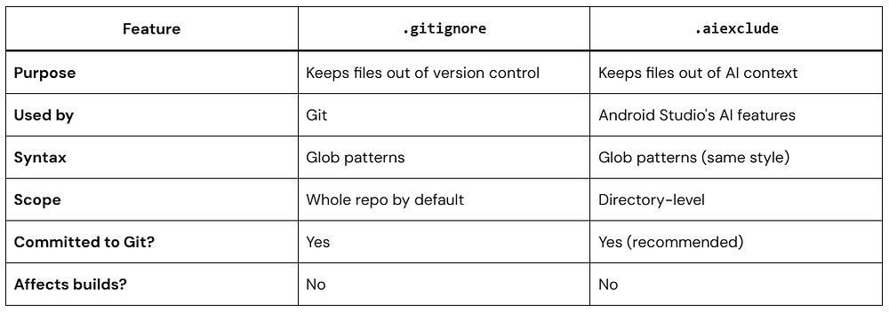
That’s exactly where the .aiexclude file comes in. It’s Android Studio’s answer to the .gitignore file, but instead of telling Git what to ignore, it tells the AI assistant what files should stay completely off-limits.
In this guide, we’ll walk you through everything you need to know about the .aiexclude file — what it is, why it matters, how to create and configure it, and real-world patterns to protect your project.
What Is the .aiexclude File?
The .aiexclude file is a plain text configuration file that tells Android Studio’s AI features which files and folders it should never index, read, or use as context when generating suggestions.
Think of it like a privacy wall between your sensitive project files and the AI. When a file is listed in the .aiexclude file, it simply becomes invisible to the AI — it won’t factor into any code completions, refactoring suggestions, or AI-assisted search results.
This feature was introduced as developers started using AI assistants more deeply in their workflows and needed a simple, declarative way to control what data gets shared.
Why Does This Matter?
Here’s a realistic scenario: You’re building a fintech app. You have a local.properties file with a Stripe API key sitting in your project root. Your .gitignore already excludes it from version control. But your AI assistant doesn’t know about .gitignore — it reads every file it can find in your project.
Without a .aiexclude file, that API key could end up in the AI’s context. With one, you can ensure it’s never touched.
Where to Place the .aiexclude File
The .aiexclude file can live in two places, and the location determines its scope:
1. Project root directory — Applies rules across the entire project.
2. Inside a specific module or subdirectory — Applies rules only to that folder and its contents.
Plaintext
MyAndroidApp/├── app/│ ├── .aiexclude ← covers only the /app module│ └── src/└── secrets/ ├── .aiexclude ← covers only /secrets └── api_keys.txt
You can even have multiple .aiexclude files in the same project, one per folder, with each one managing its own exclusion rules. They all work together, so there’s no conflict — Android Studio respects all of them.
How the .aiexclude File Syntax Works
The .aiexclude file uses a simple pattern syntax, very similar to .gitignore. Let’s break it down.
Basic File Exclusion
To exclude a specific file, just write its name or path:
Plaintext
# Exclude a specific file in the same directorylocal.properties# Exclude a file using a relative pathconfig/secrets.json
The # character starts a comment — anything after # on that line is ignored by the parser.
Excluding Entire Directories
Add a trailing slash / to target a whole folder:
Plaintext
# Exclude the entire secrets foldersecrets/# Exclude a nested folderapp/src/main/assets/private/
Every file inside that folder — regardless of name or extension — becomes invisible to the AI.
Wildcard Patterns
Wildcards are your best friends here. The .aiexclude file supports standard glob patterns:
Plaintext
# Exclude all .properties files anywhere in the project**/*.properties# Exclude all JSON files in the config directoryconfig/*.json# Exclude all files that start with "key_"**/key_*# Exclude everything inside any folder named "internal"**/internal/**
The ** pattern means “match any number of directories,” so **/*.env would catch .env files no matter how deeply nested they are.
Negation with !
You can un-exclude something that was already covered by a broader rule, using !:
Plaintext
# Exclude all .properties files**/*.properties# ...but allow gradle.properties back in (it has no secrets)!gradle.properties
Just like .gitignore, order matters here — later rules override earlier ones. So always put the negation after the broader exclusion.
Creating Your First .aiexclude File
Let’s walk through setting up a .aiexclude file from scratch in a typical Android project.
Step 1: Create the File
Right-click the project root in Android Studio’s Project view, select New → File, and name it exactly:
.aiexclude
No extension. No prefix. Just .aiexclude.
Tip: If you’re on Windows and File Explorer is hiding files starting with a dot, use Android Studio’s built-in file creation — it handles this correctly.
Step 2: Add Your Exclusion Rules
Open the newly created .aiexclude file and start adding your rules. Here’s a practical starter template:
Plaintext
# ─────────────────────────────────────────────# .aiexclude — AI context exclusion rules# Keeps sensitive and irrelevant files out of# Android Studio's AI assistant context.# ─────────────────────────────────────────────# Local configuration with API keys or secretslocal.properties*.env*.env.*# Keystores and signing credentials**/*.jks**/*.keystorekeystore.properties# Service account and OAuth credential filesgoogle-services-staging.json**/credentials/**/service_account*.json# Internal analytics or experiment configs**/internal_experiments/**/ab_test_config.json# Build outputs - not useful for AI contextbuild/**/build/.gradle/# Auto-generated files (reduce AI noise)**/generated/**/*Generated.java**/*Generated.kt# Raw data or large asset files**/raw/**/*.csv**/*.sqlite**/*.db# Private documentationdocs/internal/INTERNAL_NOTES.md
Step 3: Verify It’s Working
After saving the .aiexclude file, restart Android Studio or invalidate caches (File → Invalidate Caches / Restart). The AI assistant should now skip the excluded files entirely when generating suggestions.
You can confirm this by checking whether the AI references any content from an excluded file — it shouldn’t.
Real-World Use Cases: What to Exclude and Why
Here are common scenarios where the .aiexclude file becomes genuinely essential.
Use Case 1: Protecting API Keys in local.properties
The local.properties file is the most common place Android developers store sensitive keys — Maps API keys, Firebase project IDs, payment gateway tokens. It’s excluded from Git, but not from AI by default.
Plaintext
# .aiexclude# Keep the AI away from local config with secretslocal.propertieskeystore.properties
Why this matters: If the AI reads local.properties, it might include your API key in a generated code snippet or log statement — even innocently, in a test file it suggests.
Use Case 2: Excluding Generated Code
Generated files (like Room database implementations, Hilt component files, or proto-generated classes) create a lot of noise for the AI. The AI might try to “help” by referencing or modifying them, even though they’re auto-generated and will be overwritten on the next build.
Plaintext
# .aiexclude# Auto-generated files - don't waste AI context on these**/generated/**/*_Impl.kt**/*.pb.java
Generated files can confuse the AI or cause it to suggest changes to code that isn’t meant to be manually edited. Excluding them improves suggestion quality.
Use Case 3: Excluding Proprietary Business Logic
Maybe you’re working on a module that contains proprietary algorithms or confidential business logic — something your company doesn’t want indexed anywhere outside of approved systems.
Plaintext
# .aiexclude placed inside /pricing-engine module# Protect proprietary pricing logic from AI indexingalgorithms/models/pricing/
Even if you trust the AI tool itself, having strict boundaries on what it accesses is good security hygiene — especially in regulated industries.
Use Case 4: Large Files That Hurt Performance
The AI doesn’t need to read a 50MB SQLite database file or a massive CSV dataset. Including them wastes AI context budget and can slow things down.
Plaintext
# .aiexclude# Large files that don't help the AI at all**/*.sqlite**/*.db**/*.csvassets/large_dataset.json
AI context windows have limits. Keeping them focused on actual source code means better, more relevant suggestions.
Common Mistakes to Avoid with the .aiexclude File
Even experienced developers make these slip-ups when first working with the .aiexclude file. Here’s what to watch out for.
Always use relative paths from the location of the .aiexclude file itself:
Plaintext
# Correct — relative pathlocal.properties
Mistake 2: Forgetting Subdirectories
This only excludes secrets.json at the root level:
Plaintext
# Only matches root-level filesecrets.json
If the file might exist deeper in the project:
Plaintext
# Matches the file anywhere in the project**/secrets.json
Mistake 3: Not Committing the .aiexclude File to Version Control
Unlike local.properties, the .aiexclude file itself is not sensitive — it just describes what’s sensitive. You should absolutely commit it to Git so your whole team benefits from the same exclusion rules.
Plaintext
git add .aiexcludegit commit -m "Add .aiexclude to protect sensitive files from AI context"
Mistake 4: Over-Excluding Everything
It can be tempting to exclude huge chunks of your project “just to be safe,” but that defeats the purpose of the AI assistant. If the AI can’t see your code, it can’t help you write better code.
Be selective. Exclude what’s genuinely sensitive or noisy — not everything.
The .aiexclude File vs. .gitignore: What’s the Difference?
People often ask whether these two files overlap. Here’s a clear side-by-side comparison:
They’re complementary, not replacements for each other. A file can be in .gitignore but still readable by the AI — that’s the exact problem the .aiexclude file solves.
Team Workflow: Making .aiexclude a Team Standard
If you’re leading a team, the .aiexclude file should be part of your project setup checklist — right alongside .gitignore and EditorConfig.
Here’s how to make it a team standard:
Add it to your project template. If your team uses a custom Android project template (or a cookiecutter script), bake in a sensible default .aiexclude file from day one.
Include it in your code review checklist. When a new secret, config, or sensitive module gets added to the project, verify the .aiexclude file is updated accordingly.
Document it in your README. A single line in your project’s README explaining that the project uses a .aiexclude file helps new team members understand the setup quickly.
Treat it like a security document. Additions to the .aiexclude file should go through a quick review — just like changes to SECURITY.md or secrets management configs.
Advanced Pattern: Module-Level .aiexclude Files
In larger, multi-module Android projects, it often makes more sense to manage exclusions at the module level rather than maintaining one giant .aiexclude file at the root.
# Global ruleslocal.properties**/*.jks**/*.keystore**/build/
feature-payments/.aiexclude:
Plaintext
# Extra-strict for this module — payment logic is proprietarysrc/
This hierarchical approach gives you fine-grained control without cluttering a single file.
Frequently Asked Questions About the .aiexclude File
Q: Does the .aiexclude file affect code completion outside of AI features?
No. The .aiexclude file only affects the AI assistant. Standard IntelliJ code completion, navigation, and refactoring tools are not impacted.
Q: Can I use the .aiexclude file in other JetBrains IDEs?
The .aiexclude file was introduced in the context of Android Studio’s AI integration. Support in other JetBrains IDEs may vary — check the documentation for the specific IDE.
Q: What happens if I have conflicting rules between two .aiexclude files?
Each .aiexclude file applies to its own directory and below. There’s no true “conflict” — rules from parent and child directories stack together. The most specific rule (closest to the file) generally wins, similar to .gitignore behavior.
Q: Will the .aiexclude file protect me from ALL data leakage?
The .aiexclude file is a strong first line of defense for local AI features in Android Studio. However, it does not control what happens when you use external AI tools, paste code into chat interfaces, or use other plugins. Treat it as one layer of a broader security practice.
Q: Should I exclude google-services.json?
It depends. The google-services.json that goes into your app usually contains project IDs and API keys. While it’s not as sensitive as a private key, it’s worth excluding it from AI context — especially the production variant. You might do this:
Copy this into any Android project and customize as needed:
Plaintext
# ─────────────────────────────────────# .aiexclude — Recommended Default# Android Studio AI Context Exclusions# ─────────────────────────────────────# Secrets and local configlocal.propertieskeystore.properties*.env*.env.*.env.local# Signing keystores**/*.jks**/*.keystore# Firebase and Google service filesgoogle-services.jsonGoogleService-Info.plist# Service accounts and credentials**/credentials/**/service_account*.json# Build artifacts**/build/.gradle/**/.gradle/# Auto-generated code**/generated/**/*Generated.java**/*Generated.kt**/*_Impl.kt# Large binary or data assets**/*.sqlite**/*.db**/*.csv**/*.parquet# Internal documentationdocs/internal/INTERNAL*.mdCONFIDENTIAL*# IDE-specific artifacts.idea/workspace.xml.idea/tasks.xm
Conclusion
The .aiexclude file is a small file with a big impact. In just a few lines, it lets you control exactly what your AI assistant sees — keeping sensitive keys, proprietary logic, and noisy generated files out of its context while letting it focus on the code that actually matters.
Here’s a quick recap of what we covered:
The .aiexclude file acts like a privacy filter between your project and the AI assistant in Android Studio.
Place it in your project root for global rules, or in subdirectories for module-level control.
It uses glob-style patterns very similar to .gitignore.
Always commit it to version control so your whole team benefits.
Combine it with other security practices — it’s one layer, not a complete solution.
If you haven’t added a .aiexclude file to your Android project yet, now’s the time. Open Android Studio, create the file, drop in the template above, and customize it for your project’s needs.
It takes five minutes and pays dividends in security, performance, and peace of mind.
If you’ve been in the mobile and cross-platform world lately, you’ve probably heard a lot about Compose Multiplatform (CMP). It’s one of the fastest-growing ways to build apps that run on Android, iOS and the Web using a single shared UI approach.
But what exactly is CMP? And why are developers increasingly choosing it over other frameworks? In this post, we’ll break it down, with examples, comparisons and real reasons developers love it.
What Is Compose Multiplatform — Precisely
Compose Multiplatform (CMP) is a UI framework developed and maintained by JetBrains, built on top of Google’s Jetpack Compose runtime. It extends the Compose programming model — declarative, reactive, composable UI functions — beyond Android to iOS, Desktop (JVM), and Web (Kotlin/Wasm).
CMP is layered on top of Kotlin Multiplatform (KMP), which is the underlying technology for compiling Kotlin code to multiple targets: JVM (Android/Desktop), Kotlin/Native (iOS/macOS), and Kotlin/Wasm (Web). Understanding this layering matters architecturally:
Not a pixel-for-pixel clone of native UI widgets on every platform
Not a guarantee that code runs identically on all platforms — it compiles and runs on all platforms, with deliberate platform-specific divergences in rendering, gestures, and system behaviors
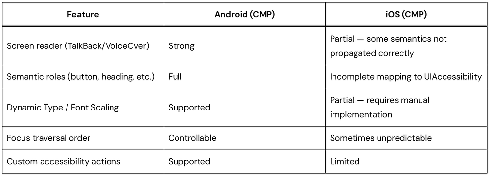
Current Platform Support: Honest Status
What “iOS API Stable” means precisely: JetBrains has declared the CMP public API surface stable, meaning they will not make breaking changes without a deprecation cycle. It does not mean:
Pixel-perfect parity with SwiftUI or UIKit
Complete VoiceOver/accessibility support (this is a known gap as of 2026)
Identical scroll physics to UIScrollView
Equivalent Xcode debugging experience to native Swift development
Teams shipping CMP-based iOS apps in production report success, but they do so with deliberate investment in iOS-specific testing, accessibility audits, and gesture tuning — not by assuming parity.
CMP vs Flutter vs React Native — Engineering Comparison
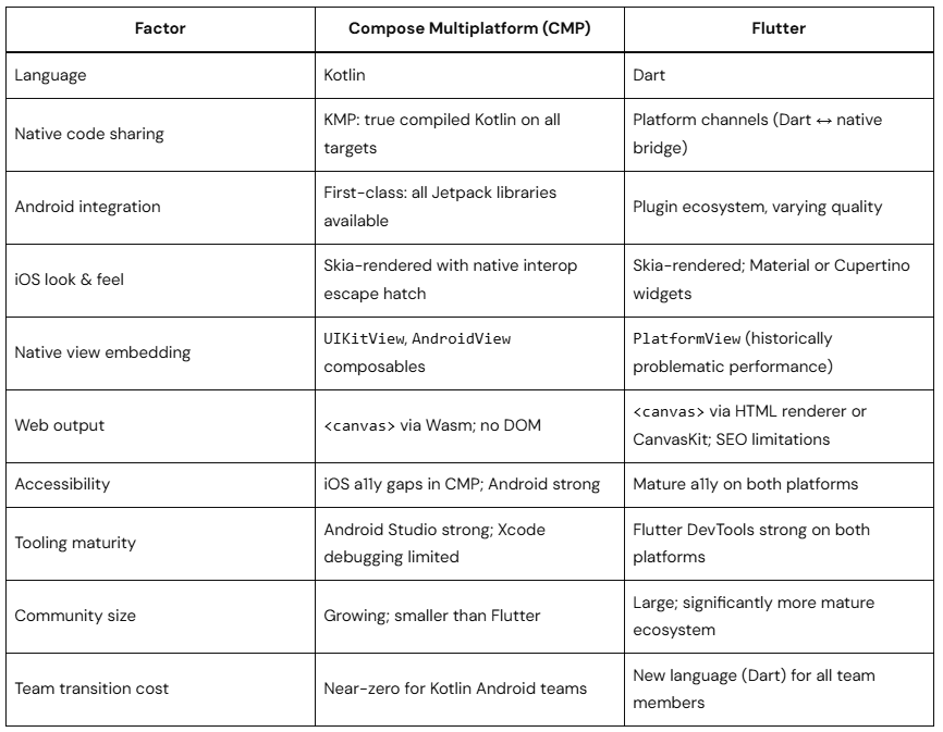
Compose Multiplatform vs Flutter
Both use a custom rendering engine (not native OS widgets) to draw UI. Key engineering differences:
Honest verdict: Flutter has a more mature cross-platform tooling story and stronger iOS accessibility today. CMP wins decisively if your team is already invested in Kotlin, Jetpack libraries, and Android-first development.
Compose Multiplatform vs React Native
React Native’s new architecture (JSI + Fabric renderer) significantly closes the performance gap that historically plagued the JavaScript bridge. The architectural difference from CMP:
CMP compiles Kotlin to native binaries — no runtime JS, no bridge
React Native (New Architecture) uses JSI for synchronous JS-to-native calls — faster than the old bridge, but still a JS runtime overhead
React Native renders actual native widgets on each platform; CMP renders via Skia
React Native is the right choice for web-first teams; CMP is the right choice for Kotlin-first teams
How CMP Works Under the Hood
Rendering Pipeline
CMP uses different rendering approaches per platform, which explains both its strengths and its platform-specific behavioral differences:
Kotlin
commonMain Compose Code
         │
         ├── Android
         │     └── Jetpack Compose Runtime
         │           └── Android RenderNode / Canvas API
         │                 └── Skia (via Android's internal pipeline)
         │
         ├── iOS
         │     └── Skiko (Kotlin/Native bindings to Skia)
         │           └── Metal GPU API
         │                 └── CAMetalLayer embedded in UIView
         │
         ├── Desktop (JVM)
         │     └── Skiko
         │           └── OpenGL / DirectX / Metal (OS-dependent)
         │
         └── Web
               └── Kotlin/Wasm + Skia compiled to WebAssembly
                     └── HTML <canvas> element
Critical implication of this architecture: Because CMP on iOS renders through a CAMetalLayer-backed UIView (not through SwiftUI’s layout engine), layout behaviors, font metrics, shadow rendering, and scroll momentum physics are produced by Skia — not by iOS’s native compositor. This is why experienced iOS users may notice subtle differences. It is also why full SwiftUI NavigationStack integration with CMP-managed screens is architecturally complicated.
The KMP Foundation: expect/actual
The expect/actual mechanism is the primary tool for platform branching. It operates at compile time, not runtime:
Kotlin
// commonMain — declares the contractexpect funcurrentTimeMillis(): Long// androidMain - Android implementationactual funcurrentTimeMillis(): Long = System.currentTimeMillis()// iosMain - iOS implementation (using Kotlin/Native platform APIs)actual funcurrentTimeMillis(): Long = NSDate().timeIntervalSince1970.toLong() * 1000
expect/actual works for:
Top-level functions
Classes (with matching constructors)
Objects
Interfaces (less common; prefer interfaces in commonMain with actual implementations)
Typealiases (useful for mapping platform types)
expect class constructor limitation: When you declare expect class Foo(), every actual implementation must match the constructor signature. This creates a real problem for Android classes that require Context. The correct pattern uses dependency injection or a platform-provided factory, not a bare constructor — covered in detail in the DI section.
Project Structure and Modularization
The single-module structure shown in most tutorials works for demos. Production apps require modularization from the start — it affects build times, team ownership, and testability fundamentally.
:core:domain depends on nothing — it’s pure Kotlin, testable anywhere
:core:data depends on :core:domain interfaces only
Feature modules depend on :core:domain and :core:ui-components; never on each other
Platform entry points wire everything together via DI — they’re the only place with platform-specific imports
Gradle Configuration — The Real Picture
Here is a production-realistic Gradle configuration with current APIs (Kotlin 2.1.x):
Kotlin
// build-logic/src/main/kotlin/CmpLibraryPlugin.kt// Convention plugin applied to all shared library modulesimport org.jetbrains.kotlin.gradle.dsl.JvmTargetplugins {id("com.android.library")kotlin("multiplatform")id("org.jetbrains.compose")id("org.jetbrains.kotlin.plugin.compose")}kotlin {androidTarget {compilerOptions { // Note: kotlinOptions {} is deprecated jvmTarget.set(JvmTarget.JVM_11) } }listOf(iosX64(),iosArm64(),iosSimulatorArm64() ).forEach { iosTarget -> iosTarget.binaries.framework { baseName = "SharedModule" isStatic = true// Static frameworks are required for proper Kotlin/Native// memory management with Swift ARC interop } }@OptIn(ExperimentalWasmDsl::class)wasmJs {browser() binaries.executable() }sourceSets { commonMain.dependencies {implementation(compose.runtime)implementation(compose.foundation)implementation(compose.material3)implementation(compose.ui)implementation(compose.components.resources)implementation(libs.lifecycle.viewmodel.compose) // Multiplatform ViewModelimplementation(libs.lifecycle.runtime.compose) // collectAsStateWithLifecycleimplementation(libs.navigation.compose) // Multiplatform navimplementation(libs.kotlinx.coroutines.core)implementation(libs.koin.compose) // DI } androidMain.dependencies {implementation(libs.androidx.activity.compose)implementation(libs.kotlinx.coroutines.android) // Provides Dispatchers.Main on Android } iosMain.dependencies {implementation(libs.kotlinx.coroutines.core)// Note: kotlinx-coroutines-core for Native provides// Dispatchers.Main via Darwin integration - requires explicit dependency } commonTest.dependencies {implementation(libs.kotlin.test)implementation(libs.kotlinx.coroutines.test) } }}
Known Gradle pain points in production:
Kotlin/Native compilation is 3–5× slower than JVM compilation. Enable the Kotlin build cache (kotlin.native.cacheKind=static in gradle.properties) and Gradle build cache
XCFramework generation for App Store distribution requires a separate XCFramework task — not included in the default template
The linkDebugFrameworkIosArm64 Gradle task must be connected to Xcode’s build phase; misconfiguration here is the #1 cause of “works on simulator, fails on device” issues
Keep isStatic = true on iOS framework targets. Dynamic frameworks are supported but add complexity to iOS app startup and Xcode integration
Correct Architectural Patterns
The Layered Architecture for CMP
Kotlin
┌─────────────────────────────────────────┐│ UI Layer (CMP) ││ Composables receive UiState, emit ││ events/callbacks. No business logic. │├─────────────────────────────────────────┤│ ViewModel Layer ││ Holds UiState (single StateFlow). ││ Orchestrates use cases. Maps domain ││ models to UI models. │├─────────────────────────────────────────┤│ Domain Layer ││ Use cases (interactors). Pure Kotlin. ││ No framework dependencies. │├─────────────────────────────────────────┤│ Data Layer ││ Repository implementations. ││ Ktor for network. SQLDelight for DB. ││ Platform-specific data sources. │└─────────────────────────────────────────┘
MVI with Single UiState (Preferred for CMP)
Multiple independent StateFlow properties in a ViewModel create impossible UI states and double recompositions. Use a single sealed UiState:
Kotlin
// Correct: Single state object prevents impossible states// and triggers exactly one recomposition per state changesealedclassProductListUiState {objectLoading : ProductListUiState()dataclassSuccess(val products: List<ProductUiModel>,val searchQuery: String = "" ) : ProductListUiState()dataclassError(val message: String,val isRetryable: Boolean ) : ProductListUiState()}// UiModel - separate from domain model// Only contains what the UI needs; formatted strings, not raw data@Immutable// Tells Compose compiler this is stable - critical for LazyColumn performancedataclassProductUiModel(val id: String,val name: String,val formattedPrice: String, // "$12.99" not 12.99 - formatting in ViewModel, not Composableval description: String,val imageUrl: String)
Why error.toUserFacingMessage() matters: On Kotlin/Native (iOS), exception.message can be null. Always map exceptions to typed error representations before exposing them to the UI layer.
State Management Done Right
State Hoisting — The Correct Pattern
The most common architectural mistake in Compose (multiplatform or not) is passing a ViewModel into a composable. This breaks testability, violates unidirectional data flow, and causes incorrect recomposition scoping.
The rule: Composables receive state (immutable data) and emit events (callbacks). They never hold or reference a ViewModel directly.
Kotlin
// Anti-pattern — breaks testability and state hoisting@ComposablefunProductListScreen(viewModel: ProductListViewModel) {val uiState by viewModel.uiState.collectAsState()// ...}// Correct - state in, events out@ComposablefunProductListScreen( uiState: ProductListUiState, onRetry: () -> Unit, onSearchQueryChanged: (String) -> Unit, onProductClick: (String) -> Unit, // Pass ID, not the whole object modifier: Modifier = Modifier // Always accept a Modifier parameter) {when (uiState) {is ProductListUiState.Loading ->LoadingContent(modifier)is ProductListUiState.Error ->ErrorContent( message = uiState.message, isRetryable = uiState.isRetryable, onRetry = onRetry, modifier = modifier )is ProductListUiState.Success ->ProductListContent( products = uiState.products, searchQuery = uiState.searchQuery, onSearchQueryChanged = onSearchQueryChanged, onProductClick = onProductClick, modifier = modifier ) }}
The ViewModel sits at the navigation/screen level, never inside a composable:
Kotlin
// In your navigation graph composable<ProductList> {val viewModel: ProductListViewModel = koinViewModel()val uiState by viewModel.uiState.collectAsStateWithLifecycle()// collectAsStateWithLifecycle is preferred over collectAsState —// it respects platform lifecycle and pauses collection when the app is backgroundedProductListScreen( uiState = uiState, onRetry = viewModel::loadProducts, onSearchQueryChanged = viewModel::onSearchQueryChanged, onProductClick = { productId -> navController.navigate(ProductDetail(productId)) } )}
remember vs rememberSaveable
Kotlin
@ComposablefunSearchBar( query: String, // Lifted state — parent owns it onQueryChange: (String) -> Unit, onSearch: (String) -> Unit, modifier: Modifier = Modifier) {// No local mutableStateOf needed — state is owned by caller// Only use remember for objects that are expensive to createval focusRequester = remember { FocusRequester() }OutlinedTextField(value = query, onValueChange = onQueryChange, modifier = modifier.focusRequester(focusRequester),// ... )}// For state that must survive configuration changes AND process death,// use rememberSaveable with a Saver if the type is not primitive:val scrollState = rememberSaveable(saver = ScrollState.Saver) { ScrollState(0) }
Lifecycle-Aware Collection
collectAsState() does not pause collection when the app is backgrounded on iOS. Use collectAsStateWithLifecycle() from lifecycle-runtime-compose:
Kotlin
// Lifecycle-aware — pauses when app is in background on all platformsval uiState by viewModel.uiState.collectAsStateWithLifecycle()// Always-on - continues collecting even when app is backgroundedval uiState by viewModel.uiState.collectAsState()
Type-Safe Navigation Across Platforms
String Routes Are Deprecated — Use Type-Safe Navigation
As of navigation-compose 2.8.x, type-safe navigation using @Serializable route objects is stable and the recommended approach. String-based routes are error-prone, refactoring-unsafe, and lack compile-time guarantees.
iOS back-swipe gesture: The multiplatform navigation-compose supports interactive back-swipe on iOS, but the animation curve and gesture threshold are Skia-rendered approximations of the native UINavigationController push/pop animation. They are close but distinguishable to trained iOS users. For apps where native-feel is paramount, consider using Decompose (a community navigation library) which supports fully native iOS transitions via UIKit integration.
Android back handling: The hardware back button and predictive back gesture (Android 14+) require explicit handling. Register a BackHandler composable where needed:
Kotlin
BackHandler(enabled = uiState is CheckoutUiState.InProgress) {// Prompt user before losing checkout progress showExitConfirmationDialog = true}
Web browser history: Navigation-compose on Wasm integrates with browser history via the History API, but deep link handling (initial URL → correct screen) requires setup in your Wasm entry point that the default template does not provide.
Platform-Specific Features via expect/actual
The Context Problem on Android — Solved Correctly
A common mistake is defining expect class with a no-arg constructor when the Android implementation needs Context. The correct approach uses dependency injection, not constructor parameters in the expect declaration:
The DI framework (Koin shown below) provides the platform-correct implementation to commonMain code — no expect/actual needed when the interface lives in commonMain.
Embedding Native Views
For platform-native components that cannot be reproduced in Compose (maps, WebViews, camera previews):
Kotlin
// features/map/src/iosMain/ — iOS-specific file@ComposablefunNativeMapView( latitude: Double, longitude: Double, modifier: Modifier = Modifier) {UIKitView( factory = {MKMapView().apply {// Configure once on creation showsUserLocation = true } }, update = { mapView ->// Called on recomposition when inputs changeval region = MKCoordinateRegionMake(CLLocationCoordinate2DMake(latitude, longitude),MKCoordinateSpanMake(0.01, 0.01) ) mapView.setRegion(region, animated = true) }, modifier = modifier )}
Important:UIKitView must be in iosMain, not commonMain. Expose it via an expect/actual composable or via conditional compilation if you need a platform-specific fallback in the shared screen.
iOS-Specific: Lifecycle, Interop, and Debugging
This section covers the most under-addressed topic in CMP guides. iOS lifecycle management is where most production incidents originate.
The iOS Lifecycle vs Android Lifecycle
On Android, ViewModel.viewModelScope is tied to Lifecycle.State.CREATED — coroutines are automatically cancelled when the ViewModel is cleared. On iOS, the mapping is:
iOS App States          →   CMP/Compose Lifecycle
─────────────────────────────────────────────────
Active (foreground)     →   Lifecycle.State.RESUMED
Inactive (transitioning)→   Lifecycle.State.STARTED
Background (suspended)  →   Lifecycle.State.CREATED
Terminated (clean exit) →   Lifecycle.State.DESTROYED
Killed by OS (OOM/force)→   DESTROYED not guaranteed
The critical issue: When an iOS app is backgrounded, the OS may suspend it entirely with no further CPU time. Coroutines in viewModelScope do not automatically pause on iOS the way Android’s lifecycle-aware components do. This means:
Kotlin
// Dangerous on iOS — will attempt network calls even when app is suspendedclassProductListViewModel : ViewModel() {init { viewModelScope.launch {// This may run after iOS has suspended your app,// causing unexpected behavior or battery drain productRepository.startPolling() } }}// Correct - use lifecycle-aware collectionclassProductListViewModel : ViewModel() {val uiState: StateFlow<ProductListUiState> = productRepository .productsFlow .map { it.toUiState() } .stateIn( scope = viewModelScope, started = SharingStarted.WhileSubscribed(5_000),// WhileSubscribed stops the upstream flow when there are no collectors// (i.e., when the screen is not visible) initialValue = ProductListUiState.Loading )}
SharingStarted.WhileSubscribed(5_000) is the correct production pattern — it stops upstream flows 5 seconds after the last subscriber disappears (the screen leaves composition), which handles both backgrounding and navigation.
// iosMain — Kotlin entry point called from SwiftfunMainViewController() = ComposeUIViewController( configure = {// Configure the Compose host here// For example, register platform-specific implementations }) {// Koin DI initialization for iOSKoinApplication( application = { modules(platformModule(), sharedModule()) } ) {AppNavigation() }}
SwiftUI NavigationStack + CMP: You cannot simultaneously use SwiftUI NavigationStack for routing AND CMP’s NavHost for routing. Choose one as the source of truth. Mixing both causes double back-stack management and broken state restoration. The recommended approach for CMP-first apps is to let CMP’s NavHost own all navigation and wrap the entire CMP root as a single SwiftUI view.
Debugging Kotlin/Native on iOS
Xcode’s debugger does not understand Kotlin. For production crash debugging:
Kotlin/Native crash reports appear in Xcode Organizer as native crashes with mangled Kotlin symbols
You must use konan/bin/llvm-symbolizer with your app’s .dSYM file to demangle crash stacks
Sentry’s KMP SDK handles crash symbolication automatically and is the most production-proven option
For local debugging, enable Kotlin LLDB formatters by adding the Kotlin LLDB plugin to Xcode
Dependency Injection in CMP
DI is not mentioned in most CMP tutorials and is the first thing that breaks in real projects. Koin is the most production-proven multiplatform DI framework for CMP. Kodein-DI is a capable alternative.
CMP’s iOS accessibility support is the most significant production gap as of early 2026. This section must be understood before committing to CMP for any app serving users with disabilities or operating in regulated industries (healthcare, finance, government).
Current iOS Accessibility Status
JetBrains is actively improving iOS accessibility. Track progress at youtrack.jetbrains.com — search for “iOS accessibility CMP.”
Semantic Annotations — Always Provide Them
Even where CMP’s accessibility pipeline is strong, you must provide explicit semantics:
For apps where full iOS VoiceOver compliance is non-negotiable right now, consider:
Hybrid approach: Use CMP for Android + Desktop + Web, keep native SwiftUI for iOS
UIKitView fallback: Implement accessibility-critical screens as UIKit views wrapped in UIKitView
Wait for CMP 1.8+: JetBrains has prioritized iOS accessibility — the gap is closing
Performance: Real Numbers and Real Caveats
iOS Rendering Performance
Startup overhead: The Kotlin/Native runtime initialization time is the most cited performance concern. It is real and not fully eliminable, but it can be minimized:
Initialize the Kotlin runtime as early as possible in your Swift AppDelegate or @main struct, before any UI is shown
Use MainActor in Swift to ensure the CMP compositor is ready before the first frame
Memory Management on iOS
CMP’s memory behavior on iOS requires awareness of three interacting systems:
Kotlin/Native’s concurrent garbage collector (introduced in Kotlin 1.9.20) — significantly improved but still runs GC pauses under pressure
Swift’s ARC — automatic reference counting at the Swift/Kotlin boundary
// Register for iOS memory pressure notifications and clear image caches// This should be done in your iosMain platform setupclassIosMemoryPressureHandler(privateval imageLoader: ImageLoader// Coil's ImageLoader) {funregister() { NSNotificationCenter.defaultCenter.addObserverForName( name = UIApplicationDidReceiveMemoryWarningNotification, `object` = null, queue = NSOperationQueue.mainQueue ) { _ -> imageLoader.memoryCache?.clear() imageLoader.diskCache?.clear() } }}
Recomposition Performance
Mark your data models @Immutable or @Stable to enable the Compose compiler to skip recomposition when inputs haven’t changed:
Kotlin
@Immutable// Tells Compose: all properties are val and of stable typesdataclassProductUiModel(val id: String,val name: String,val formattedPrice: String,val description: String,val imageUrl: String)// Without @Immutable, a data class with List<> properties will be inferred// as unstable by the Compose compiler, causing full recomposition of every// LazyColumn item on every parent recomposition - a major performance issue@ImmutabledataclassCartUiState(val items: List<CartItemUiModel>, // List<> requires @Immutable on the containing classval totalFormatted: String,val itemCount: Int)
Enable Compose compiler metrics to verify your composables are stable:
Kotlin
// In your app's build.gradle.ktscomposeCompiler { metricsDestination = layout.buildDirectory.dir("compose-metrics") reportsDestination = layout.buildDirectory.dir("compose-reports")}
Run ./gradlew assembleRelease and inspect the generated reports for unstable markers.
Web (Wasm) Performance Reality
Initial Wasm binary: 5–20MB depending on features used
Execution speed once loaded: faster than equivalent JavaScript, competitive with native apps for logic-heavy operations
Rendering: <canvas>-based — no DOM, no browser text selection, no SEO crawling, no browser accessibility tree
Not suitable for: SEO-dependent content, server-side rendering, or apps requiring native browser accessibility
Suitable for: Internal tools, dashboards, B2B applications where load time and SEO are not primary concerns
Testing Strategy Across Platforms
Unit Testing (commonTest)
Kotlin
// core/domain/src/commonTest/ — Pure logic tests run on all platformsclassProductListViewModelTest {privateval testProducts = listOf(Product(id = "1", name = "Widget", price = 9.99, description = "A widget", imageUrl = ""),Product(id = "2", name = "Gadget", price = 19.99, description = "A gadget", imageUrl = "") )@Testfun`loadProducts emits Success state with mapped UI models`() = runTest {val fakeRepository = FakeProductRepository(products = testProducts)val useCase = GetProductsUseCaseImpl(fakeRepository)val viewModel = ProductListViewModel(useCase)val state = viewModel.uiState.valueassertTrue(state is ProductListUiState.Success)assertEquals(2, (state as ProductListUiState.Success).products.size)assertEquals("$9.99", state.products[0].formattedPrice) }@Testfun`loadProducts emits Error state on network failure`() = runTest {val fakeRepository = FakeProductRepository(shouldFail = true)val useCase = GetProductsUseCaseImpl(fakeRepository)val viewModel = ProductListViewModel(useCase)val state = viewModel.uiState.valueassertTrue(state is ProductListUiState.Error)assertTrue((state as ProductListUiState.Error).isRetryable) }}// Fake repository - not a mock, avoids Mockito (JVM-only)classFakeProductRepository(privateval products: List<Product> = emptyList(),privateval shouldFail: Boolean = false) : ProductRepository {overridesuspendfungetProducts(): Result<List<Product>> = if (shouldFail) { Result.failure(NetworkException("Network unavailable")) } else { Result.success(products) }}
Do not use Mockito in commonTest — it is JVM-only. Use fakes (hand-written test doubles) or MockK’s multiplatform-compatible subset.
UI Testing
CMP UI tests use ComposeUiTest from compose-ui-test:
Sentry has the most mature KMP SDK with multiplatform crash reporting, breadcrumbs, and Kotlin/Native stack trace symbolication:
Kotlin
// composeApp/src/commonMain/ — Shared error reporting interfaceinterfaceErrorReporter {funcaptureException(throwable: Throwable, context: Map<String, String> = emptyMap())funaddBreadcrumb(category: String, message: String)funsetUser(userId: String)}// In your ViewModel base class:abstractclassBaseViewModel(protectedval errorReporter: ErrorReporter) : ViewModel() {protectedfunlaunchWithErrorHandling( block: suspendCoroutineScope.() -> Unit ) = viewModelScope.launch {try {block() } catch (e: CancellationException) {throw e // Never swallow CancellationException } catch (e: Exception) { errorReporter.captureException(e)handleError(e) } }protectedopenfunhandleError(e: Exception) {}}
Firebase Crashlytics does not have a native KMP SDK. You can integrate it via expect/actual where Android uses the Firebase SDK directly and iOS uses the Crashlytics iOS SDK called via Kotlin/Native interop — but setup is significantly more complex than Sentry.
// Will not compile — Android import in shared codeimport android.content.Context// Define an interface in commonMain, implement per platforminterfacePlatformContext// Marker interface or use Koin's module system
Pitfall 2: Using JVM-Only Libraries
Pitfall 3: Keyboard Insets on iOS
Kotlin
// Always use imePadding() for forms — handles iOS keyboard differently than Android@ComposablefunFormScreen() {Column( modifier = Modifier .fillMaxSize() .imePadding() // Pushes content above keyboard on both platforms .verticalScroll(rememberScrollState()) .padding(16.dp) ) {// Form fields }}
Note: On iOS, imePadding() behavior depends on the window configuration. Ensure your ComposeUIViewController is not configured with ignoresSafeArea(.keyboard) on the Swift side if you want CMP to handle keyboard insets. Choose one approach and apply it consistently.
Pitfall 4: Missing Coroutine Dispatcher Setup on iOS
Kotlin
// iosMain — MUST call this before any coroutine usage on iOS// Without it, Dispatchers.Main may not be properly initializedfuninitCoroutines() {// This is handled automatically when using lifecycle-viewmodel on iOS,// but if you use coroutines outside of ViewModels, explicit initialization// may be required depending on your kotlinx-coroutines-core version}
Ensure kotlinx-coroutines-core is in your iosMain dependencies (not just commonMain) to guarantee the Darwin dispatcher (iOS/macOS version of a Coroutine Dispatcher) is available.
Pitfall 5: Skipping Compose Compiler Metrics
Run the Compose compiler metrics on every release build and investigate any composables marked unstable. Unstable composables recompose unnecessarily, degrading performance silently.
Pitfall 6: Forgetting CancellationException
Kotlin
// Swallows coroutine cancellation — causes memory leaks and undefined behaviortry {val result = repository.getProducts()} catch (e: Exception) {handleError(e) // CancellationException caught here!}// Always rethrow CancellationExceptiontry {val result = repository.getProducts()} catch (e: CancellationException) {throw e // Must propagate} catch (e: Exception) {handleError(e)}
Migration Strategy from Native to CMP
Realistic Migration Path
Do not do a big-bang rewrite. Migrate incrementally with feature flags and measurable milestones.
Phase 0 — Foundation (Weeks 1–4)
Set up multi-module project structure
Migrate data models to commonMain
Migrate network layer (Ktor), serialization (kotlinx.serialization), and database (SQLDelight) to KMP
Set up DI (Koin) with platform modules
Establish CI pipeline building for Android and iOS from day one
Measure and baseline: build times, app startup time, binary size, crash rate
Phase 1 — First CMP Screen (Weeks 5–8)
Choose a low-risk, low-traffic screen (Settings, About, or a simple list)
Implement it in commonMain with full tests
Ship behind a feature flag — A/B test CMP vs native version
SharingStarted.WhileSubscribed used for all StateFlows
Back-swipe gesture tested on physical device
Font rendering reviewed on iOS (San Francisco vs Roboto differences)
imePadding() tested with all form screens on iPhone SE (smallest current screen)
Accessibility
All interactive elements have contentDescription or semantic roles
mergeDescendants = true applied to card-style components
TalkBack tested on Android (with CMP screen)
VoiceOver tested on iOS (acknowledge any known gaps)
Minimum touch target size: 48×48dp enforced
Performance
Compose compiler metrics reviewed — no unexpected unstable composables
LazyColumn scroll tested at 60fps on target minimum device specs
iOS startup time measured and within acceptable threshold
IPA size measured and within App Store guidelines
Testing
Unit tests in commonTest covering ViewModel state transitions
UI tests covering primary happy path and error state
Screenshot regression tests configured
CI builds both Android and iOS on every PR
Observability
Crash reporting integrated (Sentry recommended)
Structured logging in place
Performance metrics baseline captured
Who Is Using CMP in Production
JetBrains — Uses CMP in JetBrains Toolbox App and Fleet, with ongoing expansion.
Cash App (Block) — KMP used for shared business logic; CMP UI adoption in progress for select screens.
Touchlab — Consultancy with multiple enterprise deployments in healthcare, fintech, and retail; their public case studies are the most detailed available.
IceRock Development — Multiple production CMP deployments; maintains the moko suite of KMP/CMP libraries.
Yandex — Uses KMP for shared business logic in several products; CMP adoption expanding.
Recognized pattern across adopters: Teams that start with shared business logic via KMP report the lowest-risk path to CMP. Direct CMP adoption without prior KMP experience significantly increases migration risk.
Should Your Team Adopt CMP?
Adopt CMP if:
Your team writes Kotlin for Android and you maintain a parallel iOS codebase with feature parity requirements. The marginal cost of adopting CMP is very low; the long-term cost reduction is substantial.
You are starting a new project. The incremental cost of CMP vs Android-only is low, and you avoid the compounding technical debt of two separate UI codebases.
Your product serves non-accessibility-critical markets (B2B tools, internal apps, dashboards) where the iOS VoiceOver gap is manageable today.
You can invest in iOS-specific testing infrastructure from day one, not as an afterthought.
Proceed cautiously or defer if:
Your iOS app is in a regulated industry where WCAG 2.1 / ADA accessibility compliance is legally required. CMP’s iOS accessibility gaps are real and not fully controllable on your timeline.
Your app relies heavily on platform-specific animations, ARKit, Core ML on-device UI, or custom UIKit components that represent a significant portion of your UI surface.
Your team has no Kotlin experience. The KMP learning curve on top of CMP adoption simultaneously is a high-risk combination.
Your iOS app is a primary revenue driver and even a 200–300ms cold startup increase represents a measurable conversion loss at your scale — benchmark first.
The Right Default: Hybrid Approach
The most risk-managed production pattern today is:
Android: 100% CMP (builds on your existing Jetpack Compose investment)
iOS: CMP for data/logic-heavy screens; native SwiftUI for launch screen, onboarding, and accessibility-critical flows
Desktop: CMP if you need desktop support; low-cost add given Android CMP coverage
Web: CMP/Wasm for internal tools; native web (React/Vue) for consumer-facing, SEO-dependent products
This hybrid approach maximizes code reuse where CMP is strongest while using native where the gaps are most consequential.
Frequently Asked Questions
Q: Is Compose Multiplatform the same as Kotlin Multiplatform?
No. Kotlin Multiplatform (KMP) is the foundational technology for compiling Kotlin code to multiple targets and sharing business logic, data layers, and domain models across platforms. Compose Multiplatform (CMP) is built on top of KMP and specifically handles the declarative UI layer. You can use KMP without CMP (sharing logic while keeping native UI), but you cannot use CMP without KMP.
Q: Does CMP code run identically on all platforms?
No — and any resource that tells you it does is being imprecise. CMP code compiles and runs on all platforms, but font rendering, scroll physics, shadow appearance, gesture thresholds, and system behavior differ between Android and iOS because the rendering backends (Android’s hardware compositor vs Skia/Metal on iOS) operate differently. These differences require deliberate iOS testing and, in some cases, platform-specific composable implementations.
Q: How does CMP handle accessibility?
On Android, CMP’s accessibility support maps cleanly to Android’s Accessibility API — strong and production-ready. On iOS, CMP’s accessibility integration with UIAccessibility/VoiceOver has known gaps as of CMP 1.7.x. JetBrains is actively improving this. For iOS apps requiring full VoiceOver compliance today, a hybrid approach (native SwiftUI for accessibility-critical screens) is recommended.
Q: What is the realistic shared code percentage?
In production deployments, teams consistently achieve 65–80% shared UI code. The remaining 20–35% is platform-specific handling for: native view interop, platform lifecycle events, accessibility edge cases, and behaviors where native look-and-feel is non-negotiable. Claims of 90%+ shared code are technically possible for simple apps but are not representative of complex, production-quality applications.
Q: Does CMP support Material Design 3?
Yes. Material 3 (compose.material3) is fully supported in commonMain and renders on all platforms. The Material 3 component rendering on iOS is Skia-drawn (not native UIKit), which means it does not automatically adapt to iOS’s Human Interface Guidelines. If HIG compliance is required on iOS, you will need platform-specific theming via the expect/actual pattern or conditional logic using LocalPlatformInfo.
Q: How do I handle different screen sizes and form factors?
Use WindowSizeClass from compose-material3-adaptive, BoxWithConstraints, and responsive Modifier patterns — the same approach as Jetpack Compose on Android, applied in commonMain. These APIs are multiplatform-compatible.
Q: Is CMP free?
Yes. CMP is open-source under the Apache 2.0 license, free for commercial use. JetBrains monetizes through IntelliJ IDEA / Android Studio tooling and Kotlin-based services, not through CMP licensing.
Q: What is the binary size impact on iOS?
Adding CMP to an iOS app adds approximately 15–25MB uncompressed to the app bundle (including the Kotlin/Native runtime and Skia). After Apple’s App Thinning and compression, the incremental App Store download size increase is approximately 8–14MB. This is acceptable for most feature-rich applications; it may be a concern for lightweight utility apps competing on download size.
Conclusion
Compose Multiplatform is a production-viable framework for sharing UI code across Android, iOS, Desktop, and Web when adopted with clear eyes about its genuine tradeoffs.
Its real strengths: True Kotlin compilation (no bridges), zero retraining for Android Kotlin teams, first-class KMP integration, access to all native APIs via expect/actual and native view interop, and a strong trajectory backed by serious JetBrains investment.
Its real limitations today: iOS accessibility gaps requiring active management, startup overhead on iOS from Kotlin/Native runtime initialization, iOS debugging tooling significantly behind Android, and a Web/Wasm target still maturing toward production-grade use for consumer applications.
The teams shipping CMP successfully in production are not doing so because CMP eliminated all platform differences — they are doing so because they invested in proper architecture (Clean + MVI, typed state, state hoisting), iOS-specific testing, accessibility audits, and observability infrastructure. The framework enables code sharing; engineering discipline determines whether that sharing improves or degrades product quality.
Start with a well-scoped pilot. Measure relentlessly. Expand where the data supports it.
