Amol Pawar

Material 3 colorScheme

Material 3 colorScheme Explained: How Dynamic Color Really Works

Have you ever wondered how Android apps magically match your wallpaper colors? Or how Material Design creates those perfectly harmonious color palettes that just work

That’s the magic of Material 3’s dynamic color system, and today, we’re diving deep into how it all comes together using Kotlin and Jetpack Compose.

By the end of this guide, you’ll understand exactly how the Material 3 colorScheme works, how to implement it in your Android apps with Kotlin, and how to harness the power of dynamic theming to create stunning user interfaces that feel personal and cohesive.

Let’s get started..!

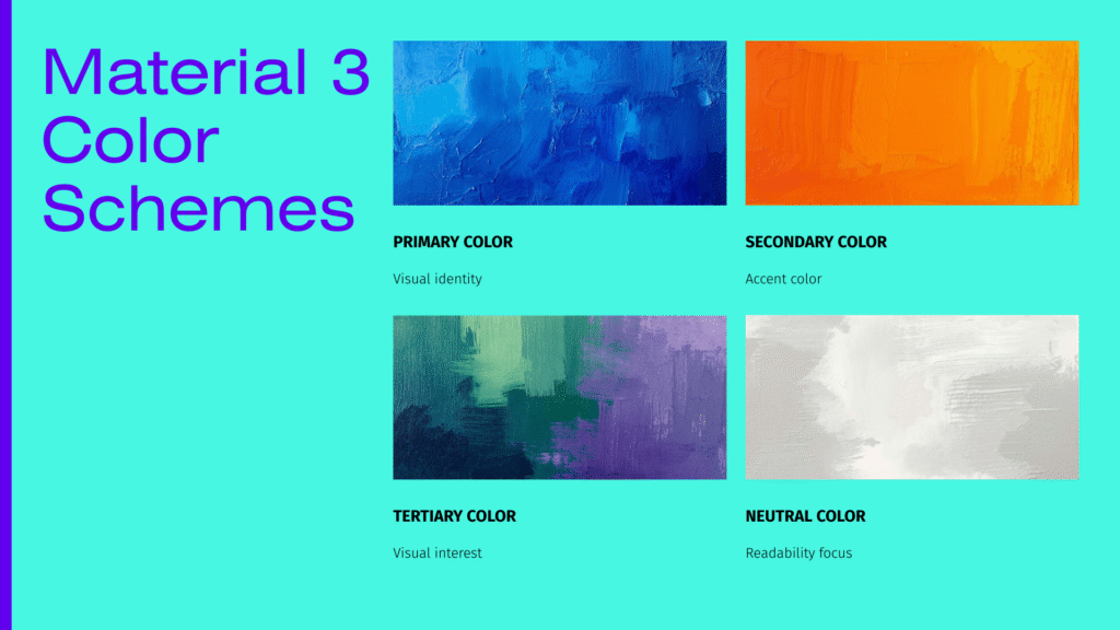
What Is Material 3 ColorScheme?

The Material 3 colorScheme is Google’s revolutionary approach to app theming that goes way beyond simple primary and secondary colors. Think of it as a complete color system that automatically generates a harmonious palette of colors designed to work together beautifully.

Here’s what makes it special:

Dynamic Color Generation: Instead of manually picking dozens of color shades, the Material 3 colorScheme generates an entire palette from a single seed color. This means you get consistent, accessible, and visually appealing colors without the guesswork.

Adaptive Theming: The system automatically adjusts for light and dark modes, ensuring your app looks great in any setting.

Wallpaper Integration: On Android 12 and above, your app can automatically extract colors from the user’s wallpaper, creating a truly personalized experience.

Accessibility Built-In: Every color in the Material 3 colorScheme meets WCAG (Web Content Accessibility Guidelines) accessibility standards when used correctly, so you don’t have to worry about contrast ratios.

Understanding Dynamic Color: The Foundation

Dynamic color is the heart of Material 3 on Android. But what exactly is it?

Imagine your phone’s wallpaper is a beautiful sunset with warm orange and purple tones. With dynamic color, your apps can extract those colors and build their entire theme around them. It’s personalization taken to the next level.

How Dynamic Color Works on Android

The process is actually quite elegant:

  1. Color Extraction: The system analyzes your wallpaper using the Monet color system
  2. Palette Generation: Using color science algorithms, it creates a full tonal palette
  3. Role Assignment: Colors are assigned to specific UI roles (more on this shortly)
  4. Adaptation: The scheme automatically adapts for light and dark themes

The beauty of the Material 3 colorScheme is that all this complexity is handled for you in Jetpack Compose. You just need to understand how to use it.

The Color Roles: Your New Best Friends

Here’s where Material 3 gets really interesting. Instead of thinking in terms of “primary,” “secondary,” and “tertiary” colors alone, the Material 3 colorScheme introduces color roles.

Think of color roles as jobs that colors perform in your UI. Let’s break down the main players:
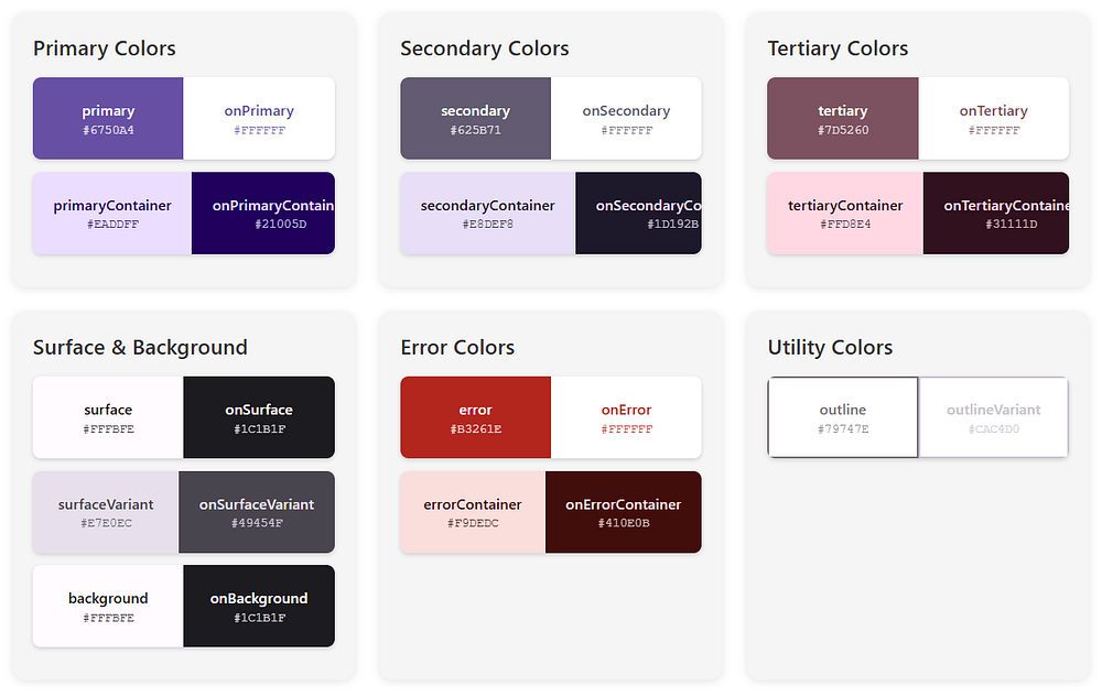
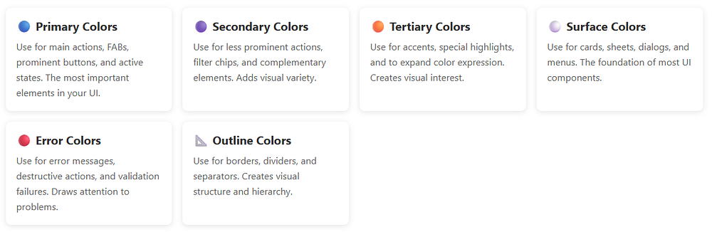
Primary Colors

Primary: This is your brand color, the star of the show. It appears on prominent buttons and active states.

OnPrimary: Text and icons that sit on top of the primary color. The Material 3 colorScheme ensures this has enough contrast to be readable.

PrimaryContainer: A lighter (or darker in dark mode) version used for less prominent components.

OnPrimaryContainer: Text that appears on primary containers.

Secondary Colors

Secondary: Provides visual variety and highlights less prominent components.

OnSecondary: You guessed it — text on secondary colors.

SecondaryContainer: For chips, cards, and other contained elements.

OnSecondaryContainer: Text on those containers.

Tertiary Colors

Tertiary: Adds even more variety, often used for accents and special highlights.

OnTertiary, TertiaryContainer, OnTertiaryContainer: Following the same pattern.

Surface and Background Colors

Surface: The background color for cards, sheets, and menus.

OnSurface: Text and icons on surfaces.

SurfaceVariant: Alternative surface with subtle differences.

OnSurfaceVariant: Text with lower emphasis.

Background: The main background of your app.

OnBackground: Primary text on the background.

Error Colors

Error: For error states and destructive actions.

OnError: Text on error colors.

ErrorContainer: Background for error messages.

OnErrorContainer: Text in error containers.

Special Roles

Outline: Borders and dividers.

OutlineVariant: Subtle borders.

Scrim: Semi-transparent overlays.

InverseSurface, InverseOnSurface, InversePrimary: For high-contrast elements like tooltips.

SurfaceTint: Used for elevation overlays in Material 3.

Phew! That’s a lot of colors, right..? 

But here’s the magic: the Material 3 colorScheme generates all of these automatically, ensuring they work harmoniously together.

In short, a typical Material 3 colorScheme includes:

  • primary – main brand color
  • onPrimary – content placed on primary
  • secondary – supporting color
  • tertiary – optional accent color
  • background – app background
  • surface – cards and sheets
  • error – error states
  • onSurface – text/icons on surfaces

Each color has a paired onColor to guarantee readability.

This pairing is key to accessibility.

Setting Up Your Kotlin Project

Before we dive into code, let’s make sure your Android project is ready for Material 3.

Adding Dependencies

First, add the necessary dependencies to your build.gradle.kts (Module level):

Kotlin
dependencies {
    // Jetpack Compose BOM (Bill of Materials)
    implementation(platform("androidx.compose:compose-bom:2024.02.00"))
    
    // Material 3
    implementation("androidx.compose.material3:material3")
    
    // Other Compose dependencies
    implementation("androidx.compose.ui:ui")
    implementation("androidx.compose.ui:ui-tooling-preview")
    implementation("androidx.activity:activity-compose:1.8.2")
    
    // Core KTX
    implementation("androidx.core:core-ktx:1.12.0")
    
    // Lifecycle
    implementation("androidx.lifecycle:lifecycle-runtime-ktx:2.7.0")
}

What each dependency does:

  • compose-bom: Manages Compose versions automatically
  • material3: The Material 3 components and colorScheme system
  • ui and ui-tooling-preview: Core Compose UI and preview support
  • activity-compose: Integration with Android activities

Update Your Theme File

Create a new file called Theme.kt in your ui.theme package:

Kotlin
package com.softaai.myapp.ui.theme

import android.app.Activity
import android.os.Build
import androidx.compose.foundation.isSystemInDarkTheme
import androidx.compose.material3.MaterialTheme
import androidx.compose.material3.darkColorScheme
import androidx.compose.material3.dynamicDarkColorScheme
import androidx.compose.material3.dynamicLightColorScheme
import androidx.compose.material3.lightColorScheme
import androidx.compose.runtime.Composable
import androidx.compose.runtime.SideEffect
import androidx.compose.ui.graphics.toArgb
import androidx.compose.ui.platform.LocalContext
import androidx.compose.ui.platform.LocalView
import androidx.core.view.WindowCompat

@Composable
fun MyAppTheme(
    darkTheme: Boolean = isSystemInDarkTheme(),
    dynamicColor: Boolean = true,
    content: @Composable () -> Unit
) {
    // We'll fill this in shortly!
}

This is your foundation. Now let’s build on it!

Implementing Material 3 ColorScheme in Kotlin

Let’s start with the simplest implementation and work our way up to more advanced features.

Basic Static ColorScheme

Here’s how to create a basic Material 3 colorScheme with custom colors:

Kotlin
import androidx.compose.material3.darkColorScheme
import androidx.compose.material3.lightColorScheme
import androidx.compose.ui.graphics.Color

// Light theme colors
private val LightColorScheme = lightColorScheme(
    primary = Color(0xFF6750A4),
    onPrimary = Color(0xFFFFFFFF),
    primaryContainer = Color(0xFFEADDFF),
    onPrimaryContainer = Color(0xFF21005D),
    secondary = Color(0xFF625B71),
    onSecondary = Color(0xFFFFFFFF),
    secondaryContainer = Color(0xFFE8DEF8),
    onSecondaryContainer = Color(0xFF1D192B),
    tertiary = Color(0xFF7D5260),
    onTertiary = Color(0xFFFFFFFF),
    tertiaryContainer = Color(0xFFFFD8E4),
    onTertiaryContainer = Color(0xFF31111D),
    error = Color(0xFFB3261E),
    onError = Color(0xFFFFFFFF),
    errorContainer = Color(0xFFF9DEDC),
    onErrorContainer = Color(0xFF410E0B),
    background = Color(0xFFFFFBFE),
    onBackground = Color(0xFF1C1B1F),
    surface = Color(0xFFFFFBFE),
    onSurface = Color(0xFF1C1B1F),
    surfaceVariant = Color(0xFFE7E0EC),
    onSurfaceVariant = Color(0xFF49454F),
    outline = Color(0xFF79747E),
    outlineVariant = Color(0xFFCAC4D0),
    scrim = Color(0xFF000000),
    inverseSurface = Color(0xFF313033),
    inverseOnSurface = Color(0xFFF4EFF4),
    inversePrimary = Color(0xFFD0BCFF),
)

// Dark theme colors
private val DarkColorScheme = darkColorScheme(
    primary = Color(0xFFD0BCFF),
    onPrimary = Color(0xFF381E72),
    primaryContainer = Color(0xFF4F378B),
    onPrimaryContainer = Color(0xFFEADDFF),
    secondary = Color(0xFFCCC2DC),
    onSecondary = Color(0xFF332D41),
    secondaryContainer = Color(0xFF4A4458),
    onSecondaryContainer = Color(0xFFE8DEF8),
    tertiary = Color(0xFFEFB8C8),
    onTertiary = Color(0xFF492532),
    tertiaryContainer = Color(0xFF633B48),
    onTertiaryContainer = Color(0xFFFFD8E4),
    error = Color(0xFFF2B8B5),
    onError = Color(0xFF601410),
    errorContainer = Color(0xFF8C1D18),
    onErrorContainer = Color(0xFFF9DEDC),
    background = Color(0xFF1C1B1F),
    onBackground = Color(0xFFE6E1E5),
    surface = Color(0xFF1C1B1F),
    onSurface = Color(0xFFE6E1E5),
    surfaceVariant = Color(0xFF49454F),
    onSurfaceVariant = Color(0xFFCAC4D0),
    outline = Color(0xFF938F99),
    outlineVariant = Color(0xFF49454F),
    scrim = Color(0xFF000000),
    inverseSurface = Color(0xFFE6E1E5),
    inverseOnSurface = Color(0xFF313033),
    inversePrimary = Color(0xFF6750A4),
)

Now let’s use these in your theme:

Kotlin
@Composable
fun MyAppTheme(
    darkTheme: Boolean = isSystemInDarkTheme(),
    content: @Composable () -> Unit
) {
    val colorScheme = if (darkTheme) DarkColorScheme else LightColorScheme
    
    MaterialTheme(
        colorScheme = colorScheme,
        typography = Typography,
        content = content
    )
}

Here,

  • We defined two complete Material 3 colorScheme objects (light and dark)
  • The theme composable selects the appropriate scheme based on system settings
  • MaterialTheme applies the colorScheme to your entire app
  • Every color role is explicitly defined for maximum control

This is the manual approach. But there’s a much easier way..!

Dynamic Color: The Android 12+ Magic

Here’s where things get really exciting. On Android 12 (API 31) and above, you can use dynamic color to automatically match the user’s wallpaper.

Implementing Dynamic Color

Kotlin
@Composable
fun MyAppTheme(
    darkTheme: Boolean = isSystemInDarkTheme(),
    dynamicColor: Boolean = true, // Enable/disable dynamic color
    content: @Composable () -> Unit
) {
    val context = LocalContext.current
    
    // Determine which colorScheme to use
    val colorScheme = when {
        // Use dynamic color if available (Android 12+)
        dynamicColor && Build.VERSION.SDK_INT >= Build.VERSION_CODES.S -> {
            if (darkTheme) dynamicDarkColorScheme(context)
            else dynamicLightColorScheme(context)
        }
        // Fall back to custom dark colors
        darkTheme -> DarkColorScheme
        // Fall back to custom light colors
        else -> LightColorScheme
    }
    
    // Update the system bars to match theme
    val view = LocalView.current
    if (!view.isInEditMode) {
        SideEffect {
            val window = (view.context as Activity).window
            window.statusBarColor = colorScheme.surface.toArgb()
            WindowCompat.getInsetsController(window, view)
                .isAppearanceLightStatusBars = !darkTheme
        }
    }
    
    MaterialTheme(
        colorScheme = colorScheme,
        typography = Typography,
        content = content
    )
}

Let’s break down what’s happening:

  1. Version Check: We check if the device runs Android 12+ (API 31+)
  2. Dynamic ColorScheme: If supported, we use dynamicDarkColorScheme() or dynamicLightColorScheme()
  3. Fallback: On older devices, we fall back to our custom color schemes
  4. System Bars: We update the status bar color to match our theme
  5. Edge-to-Edge: The window insets controller adjusts the status bar appearance

That’s it..! 

Your app now supports dynamic theming with the Material 3 colorScheme.

Using the Theme in Your MainActivity

Don’t forget to wrap your content in the theme:

Kotlin
class MainActivity : ComponentActivity() {
    override fun onCreate(savedInstanceState: Bundle?) {
        super.onCreate(savedInstanceState)
        setContent {
            MyAppTheme {
                // Your app content here
                Surface(
                    modifier = Modifier.fillMaxSize(),
                    color = MaterialTheme.colorScheme.background
                ) {
                    ProfileScreen()
                }
            }
        }
    }
}

Important points:

  • MyAppTheme wraps all your composables
  • Surface uses colorScheme.background for the base color
  • Everything inside automatically has access to the Material 3 colorScheme

Accessing Colors in Your Composables

Now that you have your Material 3 colorScheme set up, how do you actually use these colors in your UI?

The Easy Way: Built-in Components

Material 3 components automatically use the appropriate colors from your colorScheme:

Kotlin
@Composable
fun AutomaticColorExample() {

    Column(
        modifier = Modifier.padding(16.dp),
        verticalArrangement = Arrangement.spacedBy(8.dp)
    ) {
        // Primary button - automatically uses primary color
        Button(onClick = { /* Do something */ }) {
            Text("Primary Button")
        }
        
        // Tonal button - uses primaryContainer
        FilledTonalButton(onClick = { /* Do something */ }) {
            Text("Tonal Button")
        }
        
        // Outlined button - uses outline color
        OutlinedButton(onClick = { /* Do something */ }) {
            Text("Outlined Button")
        }
        
        // Card - automatically uses surface color
        Card {
            Text(
                text = "This card uses surface colors",
                modifier = Modifier.padding(16.dp)
            )
        }
    }
}

No manual color assignment needed..! The Material 3 colorScheme handles it automatically.

The Manual Way: Direct Access

Sometimes you need direct access to specific colors:

Kotlin
@Composable
fun ManualColorExample() {
    // Access the current Material 3 colorScheme
    val colorScheme = MaterialTheme.colorScheme
    
    Box(
        modifier = Modifier
            .fillMaxWidth()
            .background(colorScheme.primaryContainer)
            .padding(16.dp)
    ) {
        Text(
            text = "Custom colored container",
            color = colorScheme.onPrimaryContainer,
            style = MaterialTheme.typography.headlineSmall
        )
    }
}

Key points:

  • Use MaterialTheme.colorScheme to access all color roles
  • Always pair surfaces with their corresponding “on” colors
  • The Material 3 colorScheme ensures all combinations are accessible

Building Real UI with Material 3 ColorScheme

Let’s create some practical examples that showcase the Material 3 colorScheme in action.

Custom Button with ColorScheme

Kotlin
@Composable
fun ThemedButton(
    text: String,
    onClick: () -> Unit,
    modifier: Modifier = Modifier,
    isPrimary: Boolean = true
) {
    val colorScheme = MaterialTheme.colorScheme
    
    // Choose colors based on button type
    val backgroundColor = if (isPrimary) {
        colorScheme.primary
    } else {
        colorScheme.secondary
    }
    
    val contentColor = if (isPrimary) {
        colorScheme.onPrimary
    } else {
        colorScheme.onSecondary
    }
    
    Button(
        onClick = onClick,
        modifier = modifier,
        colors = ButtonDefaults.buttonColors(
            containerColor = backgroundColor,
            contentColor = contentColor
        )
    ) {
        Text(text)
    }
}

// Usage
@Composable
fun ButtonExample() {
    Column(
        modifier = Modifier.padding(16.dp),
        verticalArrangement = Arrangement.spacedBy(8.dp)
    ) {
        ThemedButton(
            text = "Primary Action",
            onClick = { /* Handle click */ },
            isPrimary = true
        )
        
        ThemedButton(
            text = "Secondary Action",
            onClick = { /* Handle click */ },
            isPrimary = false
        )
    }
}

Here,

  • We’re accessing the Material 3 colorScheme directly
  • Colors automatically adjust for light/dark mode and dynamic color
  • Accessibility is maintained through proper color role usage

Status Card with Conditional Colors

Kotlin
@Composable
fun StatusCard(
    title: String,
    message: String,
    isError: Boolean = false,
    modifier: Modifier = Modifier
) {
    val colorScheme = MaterialTheme.colorScheme
    
    // Choose colors based on status
    val containerColor = if (isError) {
        colorScheme.errorContainer
    } else {
        colorScheme.primaryContainer
    }
    
    val contentColor = if (isError) {
        colorScheme.onErrorContainer
    } else {
        colorScheme.onPrimaryContainer
    }
    
    val iconColor = if (isError) {
        colorScheme.error
    } else {
        colorScheme.primary
    }
    
    Card(
        modifier = modifier.fillMaxWidth(),
        colors = CardDefaults.cardColors(
            containerColor = containerColor
        )
    ) {
        Row(
            modifier = Modifier.padding(16.dp),
            horizontalArrangement = Arrangement.spacedBy(12.dp),
            verticalAlignment = Alignment.CenterVertically
        ) {
            Icon(
                imageVector = if (isError) {
                    Icons.Default.Error
                } else {
                    Icons.Default.CheckCircle
                },
                contentDescription = null,
                tint = iconColor,
                modifier = Modifier.size(32.dp)
            )
            
            Column {
                Text(
                    text = title,
                    style = MaterialTheme.typography.titleMedium,
                    color = contentColor,
                    fontWeight = FontWeight.Bold
                )
                Spacer(modifier = Modifier.height(4.dp))
                Text(
                    text = message,
                    style = MaterialTheme.typography.bodyMedium,
                    color = contentColor
                )
            }
        }
    }
}

// Usage
@Composable
fun StatusCardExample() {
    Column(
        modifier = Modifier.padding(16.dp),
        verticalArrangement = Arrangement.spacedBy(12.dp)
    ) {
        StatusCard(
            title = "Success",
            message = "Your profile has been updated successfully",
            isError = false
        )
        
        StatusCard(
            title = "Error",
            message = "Failed to save changes. Please try again.",
            isError = true
        )
    }
}

This example shows how the Material 3 colorScheme adapts to different UI states seamlessly.

Complete Profile Screen

Let’s build a realistic profile screen using the Material 3 colorScheme:

Kotlin
@Composable
fun ProfileScreen() {
    val colorScheme = MaterialTheme.colorScheme
    
    Scaffold(
        topBar = {
            TopAppBar(
                title = { Text("Profile") },
                colors = TopAppBarDefaults.topAppBarColors(
                    containerColor = colorScheme.surface,
                    titleContentColor = colorScheme.onSurface
                )
            )
        }
    ) { paddingValues ->
        Column(
            modifier = Modifier
                .fillMaxSize()
                .background(colorScheme.background)
                .padding(paddingValues)
                .padding(16.dp),
            verticalArrangement = Arrangement.spacedBy(16.dp)
        ) {
            // Profile Header Card
            Card(
                modifier = Modifier.fillMaxWidth(),
                colors = CardDefaults.cardColors(
                    containerColor = colorScheme.primaryContainer
                )
            ) {
                Column(
                    modifier = Modifier
                        .fillMaxWidth()
                        .padding(20.dp),
                    horizontalAlignment = Alignment.CenterHorizontally
                ) {
                    // Profile Image
                    Surface(
                        modifier = Modifier.size(100.dp),
                        shape = CircleShape,
                        color = colorScheme.primary
                    ) {
                        Icon(
                            imageVector = Icons.Default.Person,
                            contentDescription = "Profile Picture",
                            modifier = Modifier
                                .fillMaxSize()
                                .padding(20.dp),
                            tint = colorScheme.onPrimary
                        )
                    }
                    
                    Spacer(modifier = Modifier.height(16.dp))
                    
                    Text(
                        text = "Amol Pawar",
                        style = MaterialTheme.typography.headlineMedium,
                        color = colorScheme.onPrimaryContainer,
                        fontWeight = FontWeight.Bold
                    )
                    
                    Text(
                        text = "[email protected]",
                        style = MaterialTheme.typography.bodyMedium,
                        color = colorScheme.onPrimaryContainer.copy(alpha = 0.8f)
                    )
                }
            }
            
            // Settings Section
            Card(
                modifier = Modifier.fillMaxWidth(),
                colors = CardDefaults.cardColors(
                    containerColor = colorScheme.surface
                )
            ) {
                Column {
                    SettingsItem(
                        icon = Icons.Default.Notifications,
                        title = "Notifications",
                        onClick = { /* Handle click */ }
                    )
                    
                    HorizontalDivider(color = colorScheme.outlineVariant)
                    
                    SettingsItem(
                        icon = Icons.Default.Security,
                        title = "Privacy & Security",
                        onClick = { /* Handle click */ }
                    )
                    
                    HorizontalDivider(color = colorScheme.outlineVariant)
                    
                    SettingsItem(
                        icon = Icons.Default.Help,
                        title = "Help & Support",
                        onClick = { /* Handle click */ }
                    )
                }
            }
            
            // Action Buttons
            Button(
                onClick = { /* Edit profile */ },
                modifier = Modifier.fillMaxWidth(),
                colors = ButtonDefaults.buttonColors(
                    containerColor = colorScheme.primary,
                    contentColor = colorScheme.onPrimary
                )
            ) {
                Text("Edit Profile")
            }
            
            OutlinedButton(
                onClick = { /* Sign out */ },
                modifier = Modifier.fillMaxWidth(),
                colors = ButtonDefaults.outlinedButtonColors(
                    contentColor = colorScheme.error
                ),
                border = BorderStroke(1.dp, colorScheme.error)
            ) {
                Text("Sign Out")
            }
        }
    }
}

@Composable
fun SettingsItem(
    icon: ImageVector,
    title: String,
    onClick: () -> Unit
) {
    val colorScheme = MaterialTheme.colorScheme
    
    Surface(
        onClick = onClick,
        color = Color.Transparent
    ) {
        Row(
            modifier = Modifier
                .fillMaxWidth()
                .padding(16.dp),
            horizontalArrangement = Arrangement.SpaceBetween,
            verticalAlignment = Alignment.CenterVertically
        ) {
            Row(
                horizontalArrangement = Arrangement.spacedBy(16.dp),
                verticalAlignment = Alignment.CenterVertically
            ) {
                Icon(
                    imageVector = icon,
                    contentDescription = null,
                    tint = colorScheme.primary
                )
                Text(
                    text = title,
                    style = MaterialTheme.typography.bodyLarge,
                    color = colorScheme.onSurface
                )
            }
            
            Icon(
                imageVector = Icons.AutoMirrored.Filled.KeyboardArrowRight,
                contentDescription = "Navigate",
                tint = colorScheme.onSurfaceVariant
            )
        }
    }
}
  • Every color comes from the Material 3 colorScheme
  • Semantic color names ensure accessibility
  • Works perfectly in light and dark modes
  • Adapts to dynamic colors automatically
  • Zero hard-coded color values

Advanced ColorScheme Techniques

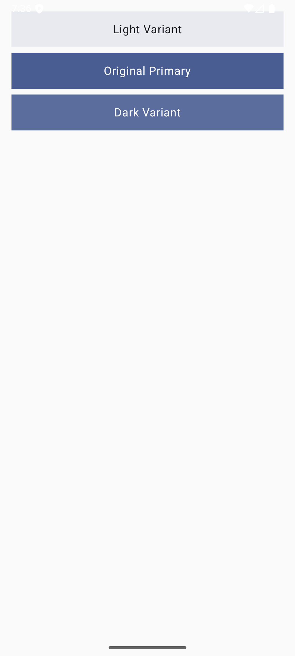
Creating Color Variants

Sometimes you need variations of your Material 3 colorScheme colors:

Kotlin
@Composable
fun ColorVariantExample() {
    val colorScheme = MaterialTheme.colorScheme
    
    // Create lighter or darker variants using alpha
    val primaryLight = colorScheme.primary.copy(alpha = 0.1f)
    val primaryDark = colorScheme.primary.copy(alpha = 0.9f)
    
    Column(
        modifier = Modifier.padding(16.dp),
        verticalArrangement = Arrangement.spacedBy(8.dp)
    ) {
        // Light variant
        Surface(
            modifier = Modifier
                .fillMaxWidth()
                .height(50.dp),
            color = primaryLight
        ) {
            Box(contentAlignment = Alignment.Center) {
                Text(
                    "Light Variant",
                    color = colorScheme.onSurface
                )
            }
        }
        
        // Original color
        Surface(
            modifier = Modifier
                .fillMaxWidth()
                .height(50.dp),
            color = colorScheme.primary
        ) {
            Box(contentAlignment = Alignment.Center) {
                Text(
                    "Original Primary",
                    color = colorScheme.onPrimary
                )
            }
        }
        
        // Dark variant
        Surface(
            modifier = Modifier
                .fillMaxWidth()
                .height(50.dp),
            color = primaryDark
        ) {
            Box(contentAlignment = Alignment.Center) {
                Text(
                    "Dark Variant",
                    color = colorScheme.onPrimary
                )
            }
        }
    }
}

Composing with Surface Tint

Material 3 introduces surface tint for elevation. Here’s how to use it:

Kotlin
@Composable
fun ElevatedCardExample() {
    val colorScheme = MaterialTheme.colorScheme
    
    Column(
        modifier = Modifier.padding(16.dp),
        verticalArrangement = Arrangement.spacedBy(12.dp)
    ) {
        // Card with different elevation levels
        listOf(0.dp, 2.dp, 4.dp, 6.dp).forEach { elevation ->
            Card(
                modifier = Modifier.fillMaxWidth(),
                elevation = CardDefaults.cardElevation(
                    defaultElevation = elevation
                ),
                colors = CardDefaults.cardColors(
                    containerColor = colorScheme.surface
                )
            ) {
                Text(
                    text = "Elevation: $elevation",
                    modifier = Modifier.padding(16.dp),
                    color = colorScheme.onSurface
                )
            }
        }
    }
}

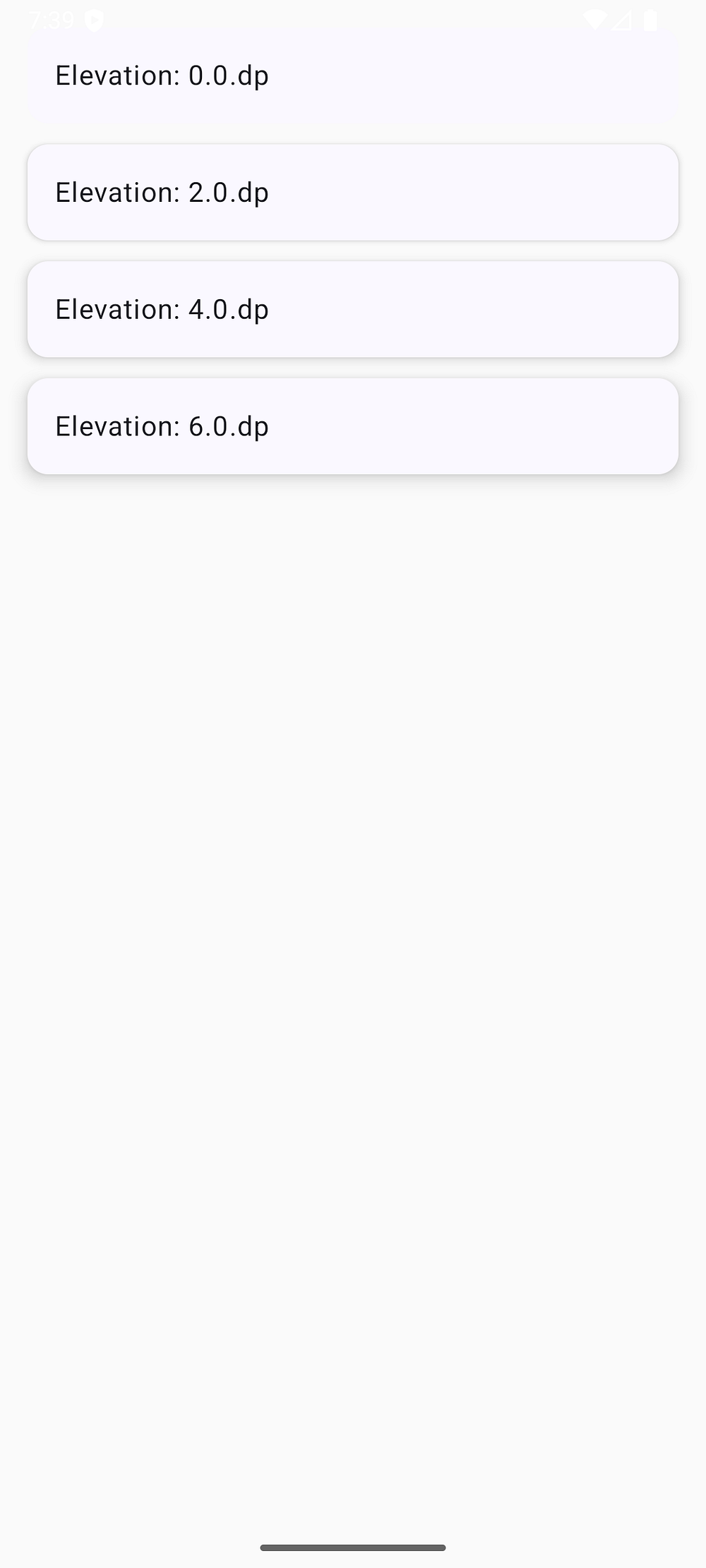
The Material 3 colorScheme automatically applies surfaceTint (usually the primary color) to create subtle elevation effects.

Creating Theme Toggle

Let users switch between light and dark themes:

Kotlin
@Composable
fun ThemeToggleExample() {
    var isDarkTheme by remember { mutableStateOf(false) }
    
    MyAppTheme(darkTheme = isDarkTheme) {
        val colorScheme = MaterialTheme.colorScheme
        
        Scaffold { paddingValues ->
            Column(
                modifier = Modifier
                    .fillMaxSize()
                    .padding(paddingValues)
                    .background(colorScheme.background)
                    .padding(16.dp)
            ) {
                Card(
                    modifier = Modifier.fillMaxWidth(),
                    colors = CardDefaults.cardColors(
                        containerColor = colorScheme.surfaceVariant
                    )
                ) {
                    Row(
                        modifier = Modifier
                            .fillMaxWidth()
                            .padding(16.dp),
                        horizontalArrangement = Arrangement.SpaceBetween,
                        verticalAlignment = Alignment.CenterVertically
                    ) {
                        Row(
                            horizontalArrangement = Arrangement.spacedBy(12.dp),
                            verticalAlignment = Alignment.CenterVertically
                        ) {
                            Icon(
                                imageVector = if (isDarkTheme) {
                                    Icons.Default.DarkMode
                                } else {
                                    Icons.Default.LightMode
                                },
                                contentDescription = null,
                                tint = colorScheme.onSurfaceVariant
                            )
                            Text(
                                text = "Dark Mode",
                                style = MaterialTheme.typography.bodyLarge,
                                color = colorScheme.onSurfaceVariant
                            )
                        }
                        
                        Switch(
                            checked = isDarkTheme,
                            onCheckedChange = { isDarkTheme = it },
                            colors = SwitchDefaults.colors(
                                checkedThumbColor = colorScheme.primary,
                                checkedTrackColor = colorScheme.primaryContainer
                            )
                        )
                    }
                }
            }
        }
    }
}

Material Theme Builder Integration

Want to generate a complete Material 3 colorScheme visually..? Google provides an amazing tool called Material Theme Builder.

Using Material Theme Builder

  1. Visit Material Theme Builder
  2. Choose your primary color or upload an image
  3. Customize secondary and tertiary colors if desired
  4. Click “Export” and select “Jetpack Compose (Theme.kt)”

The tool generates complete Kotlin code.

Just copy this code into your Theme.kt file and you’re done..!

Pro tip: The Material Theme Builder ensures all colors are harmonious and accessible, saving you hours of manual color picking.

Best Practices for Material 3 ColorScheme

1. Always Use Semantic Names

Use the semantic color roles instead of hard-coded values:

Kotlin
// Good: Uses Material 3 colorScheme
Box(
    modifier = Modifier.background(MaterialTheme.colorScheme.surface)
)

// Bad: Hard-coded color
Box(
    modifier = Modifier.background(Color.White)
)

Why this matters: Semantic names adapt automatically to light/dark mode and dynamic color.

2. Pair Colors Correctly

Always use the “on” variant for text on colored surfaces:

Kotlin
// Good: Proper pairing ensures readability
Card(
    colors = CardDefaults.cardColors(
        containerColor = colorScheme.primaryContainer
    )
) {
    Text(
        text = "Accessible text",
        color = colorScheme.onPrimaryContainer
    )
}

// Bad: Might have contrast issues
Card(
    colors = CardDefaults.cardColors(
        containerColor = colorScheme.primaryContainer
    )
) {
    Text(
        text = "Poor contrast",
        color = colorScheme.secondary // Wrong pairing!
    )
}

3. Provide Dynamic Color Fallbacks

Always have a backup for devices that don’t support dynamic color:

Kotlin
val colorScheme = when {
    dynamicColor && Build.VERSION.SDK_INT >= Build.VERSION_CODES.S -> {
        if (darkTheme) dynamicDarkColorScheme(context)
        else dynamicLightColorScheme(context)
    }
    darkTheme -> DarkColorScheme // Fallback
    else -> LightColorScheme     // Fallback
}

4. Test Both Themes

Always test your UI in both light and dark modes:

Kotlin
@Preview(
    name = "Light Mode",
    showBackground = true
)
@Preview(
    name = "Dark Mode",
    showBackground = true,
    uiMode = Configuration.UI_MODE_NIGHT_YES
)
@Composable
fun PreviewProfileScreen() {
    MyAppTheme {
        ProfileScreen()
    }
}

5. Leverage Preview Parameters

Use preview parameters to test different scenarios:

Kotlin
@Preview(name = "Light - No Dynamic Color", showBackground = true)
@Composable
fun LightStaticPreview() {
    MyAppTheme(darkTheme = false, dynamicColor = false) {
        MyComposable()
    }
}

@Preview(name = "Dark - No Dynamic Color", showBackground = true)
@Composable
fun DarkStaticPreview() {
    MyAppTheme(darkTheme = true, dynamicColor = false) {
        MyComposable()
    }
}

Understanding Color Harmonization

The Material 3 colorScheme uses advanced color science to ensure harmony. Here’s what happens under the hood:

HCT Color Space

Material 3 uses HCT (Hue, Chroma, Tone) instead of RGB or HSL:

  • Hue: The color type (0–360 degrees)
  • Chroma: The colorfulness or saturation (0–120+)
  • Tone: The perceived lightness (0–100)

Tonal Palettes

When you provide a seed color, the Material 3 colorScheme:

  1. Converts it to HCT color space
  2. Generates tonal palettes at specific chroma levels
  3. Maps tones to color roles based on their purpose
  4. Ensures all combinations meet WCAG contrast requirements

Example of Tone Mapping

Kotlin
Primary Palette (High Chroma):
- primary: tone 40 (light) / tone 80 (dark)
- onPrimary: tone 100 (light) / tone 20 (dark)
- primaryContainer: tone 90 (light) / tone 30 (dark)

Neutral Palette (Low Chroma):
- surface: tone 99 (light) / tone 10 (dark)
- onSurface: tone 10 (light) / tone 90 (dark)
Tonal Palettes (Light Theme)

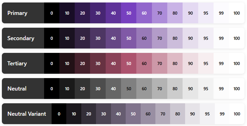
You don’t need to understand all the math — just know that it works beautifully..!

Troubleshooting Common Issues

Issue 1: Colors Not Updating

Problem: Changes to colorScheme don’t appear in the UI.

Solution: Make sure you’re wrapping your content in the theme:

Kotlin
setContent {
    MyAppTheme {  // Essential wrapper!
        Surface(
            modifier = Modifier.fillMaxSize(),
            color = MaterialTheme.colorScheme.background
        ) {
            MyApp()
        }
    }
}

Issue 2: Dynamic Colors Not Working

Problem: App doesn’t match wallpaper colors.

Solution: Check these points:

  1. Device Version: Dynamic color requires Android 12+ (API 31+)
  2. Feature Flag: Ensure dynamicColor = true in your theme
  3. Wallpaper: Try changing your wallpaper to trigger update
  4. Build Version: Verify Build.VERSION.SDK_INT >= Build.VERSION_CODES.S
Kotlin
// Debug logging
val colorScheme = when {
    dynamicColor && Build.VERSION.SDK_INT >= Build.VERSION_CODES.S -> {
        Log.d("Theme", "Using dynamic colors from wallpaper")
        if (darkTheme) dynamicDarkColorScheme(context)
        else dynamicLightColorScheme(context)
    }
    else -> {
        Log.d("Theme", "Using static fallback colors")
        if (darkTheme) DarkColorScheme else LightColorScheme
    }
}

Issue 3: Wrong Colors in Previews

Problem: Compose previews show incorrect or default colors.

Solution: Always wrap preview content in your theme:

Kotlin
@Preview
@Composable
fun MyComposablePreview() {
    MyAppTheme {  // Never forget the theme wrapper!
        MyComposable()
    }
}

Issue 4: System Bars Not Matching Theme

Problem: Status bar and navigation bar don’t match app theme.

Solution: Update system bars in your theme composable:

Kotlin
val view = LocalView.current
if (!view.isInEditMode) {
    SideEffect {
        val window = (view.context as Activity).window
        // Set status bar color
        window.statusBarColor = colorScheme.surface.toArgb()
        // Set navigation bar color
        window.navigationBarColor = colorScheme.surface.toArgb()
        // Adjust icon colors
        WindowCompat.getInsetsController(window, view).apply {
            isAppearanceLightStatusBars = !darkTheme
            isAppearanceLightNavigationBars = !darkTheme
        }
    }
}

Issue 5: Gradle Build Errors

Problem: Cannot resolve Material 3 symbols.

Solution: Ensure you have the correct dependencies:

Kotlin
dependencies {
    // Use BOM for version management
    implementation(platform("androidx.compose:compose-bom:2024.02.00"))
    implementation("androidx.compose.material3:material3")
    
    // Or specify version explicitly
    implementation("androidx.compose.material3:material3:1.2.0")
}

Complete Working Example

Here’s a complete, copy-paste-ready example:

build.gradle.kts (Module)

Kotlin
plugins {
    id("com.android.application")
    id("org.jetbrains.kotlin.android")
}

android {
    namespace = "com.softaai.myapp"
    compileSdk = 34
    
    defaultConfig {
        applicationId = "com.softaai.myapp"
        minSdk = 21
        targetSdk = 34
        versionCode = 1
        versionName = "1.0"
    }
    
    buildFeatures {
        compose = true
    }
    
    composeOptions {
        kotlinCompilerExtensionVersion = "1.5.8"
    }
    
    kotlinOptions {
        jvmTarget = "1.8"
    }
}

dependencies {
    implementation(platform("androidx.compose:compose-bom:2024.02.00"))
    implementation("androidx.compose.material3:material3")
    implementation("androidx.compose.ui:ui")
    implementation("androidx.compose.ui:ui-tooling-preview")
    implementation("androidx.activity:activity-compose:1.8.2")
    implementation("androidx.core:core-ktx:1.12.0")
    implementation("androidx.lifecycle:lifecycle-runtime-ktx:2.7.0")
    
    debugImplementation("androidx.compose.ui:ui-tooling")
}

Theme.kt

Kotlin
package com.softaai.myapp.ui.theme

import android.app.Activity
import android.os.Build
import androidx.compose.foundation.isSystemInDarkTheme
import androidx.compose.material3.MaterialTheme
import androidx.compose.material3.darkColorScheme
import androidx.compose.material3.dynamicDarkColorScheme
import androidx.compose.material3.dynamicLightColorScheme
import androidx.compose.material3.lightColorScheme
import androidx.compose.runtime.Composable
import androidx.compose.runtime.SideEffect
import androidx.compose.ui.graphics.Color
import androidx.compose.ui.graphics.toArgb
import androidx.compose.ui.platform.LocalContext
import androidx.compose.ui.platform.LocalView
import androidx.core.view.WindowCompat

private val LightColorScheme = lightColorScheme(
    primary = Color(0xFF6750A4),
    onPrimary = Color(0xFFFFFFFF),
    primaryContainer = Color(0xFFEADDFF),
    onPrimaryContainer = Color(0xFF21005D),
    secondary = Color(0xFF625B71),
    onSecondary = Color(0xFFFFFFFF),
    secondaryContainer = Color(0xFFE8DEF8),
    onSecondaryContainer = Color(0xFF1D192B),
    tertiary = Color(0xFF7D5260),
    onTertiary = Color(0xFFFFFFFF),
    tertiaryContainer = Color(0xFFFFD8E4),
    onTertiaryContainer = Color(0xFF31111D),
    error = Color(0xFFB3261E),
    onError = Color(0xFFFFFFFF),
    errorContainer = Color(0xFFF9DEDC),
    onErrorContainer = Color(0xFF410E0B),
    background = Color(0xFFFFFBFE),
    onBackground = Color(0xFF1C1B1F),
    surface = Color(0xFFFFFBFE),
    onSurface = Color(0xFF1C1B1F),
    surfaceVariant = Color(0xFFE7E0EC),
    onSurfaceVariant = Color(0xFF49454F),
    outline = Color(0xFF79747E),
    outlineVariant = Color(0xFFCAC4D0),
    scrim = Color(0xFF000000),
    inverseSurface = Color(0xFF313033),
    inverseOnSurface = Color(0xFFF4EFF4),
    inversePrimary = Color(0xFFD0BCFF),
)

private val DarkColorScheme = darkColorScheme(
    primary = Color(0xFFD0BCFF),
    onPrimary = Color(0xFF381E72),
    primaryContainer = Color(0xFF4F378B),
    onPrimaryContainer = Color(0xFFEADDFF),
    secondary = Color(0xFFCCC2DC),
    onSecondary = Color(0xFF332D41),
    secondaryContainer = Color(0xFF4A4458),
    onSecondaryContainer = Color(0xFFE8DEF8),
    tertiary = Color(0xFFEFB8C8),
    onTertiary = Color(0xFF492532),
    tertiaryContainer = Color(0xFF633B48),
    onTertiaryContainer = Color(0xFFFFD8E4),
    error = Color(0xFFF2B8B5),
    onError = Color(0xFF601410),
    errorContainer = Color(0xFF8C1D18),
    onErrorContainer = Color(0xFFF9DEDC),
    background = Color(0xFF1C1B1F),
    onBackground = Color(0xFFE6E1E5),
    surface = Color(0xFF1C1B1F),
    onSurface = Color(0xFFE6E1E5),
    surfaceVariant = Color(0xFF49454F),
    onSurfaceVariant = Color(0xFFCAC4D0),
    outline = Color(0xFF938F99),
    outlineVariant = Color(0xFF49454F),
    scrim = Color(0xFF000000),
    inverseSurface = Color(0xFFE6E1E5),
    inverseOnSurface = Color(0xFF313033),
    inversePrimary = Color(0xFF6750A4),
)

@Composable
fun MyAppTheme(
    darkTheme: Boolean = isSystemInDarkTheme(),
    dynamicColor: Boolean = true,
    content: @Composable () -> Unit
) {
    val context = LocalContext.current
    
    val colorScheme = when {
        dynamicColor && Build.VERSION.SDK_INT >= Build.VERSION_CODES.S -> {
            if (darkTheme) dynamicDarkColorScheme(context)
            else dynamicLightColorScheme(context)
        }
        darkTheme -> DarkColorScheme
        else -> LightColorScheme
    }
    
    val view = LocalView.current
    if (!view.isInEditMode) {
        SideEffect {
            val window = (view.context as Activity).window
            window.statusBarColor = colorScheme.surface.toArgb()
            window.navigationBarColor = colorScheme.surface.toArgb()
            WindowCompat.getInsetsController(window, view).apply {
                isAppearanceLightStatusBars = !darkTheme
                isAppearanceLightNavigationBars = !darkTheme
            }
        }
    }
    
    MaterialTheme(
        colorScheme = colorScheme,
        typography = Typography,
        content = content
    )
}

MainActivity.kt

Kotlin
package com.softaai.myapp

import android.os.Bundle
import androidx.activity.ComponentActivity
import androidx.activity.compose.setContent
import androidx.compose.foundation.layout.fillMaxSize
import androidx.compose.material3.MaterialTheme
import androidx.compose.material3.Surface
import androidx.compose.ui.Modifier
import com.softaai.myapp.ui.theme.MyAppTheme
class MainActivity : ComponentActivity() {
    override fun onCreate(savedInstanceState: Bundle?) {
        super.onCreate(savedInstanceState)
        setContent {
            MyAppTheme {
                Surface(
                    modifier = Modifier.fillMaxSize(),
                    color = MaterialTheme.colorScheme.background
                ) {
                    // Your app content here
                    ProfileScreen()
                }
            }
        }
    }
}

Quick Reference Guide

Essential ColorScheme Properties

Kotlin
val colorScheme = MaterialTheme.colorScheme

// Primary colors
colorScheme.primary                // Main brand color
colorScheme.onPrimary              // Text on primary
colorScheme.primaryContainer       // Lighter primary variant
colorScheme.onPrimaryContainer     // Text on primary container

// Secondary colors
colorScheme.secondary              // Secondary accent
colorScheme.onSecondary            // Text on secondary
colorScheme.secondaryContainer     // Lighter secondary
colorScheme.onSecondaryContainer   // Text on secondary container

// Tertiary colors
colorScheme.tertiary               // Third accent color
colorScheme.onTertiary             // Text on tertiary
colorScheme.tertiaryContainer      // Lighter tertiary
colorScheme.onTertiaryContainer    // Text on tertiary container

// Surface and background
colorScheme.surface                // Card/sheet background
colorScheme.onSurface              // Text on surfaces
colorScheme.surfaceVariant         // Alternative surface
colorScheme.onSurfaceVariant       // Text on surface variant
colorScheme.background             // Main app background
colorScheme.onBackground           // Text on background

// Error colors
colorScheme.error                  // Error state color
colorScheme.onError                // Text on error
colorScheme.errorContainer         // Error message background
colorScheme.onErrorContainer       // Text in error messages

// Utility colors
colorScheme.outline                // Borders and dividers
colorScheme.outlineVariant         // Subtle borders
colorScheme.surfaceTint            // Elevation tint (usually primary)
colorScheme.scrim                  // Semi-transparent overlays

// Inverse colors (for tooltips, snackbars)
colorScheme.inverseSurface         // High-contrast surface
colorScheme.inverseOnSurface       // Text on inverse surface
colorScheme.inversePrimary         // Primary color on inverse surface

Common Usage Patterns

Kotlin
// Primary button
Button(
    onClick = { },
    colors = ButtonDefaults.buttonColors(
        containerColor = MaterialTheme.colorScheme.primary,
        contentColor = MaterialTheme.colorScheme.onPrimary
    )
) {
    Text("Click Me")
}

// Surface card
Card(
    colors = CardDefaults.cardColors(
        containerColor = MaterialTheme.colorScheme.surface
    )
) {
    Text(
        text = "Card Content",
        color = MaterialTheme.colorScheme.onSurface,
        modifier = Modifier.padding(16.dp)
    )
}

// Custom background
Box(
    modifier = Modifier
        .background(MaterialTheme.colorScheme.primaryContainer)
        .padding(16.dp)
) {
    Text(
        text = "Custom Container",
        color = MaterialTheme.colorScheme.onPrimaryContainer
    )
}

// Error state
Surface(
    color = MaterialTheme.colorScheme.errorContainer,
    modifier = Modifier.padding(8.dp)
) {
    Text(
        text = "Error message",
        color = MaterialTheme.colorScheme.onErrorContainer,
        modifier = Modifier.padding(16.dp)
    )
}

Conclusion

The Material 3 colorScheme is a game-changer for Android app theming. It takes the complexity out of color design and gives you a robust, accessible, and beautiful color system right out of the box.

Here’s what we’ve covered:

Understanding: The Material 3 colorScheme generates complete, harmonious palettes from seed colors or wallpaper

Color Roles: Semantic color names ensure accessibility and visual consistency

Implementation: Simple Kotlin setup with Jetpack Compose and dynamic color support

Dynamic Color: Apps automatically match user wallpapers on Android 12+ for personalized experiences

Best Practices: Use semantic colors, test both themes, provide fallbacks, and optimize performance

Real Examples: Production-ready Kotlin code you can use in your projects immediately

Troubleshooting: Solutions to common issues developers face

The beauty of the Material 3 colorScheme is that it makes professional color design accessible to everyone. You don’t need to be a color theory expert to create stunning, accessible Android apps.

Getting Started Today

Start your next Android project by:

  1. Adding Dependencies: Include Material 3 in your build.gradle.kts
  2. Creating Your Theme: Set up lightColorScheme() and darkColorScheme() in Theme.kt
  3. Enabling Dynamic Color: Support Android 12+ wallpaper theming
  4. Using Semantic Colors: Reference MaterialTheme.colorScheme throughout your composables
  5. Testing Thoroughly: Preview in both light and dark modes

The Material 3 colorScheme handles the complexity of color science, accessibility, and harmonization so you can focus on building amazing user experiences. And that’s what makes it so powerful.

Additional Resources

Official Documentation:

Tools:

Sample Projects:

Now go build something beautiful with the Material 3 colorScheme in Kotlin..!

Mermaid

What Is Mermaid? A Complete Guide to the Text-Based Diagramming Language Developers Love

Diagrams are essential in software development. They help explain system architecture, workflows, data flow, and logic in ways plain text cannot. But traditional diagram tools can be slow, visual-only, and hard to maintain.

That’s where Mermaid plays an important role.

Mermaid is a text-based diagramming language that lets developers create diagrams using simple, readable syntax. Instead of dragging boxes and arrows, you write text. Mermaid turns that text into clean, professional diagrams automatically.

In this guide, you’ll learn what Mermaid is, how it works, why developers love it, and how to start using it with real examples.

What Is Mermaid?

Mermaid is an open-source JavaScript-based diagramming and charting tool that allows you to generate diagrams from plain text.

You describe a diagram using Mermaid syntax, and Mermaid renders it as a visual diagram.

In simple terms:

Text in → Diagram out

Mermaid is widely used by developers, technical writers, DevOps engineers, and product teams because it fits naturally into code-driven workflows.

Why Developers Prefer Mermaid

Mermaid solves many problems that traditional diagram tools create.

1. Diagrams as Code

With Mermaid, diagrams live next to your code. That means:

  • You can store diagrams in Git
  • Track changes with version control
  • Review diagrams in pull requests
  • Update diagrams as easily as text

No more outdated architecture diagrams.

2. Simple and Readable Syntax

Mermaid syntax is designed to be easy to read, even if you’ve never used it before.

Here’s a basic example:

Mermaid
graph TD
    A[User] --> B[Web App]
    B --> C[Database]

Even without knowing Mermaid, you can understand what this diagram does.

3. Works Everywhere Developers Work

Mermaid integrates with many popular tools, including:

  • Markdown files
  • GitHub
  • GitLab
  • Notion
  • Obsidian
  • VS Code
  • Documentation platforms

If you already write Markdown, you’re halfway there.

How Mermaid Works

Mermaid follows a simple process:

  1. You write Mermaid syntax
  2. The Mermaid engine parses the text
  3. The diagram is rendered visually

The source remains readable text, which makes Mermaid ideal for long-term documentation.

Common Diagram Types Supported by Mermaid

Mermaid supports a wide range of diagram types used in real-world development.

Let’s go through the most popular ones.

Flowcharts in Mermaid

Flowcharts are one of the most common uses of Mermaid.

Basic Flowchart

Mermaid
flowchart TD
    Start --> Check{Is user logged in?}
    Check -->|Yes| Dashboard
    Check -->|No| Login
  • flowchart TD means top-to-bottom layout
  • Curly braces {} define a decision
  • |Yes| and |No| label arrows

This makes Mermaid perfect for explaining logic and user flows.

Sequence Diagrams in Mermaid

Sequence diagrams show how different systems interact over time.

API Request Flow

Mermaid
sequenceDiagram
    User ->> Frontend: Clicks "Submit"
    Frontend ->> Backend: Send API request
    Backend ->> Database: Query data
    Database -->> Backend: Return result
    Backend -->> Frontend: Response
  • Arrows show communication
  • ->> is a request
  • -->> is a response

Mermaid sequence diagrams are excellent for backend and API documentation.

Class Diagrams in Mermaid

Class diagrams are useful in object-oriented design.

Simple Class Diagram

Mermaid
classDiagram
    class User {
        +String name
        +String email
        +login()
    }

    class Order {
        +int orderId
        +float total
    }

    User "1" --> "many" Order
  • Classes are defined with attributes and methods
  • Relationships are easy to read
  • Works well for system design docs

State Diagrams in Mermaid

State diagrams show how something changes over time.

Order Status

Mermaid
stateDiagram-v2
    [*] --> Pending
    Pending --> Paid
    Paid --> Shipped
    Shipped --> Delivered

This is commonly used in workflow and business logic documentation.

Gantt Charts in Mermaid

Mermaid can also create project timelines.

Gantt Chart

Mermaid
gantt
    title Project Timeline
    dateFormat YYYY-MM-DD
    section Development
    Planning :done, 2026-03-01, 5d
    Coding :active, 2026-03-06, 10d
    Testing : 2026-03-16, 5d

This is useful for lightweight planning directly inside documentation.

Where You Can Use Mermaid

Mermaid works in many real-world environments.

Popular Platforms That Support Mermaid

  • GitHub Markdown
  • GitLab README files
  • Notion
  • Obsidian
  • VS Code (with extensions)
  • Static site generators
  • Internal documentation tools

This makes Mermaid ideal for teams that value documentation quality.

Mermaid vs Traditional Diagram Tools

Mermaid wins when documentation needs to stay accurate and maintainable.

Best Practices for Using Mermaid

To get the most out of Mermaid, follow these tips:

  • Keep diagrams simple and focused
  • Use clear labels
  • Avoid overloading one diagram
  • Store Mermaid diagrams close to related code
  • Treat diagrams as part of the development process

Is Mermaid Hard to Learn?

Not at all.

Most developers learn Mermaid basics in under an hour. Since the syntax is readable, you can often understand diagrams without knowing Mermaid at all.

That’s one reason Mermaid adoption keeps growing.

Why Mermaid Aligns with Modern Documentation Standards

Mermaid fits naturally into modern documentation practices, including:

  • Docs-as-code workflows
  • Developer experience (DX)
  • Agile and DevOps practices
  • AI-assisted documentation
  • Search-friendly, structured content

Because Mermaid diagrams are text-based, they integrate seamlessly with version-controlled documentation and are more accessible to AI tools than image-based diagrams. This makes them better suited for indexing, analysis, and automated summarization within modern documentation workflows.

Conclusion

Mermaid changes how developers think about diagrams.

Instead of treating diagrams as static images, Mermaid makes them living documentation. They evolve with your code, stay accurate, and remain easy to maintain.

If you care about clean documentation, team collaboration, and long-term clarity, Mermaid is worth learning.

Once you start using Mermaid, it’s hard to go back.

Compose Preview

Compose Preview Explained: How It Works, Why It Matters, and Where It Falls Short

If you’re building Android apps with Jetpack Compose, chances are you’ve already used Compose Preview. Or at least clicked the little Preview tab in Android Studio and hoped it would magically show your UI.

Sometimes it does.
Sometimes it doesn’t.

In this blog, we’ll break down Compose Preview, covering everything from core mechanics to practical tips. You’ll learn:

  • What Compose Preview actually is
  • How it works under the hood
  • Why it matters for real-world development
  • Where it struggles and why
  • When to trust it and when not to

Let’s start with the basics.

What Is Compose Preview?

Compose Preview is a design-time tool in Android Studio that lets you see your Jetpack Compose UI without running the app on a device or emulator.

It renders composable functions directly inside the IDE.

That means:

  • Faster feedback
  • No APK install
  • No waiting for Gradle every time you tweak padding or text size

In short, Compose Preview helps you design UI faster.

A Simple Compose Preview Example

Let’s start with a basic example.

Kotlin
@Composable
fun Greeting(name: String) {
    Text(text = "Hello, $name!")
}

This composable works, but Android Studio can’t preview it yet. Why?

Because Greeting needs a parameter.

That’s where Compose Preview comes in.

Adding a Preview Function

Kotlin
@Preview(showBackground = true)
@Composable
fun GreetingPreview() {
    Greeting(name = "Android")
}
  • @Preview tells Android Studio: Render this composable
  • showBackground = true adds a white background so text is readable
  • GreetingPreview() supplies sample data ("Android")

This preview function is not used in production.
It exists only for design-time visualization.

That’s an important detail many beginners miss.

How Compose Preview Works Behind the Scenes

Compose Preview does not run your full app.

Instead, Android Studio:

  1. Compiles the composable function
  2. Runs it in a special design-time environment
  3. Skips most Android framework components
  4. Renders the UI using sample data

That’s why previews are fast.

And that’s also why they’re limited.

Why Compose Preview Matters So Much

1. Faster UI Iteration

With Compose Preview, you can:

  • Adjust spacing
  • Change colors
  • Try different text styles
  • Experiment with layouts

All without touching an emulator.

For UI-heavy screens, this saves hours over time.

2. Encourages Smaller, Cleaner Composables

Compose Preview works best with small, focused composables.

That naturally pushes you toward:

  • Better separation of concerns
  • Reusable UI components
  • Clearer code structure

This directly improves long-term maintainability.

3. Better Design Collaboration

Designers and developers can:

  • Review UI changes quickly
  • Compare states side by side
  • Validate layouts early

Compose Preview becomes a shared visual language.

Advanced Compose Preview Features You Should Know

Beyond basic previews, several advanced features make Compose Preview even more powerful.

Preview with Different Device Configurations

The @Preview annotation accepts parameters that let you simulate different devices, screen sizes, and system settings.

Kotlin
@Preview(
    name = "Small phone",
    device = Devices.PIXEL_3A,
    showSystemUi = true
)
@Preview(
    name = "Large phone",
    device = Devices.PIXEL_7_PRO,
    showSystemUi = true
)
@Preview(
    name = "Tablet",
    device = Devices.PIXEL_TABLET,
    showSystemUi = true
)
@Preview(
    name = "Foldable",
    device = Devices.FOLDABLE,
    showSystemUi = true
)
@Preview(
    name = "Landscape",
    device = Devices.PIXEL_7_PRO,
    widthDp = 891,
    heightDp = 411
)
@Preview(
    name = "Dark Theme",
    uiMode = Configuration.UI_MODE_NIGHT_YES,
    showBackground = true
)
@Preview(showBackground = true)
@Composable
fun ResponsiveLayoutPreview() {
    MaterialTheme {
        Surface(
            modifier = Modifier.fillMaxSize(),
            tonalElevation = 4.dp
        ) {
            Column(
                modifier = Modifier
                    .fillMaxSize()
                    .padding(24.dp),
                verticalArrangement = Arrangement.spacedBy(20.dp)
            ) {

                // Header
                Text(
                    text = "Responsive UI",
                    style = MaterialTheme.typography.headlineMedium,
                    fontWeight = FontWeight.Bold
                )

                Text(
                    text = "Adaptive layouts across form factors",
                    style = MaterialTheme.typography.bodyMedium,
                    color = MaterialTheme.colorScheme.onSurfaceVariant
                )

                Divider()

                Column(
                    verticalArrangement = Arrangement.spacedBy(12.dp)
                ) {
                    FeatureRow("Phones", "Compact & large screens")
                    FeatureRow("Tablets", "Expanded content layouts")
                    FeatureRow("Foldables", "Posture-aware UI")
                    FeatureRow("Themes", "Light & Dark mode ready")
                }
            }
        }
    }
}

@Composable
private fun FeatureRow(
    title: String,
    subtitle: String
) {
    Column {
        Text(
            text = title,
            style = MaterialTheme.typography.titleMedium,
            fontWeight = FontWeight.SemiBold
        )
        Text(
            text = subtitle,
            style = MaterialTheme.typography.bodySmall,
            color = MaterialTheme.colorScheme.onSurfaceVariant
        )
    }
}

Let me break down what’s happening here:

  • device = Devices.PIXEL_7_PRO: This tells Compose Preview to render your composable as if it’s running on a Pixel 7 Pro device, matching that specific screen size and dimensions.
  • showSystemUi = true: This parameter displays the system UI elements like the status bar and navigation bar, giving you a more realistic preview of how your app will look.
  • uiMode = Configuration.UI_MODE_NIGHT_YES: This simulates dark mode, letting you verify that your colors and themes work properly in both light and dark settings.

You can stack multiple @Preview annotations on the same function to see all these variations simultaneously.

Preview Parameters for Dynamic Content

Sometimes you want to test your composables with different data sets. The @PreviewParameter annotation helps with this.

Kotlin
class UserStateProvider : PreviewParameterProvider<Boolean> {
    override val values = sequenceOf(true, false)
}

@Preview(showBackground = true)
@Composable
fun StatusBadgePreview(
    @PreviewParameter(UserStateProvider::class) isActive: Boolean
) {
    Box(
        modifier = Modifier
            .size(100.dp)
            .background(
                color = if (isActive) Color.Green else Color.Red,
                shape = CircleShape
            ),
        contentAlignment = Alignment.Center
    ) {
        Text(
            text = if (isActive) "Active" else "Inactive",
            color = Color.White,
            fontWeight = FontWeight.Bold
        )
    }
}

Here,

The UserStateProvider class implements PreviewParameterProvider<Boolean>, which means it provides a sequence of Boolean values for previewing. The values property returns both true and false.

When you use @PreviewParameter(UserStateProvider::class) on the isActive parameter, Compose Preview automatically generates two separate previews—one for each value in the sequence. You get both the active and inactive states without writing separate preview functions.

This approach is incredibly useful when testing with lists of data, different user types, or various configuration options.

Interactive Preview Mode

Recent versions of Android Studio introduced interactive preview mode, which lets you click buttons, scroll lists, and interact with your UI directly in the preview pane. This feature brings you even closer to the actual app experience without leaving the IDE.

To enable it, look for the interactive mode toggle in the preview pane toolbar. Keep in mind that interactions are limited to the composable being previewed — you can’t navigate to other screens or trigger real network calls.

Where Compose Preview Falls Short

Compose Preview is helpful, but it’s not perfect.

Let’s talk honestly about its limitations.

1. No Real Runtime Logic

Compose Preview does not handle:

  • Network calls
  • Database access
  • ViewModel state from real sources
  • Dependency injection (Hilt, Koin)

If your composable depends on runtime data, preview will break.

That’s why preview-friendly composables should take simple, deterministic parameters that can be easily mocked in previews, rather than ViewModels.

2. Limited Interaction Support

You can’t:

  • Click buttons meaningfully
  • Trigger navigation
  • Test animations properly
  • Simulate gestures accurately

Compose Preview shows how things look, not how they behave.

For behavior, you still need:

  • Emulators
  • Physical devices
  • UI tests

3. Can Be Slow in Large Projects

As your project grows:

  • Previews may take longer to render
  • IDE memory usage increases
  • Sometimes previews just refuse to refresh

This isn’t your fault. It’s a known trade-off.

4. Not a Replacement for Testing

Compose Preview is not a test.

It won’t catch:

  • Crashes
  • Logic bugs
  • Edge-case states
  • Performance issues

Think of it as a design aid, not a quality gate.

Best Practices for Using Compose Preview

To get the most out of Compose Preview:

Keep Preview Functions Simple and Focused

Your preview functions should be straightforward and serve a single purpose. Don’t overcomplicate them with business logic or complex data transformations.

Kotlin
// Good: Simple and clear
@Preview(showBackground = true)
@Composable
fun LoadingButtonPreview() {
    LoadingButton(
        text = "Loading",
        isLoading = true,
        onClick = { }
    )
}

// Avoid: Too much logic in preview
@Preview(showBackground = true)
@Composable
fun ComplicatedPreview() {
    val viewModel = remember { MyViewModel() }
    val state by viewModel.uiState.collectAsState()
    // This won't work well in preview..!
}

The first preview is clean and predictable. The second tries to instantiate a ViewModel, which likely depends on dependency injection, context, or other resources that aren’t available in preview mode.

Use Preview Groups for Organization

When you have many related previews, organize them into preview groups for better navigation.

Kotlin
annotation class ComponentPreviews

@ComponentPreviews
@Preview(name = "Small Button", widthDp = 100)
@Preview(name = "Medium Button", widthDp = 200)
@Preview(name = "Large Button", widthDp = 300)
@Composable
fun ButtonSizePreview() {
    Button(onClick = { }) {
        Text("Click Me")
    }
}

By creating a custom annotation like @ComponentPreviews and applying it alongside your @Preview annotations, you can filter and group previews in Android Studio. This becomes invaluable when working on large projects with hundreds of composables.

Create Preview Fixtures for Common Data

Maintain a separate file with preview fixtures — sample data objects you can reuse across multiple previews.

Kotlin
// PreviewFixtures.kt
object PreviewFixtures {
    val sampleUser = UserData(
        name = "Amol Pawar",
        email = "[email protected]",
        joinDate = "March 2022"
    )
    
    val sampleMessages = listOf(
        MessageData("Hello there!", "Amol", "9:00 AM"),
        MessageData("How are you?", "Rutuja", "9:05 AM"),
        MessageData("Doing great!", "Amol", "9:10 AM")
    )
    
    val longText = """
        This is a longer text sample that helps us test how our UI
        handles content that spans multiple lines. It's useful for
        checking text wrapping, overflow behavior, and spacing.
    """.trimIndent()
}

Then use these fixtures in your previews:

Kotlin
@Preview(showBackground = true)
@Composable
fun UserProfileWithFixturePreview() {
    UserProfile(
        userId = "sample",
        getUserData = { PreviewFixtures.sampleUser }
    )
}

This approach keeps your preview code DRY (Don’t Repeat Yourself) and makes it easier to maintain consistency across previews.

Test Edge Cases in Previews

Don’t just preview your happy path. Create previews for edge cases like empty states, error states, and extreme data conditions.

Kotlin
@Preview(name = "Empty List", showBackground = true)
@Composable
fun EmptyListPreview() {
    MessageList(messages = emptyList())
}

@Preview(name = "Very Long Name", showBackground = true)
@Composable
fun LongNamePreview() {
    ProfileCard(
        name = "Soundarya Bhagayalaxmi Venkateshwari Basapa Rao",
        isOnline = true,
        profileImageUrl = null
    )
}

@Preview(name = "Single Character", showBackground = true)
@Composable
fun SingleCharPreview() {
    ProfileCard(
        name = "X",
        isOnline = false,
        profileImageUrl = null
    )
}

These edge case previews help you catch layout issues before they reach production. Does your text truncate properly? Do your empty states look intentional rather than broken? 

The Future of Compose Preview

The Compose Preview tool continues to evolve with each Android Studio release. Recent improvements include better performance, enhanced animation support, and more sophisticated interactive capabilities.

Looking ahead, we can expect:

  • Deeper integration with design tools: Better collaboration between designers and developers through improved Figma integration and design token support.
  • AI-assisted previews: Automated generation of preview functions based on your composable parameters and common usage patterns.
  • Enhanced debugging: More powerful inspection tools for understanding why your UI renders the way it does.
  • Cloud-based previews: The ability to share interactive previews with team members without requiring them to open Android Studio.

The Android development community actively shapes these improvements through feedback, so don’t hesitate to file feature requests or bug reports.

Conclusion

Despite its limitations, Compose Preview is an essential part of modern Android development. The speed and convenience it offers make it ideal for rapid UI iteration and component-level design work.

The key is knowing when to use it. Compose Preview works best for visual validation and layout refinement, while emulators or real devices are still necessary for testing interactions, animations, and real data flows.

When used with preview-friendly composables and best practices, Compose Preview significantly improves development speed and feedback. It turns UI work into a more iterative, design-driven process rather than a cycle of long builds and guesswork.

Happy previewing..!

Responsive and Adaptive UI in Jetpack Compose

How to Build Responsive and Adaptive UI in Jetpack Compose for Every Screen Size

If you’ve ever opened your beautifully designed app on a tablet only to see it looking like a stretched-out phone screen, you know the pain. Or maybe you’ve watched your carefully crafted layout break apart on a foldable device. Trust me, I’ve been there.

The good news..? Responsive and Adaptive UI in Jetpack Compose makes handling multiple screen sizes way easier than the old XML days. Today, I’m going to walk you through everything you need to know to make your apps look fantastic on every device, from tiny phones to massive tablets.

Let’s dive in!

What’s the Difference Between Responsive and Adaptive UI?

Before we jump into code, let’s clear up some confusion. These terms get thrown around a lot, but they mean different things.

Responsive UI is like water — it flows and adjusts smoothly to fit any container. Your layout stretches, shrinks, and rearranges based on available space. Think of a text field that grows wider on a tablet or a grid that shows more columns on larger screens.

Adaptive UI is more like having different outfits for different occasions. Your app actually changes its structure based on the device. On a phone, you might show a single-pane layout. On a tablet, you’d show a master-detail view with two panes side by side.

In real-world apps, you’ll use both approaches together. That’s what makes Responsive and Adaptive UI in Jetpack Compose so powerful.

Why Jetpack Compose Makes This Easier

If you’ve built responsive layouts in XML, you know it can get messy fast. Multiple layout files, qualifiers, configuration changes — it’s a lot to manage.

Jetpack Compose changes the game. Everything is code-based, which means you can use regular Kotlin logic to make decisions about your UI. No more jumping between files. No more cryptic folder names like layout-sw600dp-land.

Plus, Compose gives you real-time information about screen size, orientation, and window metrics. You can make smart decisions on the fly.

Setting Up Your Project

First things first. Make sure you have the necessary dependencies in your build.gradle.kts file:

Kotlin
dependencies {
    implementation("androidx.compose.ui:ui:1.6.0")
    implementation("androidx.compose.material3:material3:1.2.0")
    implementation("androidx.compose.material3:material3-window-size-class:1.2.0")
}

The material3-window-size-class library is your best friend for building Responsive and Adaptive UI in Jetpack Compose. It provides a standardized way to categorize screen sizes.

Understanding Window Size Classes

Window size classes are Google’s recommended way to handle different screen sizes. Instead of checking exact pixel dimensions, you work with three categories: Compact, Medium, and Expanded.

Here’s what they mean:

  • Compact: Most phones in portrait mode (width < 600dp)
  • Medium: Most phones in landscape, small tablets, or foldables (600dp ≤ width < 840dp)
  • Expanded: Large tablets and desktops (width ≥ 840dp)

Let’s see how to get the current window size class:

Kotlin
@Composable
fun MyResponsiveApp() {
    val windowSizeClass = calculateWindowSizeClass(activity = this as Activity)
    
    when (windowSizeClass.widthSizeClass) {
        WindowWidthSizeClass.Compact -> {
            // Show phone layout
            CompactLayout()
        }
        WindowWidthSizeClass.Medium -> {
            // Show tablet or landscape phone layout
            MediumLayout()
        }
        WindowWidthSizeClass.Expanded -> {
            // Show large tablet or desktop layout
            ExpandedLayout()
        }
    }
}

Here, we’re calculating the window size class and using a when statement to decide which layout to show. Simple, right..? This is the foundation of adaptive UI.

You can also check height size classes the same way using windowSizeClass.heightSizeClass. This is super useful for handling landscape orientations.

Building Your First Responsive Layout

Let’s start with something practical — a responsive grid that adjusts the number of columns based on screen size.

Kotlin
@Composable
fun ResponsiveGrid(
    items: List<String>,
    windowSizeClass: WindowSizeClass
) {
    // Determine columns based on screen width
    val columns = when (windowSizeClass.widthSizeClass) {
        WindowWidthSizeClass.Compact -> 2
        WindowWidthSizeClass.Medium -> 3
        WindowWidthSizeClass.Expanded -> 4
        else -> 2
    }
    
    LazyVerticalGrid(
        columns = GridCells.Fixed(columns),
        contentPadding = PaddingValues(16.dp),
        horizontalArrangement = Arrangement.spacedBy(16.dp),
        verticalArrangement = Arrangement.spacedBy(16.dp)
    ) {
        items(items) { item ->
            GridItem(text = item)
        }
    }
}


@Composable
fun GridItem(text: String) {
    Card(
        modifier = Modifier
            .fillMaxWidth()
            .aspectRatio(1f),
        elevation = CardDefaults.cardElevation(defaultElevation = 4.dp)
    ) {
        Box(
            modifier = Modifier.fillMaxSize(),
            contentAlignment = Alignment.Center
        ) {
            Text(text = text, style = MaterialTheme.typography.bodyLarge)
        }
    }
}

We’re creating a grid that shows 2 columns on phones, 3 on medium devices, and 4 on large tablets. The LazyVerticalGrid handles the layout, and we’re using GridCells.Fixed() to set the column count.

The aspectRatio(1f) modifier makes each card square, which looks clean and consistent across all screen sizes. The spacing and padding ensure everything breathes nicely.

Creating Adaptive Navigation

Navigation is where adaptive UI really shines. On phones, you typically use a bottom navigation bar or navigation drawer. On tablets, a persistent navigation rail makes better use of space.

Here’s how to implement adaptive navigation:

Kotlin
@Composable
fun AdaptiveNavigationLayout(
    windowSizeClass: WindowSizeClass,
    currentDestination: String,
    onNavigate: (String) -> Unit,
    content: @Composable () -> Unit
) {
    val useNavigationRail = windowSizeClass.widthSizeClass != WindowWidthSizeClass.Compact
    
    if (useNavigationRail) {
        // Tablet layout with navigation rail
        Row(modifier = Modifier.fillMaxSize()) {
            NavigationRail(
                modifier = Modifier.fillMaxHeight()
            ) {
                NavigationItems(
                    currentDestination = currentDestination,
                    onNavigate = onNavigate,
                    isRail = true
                )
            }
            Box(modifier = Modifier.weight(1f)) {
                content()
            }
        }
    } else {
        // Phone layout with bottom navigation
        Scaffold(
            bottomBar = {
                NavigationBar {
                    NavigationItems(
                        currentDestination = currentDestination,
                        onNavigate = onNavigate,
                        isRail = false
                    )
                }
            }
        ) { paddingValues ->
            Box(modifier = Modifier.padding(paddingValues)) {
                content()
            }
        }
    }
}

@Composable
fun RowScope.NavigationItems(
    currentDestination: String,
    onNavigate: (String) -> Unit,
    isRail: Boolean
) {
    val items = listOf("Home", "Search", "Profile")
    
    items.forEach { item ->
        if (isRail) {
            NavigationRailItem(
                icon = { Icon(getIconForItem(item), contentDescription = item) },
                label = { Text(item) },
                selected = currentDestination == item,
                onClick = { onNavigate(item) }
            )
        } else {
            NavigationBarItem(
                icon = { Icon(getIconForItem(item), contentDescription = item) },
                label = { Text(item) },
                selected = currentDestination == item,
                onClick = { onNavigate(item) }
            )
        }
    }
}

On compact screens (phones), we use NavigationBar at the bottom. On medium and expanded screens, we use NavigationRail on the side. The useNavigationRail boolean makes this decision.

The Row layout for tablets puts the navigation rail on the left and gives the content area the remaining space with weight(1f). Clean and efficient!

Master-Detail Pattern for Tablets

The master-detail pattern is the gold standard for tablet layouts. You show a list on the left and details on the right. On phones, you navigate between these screens.

Kotlin
@Composable
fun MasterDetailLayout(
    items: List<Item>,
    selectedItem: Item?,
    onItemSelected: (Item) -> Unit,
    windowSizeClass: WindowSizeClass
) {
    val showTwoPane = windowSizeClass.widthSizeClass != WindowWidthSizeClass.Compact
    
    if (showTwoPane) {
        // Two-pane layout for tablets
        Row(modifier = Modifier.fillMaxSize()) {
            // Master pane
            Box(
                modifier = Modifier
                    .weight(0.4f)
                    .fillMaxHeight()
            ) {
                ItemList(
                    items = items,
                    selectedItem = selectedItem,
                    onItemSelected = onItemSelected
                )
            }
            
            // Divider
            VerticalDivider()
            
            // Detail pane
            Box(
                modifier = Modifier
                    .weight(0.6f)
                    .fillMaxHeight()
            ) {
                if (selectedItem != null) {
                    ItemDetail(item = selectedItem)
                } else {
                    EmptyDetailView()
                }
            }
        }
    } else {
        // Single-pane layout for phones
        if (selectedItem != null) {
            ItemDetail(
                item = selectedItem,
                onBackPressed = { onItemSelected(null) }
            )
        } else {
            ItemList(
                items = items,
                selectedItem = null,
                onItemSelected = onItemSelected
            )
        }
    }
}

@Composable
fun ItemList(
    items: List<Item>,
    selectedItem: Item?,
    onItemSelected: (Item) -> Unit
) {
    LazyColumn(
        modifier = Modifier.fillMaxSize()
    ) {
        items(items) { item ->
            ListItem(
                headlineContent = { Text(item.title) },
                supportingContent = { Text(item.description) },
                modifier = Modifier
                    .clickable { onItemSelected(item) }
                    .background(
                        if (item == selectedItem) 
                            MaterialTheme.colorScheme.primaryContainer 
                        else 
                            Color.Transparent
                    )
            )
            HorizontalDivider()
        }
    }
}

@Composable
fun ItemDetail(item: Item, onBackPressed: (() -> Unit)? = null) {
    Column(
        modifier = Modifier
            .fillMaxSize()
            .padding(16.dp)
    ) {
        onBackPressed?.let {
            IconButton(onClick = it) {
                Icon(Icons.Default.ArrowBack, contentDescription = "Back")
            }
        }
        
        Text(
            text = item.title,
            style = MaterialTheme.typography.headlineMedium,
            modifier = Modifier.padding(bottom = 16.dp)
        )
        
        Text(
            text = item.description,
            style = MaterialTheme.typography.bodyLarge
        )
    }
}

On phones, we show either the list or the detail screen — never both. When an item is selected, we navigate to the detail view and provide a back button.

On tablets, both panes are visible simultaneously. The list takes 40% of the width (weight(0.4f)), and the detail pane takes 60% (weight(0.6f)). Clicking an item updates the detail pane without any navigation.

This is Responsive and Adaptive UI in Jetpack Compose at its finest!

Using BoxWithConstraints for Fine-Grained Control

Sometimes you need more precise control over your layout based on exact dimensions. That’s where BoxWithConstraints comes in handy.

Kotlin
@Composable
fun FlexibleLayout() {
    BoxWithConstraints(
        modifier = Modifier.fillMaxSize()
    ) {
        // maxWidth and maxHeight are available here
        val isWideScreen = maxWidth > 600.dp
        val isLandscape = maxWidth > maxHeight
        
        if (isWideScreen && isLandscape) {
            // Landscape tablet layout
            Row(modifier = Modifier.fillMaxSize()) {
                Sidebar(modifier = Modifier.width(280.dp))
                MainContent(modifier = Modifier.weight(1f))
            }
        } else if (isWideScreen) {
            // Portrait tablet layout
            Column(modifier = Modifier.fillMaxSize()) {
                TopBar(modifier = Modifier.height(80.dp))
                MainContent(modifier = Modifier.weight(1f))
            }
        } else {
            // Phone layout
            Column(modifier = Modifier.fillMaxSize()) {
                CompactTopBar(modifier = Modifier.height(56.dp))
                MainContent(modifier = Modifier.weight(1f))
            }
        }
    }
}

Why is this useful? BoxWithConstraints gives you the exact constraints (min/max width and height) of your composable. You can make pixel-perfect decisions about your layout.

The content inside BoxWithConstraints recomposes whenever the constraints change, like when the device rotates or the window is resized. This makes it perfect for Responsive and Adaptive UI in Jetpack Compose.

Responsive Typography and Spacing

Don’t forget about text sizes and spacing! What looks good on a phone might be tiny on a tablet.

Kotlin
@Composable
fun ResponsiveText(
    text: String,
    windowSizeClass: WindowSizeClass
) {
    val textStyle = when (windowSizeClass.widthSizeClass) {
        WindowWidthSizeClass.Compact -> MaterialTheme.typography.bodyMedium
        WindowWidthSizeClass.Medium -> MaterialTheme.typography.bodyLarge
        WindowWidthSizeClass.Expanded -> MaterialTheme.typography.headlineSmall
        else -> MaterialTheme.typography.bodyMedium
    }
    
    val horizontalPadding = when (windowSizeClass.widthSizeClass) {
        WindowWidthSizeClass.Compact -> 16.dp
        WindowWidthSizeClass.Medium -> 32.dp
        WindowWidthSizeClass.Expanded -> 64.dp
        else -> 16.dp
    }
    
    Text(
        text = text,
        style = textStyle,
        modifier = Modifier.padding(horizontal = horizontalPadding)
    )
}

The concept: Larger screens can handle bigger text and more generous spacing. This code adjusts both based on the window size class, creating a more comfortable reading experience on every device.

Handling Configuration Changes Gracefully

One beautiful thing about Compose is that it handles configuration changes automatically. When the device rotates or folds, your composables recompose with the new window size class.

But you need to manage state properly:

Kotlin
@Composable
fun ResponsiveApp() {
    val windowSizeClass = calculateWindowSizeClass(activity = LocalContext.current as Activity)
    
    // State survives configuration changes with rememberSaveable
    var selectedTab by rememberSaveable { mutableStateOf(0) }
    var selectedItem by rememberSaveable { mutableStateOf<Item?>(null) }
    
    AdaptiveScaffold(
        windowSizeClass = windowSizeClass,
        selectedTab = selectedTab,
        onTabSelected = { selectedTab = it },
        selectedItem = selectedItem,
        onItemSelected = { selectedItem = it }
    ) {
        // Your content here
    }
}

Key point: Use rememberSaveable instead of remember for state that should survive configuration changes. This ensures your selected tab or item doesn’t reset when the user rotates their device.

Testing on Different Screen Sizes

Building Responsive and Adaptive UI in Jetpack Compose is only half the battle. You need to test it too!

Compose makes testing easier with preview annotations:

Kotlin
@Preview(name = "Phone", device = Devices.PHONE)
@Preview(name = "Foldable", device = Devices.FOLDABLE)
@Preview(name = "Tablet", device = Devices.TABLET)
@Preview(name = "Desktop", device = Devices.DESKTOP)
@Composable
fun PreviewResponsiveLayout() {
    MaterialTheme {
        ResponsiveGrid(
            items = List(20) { "Item ${it + 1}" },
            windowSizeClass = WindowSizeClass.calculateFromSize(DpSize(800.dp, 1280.dp))
        )
    }
}

Pro tip: Add multiple preview annotations to see your layout on different devices simultaneously in Android Studio. This catches issues early and saves you tons of time.

You can also create custom previews for specific dimensions:

Kotlin
@Preview(name = "Small Phone", widthDp = 360, heightDp = 640)
@Preview(name = "Large Tablet", widthDp = 1024, heightDp = 768)
@Composable
fun CustomSizePreviews() {
    // Your composable here
}

Common Pitfalls to Avoid

1. Hardcoding sizes: Don’t use fixed pixel values like Modifier.width(400.dp) when you can use fillMaxWidth() or weight(). Let Compose do the math.

2. Forgetting about landscape mode: Always test in both portrait and landscape. A layout that works great in portrait might completely break in landscape.

3. Ignoring content density: Large screens don’t just mean “make everything bigger.” Think about optimal content width. A text paragraph shouldn’t stretch across a 12-inch tablet — it becomes hard to read.

4. Not using window size classes: Checking exact pixel dimensions leads to brittle code. Stick with window size classes for more maintainable Responsive and Adaptive UI in Jetpack Compose.

5. Over-engineering: Start simple. You don’t need a different layout for every possible screen size. Compact, medium, and expanded are usually enough.

Advanced Technique: Content-Based Breakpoints

Sometimes you want to switch layouts based on content, not just screen size. Here’s a clever approach:

Kotlin
@Composable
fun ContentAwareLayout(items: List<String>) {
    BoxWithConstraints {
        // Calculate how many items fit comfortably
        val itemWidth = 120.dp
        val spacing = 16.dp
        val itemsPerRow = (maxWidth / (itemWidth + spacing)).toInt().coerceAtLeast(1)
        
        if (itemsPerRow >= 4) {
            // Show grid layout
            LazyVerticalGrid(columns = GridCells.Fixed(itemsPerRow)) {
                items(items) { item ->
                    GridItemCard(item)
                }
            }
        } else {
            // Show list layout
            LazyColumn {
                items(items) { item ->
                    ListItemCard(item)
                }
            }
        }
    }
}

What makes this special..? Instead of using predefined breakpoints, we calculate how many items can fit based on their desired width. If we can fit 4 or more, we use a grid. Otherwise, we use a list. This adapts beautifully to any screen size.

Making Images Responsive

Images need special attention in responsive layouts:

Kotlin
@Composable
fun ResponsiveImage(
    imageUrl: String,
    contentDescription: String,
    windowSizeClass: WindowSizeClass
) {
    val imageModifier = when (windowSizeClass.widthSizeClass) {
        WindowWidthSizeClass.Compact -> Modifier
            .fillMaxWidth()
            .aspectRatio(16f / 9f)
        
        WindowWidthSizeClass.Medium -> Modifier
            .width(400.dp)
            .aspectRatio(4f / 3f)
        
        WindowWidthSizeClass.Expanded -> Modifier
            .width(600.dp)
            .aspectRatio(16f / 10f)
        
        else -> Modifier.fillMaxWidth()
    }
    
    AsyncImage(
        model = imageUrl,
        contentDescription = contentDescription,
        modifier = imageModifier,
        contentScale = ContentScale.Crop
    )
}

We’re adjusting both the size and aspect ratio of images based on screen size. On phones, full-width images look great. On tablets, fixed-width images with appropriate aspect ratios provide better visual balance.

Performance Considerations

Responsive and Adaptive UI in Jetpack Compose can affect performance if you’re not careful. Here are some tips:

Use derivedStateOf for calculations: If you’re computing values based on window size, use derivedStateOf to avoid unnecessary recompositions.

Kotlin
@Composable
fun PerformantResponsiveLayout(windowSizeClass: WindowSizeClass) {
    val columns by remember {
        derivedStateOf {
            when (windowSizeClass.widthSizeClass) {
                WindowWidthSizeClass.Compact -> 2
                WindowWidthSizeClass.Medium -> 3
                WindowWidthSizeClass.Expanded -> 4
                else -> 2
            }
        }
    }
    
    LazyVerticalGrid(columns = GridCells.Fixed(columns)) {
        // Grid items
    }
}

Avoid heavy calculations in composition: Move expensive operations outside the composable or use LaunchedEffect for side effects.

Be smart with previews: Too many preview configurations can slow down Android Studio. Keep them focused on the most important scenarios.

Putting It All Together

Let’s create a complete example that combines everything we’ve learned:

Kotlin
@Composable
fun CompleteResponsiveApp() {
    val windowSizeClass = calculateWindowSizeClass(activity = LocalContext.current as Activity)
    var selectedScreen by rememberSaveable { mutableStateOf("home") }
    var selectedItem by rememberSaveable { mutableStateOf<Item?>(null) }
    
    AdaptiveNavigationLayout(
        windowSizeClass = windowSizeClass,
        currentDestination = selectedScreen,
        onNavigate = { selectedScreen = it }
    ) {
        when (selectedScreen) {
            "home" -> HomeScreen(windowSizeClass)
            "browse" -> BrowseScreen(
                windowSizeClass = windowSizeClass,
                selectedItem = selectedItem,
                onItemSelected = { selectedItem = it }
            )
            "profile" -> ProfileScreen(windowSizeClass)
        }
    }
}

@Composable
fun HomeScreen(windowSizeClass: WindowSizeClass) {
    val columns = when (windowSizeClass.widthSizeClass) {
        WindowWidthSizeClass.Compact -> 1
        WindowWidthSizeClass.Medium -> 2
        WindowWidthSizeClass.Expanded -> 3
        else -> 1
    }
    
    LazyVerticalGrid(
        columns = GridCells.Fixed(columns),
        contentPadding = PaddingValues(16.dp),
        horizontalArrangement = Arrangement.spacedBy(16.dp),
        verticalArrangement = Arrangement.spacedBy(16.dp),
        modifier = Modifier.fillMaxSize()
    ) {
        items(20) { index ->
            FeaturedCard(
                title = "Featured Item ${index + 1}",
                description = "This is a great item you should check out",
                windowSizeClass = windowSizeClass
            )
        }
    }
}

@Composable
fun BrowseScreen(
    windowSizeClass: WindowSizeClass,
    selectedItem: Item?,
    onItemSelected: (Item?) -> Unit
) {
    val sampleItems = remember {
        List(50) { index ->
            Item(
                id = index,
                title = "Item ${index + 1}",
                description = "Description for item ${index + 1}"
            )
        }
    }
    
    MasterDetailLayout(
        items = sampleItems,
        selectedItem = selectedItem,
        onItemSelected = onItemSelected,
        windowSizeClass = windowSizeClass
    )
}

@Composable
fun ProfileScreen(
    windowSizeClass: androidx.compose.material3.windowsizeclass.WindowSizeClass
) {
    val padding = when (windowSizeClass.widthSizeClass) {
        WindowWidthSizeClass.Compact -> 16.dp
        WindowWidthSizeClass.Medium -> 32.dp
        WindowWidthSizeClass.Expanded -> 64.dp
        else -> 16.dp
    }
    
    Column(
        modifier = Modifier
            .fillMaxSize()
            .padding(padding),
        horizontalAlignment = Alignment.CenterHorizontally
    ) {
        Text(
            text = "Profile",
            style = MaterialTheme.typography.headlineMedium,
            modifier = Modifier.padding(bottom = 24.dp)
        )
        
        Card(
            modifier = Modifier.fillMaxWidth(),
            elevation = CardDefaults.cardElevation(defaultElevation = 2.dp)
        ) {
            Column(
                modifier = Modifier.padding(16.dp)
            ) {
                Text(
                    text = "User Name",
                    style = MaterialTheme.typography.titleLarge,
                    modifier = Modifier.padding(bottom = 8.dp)
                )
                Text(
                    text = "[email protected]",
                    style = MaterialTheme.typography.bodyMedium,
                    color = MaterialTheme.colorScheme.onSurfaceVariant
                )
            }
        }
    }
}

@Composable
fun FeaturedCard(
    title: String,
    description: String,
    windowSizeClass: WindowSizeClass
) {
    val cardElevation = when (windowSizeClass.widthSizeClass) {
        WindowWidthSizeClass.Compact -> 2.dp
        else -> 4.dp
    }
    
    Card(
        modifier = Modifier.fillMaxWidth(),
        elevation = CardDefaults.cardElevation(defaultElevation = cardElevation)
    ) {
        Column(
            modifier = Modifier.padding(16.dp)
        ) {
            Text(
                text = title,
                style = MaterialTheme.typography.titleLarge,
                modifier = Modifier.padding(bottom = 8.dp)
            )
            Text(
                text = description,
                style = MaterialTheme.typography.bodyMedium
            )
        }
    }
}

@Composable
fun AdaptiveNavigationLayout(
    windowSizeClass: WindowSizeClass,
    currentDestination: String,
    onNavigate: (String) -> Unit,
    content: @Composable () -> Unit
) {
    // Determine if we should use navigation rail (for tablets and larger)
    val useNavigationRail = windowSizeClass.widthSizeClass != WindowWidthSizeClass.Compact
    
    if (useNavigationRail) {
        // Tablet/Desktop layout with navigation rail on the left
        Row(modifier = Modifier.fillMaxSize()) {
            NavigationRail(
                modifier = Modifier.fillMaxHeight()
            ) {
                Spacer(modifier = Modifier.height(12.dp))
                NavigationRailItems(
                    currentDestination = currentDestination,
                    onNavigate = onNavigate
                )
            }
            Box(modifier = Modifier.weight(1f)) {
                content()
            }
        }
    } else {
        // Phone layout with bottom navigation
        Scaffold(
            bottomBar = {
                NavigationBar {
                    NavigationBarItems(
                        currentDestination = currentDestination,
                        onNavigate = onNavigate
                    )
                }
            }
        ) { paddingValues ->
            Box(modifier = Modifier.padding(paddingValues)) {
                content()
            }
        }
    }
}

@Composable
fun MasterDetailLayout(
    items: List<Item>,
    selectedItem: Item?,
    onItemSelected: (Item?) -> Unit,
    windowSizeClass: WindowSizeClass
) {
    // Determine if we should show two panes (tablet) or one pane (phone)
    val showTwoPane = windowSizeClass.widthSizeClass != WindowWidthSizeClass.Compact
    
    if (showTwoPane) {
        // Two-pane layout for tablets and larger screens
        TwoPaneLayout(
            items = items,
            selectedItem = selectedItem,
            onItemSelected = onItemSelected
        )
    } else {
        // Single-pane layout for phones
        SinglePaneLayout(
            items = items,
            selectedItem = selectedItem,
            onItemSelected = onItemSelected
        )
    }
}

data class Item(
    val id: Int,
    val title: String,
    val description: String
)

This complete example shows a real app structure with multiple screens, adaptive navigation, responsive grids, and the master-detail pattern. It’s production-ready code that handles phones, tablets, and everything in between.

Best Practices Recap

Let me summarize the key principles for building great Responsive and Adaptive UI in Jetpack Compose:

Use window size classes as your primary decision-making tool. They’re Google’s recommended approach and they work great.

Think in terms of layouts, not devices. Don’t try to detect if something is a “tablet” or “phone.” Focus on the space available and choose the best layout for that space.

Start with the smallest screen and work your way up. It’s easier to add features for larger screens than to remove them for smaller ones.

Test early and often on different screen sizes. Use previews during development and test on real devices before shipping.

Keep content readable. Don’t let text lines stretch across a 12-inch screen. Consider maximum content width even on large displays.

Use flexible layouts like Row, Column, Box with weights and size modifiers rather than hardcoded dimensions.

Remember that orientation matters. A phone in landscape might have more width than a small tablet in portrait.

What About Foldable Devices?

Foldables add another dimension to responsive design. The window size class approach handles them automatically, but you can also detect fold states if needed:

Kotlin
@Composable
fun FoldableAwareLayout() {
    val windowSizeClass = calculateWindowSizeClass(activity = LocalContext.current as Activity)
    
    // Window size classes automatically adjust when device unfolds
    when (windowSizeClass.widthSizeClass) {
        WindowWidthSizeClass.Compact -> {
            // Folded state - show compact layout
            CompactLayout()
        }
        WindowWidthSizeClass.Medium, WindowWidthSizeClass.Expanded -> {
            // Unfolded state - show expanded layout
            ExpandedLayout()
        }
    }
}

The beauty of this approach is that you don’t need special foldable detection code. The window size class changes automatically when the device folds or unfolds, and your UI adapts accordingly.

Conclusion

Building Responsive and Adaptive UI in Jetpack Compose might seem daunting at first, but once you understand the core concepts, it becomes second nature.

Remember: window size classes are your friends. Use them to make high-level layout decisions. Combine them with BoxWithConstraints when you need fine-grained control. Test on multiple screen sizes. And always think about how your UI will adapt as screens get bigger or smaller.

The great thing about Compose is that it gives you all the tools you need without the complexity of XML layouts and configuration qualifiers. Everything is code, everything is Kotlin, and everything makes sense.

Your users will thank you when your app looks beautiful on their phone, stunning on their tablet, and perfect on their foldable device.

Now go build something awesome..! And remember — responsive design isn’t just about making things fit. It’s about creating the best possible experience for every screen size.

Happy composing..! 

Monochrome Icons

How Monochrome Icons Power Android Themed Icons (Android 12+)

Android 12 introduced one of the biggest visual upgrades in Android history: Material You.
At the heart of this design shift is a small but powerful feature called Monochrome Icons.

If you’ve ever noticed your app icons changing color to match your wallpaper, that’s Monochrome Icons doing their job.

In this guide, we’ll break down:

  • What Monochrome Icons are
  • How they power Android themed icons
  • Why Android 12+ relies on them
  • How to implement them correctly

What Are Monochrome Icons in Android?

Monochrome Icons are simplified versions of app icons that use a single color only.

They remove:

  • Gradients
  • Shadows
  • Multiple colors
  • Decorative details

Instead, they focus on shape and clarity.

Android uses these icons as a base to dynamically apply system colors based on the user’s wallpaper and theme.

In short:
Monochrome Icons are the foundation of Android themed icons.

Why Android 12+ Needs Monochrome Icons

Before Android 12, app icons were static. Every icon looked the same regardless of theme.

Android 12 changed this with dynamic theming, where the system extracts colors from the user’s wallpaper and applies them across:

  • Quick settings
  • Widgets
  • System UI
  • App icons

For this to work cleanly, Android needs icons that are easy to recolor. That’s where Monochrome Icons come in.

Without a proper monochrome layer, Android cannot theme your app icon correctly.

How Themed Icons Work Behind the Scenes

Here’s what happens when a user enables themed icons:

  1. Android checks if your app supports Monochrome Icons
  2. If supported, the system loads the monochrome drawable
  3. Android applies dynamic colors from the Material You palette
  4. The icon adapts instantly when wallpaper or theme changes

If your app does not include a monochrome icon:

  • The icon stays unchanged
  • It breaks visual consistency
  • It looks outdated next to themed apps

Where Monochrome Icons Live in Your App

Monochrome Icons are defined inside your adaptive icon XML.

This file is usually located at:

res/mipmap-anydpi-v26/ic_launcher.xml

This is where Android expects your monochrome icon to be declared.

Sample Adaptive Icon with Monochrome Support

Here’s a valid adaptive icon configuration:

XML
<?xml version="1.0" encoding="utf-8"?>
<adaptive-icon xmlns:android="http://schemas.android.com/apk/res/android">
    <background android:drawable="@color/ic_launcher_background" />
    <foreground android:drawable="@drawable/ic_launcher_foreground" />
    <monochrome android:drawable="@drawable/ic_launcher_monochrome" />
</adaptive-icon>

What Each Part Means

  • background
    Used for legacy launchers and non-themed states
  • foreground
    The full-color icon shown when themed icons are disabled
  • monochrome
    This is the key part
    Android uses this drawable for themed icons

If the <monochrome> tag is missing, themed icons won’t work for your app.

Designing a Proper Monochrome Icon

A good Monochrome Icon should:

  • Use solid white or black only
  • Avoid thin lines
  • Avoid transparency gradients
  • Focus on a recognizable shape

Recommended Format

  • Vector Drawable (.xml)
  • Single path
  • android:fillColor set to white or black
XML
<vector xmlns:android="http://schemas.android.com/apk/res/android"
    android:width="108dp"
    android:height="108dp"
    android:viewportWidth="108"
    android:viewportHeight="108">
    
<path
    android:fillColor="#FFFFFFFF"
    android:pathData="M20,20h68v68h-68z" />
</vector>

This simplicity is what allows Android to recolor it cleanly.

App Icon Configuration

Your launcher icon is referenced in AndroidManifest.xml:

XML
<application
    android:icon="@mipmap/ic_launcher"
    android:roundIcon="@mipmap/ic_launcher_round">

If your resources are misconfigured, Android won’t find the monochrome drawable.

Checking Android Version (Optional Use Case)

While Android handles themed icons automatically, you may want to check Android version in Kotlin for UI consistency elsewhere.

Kotlin
if (Build.VERSION.SDK_INT >= Build.VERSION_CODES.S) {
    // Android 12 or higher
    // Themed icons and Material You are supported
}
  • Build.VERSION.SDK_INT gives the device’s Android version
  • VERSION_CODES.S represents Android 12
  • This helps you align other UI elements with themed icons

Again, Monochrome Icons themselves do not need Kotlin logic.

Common Mistakes Developers Make

1. Using Colored Monochrome Icons

Monochrome means one solid color only.
Shades or gradients will break theming.

2. Overly Detailed Icons

Thin lines disappear when recolored.
Bold shapes work best.

3. Forgetting the <monochrome> Tag

Without it, Android ignores themed icons entirely.

4. Relying on PNGs

Vector drawables scale better and theme more reliably.

Why Monochrome Icons Improve User Experience

From a user perspective, Monochrome Icons:

  • Make the home screen feel cohesive
  • Reduce visual noise
  • Adapt naturally to dark and light themes
  • Feel modern and intentional

From a developer perspective:

  • Your app looks native on Android 12+
  • Better alignment with Material You
  • Improved visual trust and polish

Conclusion

Monochrome Icons may look simple, but they power one of Android’s most advanced design features.

If your app targets Android 12 or higher, supporting Monochrome Icons is no longer optional. It’s part of building a modern, user-first Android experience.

Keep your icons simple.
Let the system do the coloring.
And embrace Material You the way it was designed.

onValueChange = { value = it }

Understanding onValueChange = { value = it } in Jetpack Compose

Jetpack Compose introduces a very different mental model compared to XML-based Android UI. One line that often confuses beginners (and even experienced Android devs at first) is:

Kotlin
onValueChange = { value = it }

Especially when value is defined like this:

Kotlin
var value by remember { mutableStateOf(0) }

At first glance, this line looks almost too simple — and that’s exactly why it’s confusing. 

Let’s break down what’s really happening, why it’s written this way, and how it fits into Compose’s state-driven architecture.

The Big Picture: Compose Is State-Driven

Before diving into syntax, it’s important to understand how Compose thinks.

In classic Android:

  • You updated UI elements directly
  • UI held its own state
  • You manually synced UI ↔ data

In Jetpack Compose:

  • State owns the UI
  • UI is a function of state
  • When state changes → UI recomposes automatically

This single line:

Kotlin
onValueChange = { value = it }

is the bridge between user interaction and state updates.

What remember { mutableStateOf(...) } Really Does

Consider this state declaration:

Kotlin
var value by remember { mutableStateOf(0) }

This does three important things:

1. mutableStateOf

Creates an observable state holder.
Compose watches this value and tracks where it’s used.

2. remember

Ensures the state survives re-composition.
Without remember, the value would reset every time Compose redraws the UI.

3. by keyword

This is Kotlin property delegation. It allows you to write:

Kotlin
value = 5

instead of:

Kotlin
value.value = 5

So value behaves like a normal variable, but Compose is quietly observing it.

What onValueChange Is (Conceptually)

Most interactive Compose components (such as TextField, Slider, Checkbox) follow the same pattern:

Kotlin
Component(
    value = currentState,
    onValueChange = { /* update state */ }
)

This is intentional and consistent.

onValueChange is:

  • A callback function
  • Triggered every time the user interacts
  • Passed the new value as a parameter

Compose itself does not store the value internally.
You are responsible for updating the state.

Breaking Down { value = it }

Let’s rewrite the lambda in a more explicit way:

Kotlin
onValueChange = { newValue ->
    value = newValue
}

Now it’s clearer.

  • it (or newValue) is the latest value from the UI
  • value = it updates your state
  • Updating state triggers recomposition

This is not assigning a random variable — it’s updating the single source of truth.

How the Data Flow Actually Works

Here’s the real flow behind the scenes:

  1. User interacts with the UI (types text, drags slider, etc.)
  2. Compose calls onValueChange(newValue)
  3. You update state (value = newValue)
  4. Compose detects the state change
  5. Any composables reading value recompose automatically

This is called unidirectional data flow, and it’s a core Compose principle.

Kotlin
State → UI<br>UI interaction → Callback → State update → Recomposition

Simple Example with TextField

Kotlin
@Composable
fun NameInput() {
    var name by remember { mutableStateOf("") }

    TextField(
        value = name,
        onValueChange = { name = it },
        label = { Text("Enter your name") }
    )
}

Here,

  • name controls what the TextField displays
  • Typing triggers onValueChange
  • The new text is assigned to name
  • The TextField redraws with updated text

If you remove onValueChange, the field becomes read-only.

Why Compose Doesn’t Update the Value Automatically

This design is intentional.

Compose avoids hidden internal state because:

  • It prevents bugs
  • It makes UI predictable
  • It improves testability
  • It aligns with modern architecture (MVI, Redux-style patterns)

You always know where your data lives.

Common Beginner Mistakes

Forgetting to update state

Kotlin
onValueChange = { }

Result: UI never changes.

Not using remember

Kotlin
var value by mutableStateOf(0)

Result: Value resets on every recomposition.

Expecting Compose to “save” the value

Compose renders, it doesn’t store business state. That’s your job (or ViewModel’s).

Why This Pattern Is So Powerful

Once you understand this line, you understand 50% of Compose.

It enables:

  • Clean separation of UI and state
  • Easy state hoisting
  • Predictable recomposition
  • Seamless ViewModel integration

Example with state hoisting:

Kotlin
@Composable
fun Counter(value: Int, onValueChange: (Int) -> Unit) {
    Slider(
        value = value.toFloat(),
        onValueChange = { onValueChange(it.toInt()) }
    )
}

Now the parent owns the state — not the UI.

Final Mental Model (Remember This)

Compose does not mutate UI.
Compose reacts to state changes.

And this line:

JavaScript
onValueChange = { value = it }

is simply saying:

“When the user changes something, update my state — and let Compose handle the rest.”

Once this clicks, Jetpack Compose stops feeling confusing and starts feeling refreshingly simple..!

goAsync()

How goAsync() Works in BroadcastReceiver: Lifecycle, Pitfalls, and Best Practices

If you’ve ever worked with Android’s BroadcastReceiver, you know there’s a golden rule: keep your work quick. The system expects your receiver to finish in about 10 seconds, or it’ll label your app as unresponsive (ANR). But what happens when you need just a bit more time?

That’s exactly where goAsync() comes to the rescue.

In this guide, I’ll walk you through everything you need to know about goAsync() in BroadcastReceiver. We’ll explore how it works, when to use it, common mistakes developers make, and the best practices that’ll keep your Android apps running smoothly.

What Exactly Is goAsync()?

Let’s start with the basics. The goAsync() method is a special tool provided by the BroadcastReceiver class that gives you extra time to complete your work without blocking the main thread.

Normally, when a broadcast arrives, Android expects you to handle it immediately on the main thread. This works great for simple tasks like updating a variable or showing a notification. But what if you need to write to a database, make a quick network call, or perform some computation?

That’s the problem goAsync() solves.

When you call goAsync(), it returns a PendingResult object. This object essentially tells Android: “Hey, I’m not done yet, but I promise I’ll finish soon.” It extends your execution window beyond the typical onReceive() lifecycle.

The Lifecycle: How goAsync() Actually Works

Understanding the lifecycle is crucial to using goAsync() correctly. Let me break it down step by step.

Normal BroadcastReceiver Lifecycle

Here’s what happens in a regular broadcast receiver:

Kotlin
class SimpleBroadcastReceiver : BroadcastReceiver() {
    override fun onReceive(context: Context, intent: Intent) {
        // Your code runs here on the main thread
        Log.d("Receiver", "Broadcast received!")
        // When this method exits, the receiver is considered "done"
    }
}

The moment your onReceive() method finishes, Android assumes you’re done. The receiver becomes inactive, and the system may even kill your process if there’s no other component keeping it alive.

With goAsync() in the Picture

Now let’s see how goAsync() changes things:

Kotlin
class AsyncBroadcastReceiver : BroadcastReceiver() {
    override fun onReceive(context: Context, intent: Intent) {
        // Call goAsync() immediately to get a PendingResult
        val pendingResult: PendingResult = goAsync()
        
        // Now you can do work off the main thread
        CoroutineScope(Dispatchers.IO).launch {
            try {
                // Perform your background work here
                performLongRunningTask(context)
            } finally {
                // CRITICAL: Always call finish() when done
                pendingResult.finish()
            }
        }
    }
    
    private suspend fun performLongRunningTask(context: Context) {
        // Simulate some work
        delay(3000)
        Log.d("Receiver", "Task completed!")
    }
}

Here’s what’s happening behind the scenes:

  1. goAsync() is called: This immediately returns a PendingResult object and tells Android the receiver is still working
  2. Work happens off-thread: You move your heavy lifting to a background thread using coroutines or another threading mechanism
  3. finish() is called: When you’re done, calling pendingResult.finish() signals to Android that the receiver has completed its work

The key difference? Your process stays alive even after onReceive() returns, as long as you haven’t called finish() yet.

When Should You Use goAsync()?

The goAsync() method isn’t meant for every situation. Here’s when it makes sense to reach for it:

Perfect Use Cases

Database Operations: Writing user preferences or logging data that takes 2–3 seconds.

Kotlin
class DataSavingReceiver : BroadcastReceiver() {
    override fun onReceive(context: Context, intent: Intent) {
        val pendingResult = goAsync()
        
        CoroutineScope(Dispatchers.IO).launch {
            try {
                val database = AppDatabase.getInstance(context)
                val data = intent.getStringExtra("data") ?: return@launch
                
                // This database write might take a few seconds
                database.userDao().insertData(data)
                Log.d("Receiver", "Data saved successfully")
            } finally {
                pendingResult.finish()
            }
        }
    }
}

Quick Network Calls: Sending analytics events or pinging a server (though WorkManager is often better for this).

File I/O: Reading or writing small amounts of data to storage.

When NOT to Use goAsync()

Long-running tasks: Anything taking more than 10 seconds should use WorkManager, JobScheduler, or a foreground service instead.

Complex operations: If your task requires multiple steps that could fail, consider a more robust solution.

Simple tasks: If your work takes less than a millisecond, you don’t need goAsync() at all. Just do it directly in onReceive().

Common Pitfalls and How to Avoid Them

I’ve seen developers stumble over the same issues when using goAsync(). Let me save you from these headaches.

Pitfall 1: Forgetting to Call finish()

This is the number one mistake. If you never call finish(), Android keeps your receiver alive indefinitely, wasting system resources.

Kotlin
// BAD: Missing finish() call
class BadReceiver : BroadcastReceiver() {
    override fun onReceive(context: Context, intent: Intent) {
        val pendingResult = goAsync()
        
        CoroutineScope(Dispatchers.IO).launch {
            performTask()
            // Oops..! Forgot to call pendingResult.finish()
        }
    }
}

Always use a try-finally block or Kotlin’s use pattern to ensure finish() gets called:

Kotlin
// GOOD: Guaranteed finish() call
class GoodReceiver : BroadcastReceiver() {
    override fun onReceive(context: Context, intent: Intent) {
        val pendingResult = goAsync()
        
        CoroutineScope(Dispatchers.IO).launch {
            try {
                performTask()
            } catch (e: Exception) {
                Log.e("Receiver", "Error: ${e.message}")
            } finally {
                pendingResult.finish()
            }
        }
    }
}

Pitfall 2: Running on the Main Thread

Calling goAsync() doesn’t automatically move your work off the main thread. You still need to handle that yourself.

Kotlin
// BAD: Still blocking the main thread
class BlockingReceiver : BroadcastReceiver() {
    override fun onReceive(context: Context, intent: Intent) {
        val pendingResult = goAsync()
        
        // This still runs on the main thread!
        Thread.sleep(5000) // Don't do this!
        
        pendingResult.finish()
    }
}

Always explicitly move to a background thread:

Kotlin
// GOOD: Work happens on background thread
class NonBlockingReceiver : BroadcastReceiver() {
    override fun onReceive(context: Context, intent: Intent) {
        val pendingResult = goAsync()
        
        // Using Dispatchers.IO for background work
        CoroutineScope(Dispatchers.IO).launch {
            try {
                delay(5000) // This is okay on IO thread
                processData()
            } finally {
                pendingResult.finish()
            }
        }
    }
}

Pitfall 3: Exceeding the Time Limit

Even with goAsync(), you still have time constraints. Android gives you approximately 10 seconds total. Going beyond that results in an ANR.

Kotlin
class TimeConsciousReceiver : BroadcastReceiver() {
    override fun onReceive(context: Context, intent: Intent) {
        val pendingResult = goAsync()
        
        CoroutineScope(Dispatchers.IO).launch {
            try {
                withTimeout(8000) { // Set a timeout slightly under 10 seconds
                    performTaskWithTimeout()
                }
            } catch (e: TimeoutCancellationException) {
                Log.e("Receiver", "Task took too long")
            } finally {
                pendingResult.finish()
            }
        }
    }
}

Pitfall 4: Memory Leaks with Context

Be careful about holding onto the Context object in your background work. The context passed to onReceive() is short-lived.

Kotlin
// SAFER: Use application context for long-running work
class SafeContextReceiver : BroadcastReceiver() {
    override fun onReceive(context: Context, intent: Intent) {
        val pendingResult = goAsync()
        val appContext = context.applicationContext // Use app context
        
        CoroutineScope(Dispatchers.IO).launch {
            try {
                // Use appContext instead of context
                doWorkWith(appContext)
            } finally {
                pendingResult.finish()
            }
        }
    }
}

Best Practices for Using goAsync()

After working with goAsync() across multiple projects, here are my recommended best practices.

1. Always Use Structured Concurrency

Kotlin coroutines with proper scope management make your life easier:

Kotlin
class StructuredReceiver : BroadcastReceiver() {
    override fun onReceive(context: Context, intent: Intent) {
        val pendingResult = goAsync()
        
        // Create a supervised scope
        val scope = CoroutineScope(SupervisorJob() + Dispatchers.IO)
        
        scope.launch {
            try {
                // All your async work here
                val result = performNetworkCall()
                saveToDatabase(context, result)
            } catch (e: Exception) {
                handleError(e)
            } finally {
                pendingResult.finish()
                scope.cancel() // Clean up the scope
            }
        }
    }
}

2. Implement Proper Error Handling

Things will go wrong. Handle exceptions gracefully:

Kotlin
class RobustReceiver : BroadcastReceiver() {
    override fun onReceive(context: Context, intent: Intent) {
        val pendingResult = goAsync()
        
        CoroutineScope(Dispatchers.IO).launch {
            try {
                val data = intent.getStringExtra("key") 
                    ?: throw IllegalArgumentException("Missing data")
                
                processData(data)
                
            } catch (e: IllegalArgumentException) {
                Log.e("Receiver", "Invalid input: ${e.message}")
            } catch (e: IOException) {
                Log.e("Receiver", "Network error: ${e.message}")
            } catch (e: Exception) {
                Log.e("Receiver", "Unexpected error: ${e.message}")
            } finally {
                pendingResult.finish()
            }
        }
    }
}

3. Add Logging for Debugging

When things go wrong, good logs are your best friend:

Kotlin
class LoggingReceiver : BroadcastReceiver() {
    override fun onReceive(context: Context, intent: Intent) {
        Log.d(TAG, "Broadcast received: ${intent.action}")
        val startTime = System.currentTimeMillis()
        val pendingResult = goAsync()
        
        CoroutineScope(Dispatchers.IO).launch {
            try {
                Log.d(TAG, "Starting background work")
                performWork()
                Log.d(TAG, "Work completed successfully")
            } catch (e: Exception) {
                Log.e(TAG, "Work failed", e)
            } finally {
                val duration = System.currentTimeMillis() - startTime
                Log.d(TAG, "Total execution time: ${duration}ms")
                pendingResult.finish()
            }
        }
    }
    
    companion object {
        private const val TAG = "LoggingReceiver"
    }
}

4. Consider WorkManager for Complex Tasks

If your task is getting complicated, it might be time to switch to WorkManager:

Kotlin
class SmartReceiver : BroadcastReceiver() {
    override fun onReceive(context: Context, intent: Intent) {
        val taskComplexity = estimateComplexity(intent)
        
        when {
            taskComplexity < 3 -> {
                // Simple task: use goAsync()
                val pendingResult = goAsync()
                CoroutineScope(Dispatchers.IO).launch {
                    try {
                        quickTask()
                    } finally {
                        pendingResult.finish()
                    }
                }
            }
            else -> {
                // Complex task: delegate to WorkManager
                val workRequest = OneTimeWorkRequestBuilder<DataSyncWorker>()
                    .setInputData(workDataOf("data" to intent.getStringExtra("data")))
                    .build()
                WorkManager.getInstance(context).enqueue(workRequest)
            }
        }
    }
}

Real-World Example: Network Sync on Connectivity Change

Let’s put everything together with a practical example. This receiver syncs data when the device connects to WiFi:

Kotlin
class ConnectivitySyncReceiver : BroadcastReceiver() {
    
    override fun onReceive(context: Context, intent: Intent) {
        // Check if this is a connectivity change
        if (intent.action != ConnectivityManager.CONNECTIVITY_ACTION) {
            return
        }
        
        Log.d(TAG, "Connectivity changed")

        val pendingResult = goAsync()
        val appContext = context.applicationContext
        
        CoroutineScope(Dispatchers.IO).launch {
            try {
                // Check if we're on WiFi
                if (!isWiFiConnected(appContext)) {
                    Log.d(TAG, "Not on WiFi, skipping sync")
                    return@launch
                }
                
                Log.d(TAG, "WiFi connected, starting sync")
                
                // Perform sync with timeout
                withTimeout(8000) {
                    syncDataWithServer(appContext)
                }
                
                Log.d(TAG, "Sync completed successfully")
                
            } catch (e: TimeoutCancellationException) {
                Log.e(TAG, "Sync timed out")
                scheduleRetryWithWorkManager(appContext)
            } catch (e: IOException) {
                Log.e(TAG, "Network error during sync", e)
            } catch (e: Exception) {
                Log.e(TAG, "Unexpected error during sync", e)
            } finally {
                pendingResult.finish()
            }
        }
    }
    
    private fun isWiFiConnected(context: Context): Boolean {
        val cm = context.getSystemService(Context.CONNECTIVITY_SERVICE) as ConnectivityManager
        val network = cm.activeNetwork ?: return false
        val capabilities = cm.getNetworkCapabilities(network) ?: return false
        return capabilities.hasTransport(NetworkCapabilities.TRANSPORT_WIFI)
    }
    
    private suspend fun syncDataWithServer(context: Context) {
        // Simulate API call
        delay(2000)
        
        // In reality, you'd make an actual network call here
        val repository = DataRepository.getInstance(context)
        repository.syncWithServer()
    }
    
    private fun scheduleRetryWithWorkManager(context: Context) {
        val retryWork = OneTimeWorkRequestBuilder<SyncWorker>()
            .setInitialDelay(15, TimeUnit.MINUTES)
            .build()
        WorkManager.getInstance(context).enqueue(retryWork)
    }
    
    companion object {
        private const val TAG = "ConnectivitySync"
    }
}

This example demonstrates several best practices:

  • Immediate goAsync() call to extend execution time
  • Application context usage to prevent memory leaks
  • Proper exception handling for different error scenarios
  • Timeout protection to avoid ANRs
  • Fallback to WorkManager for retry logic
  • Comprehensive logging for debugging

Testing Your goAsync() Implementation

Testing broadcast receivers with goAsync() requires special attention. Here’s a simple approach:

Kotlin
@Test
fun testAsyncBroadcastReceiver() = runBlocking {
    val context = ApplicationProvider.getApplicationContext<Context>()
    val intent = Intent("com.softaai.TEST_ACTION")
    val receiver = AsyncBroadcastReceiver()
    
    // Set up a CountDownLatch to wait for async completion
    val latch = CountDownLatch(1)
    
    // Mock the receiver to signal when done
    receiver.onReceive(context, intent)
    
    // Wait for async work to complete (with timeout)
    val completed = latch.await(5, TimeUnit.SECONDS)
    assertTrue("Receiver should complete within timeout", completed)
}

Conclusion

The goAsync() method is a powerful tool in your Android development toolkit, but it requires careful handling. 

Let me recap the key points:

What goAsync() does: Extends the execution window for your BroadcastReceiver beyond the typical onReceive() lifecycle

When to use it: For tasks taking 1–8 seconds, like database writes, quick network calls, or file I/O

Critical rules: Always call finish(), move work off the main thread, respect the 10-second limit, and handle errors gracefully

Better alternatives: For longer tasks or complex workflows, consider WorkManager, JobScheduler, or foreground services

Remember, goAsync() is meant for those in-between moments when your work is too heavy for the main thread but too quick to justify a full background service. Use it wisely, follow the best practices we’ve covered, and your broadcast receivers will run smoothly without causing ANRs or draining battery life.

State Management in Jetpack Compose

Modern State Management in Jetpack Compose: Flows, Side Effects, and UI State

State management is the backbone of any modern Android app. If state is messy, your UI becomes unpredictable, buggy, and hard to maintain. Jetpack Compose was designed to solve many of these problems, but only if you understand how State Management in Jetpack Compose actually works.

In this post, we will break down modern state management in Jetpack Compose using simple examples. We will cover UI state, Kotlin Flows, side effects, and how they all fit together in a clean, scalable way.

What Does State Mean in Jetpack Compose?

In simple terms, state is data that the UI depends on.

If the state changes, the UI should update automatically.

Examples of state:

  • A loading flag
  • A list of items
  • User input text
  • An error message

Jetpack Compose is state-driven. This means you do not tell the UI how to update. You just update the state, and Compose handles the rest.

This is the foundation of State Management in Jetpack Compose.

UI State vs Business Logic

A common beginner mistake is mixing UI state with business logic. Modern Compose apps separate these responsibilities.

  • UI state describes what the screen looks like
  • Business logic decides how data changes

The ViewModel is the bridge between them.

Designing UI State the Right Way

A good UI state is:

  • Immutable
  • Easy to read
  • Represents the entire screen

Let’s start with a simple UI state class.

Kotlin
data class UserUiState(
    val isLoading: Boolean = false,
    val userName: String = "",
    val errorMessage: String? = null
)

Why this works well

  • It represents the full UI in one place
  • It avoids multiple scattered states
  • It makes the UI predictable

This pattern is widely recommended for State Management in Jetpack Compose because it scales well as your app grows.

Using ViewModel for State Management

The ViewModel holds the UI state and exposes it to the UI.

Kotlin
class UserViewModel : ViewModel() {

    private val _uiState = MutableStateFlow(UserUiState())
    val uiState: StateFlow<UserUiState> = _uiState.asStateFlow()

    fun loadUser() {
        _uiState.value = _uiState.value.copy(isLoading = true)
        viewModelScope.launch {
            delay(2000)
            _uiState.value = UserUiState(
                isLoading = false,
                userName = "Amol"
            )
        }
    }
}
  • MutableStateFlow holds mutable state inside the ViewModel
  • StateFlow is exposed as read-only to the UI (asStateFlow() exposes a read-only version to the UI)
  • copy() updates only the fields that change

This approach keeps state changes controlled and safe.

Why Kotlin Flow Is Preferred in Modern Compose

Kotlin Flow is a cold asynchronous data stream. In Compose, it works beautifully with recomposition.

Benefits:

  • Lifecycle-aware (collectAsStateWithLifecycle())
  • Handles async data naturally
  • Works perfectly with ViewModel

This is why Flow is central to State Management in Jetpack Compose.

Collecting State in Composables

Now let’s connect the ViewModel to the UI.

Kotlin
@Composable
fun UserScreen(viewModel: UserViewModel = viewModel()) {

    val uiState by viewModel.uiState.collectAsStateWithLifecycle()

    when {
        uiState.isLoading -> {
            CircularProgressIndicator()
        }
        uiState.errorMessage != null -> {
            Text(text = uiState.errorMessage)
        }
        else -> {
            Text(text = "Hello, ${uiState.userName}")
        }
    }
}

What is happening here

  • collectAsStateWithLifecycle() converts Flow into Compose state
  • Compose automatically recomposes when state changes
  • UI stays in sync with data

This is declarative UI in action.

Understanding Side Effects in Jetpack Compose

Side effects are operations that happen outside the scope of a composable function. Think network calls, database writes, or analytics events. Compose provides several side effect handlers, each with specific use cases.

LaunchedEffect: For Coroutine-Based Side Effects

Use LaunchedEffect when you need to run suspend functions:

Kotlin
@Composable
fun SearchScreen(viewModel: SearchViewModel = viewModel()) {
    var searchQuery by remember { mutableStateOf("") }
    val searchResults by viewModel.searchResults.collectAsStateWithLifecycle()
    
    LaunchedEffect(searchQuery) {
        // Debounce search queries
        delay(300)
        if (searchQuery.isNotEmpty()) {
            viewModel.search(searchQuery)
        }
    }
    
    Column {
        SearchBar(
            query = searchQuery,
            onQueryChange = { searchQuery = it }
        )
        SearchResultsList(results = searchResults)
    }
}

Why this works:

  • LaunchedEffect(searchQuery) cancels and restarts when searchQuery changes
  • The delay(300) creates a debounce effect—search only happens if the user stops typing for 300ms
  • This prevents excessive network calls while typing

DisposableEffect: Cleanup When You Leave

When you need to clean up resources, DisposableEffect is your friend:

Kotlin
@Composable
fun LocationTracker() {
    val context = LocalContext.current
    
    DisposableEffect(Unit) {
        val locationManager = context.getSystemService(Context.LOCATION_SERVICE) 
            as LocationManager
        
        val listener = object : LocationListener {
            override fun onLocationChanged(location: Location) {
                // Handle location update
            }
            // Other required methods...
        }
        
        // Request location updates
        locationManager.requestLocationUpdates(
            LocationManager.GPS_PROVIDER,
            1000L,
            10f,
            listener
        )
        
        // Cleanup when composable leaves composition
        onDispose {
            locationManager.removeUpdates(listener)
        }
    }
}

Here,

  • DisposableEffect(Unit) runs once when the composable enters composition
  • The code inside runs to set up the location listener
  • onDispose runs when the composable leaves—perfect for cleanup
  • This prevents memory leaks from lingering listeners

SideEffect: For Non-Suspend Operations

Use SideEffect for things that should happen after every successful recomposition:

Kotlin
@Composable
fun AnalyticsScreen(screenName: String) {
    val analytics = remember { Firebase.analytics }
    
    SideEffect {
        // This runs after every successful composition
        analytics.logEvent("screen_view") {
            param("screen_name", screenName)
        }
    }
    
    // Your UI content here
}

The difference:

  • SideEffect runs after every recomposition that completes successfully
  • It’s for operations that don’t involve suspend functions
  • Great for logging, analytics, or updating non-Compose code

Advanced State Management Patterns

Now that we’ve covered the basics, let’s explore patterns that’ll level up your state management in Jetpack Compose game.

The Single Source of Truth Pattern

Always maintain one source of truth for your state:

Kotlin
class ShoppingCartViewModel : ViewModel() {
    private val _cartState = MutableStateFlow(CartState())
    val cartState = _cartState.asStateFlow()
    
    fun addItem(item: Product) {
        _cartState.update { currentState ->
            val existingItem = currentState.items.find { it.product.id == item.id }
            
            if (existingItem != null) {
                // Increase quantity
                currentState.copy(
                    items = currentState.items.map { cartItem ->
                        if (cartItem.product.id == item.id) {
                            cartItem.copy(quantity = cartItem.quantity + 1)
                        } else {
                            cartItem
                        }
                    }
                )
            } else {
                // Add new item
                currentState.copy(
                    items = currentState.items + CartItem(item, 1)
                )
            }
        }
    }
    
    fun removeItem(productId: String) {
        _cartState.update { currentState ->
            currentState.copy(
                items = currentState.items.filter { it.product.id != productId }
            )
        }
    }
}

data class CartState(
    val items: List<CartItem> = emptyList()
) {
    val totalPrice: Double
        get() = items.sumOf { it.product.price * it.quantity }
    
    val itemCount: Int
        get() = items.sumOf { it.quantity }
}

data class CartItem(
    val product: Product,
    val quantity: Int
)

Why this pattern rocks:

  • All cart logic lives in one place
  • Derived values like totalPrice are computed properties
  • State updates are atomic and predictable
  • The UI just reacts to state changes

Combining Multiple Flows

Often you need to combine data from multiple sources:

Kotlin
class DashboardViewModel(
    private val userRepository: UserRepository,
    private val notificationRepository: NotificationRepository
) : ViewModel() {
    
    val dashboardState: StateFlow<DashboardUiState> = combine(
        userRepository.currentUser,
        notificationRepository.unreadCount
    ) { user, unreadCount ->
        DashboardUiState(
            userName = user?.name ?: "Guest",
            unreadNotifications = unreadCount,
            isLoggedIn = user != null
        )
    }.stateIn(
        scope = viewModelScope,
        started = SharingStarted.WhileSubscribed(5000),
        initialValue = DashboardUiState()
    )
}

data class DashboardUiState(
    val userName: String = "",
    val unreadNotifications: Int = 0,
    val isLoggedIn: Boolean = false
)

Here,

  • combine merges multiple flows into one
  • Whenever either source flow emits, the lambda recalculates the state
  • stateIn converts the regular flow to StateFlow
  • WhileSubscribed(5000) keeps the flow active for 5 seconds after the last subscriber leaves
  • This is efficient state management in Jetpack Compose for complex scenarios

Handling Loading States Elegantly

Here’s a pattern I use for handling async operations:

Kotlin
sealed class UiState<out T> {
    object Idle : UiState<Nothing>()
    object Loading : UiState<Nothing>()
    data class Success<T>(val data: T) : UiState<T>()
    data class Error(val message: String) : UiState<Nothing>()
}

class ProductViewModel : ViewModel() {
    private val _productState = MutableStateFlow<UiState<Product>>(UiState.Idle)
    val productState = _productState.asStateFlow()
    
    fun loadProduct(productId: String) {
        viewModelScope.launch {
            _productState.value = UiState.Loading
            
            try {
                val product = productRepository.getProduct(productId)
                _productState.value = UiState.Success(product)
            } catch (e: Exception) {
                _productState.value = UiState.Error(
                    e.message ?: "Unknown error occurred"
                )
            }
        }
    }
}

And here’s how you’d consume it:

Kotlin
@Composable
fun ProductScreen(
    productId: String,
    viewModel: ProductViewModel = viewModel()
) {
    val productState by viewModel.productState.collectAsStateWithLifecycle()
    
    LaunchedEffect(productId) {
        viewModel.loadProduct(productId)
    }
    
    Box(modifier = Modifier.fillMaxSize()) {
        when (val state = productState) {
            is UiState.Idle -> {
                // Show nothing or a placeholder
            }
            is UiState.Loading -> {
                CircularProgressIndicator(
                    modifier = Modifier.align(Alignment.Center)
                )
            }
            is UiState.Success -> {
                ProductDetails(product = state.data)
            }
            is UiState.Error -> {
                ErrorView(
                    message = state.message,
                    onRetry = { viewModel.loadProduct(productId) }
                )
            }
        }
    }
}

Why sealed classes are perfect here:

  • Exhaustive when expressions — the compiler ensures you handle all cases
  • Type-safe data access — state.data only exists in Success
  • Clear state representation
  • Easy to test each state

State Hoisting: Keeping Composables Reusable

State hoisting is a pattern where you move state up to make composables stateless and reusable. This is crucial for good state management in Jetpack Compose.

Before State Hoisting (Don’t Do This)

Kotlin
@Composable
fun SearchBar() {
    var query by remember { mutableStateOf("") }
    
    TextField(
        value = query,
        onValueChange = { query = it },
        placeholder = { Text("Search...") }
    )
}

This looks simple, but the state is trapped inside. You can’t access or control it from outside.

After State Hoisting (Much Better)

Kotlin
@Composable
fun SearchBar(
    query: String,
    onQueryChange: (String) -> Unit,
    modifier: Modifier = Modifier
) {
    TextField(
        value = query,
        onValueChange = onQueryChange,
        placeholder = { Text("Search...") },
        modifier = modifier
    )
}

// Usage
@Composable
fun SearchScreen() {
    var searchQuery by remember { mutableStateOf("") }
    
    Column {
        SearchBar(
            query = searchQuery,
            onQueryChange = { searchQuery = it }
        )
        // Now you can use searchQuery for other things!
        if (searchQuery.isNotEmpty()) {
            Text("Searching for: $searchQuery")
        }
    }
}

The benefits:

  • SearchBar is now stateless and testable
  • You can preview it easily with different values
  • State is controlled from the parent
  • Reusable across different screens

Remember: Choose the Right Tool

Compose provides different remember variants for different scenarios:

remember vs rememberSaveable

Kotlin
@Composable
fun FormScreen() {
    // Lost on configuration change (screen rotation)
    var tempData by remember { mutableStateOf("") }
    
    // Survives configuration changes
    var importantData by rememberSaveable { mutableStateOf("") }
    
    // For complex objects, use a custom Saver
    var complexData by rememberSaveable(stateSaver = ComplexDataSaver) {
        mutableStateOf(ComplexData())
    }
}

When to use what:

  • Use remember for temporary UI state that can be regenerated
  • Use rememberSaveable for user input or important state
  • Both are cleared when the composable leaves composition permanently

rememberCoroutineScope for Manual Control

Kotlin
@Composable
fun AnimatedButton() {
    val scope = rememberCoroutineScope()
    val scale = remember { Animatable(1f) }
    
    Button(
        onClick = {
            scope.launch {
                scale.animateTo(1.2f)
                scale.animateTo(1f)
            }
        }
    ) {
        Text(
            text = "Press Me",
            modifier = Modifier.scale(scale.value)
        )
    }
}
  • rememberCoroutineScope() gives you a scope tied to the composable’s lifecycle
  • Perfect for launching coroutines from event handlers
  • Automatically cancelled when the composable leaves

Derived State: Computing Values Efficiently

Sometimes you need to compute values from existing state. Use derivedStateOf to optimize:

Kotlin
@Composable
fun FilteredList(items: List<String>) {
    var searchQuery by remember { mutableStateOf("") }
    
    // Only recalculates when items or searchQuery actually change
    val filteredItems by remember(items, searchQuery) {
        derivedStateOf {
            if (searchQuery.isEmpty()) {
                items
            } else {
                items.filter { it.contains(searchQuery, ignoreCase = true) }
            }
        }
    }
    
    Column {
        SearchBar(
            query = searchQuery,
            onQueryChange = { searchQuery = it }
        )
        LazyColumn {
            items(filteredItems) { item ->
                Text(item)
            }
        }
    }
}

The magic here:

  • Without derivedStateOf, filtering would happen on every recomposition
  • With it, filtering only happens when dependencies change
  • This is essential for expensive computations

Testing Your State Management

Good state management in Jetpack Compose means testable code. Here’s how:

Kotlin
class ShoppingCartViewModelTest {
    @Test
    fun `adding item increases cart count`() = runTest {
        val viewModel = ShoppingCartViewModel()
        val testProduct = Product(id = "1", name = "Test", price = 10.0)
        
        viewModel.addItem(testProduct)
        
        val state = viewModel.cartState.value
        assertEquals(1, state.itemCount)
        assertEquals(10.0, state.totalPrice, 0.01)
    }
    
    @Test
    fun `removing item decreases cart count`() = runTest {
        val viewModel = ShoppingCartViewModel()
        val testProduct = Product(id = "1", name = "Test", price = 10.0)
        
        viewModel.addItem(testProduct)
        viewModel.removeItem(testProduct.id)
        
        val state = viewModel.cartState.value
        assertEquals(0, state.itemCount)
        assertEquals(0.0, state.totalPrice, 0.01)
    }
}

Testing benefits:

  • State logic is isolated in ViewModels
  • Easy to verify state transformations
  • No UI testing needed for business logic
  • Fast, reliable tests

Common Pitfalls to Avoid

Let me save you some headaches by pointing out common mistakes:

Pitfall 1: Unnecessary Recompositions

Kotlin
// Bad: Creates a new list on every recomposition
@Composable
fun BadExample() {
    val items = listOf("A", "B", "C")  // New list every time!
}

// Good: Remember the list
@Composable
fun GoodExample() {
    val items = remember { listOf("A", "B", "C") }
}

Pitfall 2: Calling Suspend Functions Directly

Kotlin
// Bad: This will crash
@Composable
fun BadNetworkCall() {
    val data = repository.getData()  // Suspend function!
}

// Good: Use LaunchedEffect
@Composable
fun GoodNetworkCall(viewModel: MyViewModel) {
    val data by viewModel.data.collectAsStateWithLifecycle()
    
    LaunchedEffect(Unit) {
        viewModel.loadData()
    }
}

Pitfall 3: Modifying State Outside Composition

Kotlin
// Bad: State update in initialization
@Composable
fun BadStateUpdate(viewModel: MyViewModel) {
    viewModel.updateState()  // Don't do this..!
}

// Good: Use side effects
@Composable
fun GoodStateUpdate(viewModel: MyViewModel) {
    LaunchedEffect(Unit) {
        viewModel.updateState()
    }
}

Best Practices for State Management in Jetpack Compose

Here are proven guidelines used in real production apps:

  • Use a single UI state per screen
  • Keep state immutable
  • Expose state as StateFlow
  • Handle side effects explicitly
  • Avoid mutable state in Composables
  • Let ViewModel own the logic

Following these keeps your app stable and testable.

Conclusion

Modern State Management in Jetpack Compose is not complicated once you understand the core ideas. State flows down. Events flow up. Side effects are handled explicitly.

Jetpack Compose rewards clean thinking. If your state is simple and predictable, your UI will be too.

Start small. Keep state clear. Let Compose do the heavy lifting.

Process Death in Android

What Is Process Death in Android? Causes, Examples, and How to Handle It

Have you ever opened an app on your Android phone, switched to another app for a while, and then returned only to find everything reset? Your form data gone, your scroll position lost, or the app back at the home screen?

That’s Process Death in Android.

Understanding Process Death in Android is crucial for building apps that feel reliable and professional. In this guide, we’ll explore what it is, why it happens, and most importantly, how to handle it properly in your Android apps.

What Exactly Is Process Death in Android?

Process Death in Android occurs when the Android operating system kills your app’s process to free up memory for other apps. Think of it like your phone doing some housekeeping — when memory gets tight, Android decides which apps to close to keep everything running smoothly.

Here’s the tricky part: when your app’s process dies, your activities might still appear to be in the back stack. When the user returns, Android recreates the activity, but all your runtime data is gone unless you’ve saved it properly.

This is different from the normal activity lifecycle. Your app doesn’t just pause or stop — it’s completely terminated and then brought back to life.

Why Does Process Death Happen?

Android needs to manage limited device resources efficiently. Here are the main reasons Process Death in Android occurs:

Low Memory Situations

When your device runs low on RAM, Android starts killing background processes. Apps you haven’t used recently are the first to go.

Developer Options Testing

During development, you can enable “Don’t keep activities” in Developer Options. This immediately destroys activities when they leave the foreground, making it easier to test Process Death scenarios.

Long Background Duration

If your app stays in the background for an extended period while the user uses other memory-intensive apps, there’s a higher chance your process will be killed.

System Updates or Crashes

Sometimes system events or crashes can trigger process termination across multiple apps.

Real-World Example: The Shopping Cart Problem

Let me share a common scenario that illustrates Process Death in Android perfectly.

Imagine you’re building a shopping app. A user adds five items to their cart, then switches to their messaging app to check a friend’s recommendation. They spend 10 minutes chatting, during which Android kills your shopping app’s process to free memory.

When they return to your app, if you haven’t handled Process Death properly, their cart is empty. 

Frustrating, right?

This is exactly why understanding and handling Process Death in Android matters for user experience.

How to Detect Process Death in Android

Before we fix it, let’s learn how to detect it. Add this code to your activity:

Kotlin
class MainActivity : AppCompatActivity() {
    
    override fun onCreate(savedInstanceState: Bundle?) {
        super.onCreate(savedInstanceState)
        setContentView(R.layout.activity_main)
        
        if (savedInstanceState != null) {
            // Activity was recreated after process death
            Log.d("ProcessDeath", "Activity restored after process death")
        } else {
            // Normal first-time creation
            Log.d("ProcessDeath", "Activity created normally")
        }
    }
}

The onCreate() method receives a savedInstanceState parameter. When this parameter is not null, it means Android is restoring your activity after Process Death. If it’s null, your activity is being created for the first time or normally resumed.

This simple check helps you understand when restoration is happening.

Saving State with onSaveInstanceState

The primary way to handle Process Death in Android is by overriding onSaveInstanceState(). This method is called before your activity might be destroyed, giving you a chance to save important data.

Kotlin
class ShoppingCartActivity : AppCompatActivity() {
    
    private var cartItems = mutableListOf<String>()
    private var totalPrice = 0.0
    private var userName = ""
    
    override fun onCreate(savedInstanceState: Bundle?) {
        super.onCreate(savedInstanceState)
        setContentView(R.layout.activity_shopping_cart)
        
        // Restore saved state if available
        savedInstanceState?.let {
            cartItems = it.getStringArrayList("CART_ITEMS")?.toMutableList() ?: mutableListOf()
            totalPrice = it.getDouble("TOTAL_PRICE", 0.0)
            userName = it.getString("USER_NAME", "")
            
            Log.d("ProcessDeath", "Restored ${cartItems.size} items")
        }
        
        updateUI()
    }
    
    override fun onSaveInstanceState(outState: Bundle) {
        super.onSaveInstanceState(outState)
        
        // Save critical data before potential process death
        outState.putStringArrayList("CART_ITEMS", ArrayList(cartItems))
        outState.putDouble("TOTAL_PRICE", totalPrice)
        outState.putString("USER_NAME", userName)
        
        Log.d("ProcessDeath", "Saved ${cartItems.size} items to bundle")
    }
    
    private fun updateUI() {
        // Update your UI with restored data
        findViewById<TextView>(R.id.itemCount).text = "Items: ${cartItems.size}"
        findViewById<TextView>(R.id.totalPrice).text = "Total: $$totalPrice"
    }
}

Here, we override two key methods:

  1. onSaveInstanceState(): This is where we save our data to a Bundle. Think of a Bundle as a container that Android keeps safe even during Process Death. We use methods like putStringArrayList(), putDouble(), and putString() to store different data types.
  2. onCreate(): We check if savedInstanceState exists. If it does, we restore our data using corresponding get methods like getStringArrayList() and getDouble().

The ?.let syntax is Kotlin’s safe call operator, ensuring we only access the bundle if it’s not null.

What Data Can You Save in a Bundle?

Bundles support many common data types, but there are limitations. Here’s what you can save:

Supported Types:

  • Primitive types (Int, Long, Float, Double, Boolean)
  • Strings and CharSequences
  • Parcelable objects
  • Serializable objects
  • Arrays and ArrayLists of supported types

Important Limitation: Bundles have a size limit (typically around 500KB to 1MB). Don’t try to save large images, videos, or extensive datasets. For large data, use other persistence methods like databases or files.

Using ViewModel to Survive Configuration Changes

While onSaveInstanceState() handles Process Death in Android, ViewModels help with configuration changes like screen rotation. However, ViewModels alone don’t survive process death.

Here’s how to combine both approaches:

Kotlin
class UserProfileViewModel : ViewModel() {
    
    // This survives configuration changes but NOT process death
    var userName = MutableLiveData<String>()
    var userAge = MutableLiveData<Int>()
    var profileImageUrl = MutableLiveData<String>()
    
    fun updateUserData(name: String, age: Int, imageUrl: String) {
        userName.value = name
        userAge.value = age
        profileImageUrl.value = imageUrl
    }
}

class UserProfileActivity : AppCompatActivity() {
    
    private lateinit var viewModel: UserProfileViewModel
    
    override fun onCreate(savedInstanceState: Bundle?) {
        super.onCreate(savedInstanceState)
        setContentView(R.layout.activity_user_profile)
        
        viewModel = ViewModelProvider(this).get(UserProfileViewModel::class.java)
        
        // If recovering from process death, restore to ViewModel
        savedInstanceState?.let {
            val name = it.getString("USER_NAME", "")
            val age = it.getInt("USER_AGE", 0)
            val imageUrl = it.getString("PROFILE_IMAGE_URL", "")
            
            viewModel.updateUserData(name, age, imageUrl)
        }
        
        observeViewModel()
    }
    
    override fun onSaveInstanceState(outState: Bundle) {
        super.onSaveInstanceState(outState)
        
        // Save ViewModel data to survive process death
        outState.putString("USER_NAME", viewModel.userName.value ?: "")
        outState.putInt("USER_AGE", viewModel.userAge.value ?: 0)
        outState.putString("PROFILE_IMAGE_URL", viewModel.profileImageUrl.value ?: "")
    }
    
    private fun observeViewModel() {
        viewModel.userName.observe(this) { name ->
            findViewById<TextView>(R.id.nameText).text = name
        }
        
        viewModel.userAge.observe(this) { age ->
            findViewById<TextView>(R.id.ageText).text = "Age: $age"
        }
    }
}

The ViewModel holds our UI data and survives configuration changes automatically. However, to survive Process Death in Android, we still need to:

  1. Save ViewModel data in onSaveInstanceState()
  2. Restore that data back to the ViewModel in onCreate()

This gives us the best of both worlds: automatic configuration change handling from ViewModel, plus process death recovery from saved instance state.

SavedStateHandle: The Modern Approach

Android Jetpack provides SavedStateHandle, which combines ViewModel benefits with automatic state saving. This is the recommended approach for handling Process Death in Android:

Kotlin
class ShoppingViewModel(private val savedStateHandle: SavedStateHandle) : ViewModel() {
    
    // Automatically saved and restored across process death
    var cartItems: MutableLiveData<List<String>> = savedStateHandle.getLiveData("cart_items", emptyList())
    var totalPrice: MutableLiveData<Double> = savedStateHandle.getLiveData("total_price", 0.0)
    
    fun addItem(item: String, price: Double) {
        val currentItems = cartItems.value?.toMutableList() ?: mutableListOf()
        currentItems.add(item)
        cartItems.value = currentItems
        
        val currentTotal = totalPrice.value ?: 0.0
        totalPrice.value = currentTotal + price
        
        // Automatically saved to SavedStateHandle
    }
    
    fun clearCart() {
        cartItems.value = emptyList()
        totalPrice.value = 0.0
    }
}


class ShoppingActivity : AppCompatActivity() {
    
    private val viewModel: ShoppingViewModel by viewModels()
    
    override fun onCreate(savedInstanceState: Bundle?) {
        super.onCreate(savedInstanceState)
        setContentView(R.layout.activity_shopping)
        
        // No manual state restoration needed!
        // SavedStateHandle does it automatically
        
        viewModel.cartItems.observe(this) { items ->
            updateCartUI(items)
        }
        
        viewModel.totalPrice.observe(this) { total ->
            findViewById<TextView>(R.id.totalText).text = "Total: $$total"
        }
        
        findViewById<Button>(R.id.addButton).setOnClickListener {
            viewModel.addItem("Product ${System.currentTimeMillis()}", 29.99)
        }
    }
    
    private fun updateCartUI(items: List<String>) {
        // Update RecyclerView or ListView with items
    }
}

SavedStateHandle is magical for handling Process Death in Android. Here’s why:

  1. getLiveData(): This method creates LiveData that’s automatically backed by saved state. When process death occurs, the data is saved. When the process restarts, the data is restored automatically.
  2. No manual saving: Unlike the previous examples, we don’t need to override onSaveInstanceState(). The SavedStateHandle does it for us.
  3. Type-safe: We can store various types, and they’re automatically serialized and deserialized.

The by viewModels() delegate is a Kotlin property delegate that creates or retrieves the ViewModel with SavedStateHandle automatically injected.

Testing Process Death in Android

Testing is crucial to ensure your app handles Process Death in Android correctly. Here are practical ways to test:

Method 1: Developer Options

  1. Go to Settings → Developer Options
  2. Enable “Don’t keep activities”
  3. Navigate through your app, switching between activities
  4. Every time an activity goes to the background, it’s destroyed

Method 2: Using ADB Command

Force your app’s process to be killed using Android Debug Bridge:

adb shell am kill com.yourapp.package

Then return to your app from the recent apps menu.

Method 3: Memory Pressure Testing

Use Android Studio’s Profiler to simulate low memory conditions:

  1. Open Android Profiler
  2. Select Memory
  3. Click “Force garbage collection” multiple times
  4. Android may kill your app’s process naturally

Common Mistakes to Avoid

When dealing with Process Death in Android, developers often make these mistakes:

Mistake 1: Saving Large Objects

Kotlin
// DON'T DO THIS
override fun onSaveInstanceState(outState: Bundle) {
    super.onSaveInstanceState(outState)
    outState.putSerializable("LARGE_IMAGE", largeImageBitmap) // Too big!
}

Why it’s wrong: Bundles have size limits. Saving large objects causes TransactionTooLargeException.

Better approach: Save only a reference or ID, then reload the data from a persistent source.

Kotlin
// DO THIS INSTEAD
override fun onSaveInstanceState(outState: Bundle) {
    super.onSaveInstanceState(outState)
    outState.putString("IMAGE_URL", imageUrl) // Save URL, not bitmap
}

Mistake 2: Assuming ViewModel Survives Process Death

Kotlin
// INCORRECT ASSUMPTION
class MyActivity : AppCompatActivity() {
    private lateinit var viewModel: MyViewModel
    
    override fun onCreate(savedInstanceState: Bundle?) {
        super.onCreate(savedInstanceState)
        viewModel = ViewModelProvider(this).get(MyViewModel::class.java)
        
        // Assuming viewModel.userData is always available after process death
        // This is WRONG - ViewModel doesn't survive process death without SavedStateHandle
    }
}

Fix: Use SavedStateHandle or manually save/restore ViewModel data.

Mistake 3: Not Testing Thoroughly

Many developers never test Process Death scenarios until users report bugs. Always enable “Don’t keep activities” during development.

Best Practices for Handling Process Death in Android

1. Use SavedStateHandle for Simple Data

For primitive types and small objects, SavedStateHandle is your best friend:

Kotlin
class MyViewModel(private val state: SavedStateHandle) : ViewModel() {
    val username: LiveData<String> = state.getLiveData("username", "")
    val score: LiveData<Int> = state.getLiveData("score", 0)
}

2. Persist Important Data to Database

For critical data that users can’t afford to lose, use Room database or other persistent storage:

Kotlin
class FormActivity : AppCompatActivity() {
    private lateinit var database: AppDatabase
    
    override fun onCreate(savedInstanceState: Bundle?) {
        super.onCreate(savedInstanceState)
        database = Room.databaseBuilder(
            applicationContext,
            AppDatabase::class.java,
            "form-database"
        ).build()
        
        // Restore form from database if exists
        lifecycleScope.launch {
            val savedForm = database.formDao().getUnsubmittedForm()
            savedForm?.let { restoreForm(it) }
        }
    }
    
    override fun onPause() {
        super.onPause()
        // Save form to database when leaving activity
        lifecycleScope.launch {
            val formData = collectFormData()
            database.formDao().saveForm(formData)
        }
    }
}

3. Combine Multiple Approaches

Use the right tool for each type of data:

  • SavedStateHandle: UI state (scroll position, selected tab, form inputs)
  • ViewModel: Temporary runtime data that survives configuration changes
  • Database/SharedPreferences: Persistent user data
  • Memory cache: Easily re-fetchable data

4. Keep Bundles Small

Only save essential state information. Calculate or reload other data:

Kotlin
override fun onSaveInstanceState(outState: Bundle) {
    super.onSaveInstanceState(outState)
    
    // Save only IDs, not entire objects
    outState.putInt("SELECTED_ITEM_ID", selectedItem.id)
    outState.putString("SEARCH_QUERY", searchQuery)
    
    // Don't save the entire search results list
    // Reload it using the search query instead
}

Advanced: Handling Process Death with Compose

If you’re using Jetpack Compose, handling Process Death in Android looks a bit different:

Kotlin
@Composable
fun ShoppingCartScreen(viewModel: ShoppingViewModel = viewModel()) {
    
    val cartItems by viewModel.cartItems.observeAsState(emptyList())
    val totalPrice by viewModel.totalPrice.observeAsState(0.0)
    
    Column(modifier = Modifier.fillMaxSize().padding(16.dp)) {
        Text(
            text = "Shopping Cart",
            style = MaterialTheme.typography.h5
        )
        
        Spacer(modifier = Modifier.height(16.dp))
        
        LazyColumn(modifier = Modifier.weight(1f)) {
            items(cartItems) { item ->
                CartItemRow(item = item)
            }
        }
        
        Divider()
        
        Text(
            text = "Total: $${"%.2f".format(totalPrice)}",
            style = MaterialTheme.typography.h6,
            modifier = Modifier.padding(vertical = 16.dp)
        )
        
        Button(
            onClick = { viewModel.addItem("New Product", 29.99) },
            modifier = Modifier.fillMaxWidth()
        ) {
            Text("Add Item")
        }
    }
}

@Composable
fun CartItemRow(item: String) {
    Row(
        modifier = Modifier
            .fillMaxWidth()
            .padding(vertical = 8.dp),
        horizontalArrangement = Arrangement.SpaceBetween
    ) {
        Text(text = item)
        Text(text = "$29.99")
    }
}

With Compose, you still use ViewModel with SavedStateHandle. The difference is:

  1. observeAsState(): Converts LiveData from ViewModel into Compose State
  2. Automatic recomposition: When the ViewModel data changes (including after process death restoration), Compose automatically updates the UI
  3. No manual lifecycle management: Compose handles the observation lifecycle for you

The underlying Process Death handling still uses SavedStateHandle in the ViewModel, but the UI layer becomes much simpler.

Monitoring Process Death in Production

To understand how often Process Death in Android affects your users, implement analytics:

Kotlin
class AnalyticsHelper(private val context: Context) {
    
    fun trackProcessDeath(activityName: String) {
        // Log to your analytics service
        FirebaseAnalytics.getInstance(context).logEvent("process_death_recovery") {
            param("activity_name", activityName)
            param("timestamp", System.currentTimeMillis())
        }
    }
}

class MainActivity : AppCompatActivity() {
    
    override fun onCreate(savedInstanceState: Bundle?) {
        super.onCreate(savedInstanceState)
        setContentView(R.layout.activity_main)
        
        if (savedInstanceState != null) {
            AnalyticsHelper(this).trackProcessDeath("MainActivity")
        }
    }
}

This helps you understand:

  • How frequently users experience process death
  • Which activities are most affected
  • Whether users successfully recover their state

Conclusion

Process Death in Android is an essential concept every Android developer must master. It’s not just about preventing crashes — it’s about creating a seamless user experience that feels reliable and polished.

Remember these key takeaways:

For simple UI state: Use SavedStateHandle with ViewModel. It automatically handles Process Death in Android with minimal code.

For important user data: Persist to a database. Don’t rely solely on saved instance state for data users can’t afford to lose.

Always test: Enable “Don’t keep activities” during development. Test your app thoroughly by simulating process death scenarios.

Keep bundles small: Only save essential state information. Reload complex data when the activity restores.

By properly handling Process Death in Android, you’ll build apps that feel professional, reliable, and respectful of your users’ time and data. Your users might never know about the complexity you’ve handled behind the scenes — and that’s exactly the point.

Start implementing these patterns in your next project, and you’ll be amazed at how much more robust your apps become. 

Composition Over Inheritance

What Is Composition Over Inheritance? The Built-In Compose Way Explained

If you’ve been writing object-oriented code for a while, you’ve probably used inheritance a lot. It feels natural. You create a base class, extend it, override a few methods, and move on.

But as projects grow, inheritance often becomes hard to manage. Classes get tightly coupled. Changes ripple through the codebase. Small tweaks break unexpected things.

This is where Composition Over Inheritance comes in.

In this post, we’ll break down what Composition Over Inheritance really means, why it matters, and how it’s used naturally in modern Kotlin development, especially with Jetpack Compose. 

What Does “Composition Over Inheritance” Mean?

Composition Over Inheritance is a design principle that says:

Prefer building classes by combining smaller, reusable components instead of extending base classes.

In simpler terms:

  • Inheritance says “is a”
  • Composition says “has a”

Instead of forcing behavior through class hierarchies, you compose behavior by using other objects.

A Simple Real-World Example

Think of a smartphone.

A smartphone has a camera, battery, speaker, and screen.

It does not inherit from Camera, Battery, or Speaker.

That’s composition.

If you used inheritance here, the design would fall apart fast.

The Problem With Inheritance

Inheritance looks clean at first, but it comes with hidden costs.

Example Using Inheritance (Problematic)

Kotlin
open class Vehicle {
    open fun move() {
        println("Vehicle is moving")
    }
}

open class Car : Vehicle() {
    override fun move() {
        println("Car is driving")
    }
}

class ElectricCar : Car() {
    override fun move() {
        println("Electric car is driving silently")
    }
}

At first glance, this seems fine.

But now imagine:

  • You want a flying car
  • You want a boat-car
  • You want a self-driving electric truck

Your inheritance tree explodes.

Changes to Vehicle affect every subclass. You’re locked into decisions you made early, often before requirements were clear.

This is exactly what Composition Over Inheritance helps you avoid.

Composition Over Inheritance Explained With Kotlin

Let’s rewrite the same idea using composition.

Create Small, Focused Behaviors

Kotlin
interface Engine {
    fun move()
}
Kotlin
class GasEngine : Engine {
    override fun move() {
        println("Driving using gas engine")
    }
}
Kotlin
class ElectricEngine : Engine {
    override fun move() {
        println("Driving silently using electric engine")
    }
}

Each class has one clear responsibility.

Compose the Behavior

Kotlin
class Car(private val engine: Engine) {

    fun drive() {
        engine.move()
    }
}

Now the Car has an engine, instead of being forced into a rigid hierarchy.

Use It

Kotlin
fun main() {
    val electricCar = Car(ElectricEngine())
    electricCar.drive()

    val gasCar = Car(GasEngine())
    gasCar.drive()
}

Output:

Driving silently using electric engine
Driving using gas engine

This is Composition Over Inheritance in action.

Why Composition Over Inheritance Is Better

Here’s why modern Kotlin developers strongly prefer this approach.

1. Less Coupling

Your classes depend on interfaces, not concrete implementations.

2. Easier Changes

You can swap behaviors without rewriting class hierarchies.

3. Better Testability

You can inject fake or mock implementations easily.

4. Cleaner Code

Smaller classes. Clear responsibilities. Fewer surprises.

Composition Over Inheritance in Jetpack Compose

Jetpack Compose is built almost entirely on Composition Over Inheritance.

That’s not an accident.

Traditional UI (Inheritance-Heavy)

Kotlin
class CustomButton : Button {
    // override styles, behavior, states
}

This leads to rigid UI components that are hard to reuse.

Compose Way (Composition First)

Kotlin
@Composable
fun MyButton(
    text: String,
    onClick: () -> Unit
) {
    Button(onClick = onClick) {
        Text(text)
    }
}

Here’s what’s happening:

  • MyButton is not extending Button
  • It uses Button
  • Behavior is passed in, not inherited

This is Composition Over Inheritance at the UI level.

Why Compose Feels Easier to Work With

Compose avoids deep inheritance trees entirely.

Instead:

  • UI is built from small composable functions
  • Each function does one thing
  • You combine them like building blocks

That’s composition by design.

Delegation: Kotlin’s Built-In Support for Composition

Kotlin makes Composition Over Inheritance even easier with delegation.

Example Using Delegation

Kotlin
interface Logger {
    fun log(message: String)
}

class ConsoleLogger : Logger {
    override fun log(message: String) {
        println(message)
    }
}

class UserService(private val logger: Logger) : Logger by logger

Now UserService automatically uses ConsoleLogger’s implementation without inheritance.

This keeps your code flexible and clean.

When Should You Still Use Inheritance?

Inheritance is not evil. It’s just often overused.

Inheritance works best when:

  • There is a true “is-a” relationship
  • The base class is stable
  • You control both parent and child classes

If those conditions are missing, Composition Over Inheritance is usually the safer choice.

Conclusion

Let’s wrap it up.

  • Composition Over Inheritance means building behavior using objects, not class hierarchies
  • Kotlin makes composition easy with interfaces and delegation
  • Jetpack Compose is a real-world example of this principle done right
  • Composition leads to flexible, testable, and maintainable code

If you’re writing Kotlin today, especially with Compose, you’re already using Composition Over Inheritance whether you realized it or not.

And once you start designing with it intentionally, your code gets simpler, not harder.

error: Content is protected !!