Mastering Jetpack Compose: The Ultimate Guide to Navigation, State Management, Animations, and More
Jetpack Compose is revolutionizing Android UI development, offering a declarative, efficient, and intuitive approach to building beautiful applications. Whether you’re just starting or looking to refine your expertise, this guide will help you understand key aspects such as navigation, state management, animations, custom composables, performance optimization, and theming in Jetpack Compose.
Navigation in Jetpack Compose
Setting Up Navigation
Jetpack Compose replaces traditional Fragment-based navigation with NavHost and NavController. First, add the dependency:
implementation("androidx.navigation:navigation-compose:2.7.5")Basic Navigation Example
@Composable
fun MyApp() {
    val navController = rememberNavController()
    NavHost(navController, startDestination = "home") {
        composable("home") { HomeScreen(navController) }
        composable("details") { DetailsScreen() }
    }
}

@Composable
fun HomeScreen(navController: NavController) {
    Column {
        Text("Home Screen")
        Button(onClick = { navController.navigate("details") }) {
            Text("Go to Details")
        }
    }
}

@Composable
fun DetailsScreen() {
    Text("Details Screen")
}
Passing Data Between Screens
To pass arguments:
composable("details/{userId}") { backStackEntry ->
    val userId = backStackEntry.arguments?.getString("userId")
    DetailsScreen(userId)
}
Navigate with:
navController.navigate("details/123")State Management in Jetpack Compose
Jetpack Compose follows unidirectional data flow (UDF). Here are the key approaches to managing state:
Using remember and mutableStateOf (Local State)
@Composable
fun Counter() {
    var count by remember { mutableStateOf(0) }

    Column {
        Text("Count: $count")
        Button(onClick = { count++ }) {
            Text("Increment")
        }
    }
}
Using ViewModel (Recommended for Shared State)
Add ViewModel dependency:
implementation("androidx.lifecycle:lifecycle-viewmodel-compose:2.7.0")class CounterViewModel : ViewModel() {
var count by mutableStateOf(0)
private set
fun increment() {
count++
}
}
@Composable
fun CounterScreen(viewModel: CounterViewModel = viewModel()) {
Column {
Text("Count: ${viewModel.count}")
Button(onClick = { viewModel.increment() }) {
Text("Increment")
}
}
}Animations in Jetpack Compose
Simple Animation Example
@Composable
fun AnimatedBox() {
    var expanded by remember { mutableStateOf(false) }
    val size by animateDpAsState(if (expanded) 200.dp else 100.dp, label = "")

    Box(
         modifier = Modifier
            .size(size)
            .background(Color.Blue)
            .clickable { expanded = !expanded }
    )
}
Advanced Animation with AnimatedVisibility
@Composable
fun AnimatedText(visible: Boolean) {
    AnimatedVisibility(visible) {
        Text("Hello, Jetpack Compose!", fontSize = 24.sp)
    }
}
Custom Composables
Reusable Button Composable
@Composable
fun CustomButton(text: String, onClick: () -> Unit) {
    Button(onClick = onClick) {
        Text(text)
    }
}

@Composable
fun ExampleUsage() {
    CustomButton(text = "Click Me") {
        println("Button Clicked!")
    }
}
Performance Optimization in Compose
Avoid Unnecessary Recompositions
Use remember to store expensive calculations:
@Composable
fun ExpensiveOperation() {
    val result = remember { computeSomethingExpensive() }
    Text("Result: $result")
}
Use LaunchedEffect for Side Effects
@Composable
fun TimerEffect() {
LaunchedEffect(Unit) {
delay(1000L)
println("Executed after 1 second")
}
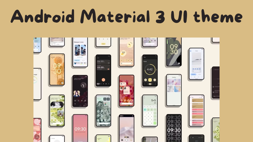
}Theming and Styling with Material3
Setting Up Material3
Add the dependency:
implementation("androidx.compose.material3:material3:1.2.0")Defining a Custom Theme
Define colors in Color.kt:
val PrimaryColor = Color(0xFF6200EE)
val SecondaryColor = Color(0xFF03DAC5)
And apply them in Theme.kt:
val myColorScheme = lightColorScheme(
    primary = PrimaryColor,
    secondary = SecondaryColor
)

@Composable
fun MyTheme(content: @Composable () -> Unit) {
    MaterialTheme(
        colorScheme = myColorScheme,
        typography = Typography(),
        content = content
    )
}
Conclusion
Jetpack Compose is an exciting evolution in Android UI development, simplifying layouts, interactions, and performance optimizations. Mastering navigation, state management, animations, and theming allows you to build more efficient, maintainable, and beautiful Android applications.