Jetpack Compose Animations Made Simple: A Complete Beginner-to-Pro Guide
Let’s be real — animations can feel intimidating at first. But once you understand how Jetpack Compose thinks about them, everything clicks into place.
Unlike the old View-based animation system (which involved XML files, ObjectAnimator, and a lot of boilerplate), Jetpack Compose animations are built right into the UI framework — they’re reactive, composable, and surprisingly intuitive.
Whether you’re building a simple button press effect or a complex multi-step transition, Compose gives you the right tool for every situation. This guide walks through every layer of the animation API — from the simplest one-liners to advanced choreography — with real, working code and honest explanations of why things work the way they do.
Prerequisites: Basic Kotlin knowledge and familiarity with Compose fundamentals (composables, state) is helpful but not mandatory. Every concept is explained from the ground up.
Why Jetpack Compose Animations Are a Game-Changer
Before Compose, adding animations to Android apps meant wrestling with AnimatorSet, writing XML animation resources, dealing with lifecycle issues, and hoping nothing crashed on API 21. It was doable, but painful.
Jetpack Compose animations completely rethink this. Because Compose is a declarative UI framework, animations are just another form of state change. You describe what the UI should look like, and Compose figures out how to smoothly get there. That mental model shift makes everything easier.
Here’s a quick side-by-side comparison:

How Compose Thinks About Animation
Think of it like this:
When state changes → Compose automatically animates the UI between old and new values.
Example:
Button size = small → user clicks → state changes → button grows smoothly
You don’t manually trigger animation frames. Compose does it for you.
Understanding this mental model will make everything else click. In Compose, your UI is a function of state:
UI = f(state) — When state changes, Compose re-renders the UI. Animations are just a smooth interpolation between two states over time. You don’t “run” an animation — you change state and tell Compose how to animate the transition.
The animation system in Compose has three layers, and it’s worth knowing which layer you’re working at:
Layer 1 — High-level APIs: AnimatedVisibility, AnimatedContent, Crossfade. These handle the most common cases with zero configuration needed.
Layer 2 — Value-based APIs: animate*AsState, updateTransition, InfiniteTransition. These animate specific values (Float, Dp, Color, etc.) that you then apply in your composables.
Layer 3 — Low-level APIs: Animatable, coroutine-based. Full manual control for complex sequencing, interruptions, or physics-based motion.
The golden rule: start at the highest level that solves your problem. Only go deeper when you genuinely need more control. Most production animations live happily in layers 1 and 2.
The Core Building Blocks
Before writing any animations, it helps to understand the main APIs you’ll actually use:
1. animate*AsState
For simple, one-off animations tied to a single value.
2. updateTransition
For animating multiple values based on the same state.
3. AnimatedVisibility
For showing and hiding composables with animation.
4. AnimatedContent
For switching between UI states.
5. rememberInfiniteTransition
For looping animations.
You don’t need all of them at once. Most real screens use 1–2 of these consistently.
animate*AsState — Your First Animation
This is the most common animation API you’ll use in everyday Jetpack Compose development. The idea is beautifully simple: instead of setting a value directly, you animate towards that value. Compose smoothly interpolates between the old value and the new one whenever the target changes.
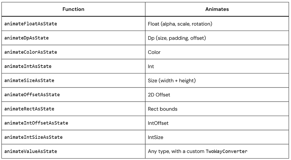
There are ready-made variants for the most common types: animateDpAsState, animateFloatAsState, animateColorAsState, animateSizeAsState, animateIntAsState, animateOffsetAsState, and more.
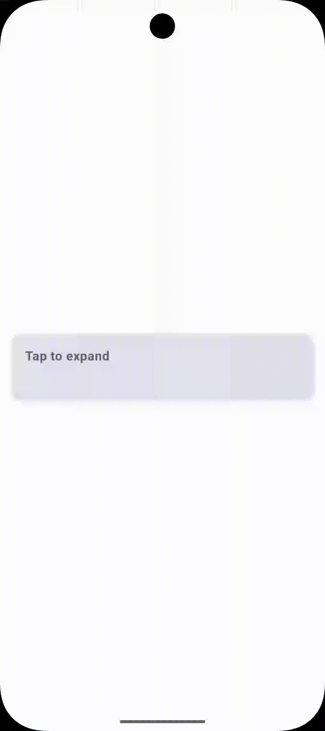
1. animateDpAsState — Smooth Size & Spacing Changes
Let’s say you have a card that expands when selected. Here’s how that looks with a Jetpack Compose animation:
@Composable
fun ExpandableCard() {
    // Track whether the card is selected
    var isExpanded by remember { mutableStateOf(false) }

    // Animate the height based on expanded state
    val cardHeight by animateDpAsState(
        targetValue = if (isExpanded) 200.dp else 80.dp,
        animationSpec = spring(
            dampingRatio = Spring.DampingRatioMediumBouncy,
            stiffness = Spring.StiffnessMedium
        ),
        label = "cardHeight"   // helps the debugger identify this animation
    )
    Card(
        modifier = Modifier
            .fillMaxWidth()
            .height(cardHeight)    // use the animated value here
            .clickable { isExpanded = !isExpanded },
        elevation = CardDefaults.cardElevation(8.dp)
    ) {
        Box(
            modifier = Modifier.padding(16.dp)
        ) {
            Text("Tap me to expand!")
        }
    }
}
Here, animateDpAsState watches isExpanded. Every time you tap the card, isExpanded flips, which gives animateDpAsState a new targetValue. Compose then smoothly interpolates the height from its current value to the new target. You didn’t write a single frame of the animation — Compose handled it all.

2. animateColorAsState — Smooth Color Transitions
Color animations are incredibly satisfying. Here’s a toggle button that shifts between two colours smoothly:
@Composable
fun ToggleButton() {
    var isActive by remember { mutableStateOf(false) }

    // Colour interpolates between green and grey
    val buttonColor by animateColorAsState(
        targetValue = if (isActive) Color(0xFF4ADE80) else Color(0xFF334155),
        animationSpec = tween(durationMillis = 400),
        label = "buttonColor"
    )

    // Text colour also animates
    val textColor by animateColorAsState(
        targetValue = if (isActive) Color.Black else Color.White,
        animationSpec = tween(durationMillis = 400),
        label = "textColor"
    )

    Button(
        onClick = { isActive = !isActive },
        colors = ButtonDefaults.buttonColors(containerColor = buttonColor)
    ) {
        Text(
            text = if (isActive) "Active ✓" else "Inactive",
            color = textColor,
            fontWeight = FontWeight.Bold
        )
    }
}
3. animateFloatAsState — Alpha, Rotation, Scale
animateFloatAsState is incredibly versatile because so many visual properties are floats — opacity, rotation, scale, and more. Here’s a smooth fade-and-scale animation for an icon:
@Composable
fun FadeScaleIcon(isVisible: Boolean) {
    val alpha by animateFloatAsState(
        targetValue = if (isVisible) 1f else 0f,
        animationSpec = tween(durationMillis = 300),
        label = "alpha"
    )

    val scale by animateFloatAsState(
        targetValue = if (isVisible) 1f else 0.5f,
        animationSpec = spring(
            dampingRatio = Spring.DampingRatioLowBouncy,
            stiffness = Spring.StiffnessLow
        ),
        label = "scale"
    )

    Icon(
        imageVector = Icons.Default.Notifications,
        contentDescription = "Notification",
        modifier = Modifier
            .graphicsLayer {
                this.alpha = alpha        // apply animated alpha
                this.scaleX = scale       // apply animated scale
                this.scaleY = scale
            },
        tint = Color(0xFF4ADE80)
    )
}
Always prefer
graphicsLayer { }overModifier.alpha()orModifier.scale()for animated properties.graphicsLayerruns on the RenderThread and doesn’t trigger recomposition for each frame, making it significantly more performant.
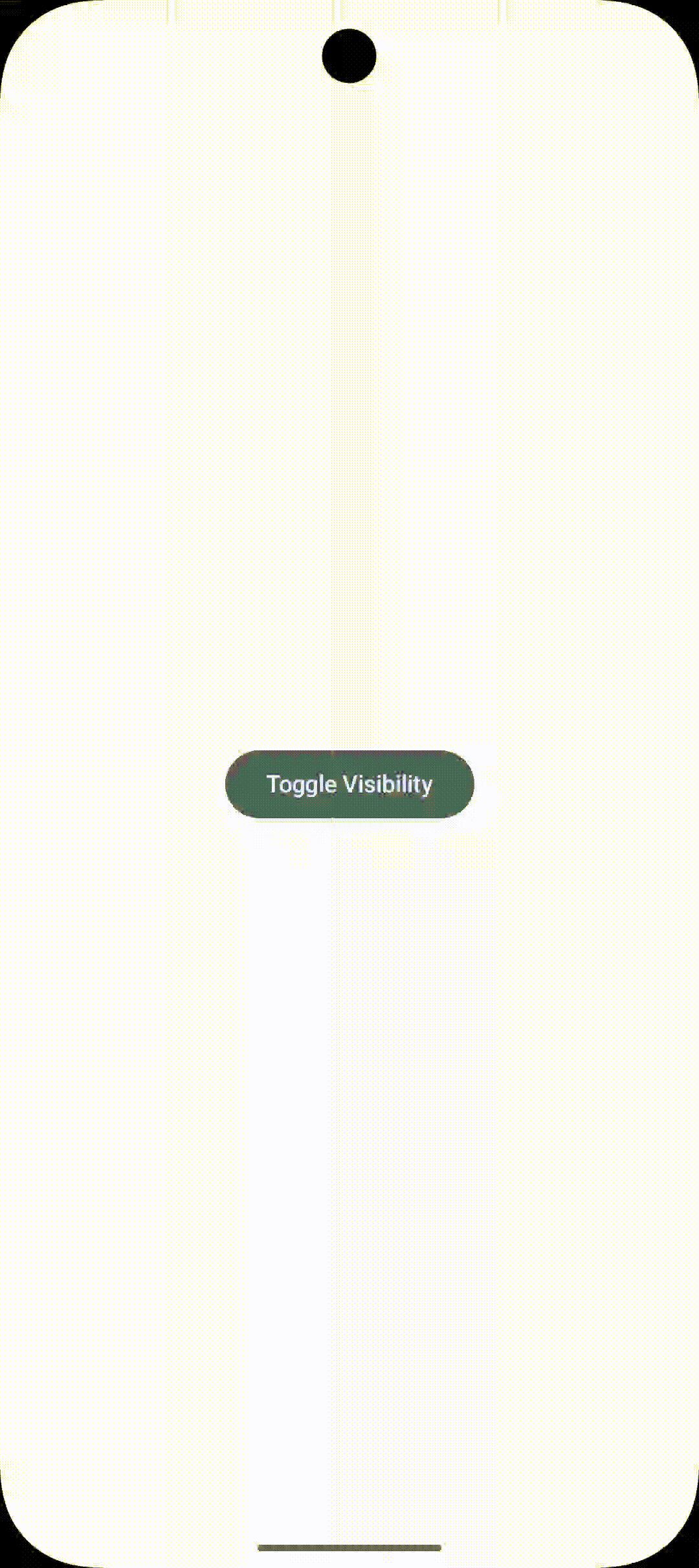
AnimatedVisibility — Show & Hide with Style
AnimatedVisibility is probably the most commonly used high-level Jetpack Compose animation API. It wraps a composable and animates its entrance and exit automatically. You just toggle a boolean.
@Composable
fun ErrorBanner(
    hasError: Boolean,
    message: String,
    onDismiss: (() -> Unit)? = null
) {
    AnimatedVisibility(
        visible = hasError,
        enter = slideInVertically(initialOffsetY = { -it }) + fadeIn(),
        exit = slideOutVertically(targetOffsetY = { -it }) + fadeOut()
    ) {
        Card(
            modifier = Modifier
                .fillMaxWidth()
                .padding(16.dp)
                .clickable(enabled = onDismiss != null) {
                    onDismiss?.invoke()
                },
            colors = CardDefaults.cardColors(
                containerColor = Color(0xFFEF4444)
            )
        ) {
            Text(
                text = message,
                color = Color.White,
                modifier = Modifier.padding(16.dp)
            )
        }
    }
}

@Preview(showBackground = true)
@Composable
fun ErrorBannerPreview() {
    var hasError by remember { mutableStateOf(false) }

    MaterialTheme {
        Box(
            modifier = Modifier.fillMaxSize(),
            contentAlignment = Alignment.Center
        ) {
            Column(horizontalAlignment = Alignment.CenterHorizontally) {

                Button(onClick = { hasError = !hasError }) {
                    Text("Show Error")
                }

                Spacer(modifier = Modifier.height(12.dp))

                ErrorBanner(
                    hasError = hasError,
                    message = "Something went wrong!",
                    onDismiss = { hasError = false }
                )
            }
        }
    }
}
The real power of AnimatedVisibility is how you can combine enter/exit transitions using the + operator. Here are all the available transitions you can mix and match:
fadeIn/fadeOutslideInHorizontally/slideOutHorizontallyslideInVertically/slideOutVerticallyexpandIn/shrinkOutexpandHorizontally/shrinkHorizontallyexpandVertically/shrinkVerticallyscaleIn/scaleOut
Using AnimatedVisibility Inside a List
One important nuance: when using AnimatedVisibility inside a LazyColumn, always provide stable key values so Compose can track item identity across recompositions:
@Composable
fun AnimatedListInteractive() {
    // Original list (source of truth)
    val allItems = remember {
        listOf("Apple", "Banana", "Cherry", "Date", "Elderberry")
    }

    // Track removed items
    val removedItems = remember { mutableStateListOf<String>() }

    LazyColumn {
        items(
            items = allItems,
            key = { it }
        ) { item ->

            val isRemoved = item in removedItems

            AnimatedVisibility(
                visible = !isRemoved,
                enter = expandVertically() + fadeIn(),
                exit = shrinkVertically() + fadeOut(),
                modifier = Modifier.animateItem()
            ) {
                ListItem(
                    headlineContent = { Text(item) },
                    modifier = Modifier
                        .fillMaxWidth()
                        .clickable {
                            removedItems.add(item) // trigger animation
                        }
                )
            }
        }
    }
}

@Preview(showBackground = true)
@Composable
fun AnimatedListPreview() {
    CenteredPreview {
        AnimatedListInteractive()
    }
}
Important: Without stable keys, Compose can’t track item identity across recompositions, and your exit animations will be silently skipped.

AnimatedContent — Swapping Composables Smoothly
AnimatedContent is like a supercharged version of AnimatedVisibility. Instead of showing or hiding content, it animates between different pieces of content as its target state changes. Think of it as an animated when expression.
A great example: a loading/content/error state machine where you want each state to visually transition into the next.
sealed class UiState {
    object Loading : UiState()
    data class Success(val data: String) : UiState()
    object Error : UiState()
}

@Composable
fun StatefulScreen(uiState: UiState) {
    AnimatedContent(
        targetState = uiState,
        transitionSpec = {
            // New content fades in + slides up
            // while old content fades out + slides down
            (fadeIn(animationSpec = tween(300)) +
             slideInVertically { it / 2 })
                .togetherWith(
                    fadeOut(animationSpec = tween(200)) +
                    slideOutVertically { -it / 2 }
                )
        },
        label = "stateTransition"
    ) { state ->
        when (state) {
            is UiState.Loading -> LoadingSpinner()
            is UiState.Success -> SuccessContent(state.data)
            is UiState.Error  -> ErrorMessage()
        }
    }
}
Key insight: Inside
AnimatedContent‘s lambda, thestateparameter is the target state being transitioned to. Both the entering and exiting composables exist simultaneously during the transition — that’s how the cross-fade and slide works.
Animating a Counter
A really satisfying use of AnimatedContent is an animated number counter. The number slides up when increasing and slides down when decreasing:
@Composable
fun AnimatedCounter(count: Int) {
    AnimatedContent(
        targetState = count,
        transitionSpec = {
            if (targetState > initialState) {
                // Counting up: slide in from bottom, slide out to top
                slideInVertically { it } + fadeIn() togetherWith
                slideOutVertically { -it } + fadeOut()
            } else {
                // Counting down: slide in from top, slide out to bottom
                slideInVertically { -it } + fadeIn() togetherWith
                slideOutVertically { it } + fadeOut()
            }
        },
        label = "counter"
    ) { targetCount ->
        Text(
            text = "$targetCount",
            style = MaterialTheme.typography.displayMedium,
            fontWeight = FontWeight.Bold
        )
    }
}
Crossfade — The Simplest Content Switch
When you just need to fade between two pieces of content (no sliding, no scaling), Crossfade is the right tool. It’s essentially a simplified AnimatedContent with a hardcoded fade transition — perfect for tab content swaps.
@Composable
fun TabScreen() {
    var selectedTab by remember { mutableStateOf(0) }

    Column {
        TabRow(selectedTabIndex = selectedTab) {
            Tab(selected = selectedTab == 0, onClick = { selectedTab = 0 }) {
                Text("Home", modifier = Modifier.padding(16.dp))
            }
            Tab(selected = selectedTab == 1, onClick = { selectedTab = 1 }) {
                Text("Profile", modifier = Modifier.padding(16.dp))
            }
        }
        Crossfade(
            targetState = selectedTab,
            animationSpec = tween(durationMillis = 350),
            label = "tabContent"
        ) { tab ->
            when (tab) {
                0 -> HomeContent()
                1 -> ProfileContent()
            }
        }
    }
}
updateTransition — Coordinating Multiple Animations
When you have multiple animated values that all change together based on the same state, updateTransition is the right tool. It creates a single transition object that you can attach multiple animated properties to — all synchronized, all driven by the same state.
Think of it as a conductor for your animation orchestra.
enum class FabState { Collapsed, Expanded }

@Composable
fun AnimatedFAB() {
    var fabState by remember { mutableStateOf(FabState.Collapsed) }
    // One transition drives all the properties below
    val transition = updateTransition(
        targetState = fabState,
        label = "fabTransition"
    )
    val fabSize by transition.animateDp(
        label = "fabSize",
        transitionSpec = { spring(stiffness = Spring.StiffnessMediumLow) }
    ) { state ->
        if (state == FabState.Expanded) 180.dp else 56.dp
    }

    val cornerRadius by transition.animateDp(
        label = "cornerRadius"
    ) { state ->
        if (state == FabState.Expanded) 16.dp else 28.dp
    }

    val backgroundColor by transition.animateColor(
        label = "backgroundColor"
    ) { state ->
        if (state == FabState.Expanded)
            Color(0xFF4ADE80)
        else
            Color(0xFF6366F1)
    }

    val textAlpha by transition.animateFloat(
        label = "textAlpha",
        transitionSpec = { tween(durationMillis = 200) }
    ) { state ->
        if (state == FabState.Expanded) 1f else 0f
    }

    Surface(
        modifier = Modifier
            .width(fabSize)
            .height(56.dp)
            .clickable {
                fabState = if (fabState == FabState.Collapsed)
                    FabState.Expanded else FabState.Collapsed
            },
        shape = RoundedCornerShape(cornerRadius),
        color = backgroundColor,
        shadowElevation = 6.dp
    ) {
        Row(
            modifier = Modifier.padding(horizontal = 16.dp),
            verticalAlignment = Alignment.CenterVertically,
            horizontalArrangement = Arrangement.Center
        ) {
            Icon(Icons.Default.Add, contentDescription = "Add")
            Text(
                text = "  Create New",
                modifier = Modifier.alpha(textAlpha)
            )
        }
    }
}
Why
updateTransitionover multipleanimate*AsState? Because all child animations share the same progress. They all start and finish together, which means your animations are inherently synchronized. With separateanimate*AsStatecalls, timing can drift if the state changes rapidly.
InfiniteTransition — Looping Animations Forever
InfiniteTransition is for animations that run continuously — loading spinners, pulsing indicators, shimmer effects, breathing animations. Once started, they loop until the composable leaves the composition.
@Composable
fun PulsingDot() {
    val infiniteTransition = rememberInfiniteTransition(label = "pulse")

    val scale by infiniteTransition.animateFloat(
        initialValue = 0.85f,
        targetValue = 1.15f,
        animationSpec = infiniteRepeatable(
            animation = tween(durationMillis = 700, easing = FastOutSlowInEasing),
            repeatMode = RepeatMode.Reverse   // ping-pong back and forth
        ),
        label = "dotScale"
    )

    val alpha by infiniteTransition.animateFloat(
        initialValue = 0.4f,
        targetValue = 1f,
        animationSpec = infiniteRepeatable(
            animation = tween(durationMillis = 700),
            repeatMode = RepeatMode.Reverse
        ),
        label = "dotAlpha"
    )

    Box(
        modifier = Modifier
            .size(20.dp)
            .graphicsLayer {
                scaleX = scale
                scaleY = scale
                this.alpha = alpha
            }
            .background(Color(0xFF4ADE80), shape = CircleShape)
    )
}
Building a Shimmer Loading Effect
Shimmer placeholders are a staple of modern app design. Here’s how to build one from scratch using InfiniteTransition and a gradient — as a reusable Modifier extension:
@Composable
fun Modifier.shimmerEffect(): Modifier {
val transition = rememberInfiniteTransition(label = "shimmer")
val offset by transition.animateFloat(
initialValue = -300f,
targetValue = 1000f,
animationSpec = infiniteRepeatable(
animation = tween(durationMillis = 1200, easing = LinearEasing)
),
label = "shimmerOffset"
)
return background(
brush = Brush.linearGradient(
colors = listOf(
Color(0xFF1E293B),
Color(0xFF334155),
Color(0xFF1E293B)
),
start = Offset(offset, 0f),
end = Offset(offset + 300f, 0f)
)
)
}
// Usage: apply to any placeholder composable
@Composable
fun ShimmerCard() {
Column(modifier = Modifier.padding(16.dp)) {
Box(modifier = Modifier
.fillMaxWidth().height(160.dp).clip(RoundedCornerShape(12.dp))
.shimmerEffect())
Spacer(Modifier.height(12.dp))
Box(modifier = Modifier
.fillMaxWidth(0.7f).height(16.dp).clip(RoundedCornerShape(4.dp))
.shimmerEffect())
Spacer(Modifier.height(8.dp))
Box(modifier = Modifier
.fillMaxWidth(0.5f).height(16.dp).clip(RoundedCornerShape(4.dp))
.shimmerEffect())
}
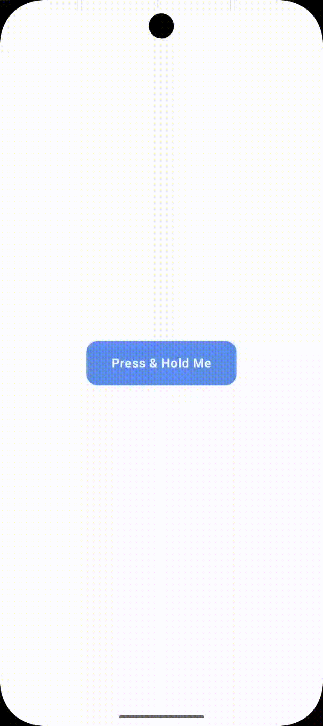
}Animatable — Full Manual Control
Animatable is the lowest-level animation primitive in Compose. It’s coroutine-based, which means you control exactly when animations start, stop, or get interrupted. Use it when the high-level APIs don’t give you enough control — for example, when you need animations triggered by gestures, sequenced one after another, or interrupted mid-flight.
@Composable
fun ShakeOnErrorField(hasError: Boolean) {
    // Animatable holds the current value and lets us animate it imperatively
    val offsetX = remember { Animatable(0f) }

    // LaunchedEffect runs in a coroutine - perfect for Animatable
    LaunchedEffect(hasError) {
        if (hasError) {
            // Sequence of animations: shake left, right, left, right, settle
            repeat(4) {
                offsetX.animateTo(
                    targetValue = if (it % 2 == 0) 10f else -10f,
                    animationSpec = tween(durationMillis = 50)
                )
            }
            offsetX.animateTo(0f) // settle back to centre
        }
    }

    TextField(
        value = "",
        onValueChange = {},
        isError = hasError,
        modifier = Modifier
            .offset(x = offsetX.value.dp)
            .fillMaxWidth()
    )
}
Animatable for Gesture-Driven Motion
One of Animatable‘s superpowers is handling interruptions gracefully. If a new gesture starts while an animation is running, you can snapTo the current gesture position without a jarring jump:
@Composable
fun DraggableCard() {
    val offsetX = remember { Animatable(0f) }
    val scope = rememberCoroutineScope()

    Card(
        modifier = Modifier
            .offset { IntOffset(offsetX.value.roundToInt(), 0) }
            .pointerInput(Unit) {
                detectHorizontalDragGestures(
                    onDragStart = {
                        // Stop any running animation when user grabs the card
                        scope.launch { offsetX.stop() }
                    },
                    onDragEnd = {
                        scope.launch {
                            // Spring back to centre when finger lifts
                            offsetX.animateTo(
                                targetValue = 0f,
                                animationSpec = spring(
                                    dampingRatio = Spring.DampingRatioMediumBouncy
                                )
                            )
                        }
                    },
                    onHorizontalDrag = { _, dragAmount ->
                        scope.launch {
                            offsetX.snapTo(offsetX.value + dragAmount)
                        }
                    }
                )
            }
    ) {
        Text("Drag me!", modifier = Modifier.padding(24.dp))
    }
}
Springs, Tweens & Easing Curves Explained
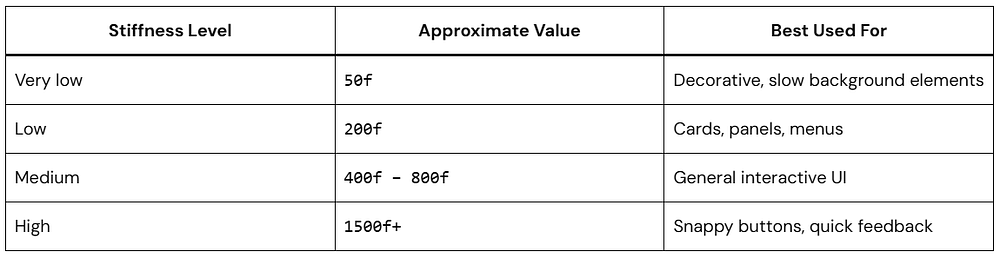
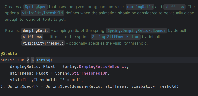
Every Jetpack Compose animation needs an animationSpec — it defines how the animation moves from A to B. There are several types, and picking the right one makes a huge difference in how your UI feels.
spring() — Physics-Based & Interruptible
Springs are the default for most interactive animations because they feel natural and handle interruptions gracefully. A spring has two key parameters:
dampingRatio — Controls bounciness.
1f = no bounce (critically damped).
0.5f = bouncy.
Compose provides presets: Spring.DampingRatioNoBouncy, Spring.DampingRatioLowBouncy, Spring.DampingRatioMediumBouncy, Spring.DampingRatioHighBouncy.
stiffness — Controls speed.
High stiffness = snappy and fast.
Low stiffness = slow and floaty.
Presets: Spring.StiffnessHigh, Spring.StiffnessMedium, Spring.StiffnessLow, Spring.StiffnessVeryLow.
// Snappy, no bounce — good for UI chrome (drawers, panels)
spring(
    dampingRatio = Spring.DampingRatioNoBouncy,
    stiffness = Spring.StiffnessMedium
)

// Playful bounce - good for FABs, chips, selection indicators
spring(
    dampingRatio = Spring.DampingRatioMediumBouncy,
    stiffness = Spring.StiffnessMedium
)

// Slow, floaty - good for hero transitions, large-format elements
spring(
    dampingRatio = Spring.DampingRatioLowBouncy,
    stiffness = Spring.StiffnessVeryLow
)
tween() — Duration-Based with Easing
Use tween when you need precise control over timing — particularly for coordinated multi-step animations where things need to arrive at specific moments.
// Standard eased animation — most general-purpose use
tween(durationMillis = 300, easing = FastOutSlowInEasing)

// Linear - good for progress bars, shimmer effects
tween(durationMillis = 1200, easing = LinearEasing)

// Delayed start - for staggered entrance animations
tween(durationMillis = 400, delayMillis = 150, easing = EaseOutBack)

// Custom cubic bezier easing curve
tween(
    durationMillis = 500,
    easing = CubicBezierEasing(0.25f, 0.1f, 0.25f, 1f)
)
keyframes() — Frame-Precise Control
keyframes lets you define exactly what value the animation should hit at specific points in time. It’s like an animator’s timeline — perfect when you need a bouncy overshoot or a stutter effect.
val size by animateDpAsState(
    targetValue = targetSize,
    animationSpec = keyframes {
        durationMillis = 600
        40.dp at 0            // start at 40dp
        80.dp at 100          // shoot up to 80dp at 100ms
        60.dp at 300          // bounce back to 60dp at 300ms
        70.dp at 500          // settle towards 70dp
    },
    label = "bounceSize"
)
Quick Reference Table

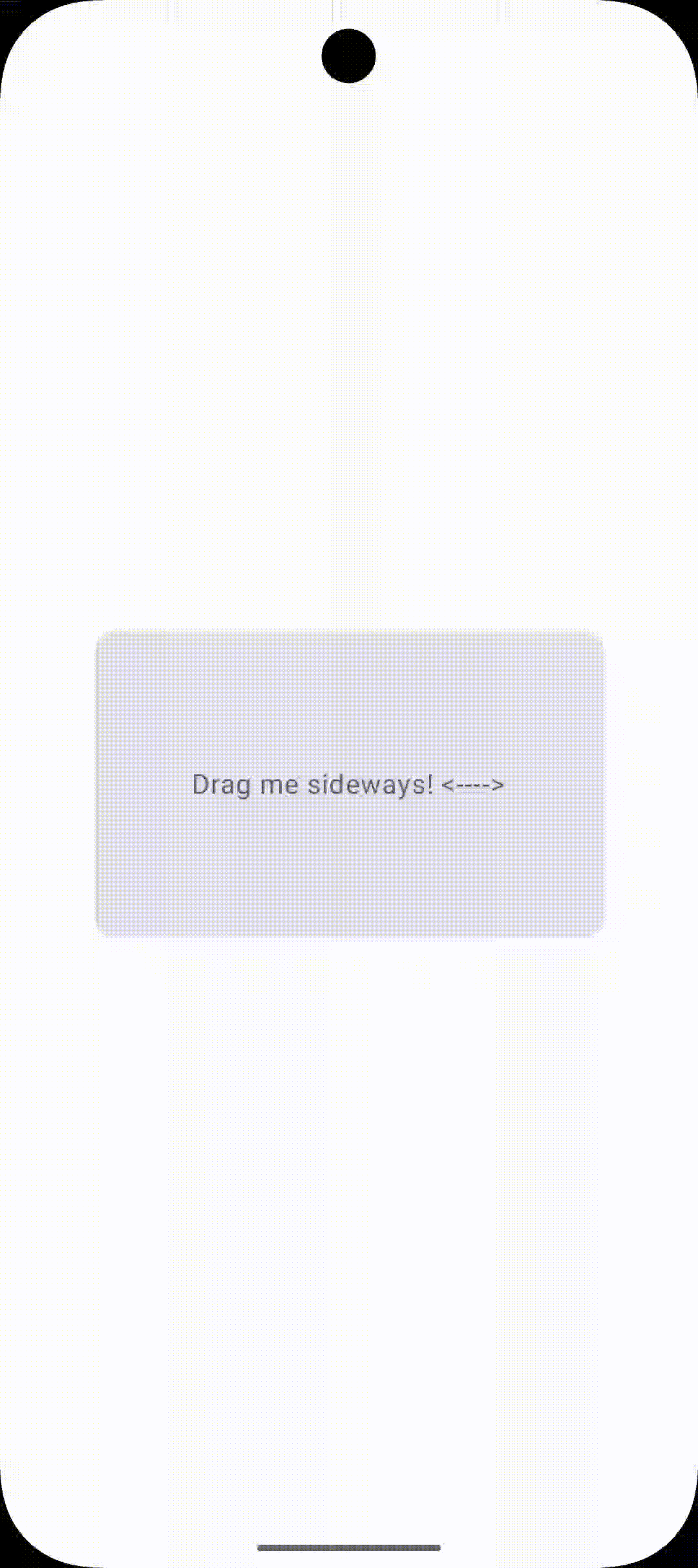
Gesture-Driven Animations
The best mobile animations respond directly to touch. Gesture-driven Jetpack Compose animations feel alive because they track the user’s finger position — they don’t just trigger on events, they continuously follow input.
Here’s a swipe-to-dismiss card commonly seen in notification screens and task managers:
@Composable
fun SwipeToDeleteCard(onDismiss: () -> Unit) {
    val offsetX = remember { Animatable(0f) }
    val scope = rememberCoroutineScope()
    val density = LocalDensity.current

    // Threshold: 40% of screen width triggers dismiss
    val screenWidth = with(density) { LocalConfiguration.current.screenWidthDp.dp.toPx() }
    val threshold = screenWidth * 0.4f

    // Derive alpha from position for a natural fade-out as you swipe
    val alpha = (1f - (abs(offsetX.value) / threshold)).coerceIn(0f, 1f)

    Box(
        modifier = Modifier
            .offset { IntOffset(offsetX.value.roundToInt(), 0) }
            .alpha(alpha)
            .pointerInput(Unit) {
                detectHorizontalDragGestures(
                    onDragEnd = {
                        scope.launch {
                            if (abs(offsetX.value) > threshold) {
                                // Fly off screen, then call onDismiss
                                offsetX.animateTo(
                                    targetValue = if (offsetX.value > 0) screenWidth else -screenWidth,
                                    animationSpec = tween(200)
                                )
                                onDismiss()
                            } else {
                                // Snap back if under threshold
                                offsetX.animateTo(0f, spring(Spring.DampingRatioMediumBouncy))
                            }
                        }
                    },
                    onHorizontalDrag = { _, dragAmount ->
                        scope.launch { offsetX.snapTo(offsetX.value + dragAmount) }
                    }
                )
            }
    ) {
        Card(modifier = Modifier.fillMaxWidth()) {
            Text("Swipe me to dismiss →", modifier = Modifier.padding(24.dp))
        }
    }
}
Shared Element Transitions (Compose 1.7+)
Shared element transitions are one of the most visually impressive patterns in mobile UI — a card expands into a detail screen, or an image flies from a list into a full-screen view. In the old View system, this was notoriously painful. In Compose 1.7+, it’s finally approachable.
Requires:
androidx.compose.animation:animation:1.7.0+and usingSharedTransitionLayoutwith Navigation Compose or manual visibility management.
@Composable
fun SharedElementDemo() {
    var showDetail by remember { mutableStateOf(false) }

    SharedTransitionLayout {
        AnimatedContent(
            targetState = showDetail,
            label = "sharedElement"
        ) { isDetail ->
            if (!isDetail) {
                // List item card
                Card(
                    modifier = Modifier
                        .size(120.dp)
                        .clickable { showDetail = true },
                ) {
                    Image(
                        painter = painterResource(R.drawable.hero_image),
                        contentDescription = null,
                        modifier = Modifier
                            .sharedElement(
                                state = rememberSharedContentState(key = "hero_image"),
                                animatedVisibilityScope = this@AnimatedContent
                            )
                            .fillMaxSize(),
                        contentScale = ContentScale.Crop
                    )
                }
            } else {
                // Full-screen detail view
                Column(modifier = Modifier
                    .fillMaxSize()
                    .clickable { showDetail = false }
                ) {
                    Image(
                        painter = painterResource(R.drawable.hero_image),
                        contentDescription = null,
                        modifier = Modifier
                            .sharedElement(
                                state = rememberSharedContentState(key = "hero_image"),
                                animatedVisibilityScope = this@AnimatedContent
                            )
                            .fillMaxWidth()
                            .height(300.dp),
                        contentScale = ContentScale.Crop
                    )
                    Text("Detail content here", modifier = Modifier.padding(16.dp))
                }
            }
        }
    }
}
The key concept: Both composables reference the same
keyinrememberSharedContentState. Compose automatically detects this and morphs the element from its position/size in the source to its position/size in the destination. The element literally flies across the screen.
Performance Tips & Best Practices
Smooth animations are 60fps animations. Here’s how to make sure your Jetpack Compose animations never drop a frame.
Use graphicsLayer for Transform Animations
Always animate transforms (scale, rotation, alpha, translation) using graphicsLayer rather than layout modifiers. graphicsLayer runs on the RenderThread and doesn’t cause recomposition.
// Causes recomposition every frame — avoid for animated values
Modifier.scale(animatedScale)  // triggers layout pass

// Runs on RenderThread - no recomposition needed
Modifier.graphicsLayer {
    scaleX = animatedScale
    scaleY = animatedScale
}
Always Provide the label Parameter
The label parameter on every animation API might seem optional, but it makes the Animation Inspector in Android Studio actually usable. Always provide it — it takes two seconds and saves minutes of debugging.
Use animateItem() for LazyList Reordering (Compose 1.7+)
LazyColumn {
    items(items, key = { it.id }) { item ->
        ListItem(
            headlineContent = { Text(item.title) },
            modifier = Modifier.animateItem() // handles add/remove/reorder
        )
    }
}
Avoid Animating Layout Properties in Lists
Animating height or width inside a LazyColumn item forces a full list measurement pass each frame. Use graphicsLayer { scaleY = ... } as an approximation, or use AnimatedVisibility‘s built-in expandVertically/shrinkVertically which is optimised for this.
Respect Reduce Motion
Check LocalAccessibilityManager.current.isAnimationEnabled and respect the system’s “Reduce Motion” setting. Some users have vestibular disorders that make motion sickness a real issue.
Test on Real Devices
Emulators lie about performance. Always test animations on a mid-range physical device — if it’s smooth there, you’re good everywhere.
Real-World Animation Patterns You Can Steal
Bottom Sheet Peek Animation
@Composable
fun PeekBottomSheet(isExpanded: Boolean) {
    val sheetHeight by animateDpAsState(
        targetValue = if (isExpanded) 400.dp else 80.dp,
        animationSpec = spring(
            dampingRatio = Spring.DampingRatioNoBouncy,
            stiffness = Spring.StiffnessMediumLow
        ),
        label = "sheetHeight"
    )

    val handleAlpha by animateFloatAsState(
        targetValue = if (isExpanded) 0f else 1f,
        label = "handleAlpha"
    )

    Surface(
        modifier = Modifier
            .fillMaxWidth()
            .height(sheetHeight),
        shape = RoundedCornerShape(topStart = 20.dp, topEnd = 20.dp),
        shadowElevation = 8.dp
    ) {
        Column(horizontalAlignment = Alignment.CenterHorizontally) {
            Box(
                modifier = Modifier
                    .padding(top = 12.dp)
                    .size(width = 40.dp, height = 4.dp)
                    .background(Color.Gray.copy(alpha = handleAlpha), RoundedCornerShape(2.dp))
            )
        }
    }
}
Staggered List Entrance
A staggered entrance is when list items animate in one after another with a slight delay between each. It’s the difference between an “okay” app and a polished one:
@Composable
fun StaggeredItem(index: Int, content: @Composable () -> Unit) {
    var visible by remember { mutableStateOf(false) }

    LaunchedEffect(Unit) {
        // Each item starts its animation 60ms after the previous
        delay(index * 60L)
        visible = true
    }

    AnimatedVisibility(
        visible = visible,
        enter = fadeIn(animationSpec = tween(300)) +
                slideInVertically(
                    animationSpec = spring(Spring.DampingRatioLowBouncy),
                    initialOffsetY = { it / 2 }
                )
    ) {
        content()
    }
}

// Usage
@Composable
fun AnimatedFeed(items: List<FeedItem>) {
    LazyColumn {
        itemsIndexed(items) { index, item ->
            StaggeredItem(index = index) {
                FeedCard(item)
            }
        }
    }
}
Animated Progress Button
A button that transforms into a loading indicator on click — combining multiple animations under one updateTransition:
enum class ButtonState { Idle, Loading, Success }

@Composable
fun AnimatedProgressButton(
    state: ButtonState,
    onClick: () -> Unit
) {
    val transition = updateTransition(state, label = "btnTransition")
    val width by transition.animateDp(label = "btnWidth") {
        when (it) {
            ButtonState.Idle    -> 200.dp
            ButtonState.Loading -> 56.dp   // collapses to a circle
            ButtonState.Success -> 200.dp
        }
    }

    val color by transition.animateColor(label = "btnColor") {
        when (it) {
            ButtonState.Idle    -> Color(0xFF6366F1)  // indigo
            ButtonState.Loading -> Color(0xFF475569)  // grey
            ButtonState.Success -> Color(0xFF4ADE80)  // green
        }
    }

    Surface(
        modifier = Modifier
            .width(width)
            .height(56.dp)
            .clickable(enabled = state == ButtonState.Idle) { onClick() },
        shape = RoundedCornerShape(28.dp),
        color = color
    ) {
        Box(contentAlignment = Alignment.Center) {
            when (state) {
                ButtonState.Idle    -> Text("Submit", color = Color.White)
                ButtonState.Loading -> CircularProgressIndicator(
                    modifier = Modifier.size(24.dp),
                    color = Color.White, strokeWidth = 2.dp
                )
                ButtonState.Success -> Icon(Icons.Default.Check, null, tint = Color.White)
            }
        }
    }
}
Conclusion
From simple one-liner animate*AsState calls to choreographed multi-step transitions and gesture-driven physics — you now have the full picture of how Jetpack Compose animations work and when to use each API.
The biggest takeaway? Start at the highest API level that solves your problem, and only go deeper when you genuinely need more control. Most apps live happily in the AnimatedVisibility and animate*AsState layer, and that’s completely fine.
Now the best thing to do is open Android Studio and start experimenting. Animations are one of those things that click much faster in practice than in theory. Build something, ship it, and enjoy watching your users smile.