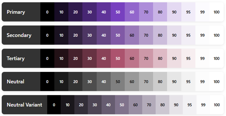
If you’ve been diving into modern Android development, you’ve probably heard the buzz about Material Design 3 (also known as Material You) and Jetpack Compose. Today, we’re going to explore one of the most powerful yet underappreciated features that ties them together: Design Tokens. Understanding Design Tokens in Material 3 and Jetpack Compose will transform...
Creating a polished Android app starts with one crucial decision: your app’s visual identity. If you’ve been wondering how to make your Jetpack Compose app look consistent and professional across every screen, you’re in the right place. In this guide, I’ll walk you through building a Custom App Theme in Jetpack Compose using Material 3....
When building apps with Jetpack Compose, you’ll often pass data down through multiple layers of composables. At first, this feels fine. But as your UI grows, you may find yourself passing the same parameter through five or six functions just to reach a deeply nested child. That pattern is called prop drilling. It works, but...
Have you ever wondered how Android apps magically match your wallpaper colors? Or how Material Design creates those perfectly harmonious color palettes that just work?
That’s the magic of Material 3’s dynamic color system, and today, we’re diving deep into how it all comes together using Kotlin and Jetpack Compose.
By the end of this guide, you’ll understand exactly how the Material 3 colorScheme works, how to implement it in your Android apps with Kotlin, and how to harness the power of dynamic theming to create stunning user interfaces that feel personal and cohesive.
Let’s get started..!
What Is Material 3 ColorScheme?
The Material 3 colorScheme is Google’s revolutionary approach to app theming that goes way beyond simple primary and secondary colors. Think of it as a complete color system that automatically generates a harmonious palette of colors designed to work together beautifully.
Here’s what makes it special:
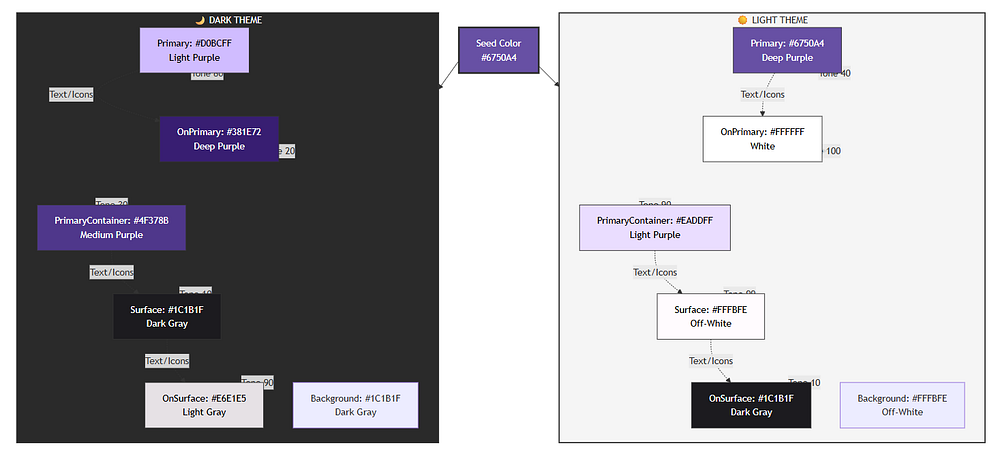
Dynamic Color Generation: Instead of manually picking dozens of color shades, the Material 3 colorScheme generates an entire palette from a single seed color. This means you get consistent, accessible, and visually appealing colors without the guesswork.
Adaptive Theming: The system automatically adjusts for light and dark modes, ensuring your app looks great in any setting.
Wallpaper Integration: On Android 12 and above, your app can automatically extract colors from the user’s wallpaper, creating a truly personalized experience.
Accessibility Built-In: Every color in the Material 3 colorScheme meets WCAG (Web Content Accessibility Guidelines) accessibility standards when used correctly, so you don’t have to worry about contrast ratios.
Understanding Dynamic Color: The Foundation
Dynamic color is the heart of Material 3 on Android. But what exactly is it?
Imagine your phone’s wallpaper is a beautiful sunset with warm orange and purple tones. With dynamic color, your apps can extract those colors and build their entire theme around them. It’s personalization taken to the next level.
How Dynamic Color Works on Android
The process is actually quite elegant:
Color Extraction: The system analyzes your wallpaper using the Monet color system
Palette Generation: Using color science algorithms, it creates a full tonal palette
Role Assignment: Colors are assigned to specific UI roles (more on this shortly)
Adaptation: The scheme automatically adapts for light and dark themes
The beauty of the Material 3 colorScheme is that all this complexity is handled for you in Jetpack Compose. You just need to understand how to use it.
The Color Roles: Your New Best Friends
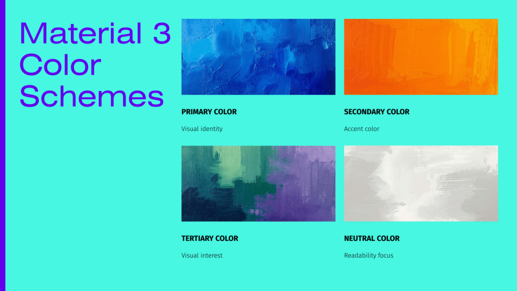
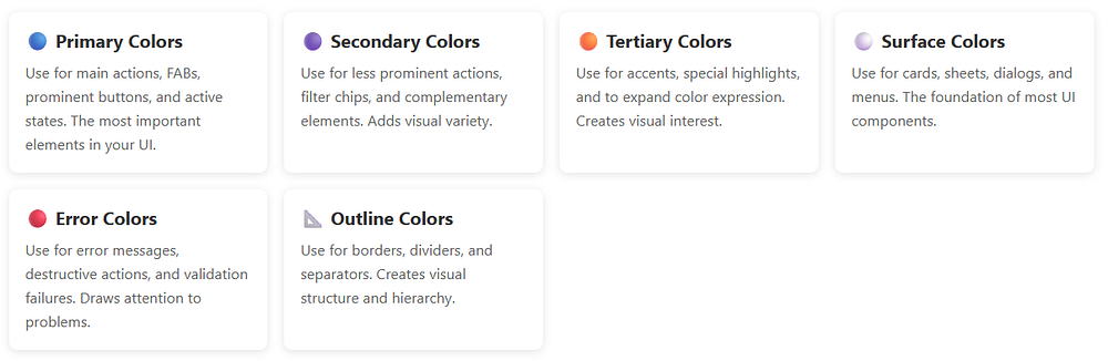
Here’s where Material 3 gets really interesting. Instead of thinking in terms of “primary,” “secondary,” and “tertiary” colors alone, the Material 3 colorScheme introduces color roles.
Think of color roles as jobs that colors perform in your UI. Let’s break down the main players:
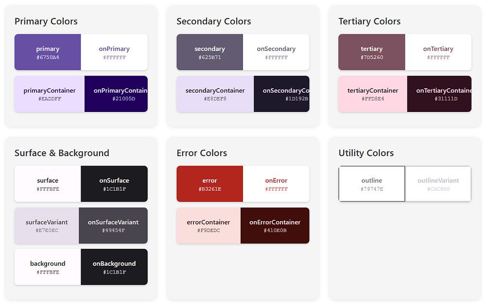
Primary Colors
Primary: This is your brand color, the star of the show. It appears on prominent buttons and active states.
OnPrimary: Text and icons that sit on top of the primary color. The Material 3 colorScheme ensures this has enough contrast to be readable.
PrimaryContainer: A lighter (or darker in dark mode) version used for less prominent components.
OnPrimaryContainer: Text that appears on primary containers.
Secondary Colors
Secondary: Provides visual variety and highlights less prominent components.
OnSecondary: You guessed it — text on secondary colors.
SecondaryContainer: For chips, cards, and other contained elements.
OnSecondaryContainer: Text on those containers.
Tertiary Colors
Tertiary: Adds even more variety, often used for accents and special highlights.
OnTertiary, TertiaryContainer, OnTertiaryContainer: Following the same pattern.
Surface and Background Colors
Surface: The background color for cards, sheets, and menus.
OnSurface: Text and icons on surfaces.
SurfaceVariant: Alternative surface with subtle differences.
OnSurfaceVariant: Text with lower emphasis.
Background: The main background of your app.
OnBackground: Primary text on the background.
Error Colors
Error: For error states and destructive actions.
OnError: Text on error colors.
ErrorContainer: Background for error messages.
OnErrorContainer: Text in error containers.
Special Roles
Outline: Borders and dividers.
OutlineVariant: Subtle borders.
Scrim: Semi-transparent overlays.
InverseSurface, InverseOnSurface, InversePrimary: For high-contrast elements like tooltips.
SurfaceTint: Used for elevation overlays in Material 3.
Phew! That’s a lot of colors, right..?
But here’s the magic: the Material 3 colorScheme generates all of these automatically, ensuring they work harmoniously together.
In short, a typical Material 3 colorScheme includes:
primary – main brand color
onPrimary – content placed on primary
secondary – supporting color
tertiary – optional accent color
background – app background
surface – cards and sheets
error – error states
onSurface – text/icons on surfaces
Each color has a paired onColor to guarantee readability.
This pairing is key to accessibility.
Setting Up Your Kotlin Project
Before we dive into code, let’s make sure your Android project is ready for Material 3.
Adding Dependencies
First, add the necessary dependencies to your build.gradle.kts (Module level):
Kotlin
dependencies {// Jetpack Compose BOM (Bill of Materials)implementation(platform("androidx.compose:compose-bom:2024.02.00"))// Material 3implementation("androidx.compose.material3:material3")// Other Compose dependenciesimplementation("androidx.compose.ui:ui")implementation("androidx.compose.ui:ui-tooling-preview")implementation("androidx.activity:activity-compose:1.8.2")// Core KTXimplementation("androidx.core:core-ktx:1.12.0")// Lifecycleimplementation("androidx.lifecycle:lifecycle-runtime-ktx:2.7.0")}
Problem: Compose previews show incorrect or default colors.
Solution: Always wrap preview content in your theme:
Kotlin
@Preview@ComposablefunMyComposablePreview() {MyAppTheme { // Never forget the theme wrapper!MyComposable() }}
Issue 4: System Bars Not Matching Theme
Problem: Status bar and navigation bar don’t match app theme.
Solution: Update system bars in your theme composable:
Kotlin
val view = LocalView.currentif (!view.isInEditMode) {SideEffect {val window = (view.context as Activity).window// Set status bar color window.statusBarColor = colorScheme.surface.toArgb()// Set navigation bar color window.navigationBarColor = colorScheme.surface.toArgb()// Adjust icon colors WindowCompat.getInsetsController(window, view).apply { isAppearanceLightStatusBars = !darkTheme isAppearanceLightNavigationBars = !darkTheme } }}
Issue 5: Gradle Build Errors
Problem: Cannot resolve Material 3 symbols.
Solution: Ensure you have the correct dependencies:
Kotlin
dependencies {// Use BOM for version managementimplementation(platform("androidx.compose:compose-bom:2024.02.00"))implementation("androidx.compose.material3:material3")// Or specify version explicitlyimplementation("androidx.compose.material3:material3:1.2.0")}
val colorScheme = MaterialTheme.colorScheme// Primary colorscolorScheme.primary // Main brand colorcolorScheme.onPrimary // Text on primarycolorScheme.primaryContainer // Lighter primary variantcolorScheme.onPrimaryContainer // Text on primary container// Secondary colorscolorScheme.secondary // Secondary accentcolorScheme.onSecondary // Text on secondarycolorScheme.secondaryContainer // Lighter secondarycolorScheme.onSecondaryContainer // Text on secondary container// Tertiary colorscolorScheme.tertiary // Third accent colorcolorScheme.onTertiary // Text on tertiarycolorScheme.tertiaryContainer // Lighter tertiarycolorScheme.onTertiaryContainer // Text on tertiary container// Surface and backgroundcolorScheme.surface // Card/sheet backgroundcolorScheme.onSurface // Text on surfacescolorScheme.surfaceVariant // Alternative surfacecolorScheme.onSurfaceVariant // Text on surface variantcolorScheme.background // Main app backgroundcolorScheme.onBackground // Text on background// Error colorscolorScheme.error // Error state colorcolorScheme.onError // Text on errorcolorScheme.errorContainer // Error message backgroundcolorScheme.onErrorContainer // Text in error messages// Utility colorscolorScheme.outline // Borders and dividerscolorScheme.outlineVariant // Subtle borderscolorScheme.surfaceTint // Elevation tint (usually primary)colorScheme.scrim // Semi-transparent overlays// Inverse colors (for tooltips, snackbars)colorScheme.inverseSurface // High-contrast surfacecolorScheme.inverseOnSurface // Text on inverse surfacecolorScheme.inversePrimary // Primary color on inverse surface
The Material 3 colorScheme is a game-changer for Android app theming. It takes the complexity out of color design and gives you a robust, accessible, and beautiful color system right out of the box.
Here’s what we’ve covered:
Understanding: The Material 3 colorScheme generates complete, harmonious palettes from seed colors or wallpaper
Color Roles: Semantic color names ensure accessibility and visual consistency
Implementation: Simple Kotlin setup with Jetpack Compose and dynamic color support
Dynamic Color: Apps automatically match user wallpapers on Android 12+ for personalized experiences
Best Practices: Use semantic colors, test both themes, provide fallbacks, and optimize performance
Real Examples: Production-ready Kotlin code you can use in your projects immediately
Troubleshooting: Solutions to common issues developers face
The beauty of the Material 3 colorScheme is that it makes professional color design accessible to everyone. You don’t need to be a color theory expert to create stunning, accessible Android apps.
Getting Started Today
Start your next Android project by:
Adding Dependencies: Include Material 3 in your build.gradle.kts
Creating Your Theme: Set up lightColorScheme() and darkColorScheme() in Theme.kt
Enabling Dynamic Color: Support Android 12+ wallpaper theming
Using Semantic Colors: Reference MaterialTheme.colorScheme throughout your composables
Testing Thoroughly: Preview in both light and dark modes
The Material 3 colorScheme handles the complexity of color science, accessibility, and harmonization so you can focus on building amazing user experiences. And that’s what makes it so powerful.
If you’re building Android apps with Jetpack Compose, chances are you’ve already used Compose Preview. Or at least clicked the little Preview tab in Android Studio and hoped it would magically show your UI.
Sometimes it does. Sometimes it doesn’t.
In this blog, we’ll break down Compose Preview, covering everything from core mechanics to practical tips. You’ll learn:
What Compose Preview actually is
How it works under the hood
Why it matters for real-world development
Where it struggles and why
When to trust it and when not to
Let’s start with the basics.
What Is Compose Preview?
Compose Preview is a design-time tool in Android Studio that lets you see your Jetpack Compose UI without running the app on a device or emulator.
It renders composable functions directly inside the IDE.
That means:
Faster feedback
No APK install
No waiting for Gradle every time you tweak padding or text size
In short, Compose Preview helps you design UI faster.
@Preview tells Android Studio: Render this composable
showBackground = true adds a white background so text is readable
GreetingPreview() supplies sample data ("Android")
This preview function is not used in production. It exists only for design-time visualization.
That’s an important detail many beginners miss.
How Compose Preview Works Behind the Scenes
Compose Preview does not run your full app.
Instead, Android Studio:
Compiles the composable function
Runs it in a special design-time environment
Skips most Android framework components
Renders the UI using sample data
That’s why previews are fast.
And that’s also why they’re limited.
Why Compose Preview Matters So Much
1. Faster UI Iteration
With Compose Preview, you can:
Adjust spacing
Change colors
Try different text styles
Experiment with layouts
All without touching an emulator.
For UI-heavy screens, this saves hours over time.
2. Encourages Smaller, Cleaner Composables
Compose Preview works best with small, focused composables.
That naturally pushes you toward:
Better separation of concerns
Reusable UI components
Clearer code structure
This directly improves long-term maintainability.
3. Better Design Collaboration
Designers and developers can:
Review UI changes quickly
Compare states side by side
Validate layouts early
Compose Preview becomes a shared visual language.
Advanced Compose Preview Features You Should Know
Beyond basic previews, several advanced features make Compose Preview even more powerful.
Preview with Different Device Configurations
The @Preview annotation accepts parameters that let you simulate different devices, screen sizes, and system settings.
Kotlin
@Preview( name = "Small phone", device = Devices.PIXEL_3A, showSystemUi = true)@Preview( name = "Large phone", device = Devices.PIXEL_7_PRO, showSystemUi = true)@Preview( name = "Tablet", device = Devices.PIXEL_TABLET, showSystemUi = true)@Preview( name = "Foldable", device = Devices.FOLDABLE, showSystemUi = true)@Preview( name = "Landscape", device = Devices.PIXEL_7_PRO, widthDp = 891, heightDp = 411)@Preview( name = "Dark Theme", uiMode = Configuration.UI_MODE_NIGHT_YES, showBackground = true)@Preview(showBackground = true)@ComposablefunResponsiveLayoutPreview() {MaterialTheme {Surface( modifier = Modifier.fillMaxSize(), tonalElevation = 4.dp ) {Column( modifier = Modifier .fillMaxSize() .padding(24.dp), verticalArrangement = Arrangement.spacedBy(20.dp) ) {// HeaderText( text = "Responsive UI", style = MaterialTheme.typography.headlineMedium, fontWeight = FontWeight.Bold )Text( text = "Adaptive layouts across form factors", style = MaterialTheme.typography.bodyMedium, color = MaterialTheme.colorScheme.onSurfaceVariant )Divider()Column( verticalArrangement = Arrangement.spacedBy(12.dp) ) {FeatureRow("Phones", "Compact & large screens")FeatureRow("Tablets", "Expanded content layouts")FeatureRow("Foldables", "Posture-aware UI")FeatureRow("Themes", "Light & Dark mode ready") } } } }}@ComposableprivatefunFeatureRow( title: String, subtitle: String) {Column {Text( text = title, style = MaterialTheme.typography.titleMedium, fontWeight = FontWeight.SemiBold )Text( text = subtitle, style = MaterialTheme.typography.bodySmall, color = MaterialTheme.colorScheme.onSurfaceVariant ) }}
Let me break down what’s happening here:
device = Devices.PIXEL_7_PRO: This tells Compose Preview to render your composable as if it’s running on a Pixel 7 Pro device, matching that specific screen size and dimensions.
showSystemUi = true: This parameter displays the system UI elements like the status bar and navigation bar, giving you a more realistic preview of how your app will look.
uiMode = Configuration.UI_MODE_NIGHT_YES: This simulates dark mode, letting you verify that your colors and themes work properly in both light and dark settings.
You can stack multiple @Preview annotations on the same function to see all these variations simultaneously.
Preview Parameters for Dynamic Content
Sometimes you want to test your composables with different data sets. The @PreviewParameter annotation helps with this.
Kotlin
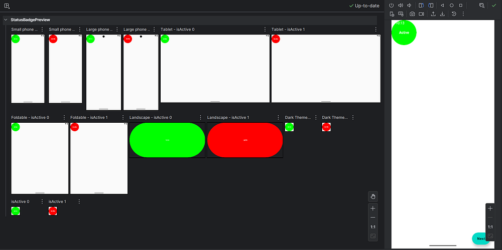
classUserStateProvider : PreviewParameterProvider<Boolean> {overrideval values = sequenceOf(true, false)}@Preview(showBackground = true)@ComposablefunStatusBadgePreview(@PreviewParameter(UserStateProvider::class) isActive: Boolean) {Box( modifier = Modifier .size(100.dp) .background( color = if (isActive) Color.Green else Color.Red, shape = CircleShape ), contentAlignment = Alignment.Center ) {Text( text = if (isActive) "Active"else"Inactive", color = Color.White, fontWeight = FontWeight.Bold ) }}
Here,
The UserStateProvider class implements PreviewParameterProvider<Boolean>, which means it provides a sequence of Boolean values for previewing. The values property returns both true and false.
When you use @PreviewParameter(UserStateProvider::class) on the isActive parameter, Compose Preview automatically generates two separate previews—one for each value in the sequence. You get both the active and inactive states without writing separate preview functions.
This approach is incredibly useful when testing with lists of data, different user types, or various configuration options.
Interactive Preview Mode
Recent versions of Android Studio introduced interactive preview mode, which lets you click buttons, scroll lists, and interact with your UI directly in the preview pane. This feature brings you even closer to the actual app experience without leaving the IDE.
To enable it, look for the interactive mode toggle in the preview pane toolbar. Keep in mind that interactions are limited to the composable being previewed — you can’t navigate to other screens or trigger real network calls.
Where Compose Preview Falls Short
Compose Preview is helpful, but it’s not perfect.
Let’s talk honestly about its limitations.
1. No Real Runtime Logic
Compose Preview does not handle:
Network calls
Database access
ViewModel state from real sources
Dependency injection (Hilt, Koin)
If your composable depends on runtime data, preview will break.
That’s why preview-friendly composables should take simple, deterministic parameters that can be easily mocked in previews, rather than ViewModels.
2. Limited Interaction Support
You can’t:
Click buttons meaningfully
Trigger navigation
Test animations properly
Simulate gestures accurately
Compose Preview shows how things look, not how they behave.
For behavior, you still need:
Emulators
Physical devices
UI tests
3. Can Be Slow in Large Projects
As your project grows:
Previews may take longer to render
IDE memory usage increases
Sometimes previews just refuse to refresh
This isn’t your fault. It’s a known trade-off.
4. Not a Replacement for Testing
Compose Preview is not a test.
It won’t catch:
Crashes
Logic bugs
Edge-case states
Performance issues
Think of it as a design aid, not a quality gate.
Best Practices for Using Compose Preview
To get the most out of Compose Preview:
Keep Preview Functions Simple and Focused
Your preview functions should be straightforward and serve a single purpose. Don’t overcomplicate them with business logic or complex data transformations.
Kotlin
// Good: Simple and clear@Preview(showBackground = true)@ComposablefunLoadingButtonPreview() {LoadingButton( text = "Loading", isLoading = true, onClick = { } )}// Avoid: Too much logic in preview@Preview(showBackground = true)@ComposablefunComplicatedPreview() {val viewModel = remember { MyViewModel() }val state by viewModel.uiState.collectAsState()// This won't work well in preview..!}
The first preview is clean and predictable. The second tries to instantiate a ViewModel, which likely depends on dependency injection, context, or other resources that aren’t available in preview mode.
Use Preview Groups for Organization
When you have many related previews, organize them into preview groups for better navigation.
By creating a custom annotation like @ComponentPreviews and applying it alongside your @Preview annotations, you can filter and group previews in Android Studio. This becomes invaluable when working on large projects with hundreds of composables.
Create Preview Fixtures for Common Data
Maintain a separate file with preview fixtures — sample data objects you can reuse across multiple previews.
Kotlin
// PreviewFixtures.ktobjectPreviewFixtures {val sampleUser = UserData( name = "Amol Pawar", email = "[email protected]", joinDate = "March 2022" )val sampleMessages = listOf(MessageData("Hello there!", "Amol", "9:00 AM"),MessageData("How are you?", "Rutuja", "9:05 AM"),MessageData("Doing great!", "Amol", "9:10 AM") )val longText = """ This is a longer text sample that helps us test how our UI handles content that spans multiple lines. It's useful for checking text wrapping, overflow behavior, and spacing. """.trimIndent()}
These edge case previews help you catch layout issues before they reach production. Does your text truncate properly? Do your empty states look intentional rather than broken?
The Future of Compose Preview
The Compose Preview tool continues to evolve with each Android Studio release. Recent improvements include better performance, enhanced animation support, and more sophisticated interactive capabilities.
Looking ahead, we can expect:
Deeper integration with design tools: Better collaboration between designers and developers through improved Figma integration and design token support.
AI-assisted previews: Automated generation of preview functions based on your composable parameters and common usage patterns.
Enhanced debugging: More powerful inspection tools for understanding why your UI renders the way it does.
Cloud-based previews: The ability to share interactive previews with team members without requiring them to open Android Studio.
The Android development community actively shapes these improvements through feedback, so don’t hesitate to file feature requests or bug reports.
Conclusion
Despite its limitations, Compose Preview is an essential part of modern Android development. The speed and convenience it offers make it ideal for rapid UI iteration and component-level design work.
The key is knowing when to use it. Compose Preview works best for visual validation and layout refinement, while emulators or real devices are still necessary for testing interactions, animations, and real data flows.
When used with preview-friendly composables and best practices, Compose Preview significantly improves development speed and feedback. It turns UI work into a more iterative, design-driven process rather than a cycle of long builds and guesswork.
If you’ve ever opened your beautifully designed app on a tablet only to see it looking like a stretched-out phone screen, you know the pain. Or maybe you’ve watched your carefully crafted layout break apart on a foldable device. Trust me, I’ve been there. The good news..? Responsive and Adaptive UI in Jetpack Compose makes...
Jetpack Compose introduces a very different mental model compared to XML-based Android UI. One line that often confuses beginners (and even experienced Android devs at first) is:
Kotlin
onValueChange = { value = it }
Especially when value is defined like this:
Kotlin
varvaluebyremember { mutableStateOf(0) }
At first glance, this line looks almost too simple — and that’s exactly why it’s confusing.
Let’s break down what’s really happening, why it’s written this way, and how it fits into Compose’s state-driven architecture.
The Big Picture: Compose Is State-Driven
Before diving into syntax, it’s important to understand how Compose thinks.
In classic Android:
You updated UI elements directly
UI held its own state
You manually synced UI ↔ data
In Jetpack Compose:
State owns the UI
UI is a function of state
When state changes → UI recomposes automatically
This single line:
Kotlin
onValueChange = { value = it }
is the bridge between user interaction and state updates.
What remember { mutableStateOf(...) } Really Does
Consider this state declaration:
Kotlin
varvaluebyremember { mutableStateOf(0) }
This does three important things:
1. mutableStateOf
Creates an observable state holder. Compose watches this value and tracks where it’s used.
2. remember
Ensures the state survives re-composition. Without remember, the value would reset every time Compose redraws the UI.
3. by keyword
This is Kotlin property delegation. It allows you to write:
Kotlin
value = 5
instead of:
Kotlin
value.value = 5
So value behaves like a normal variable, but Compose is quietly observing it.
What onValueChange Is (Conceptually)
Most interactive Compose components (such as TextField, Slider, Checkbox) follow the same pattern:
State management is the backbone of any modern Android app. If state is messy, your UI becomes unpredictable, buggy, and hard to maintain. Jetpack Compose was designed to solve many of these problems, but only if you understand how State Management in Jetpack Compose actually works. In this post, we will break down modern state...
If you’ve been writing object-oriented code for a while, you’ve probably used inheritance a lot. It feels natural. You create a base class, extend it, override a few methods, and move on.
But as projects grow, inheritance often becomes hard to manage. Classes get tightly coupled. Changes ripple through the codebase. Small tweaks break unexpected things.
In this post, we’ll break down what Composition Over Inheritance really means, why it matters, and how it’s used naturally in modern Kotlin development, especially with Jetpack Compose.
What Does “Composition Over Inheritance” Mean?
Composition Over Inheritance is a design principle that says:
Prefer building classes by combining smaller, reusable components instead of extending base classes.
In simpler terms:
Inheritance says “is a”
Composition says “has a”
Instead of forcing behavior through class hierarchies, you compose behavior by using other objects.
A Simple Real-World Example
Think of a smartphone.
A smartphone has a camera, battery, speaker, and screen.
It does not inherit from Camera, Battery, or Speaker.
That’s composition.
If you used inheritance here, the design would fall apart fast.
The Problem With Inheritance
Inheritance looks clean at first, but it comes with hidden costs.
Example Using Inheritance (Problematic)
Kotlin
openclassVehicle {openfunmove() {println("Vehicle is moving") }}openclassCar : Vehicle() {overridefunmove() {println("Car is driving") }}classElectricCar : Car() {overridefunmove() {println("Electric car is driving silently") }}
At first glance, this seems fine.
But now imagine:
You want a flying car
You want a boat-car
You want a self-driving electric truck
Your inheritance tree explodes.
Changes to Vehicleaffect every subclass. You’re locked into decisions you made early, often before requirements were clear.
This is exactly what Composition Over Inheritance helps you avoid.
Composition Over Inheritance Explained With Kotlin
Let’s rewrite the same idea using composition.
Create Small, Focused Behaviors
Kotlin
interfaceEngine {funmove()}
Kotlin
classGasEngine : Engine {overridefunmove() {println("Driving using gas engine") }}
Kotlin
classElectricEngine : Engine {overridefunmove() {println("Driving silently using electric engine") }}
If you’ve built Android apps with Jetpack Compose, you’ve probably run into the question: Should I use ViewModel or rememberSaveable? Both help you keep state alive, but they work very differently depending on what’s happening to your app — like when the screen rotates or when the system kills your process.
This post will break down ViewModel and rememberSaveable, explain when to use each, and show real code examples so it finally clicks.
The Basics: Why State Preservation Matters
On Android, your app doesn’t always stay alive. Two big events affect your app’s state:
Configuration changes — like screen rotations, language changes, or switching dark mode. The activity is destroyed and recreated, but the process usually stays alive.
Process death — when Android kills your app’s process (e.g., to reclaim memory) and later restores it when the user comes back.
If you don’t handle these correctly, your users lose whatever they were doing. That’s where ViewModel and rememberSaveable come in.
remember: The Starting Point in Compose
At the simplest level, you use remember in Jetpack Compose to keep state alive across recompositions.
Rotate the screen? count survives. The same ViewModel instance is reused.
App is killed (process death)? count is lost. The ViewModel does not persist beyond process death.
Configuration Changes vs Process Death: Who Wins?
Here’s the clear breakdown:
When to Use rememberSaveable
Use rememberSaveable for small, lightweight UI state that:
Must survive both rotation and process death.
Can easily be serialized into a Bundle.
Examples:
Current tab index.
Form text fields.
Simple filter/sort options.
When to Use ViewModel
Use ViewModel for more complex or long-lived state that:
Doesn’t need to survive process death.
Might involve business logic, repositories, or data streams.
Should be scoped to the screen or navigation graph.
Examples:
Data loaded from a database or network.
Complex business logic.
State shared across multiple composables in the same screen.
Can You Combine Them? Yes.
Often, the best solution is to use ViewModel and rememberSaveable together. For example, a ViewModel manages your main UI state, but a few critical fields use rememberSaveable so they’re restored even after process death.
userInput is lightweight and saved with rememberSaveable.
The ViewModel takes care of processing and persisting the submitted data.
Conclusion
The truth about ViewModel and rememberSaveable is simple once you think in terms of configuration changes vs process death:
remember → Only survives recomposition.
rememberSaveable → Survives both rotation and process death (small, serializable state).
ViewModel → Survives rotation, great for business logic, but not process death.
Use them in combination, not competition. Each tool has its place, and knowing when to reach for which makes your Compose apps more resilient, smoother, and user-friendly.