If you build Android apps, you’ve probably seen the term ABI in Android at least once. It shows up in Gradle settings, Play Console warnings, and NDK documentation.
But what does it actually mean? And why does it affect your APK size and app performance?
Let’s break it down.
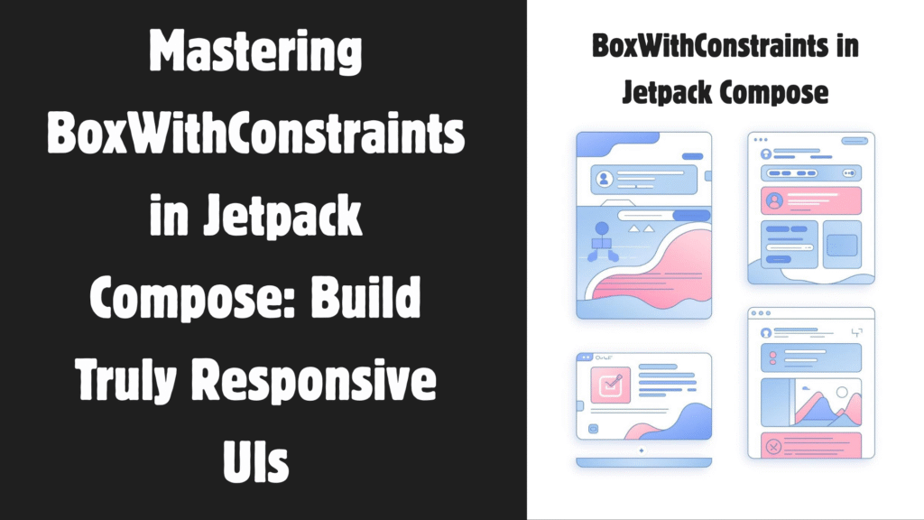
What Is ABI in Android?
ABI stands for Application Binary Interface.
In simple words, ABI in Android defines how your app’s compiled native code interacts with the device’s processor and operating system.
Think of it as a contract between:
Your compiled native code (.so files)
The Android operating system
The device’s CPU architecture
If the ABI doesn’t match the device’s CPU, your app won’t run.
Why Does ABI Exist in Android?
Android devices use different CPU architectures. The most common ones are:
arm64-v8a (64-bit ARM)
armeabi-v7a (32-bit ARM)
x86
x86_64
Each architecture understands machine code differently. So if your app includes native C or C++ code using the Android NDK, you must compile it separately for each ABI you want to support.
That’s where ABI in Android becomes important.
What Exactly Does an ABI Define?
An ABI specifies:
CPU instruction set (ARM, x86, etc.)
Register usage
Memory alignment
Data type sizes
How function calls work
How binaries are formatted
When you compile native code, the compiler uses ABI rules to generate machine code that matches the target architecture.
If you build for arm64-v8a, the generated .so file won’t work on an x86 device.
What Is a Native Library in Android?
If your project uses C or C++ (via the NDK), it generates files like this:
libnative-lib.so
These are placed inside your APK under:
lib/arm64-v8a/
lib/armeabi-v7a/
lib/x86/
Each folder corresponds to a specific ABI in Android.
The system loads the correct library at runtime based on the device’s architecture.
Why ABI in Android Matters for APK Size
This is where many developers make mistakes.
If you include all ABIs in a single APK, your app contains multiple versions of the same native library.
For example:
5 MB for arm64
4 MB for armeabi-v7a
6 MB for x86
Now your APK suddenly includes 15 MB of native code, even though a device only needs one version.
That increases:
Download size
Install time
Storage usage
Solution: Split APKs by ABI
You can configure Gradle to generate separate APKs per ABI.
Here’s an example:
Kotlin
// build.gradle (Module level)android {splits {abi { enable truereset() // Clear the default list include "arm64-v8a", "armeabi-v7a", "x86", "x86_64" universalApk false// Don't generate a fat universal APK } }}
enable true → Turns on ABI splitting
include → Specifies which ABIs to build
universalApk false → Prevents creating a large APK with all ABIs
Now each device downloads only the version it needs.
This reduces APK size significantly.
What About Android App Bundles (AAB)?
If you’re using Android App Bundles (which is required for Play Store apps), Google Play automatically delivers the correct native libraries per device.
This is called ABI split delivery.
In this case, you don’t need manual split configuration for Play Store distribution.
However, understanding ABI in Android still matters when:
Testing locally
Distributing outside Play Store
Debugging native crashes
Optimizing build size
How ABI in Android Affects Performance
Performance impact comes from two main areas:
1. 32-bit vs 64-bit
Modern devices use arm64-v8a. Running a 64-bit native library provides:
Better memory handling
More CPU registers
Improved performance for heavy computation
Better compatibility with modern Android versions
Google Play requires 64-bit support for apps using native code.
If you ship only 32-bit libraries, your app may run in compatibility mode on 64-bit devices. That’s not ideal.
2. CPU-Specific Optimization
When you compile for a specific ABI in Android, the compiler generates instructions optimized for that architecture.
Example:
ARM CPUs use ARM instruction sets
x86 devices use Intel instruction sets
Native code compiled for ARM won’t run efficiently on x86 without translation.
Better ABI targeting = better runtime performance.
How to Specify ABI in Android (NDK Example)
If you use CMake, you can define supported ABIs like this:
Work meetings. Coding sessions. Online classes. Gaming. Six to ten hours pass before we even notice. Over time, that constant sitting affects posture, drains energy, and increases physical strain.
sitLess is built to solve exactly that.
It’s a simple Android app that gives you timed reminders to stand up, stretch, and reset. No clutter. No complicated dashboards. Just smart reminders that help you protect your body while staying productive.
sitLess helps you reduce sedentary time by sending automated break reminders throughout your workday. It’s simple, focused, and designed to improve both posture and productivity.
If you spend most of your day at a desk, this app can make a real difference.
Why Prolonged Sitting Is a Problem
Prolonged sitting affects far more than your comfort.
Research consistently links extended sitting with:
Lower back pain
Neck and shoulder stiffness
Poor posture
Reduced blood circulation
Mental fatigue
Decreased productivity
Even if you exercise regularly, long, uninterrupted sitting sessions can still negatively impact your body.
That’s why experts recommend standing or moving every 30 to 60 minutes.
The challenge? Most people forget.
A break reminder app solves this by building consistent movement directly into your daily routine.
What Is sitLess?
sitLess is a lightweight sitting reminder app for Android designed to help users develop healthier desk habits.
Instead of relying on memory, the app creates an automatic cycle:
Sit → Break → Repeat
Once activated, sitLess sends reminders at your chosen intervals, helping you move consistently throughout the day without disrupting your workflow.
Unlike complex productivity tools, sitLess focuses on one goal: reducing sedentary time in a simple, sustainable way.
How sitLess Supports Ergonomic Health
Good ergonomics isn’t just about buying a better chair. Movement plays a critical role in protecting your body during long desk sessions.
Here’s how sitLess supports healthier desk habits:
1. Helps Reduce Back Pain from Sitting
Lower back discomfort is one of the most common issues among desk workers.
By prompting you to stand and reset your posture regularly, sitLess helps reduce prolonged pressure on the spine. Over time, these small adjustments can minimize strain buildup.
2. Encourages Better Posture
Extended sitting often leads to rounded shoulders and a forward-leaning neck.
Break reminders interrupt that static position, giving you the opportunity to realign your posture before returning to work. Consistency makes the difference.
3. Improves Circulation and Energy
Sitting slows blood flow, particularly in the legs.
Short movement breaks stimulate circulation and help maintain steady energy levels, reducing the likelihood of the afternoon slump.
4. Enhances Focus and Productivity
It may seem counterintuitive, but short breaks can significantly boost productivity.
When you move regularly:
Your brain resets
Eye strain decreases
Mental clarity improves
Decision-making sharpens
This structured break pattern is similar to the Pomodoro Technique, which uses timed intervals to sustain focus and performance.
The difference is that sitLess prioritizes physical health and ergonomics — not just time management.
As a result, a sitting reminder app becomes more than a productivity system. It serves as both a wellness tool and a performance enhancer.
Key Features of sitLess
sitLess keeps things simple while giving you full control over your routine.
Custom Sitting Timer
Choose how long you want to sit before receiving a reminder.
Whether you prefer 25-minute focus sessions or 45-minute deep work blocks, the app adapts to your schedule.
Custom Break Duration
Breaks aren’t one-size-fits-all.
Some days call for a quick stretch, while others may require a longer walk. sitLess lets you set break durations that fit your needs.
Automatic Repeat Cycle
Once started, the sit–break cycle runs automatically.
There’s no need to manually restart timers, making consistency effortless.
Clean, Minimal Interface
Many productivity apps overwhelm users with unnecessary features.
sitLess offers a clean, distraction-free interface focused solely on break reminders, making it easy to use every day.
Who Should Use a Sitting Reminder App?
sitLess is ideal for:
Office workers
Remote employees
Students
Developers
Designers
Writers
Gamers
Anyone with a sedentary lifestyle
If you sit for more than six hours a day, structured movement can significantly improve both comfort and focus.
How to Use sitLess for Best Results
To maximize benefits:
Set your sitting timer to 30 minutes
Choose a 5-minute break
Stand fully during breaks
Stretch your back and shoulders
Walk when possible
Repeat throughout your workday.
Use this schedule as a starting point and adjust it to fit your workflow.
The goal isn’t perfection — it’s consistency. Even short, regular breaks can make long desk hours more manageable and sustainable.
Why sitLess Is Different from Other Break Reminder Apps
Many apps combine task tracking, analytics, and habit streaks.
However, sitLess stays focused.
It is not overloaded with features. Instead, it concentrates on reducing sedentary time and supporting ergonomic health.
That simplicity increases long-term consistency.
Frequently Asked Questions
How often should I take breaks from sitting?
Most experts recommend standing or moving every 30 to 60 minutes.
Can a sitting reminder app improve productivity?
Yes. Short breaks help reset mental focus and reduce fatigue, leading to better work performance.
Does sitLess treat back pain?
sitLess is not a medical tool. However, regular movement can help reduce discomfort caused by prolonged sitting.
Is sitLess easy to use?
Yes. The app features a clean interface and simple timer customization.
Conclusion
If you work long hours at a desk, reducing sedentary time is essential.
sitLess makes that process simple.
By combining automated reminders, customizable timers, and ergonomic support, this sitting reminder app helps you protect your body while improving focus at work.
If you’ve ever uploaded an Android App Bundle to the Google Play Console and seen a warning about a missing Debug Symbol File, you’re not alone.
A lot of developers hit this message and wonder:
What exactly is a Debug Symbol File?
Why does Google Play Console need it?
Is it mandatory?
How do I generate and upload it?
In this comprehensive guide, we’ll demystify debug symbol files, explain why Google Play Console needs them, and show you exactly how to generate and upload them.
Let’s dive in..!
What Is a Debug Symbol File?
A Debug Symbol File is a file that maps compiled machine code back to readable source code.
When you build an Android app, your original code (Kotlin, Java, C++, etc.) gets compiled into low-level machine instructions. During this process, meaningful names like:
fun calculateTotalPrice(items: List<Item>): Double
may get stripped, optimized, or converted into memory addresses.
These processes make your code unreadable to humans — but they also make crash reports impossible to understand.
Without symbols, a crash report might look like this:
#00 pc 000000000004a123  /lib/arm64/libnative-lib.so
#01 pc 000000000003b789  /lib/arm64/libnative-lib.so
That tells you almost nothing.
With a Debug Symbol File, the same crash becomes:
#00 calculateTotalPrice() at PaymentProcessor.kt:42
#01 checkout() at CartManager.kt:88
Now you know exactly what went wrong and where.
That’s the difference.
Why Does Google Play Console Require a Debug Symbol File?
The Google Play Console asks for a Debug Symbol File when your app includes:
Native code (C or C++)
NDK libraries
Game engines (like Unity or Unreal)
Any .so native shared libraries
The Core Reason: Better Crash Reporting
Google Play collects crash data from real users. But without symbols, it can’t decode native crash stack traces.
When you upload a Debug Symbol File:
Google can deobfuscate native stack traces
Crash reports become human-readable
You can fix bugs faster
Your app stability improves
In short, it’s about observability and reliability.
Is It Mandatory?
Technically, your app can still be published without it.
But if you skip the Debug Symbol File:
Native crashes will be unreadable
You’ll lose valuable debugging insights
You’ll struggle to fix production issues
For any serious production app, it’s strongly recommended.
When Do You Actually Need It?
You need a Debug Symbol File if:
Your app uses Android NDK
You include native libraries (.so files)
You’re building games
You’re using certain SDKs that bundle native code
If your app is pure Kotlin or Java with no native layer, you usually won’t see this requirement.
What Happens Without a Debug Symbol File?
Let’s say your app crashes inside native code.
Without symbols:
Fatal signal 11 (SIGSEGV)
pc 00000000000af3b4
You have no idea which function caused it.
With symbols:
Segmentation fault in renderFrame()
File: Renderer.cpp
Line: 214
Now you can:
Reproduce the issue
Fix the exact line
Release a patch
Improve user ratings
This is why Google emphasizes it.
What Is Inside a Debug Symbol File?
A Debug Symbol File contains:
Function names
Variable names
Line numbers
Memory address mappings
For Android native apps, it usually includes:
.so files with symbols
Or a zipped folder generated from the NDK build
It does not expose your full source code publicly. It only helps map crash data.
How to Generate a Debug Symbol File (Step-by-Step)
Modern Android apps run on phones, tablets, foldables, Chromebooks, and even desktop environments. If your layout only looks good on one screen size, users will notice.
This pattern is widely used in email apps, dashboards, and productivity tools.
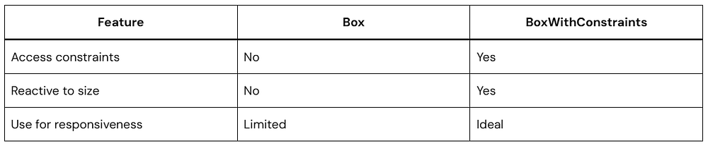
Box vs BoxWithConstraints
You might wonder:
Why not just use Box?
Here’s the difference:
If you don’t need constraint info, stick with Box.
How It Aligns with Modern Android Best Practices
Google encourages:
Adaptive layouts
Multi-device support
Foldable readiness
BoxWithConstraints in Jetpack Compose supports all of this naturally.
It works well alongside:
Window size classes
Material 3 adaptive design
Large screen guidelines
You’re building future-ready UI when you use it correctly.
Quick FAQ
What is BoxWithConstraints in Jetpack Compose?
It is a layout composable that exposes parent layout constraints like maxWidth and maxHeight, allowing dynamic and responsive UI decisions during composition.
When should I use BoxWithConstraints?
Use it when your layout must change depending on available space, such as switching from column to row or adjusting grid columns.
Does BoxWithConstraints affect performance?
It can trigger recomposition when constraints change, but it is generally efficient when used correctly.
Is BoxWithConstraints better than LocalConfiguration?
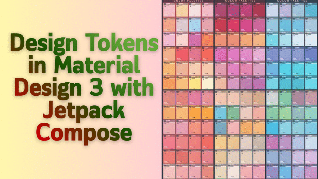
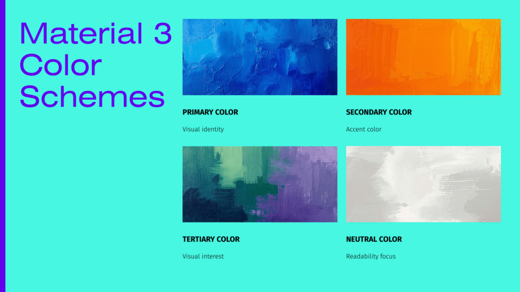
If you’ve been diving into modern Android development, you’ve probably heard the buzz about Material Design 3 (also known as Material You) and Jetpack Compose. Today, we’re going to explore one of the most powerful yet underappreciated features that ties them together: Design Tokens.
Understanding Design Tokens in Material 3 and Jetpack Compose will transform how you build consistent, beautiful, and maintainable Android apps.
Let’s dive in..!
What Are Design Tokens?
Before we jump into the Material 3 specifics, let’s get on the same page about what design tokens actually are.
Think of design tokens as the DNA of your app’s design system. They’re named values that store design decisions like colors, typography, spacing, and shapes. Instead of hardcoding Color(0xFF6200EE) everywhere in your app, you’d use a token like MaterialTheme.colorScheme.primary.
Btw why this matters..?
Actually, when you decide to rebrand your app or support dark mode, you only need to change the token values in one place, not hunt down hundreds of hardcoded values scattered across your codebase.
Why Material Design 3 Changed Everything
Material Design 3 represents a massive evolution in how we think about design systems. Unlike Material Design 2, which had a more rigid structure, Material 3 introduces a flexible, personalized approach that adapts to user preferences.
Design Tokens in Material 3 and Jetpack Compose work together to make this personalization possible. Material 3 includes over 40 color tokens, dynamic color generation from wallpapers, and a comprehensive token system for typography, shapes, and elevation.
Understanding the Material Design 3 Token Structure
Material Design 3 organizes tokens into structured layers:
1. Reference Tokens
Raw values like colors or sizes.
Example:
Blue 500
16sp
8dp
2. System Tokens
Semantic values used by the UI system.
Example:
primary
onPrimary
surface
3. Component Tokens
Values applied to specific UI components.
Example:
Button container color
TextField label color
Jetpack Compose primarily exposes system tokens through MaterialTheme, which internally map to component behavior.
Material Design 3 in Jetpack Compose
Jetpack Compose provides the MaterialTheme composable (from the material3 library) that exposes design tokens:
colorScheme
typography
shapes
Let’s explore each with Kotlin examples.
The Core Components of Design Tokens in Material 3
Let’s break down the main categories of design tokens you’ll work with:
1. Color Tokens
Material 3’s color system is brilliant. Instead of just “primary” and “secondary,” you get a full palette that automatically handles light and dark modes, accessibility, and color harmonies.
Here, we’re accessing color tokens through MaterialTheme.colorScheme. The MaterialTheme composable provides access to Material 3’s design tokens. These tokens automatically adjust based on whether the user is in light or dark mode. The onPrimary token ensures text on your primary color is always readable.
2. Typography Tokens
Typography tokens define your text styles consistently across your app. Material Design 3 provides a complete type scale with tokens for everything from large display text to tiny labels.
Kotlin
@ComposablefunTypographyTokenExample() {Column( modifier = Modifier.padding(16.dp) ) {// Display large - for prominent textText( text = "Welcome Back!", style = MaterialTheme.typography.displayLarge )// Headline medium - for section headersText( text = "Your Dashboard", style = MaterialTheme.typography.headlineMedium )// Body large - for main contentText( text = "Here's a summary of your activity today.", style = MaterialTheme.typography.bodyLarge )// Label small - for captions or metadataText( text = "Last updated: 2 hours ago", style = MaterialTheme.typography.labelSmall ) }}
Each typography token (displayLarge, headlineMedium, bodyLarge, labelSmall) defines font size, weight, line height, and letter spacing. By using these Material 3 tokens instead of hardcoding text styles, your app maintains perfect typographic hierarchy.
3. Shape Tokens
Shapes define the corner radii and other geometric properties of your components. Material Design 3 uses different shape tokens for different component types.
Kotlin
@ComposablefunShapeTokenExample() {Row( modifier = Modifier.padding(16.dp), horizontalArrangement = Arrangement.spacedBy(8.dp) ) {// Extra small - for chips and small elementsSurface( shape = MaterialTheme.shapes.extraSmall, color = MaterialTheme.colorScheme.primaryContainer, modifier = Modifier.size(60.dp) ) {Box(contentAlignment = Alignment.Center) {Text("XS") } }// Medium - for cardsSurface( shape = MaterialTheme.shapes.medium, color = MaterialTheme.colorScheme.secondaryContainer, modifier = Modifier.size(60.dp) ) {Box(contentAlignment = Alignment.Center) {Text("M") } }// Large - for dialogs and sheetsSurface( shape = MaterialTheme.shapes.large, color = MaterialTheme.colorScheme.tertiaryContainer, modifier = Modifier.size(60.dp) ) {Box(contentAlignment = Alignment.Center) {Text("L") } } }}
Shape tokens (extraSmall, medium, large) ensure consistent corner radii throughout your app. Material 3 uses different shapes for different component types, creating visual cohesion and helping users understand component hierarchy.
Setting Up Design Tokens in Your Jetpack Compose Project
Now let’s get practical. Here’s how to implement Design Tokens in Material 3 and Jetpack Compose in your project.
Add Material 3 Dependency
First, ensure you have the Material 3 library in your build.gradle.kts file:
We’re defining two color schemes — one for light mode and one for dark mode. This follows the Material Design 3 color system specification. Each color has a specific purpose.
Notice the “on” prefix..? Those ensure text and icons are readable on their corresponding background colors.
Create Your Custom Theme
Now let’s wrap everything in a theme composable. This is where we configure the MaterialTheme composable with our Material 3 design tokens:
The MyAppTheme composable automatically detects if the system is in dark mode and switches between your light and dark color schemes. We pass our design tokens to the MaterialTheme composable, which makes them available throughout your app. We’re defining custom typography based on Material Design 3’s type scale while using Material 3’s default shapes.
Apply Your Theme
Wrap your app’s root composable with your theme:
Kotlin
import android.os.Bundleimport androidx.activity.ComponentActivityimport androidx.activity.compose.setContentimport androidx.compose.foundation.layout.fillMaxSizeimport androidx.compose.material3.Surfaceimport androidx.compose.ui.ModifierclassMainActivity : ComponentActivity() {overridefunonCreate(savedInstanceState: Bundle?) {super.onCreate(savedInstanceState)setContent {MyAppTheme {// Surface provides a background using the surface color tokenSurface( modifier = Modifier.fillMaxSize(), color = MaterialTheme.colorScheme.background ) {// Your app content goes hereAppContent() } } } }}
By wrapping everything in MyAppTheme, all composables inside can access your Material 3 design tokens through MaterialTheme. The Surface composable uses the background color token automatically.
Advanced: Dynamic Color and Material You
One of the coolest features of Design Tokens in Material 3 and Jetpack Compose is dynamic color. On Android 12+, your app can generate its color scheme from the user’s wallpaper..!
This is the signature feature of Material You (Material Design 3’s brand name), creating truly personalized user experiences.
Kotlin
import android.os.Buildimport androidx.compose.material3.dynamicDarkColorSchemeimport androidx.compose.material3.dynamicLightColorSchemeimport androidx.compose.runtime.Composableimport androidx.compose.ui.platform.LocalContext@ComposablefunMyAppTheme( darkTheme: Boolean = isSystemInDarkTheme(), dynamicColor: Boolean = true, // Enable dynamic color content: @Composable () -> Unit) {val colorScheme = when {// Use dynamic colors on Android 12+ dynamicColor && Build.VERSION.SDK_INT >= Build.VERSION_CODES.S -> {val context = LocalContext.currentif (darkTheme) dynamicDarkColorScheme(context)elsedynamicLightColorScheme(context) }// Fall back to custom colors darkTheme -> DarkColorSchemeelse-> LightColorScheme }MaterialTheme( colorScheme = colorScheme, typography = AppTypography, content = content )}
On devices running Android 12 or higher, dynamicLightColorScheme() and dynamicDarkColorScheme() generate a complete Material 3 color scheme based on the user’s wallpaper. This creates a truly personalized experience without any extra work on your part! Your design tokens automatically adapt to the generated colors.
Creating Custom Design Tokens
Sometimes you need tokens beyond what Material 3 provides. Here’s how to extend the system while maintaining consistency with Material Design 3 principles:
We created custom spacing tokens using CompositionLocal, which allows us to provide values that can be accessed by any composable in the tree. The extension property makes accessing these tokens feel natural, just like accessing built-in Material 3 tokens. This approach maintains consistency with how Material Design 3 organizes its design system.
Best Practices for Design Tokens
Working with Design Tokens in Material 3 and Jetpack Compose effectively requires following some key principles:
Always Use Tokens, Never Hardcode
Bad:
Kotlin
Text( text = "Hello", color = Color(0xFF6750A4), // Hardcoded color fontSize = 16.sp // Hardcoded size)
Good:
Kotlin
Text( text = "Hello", color = MaterialTheme.colorScheme.primary, style = MaterialTheme.typography.bodyLarge)
Use Semantic Token Names
When creating custom tokens, use names that describe the purpose, not the appearance. This follows Material Design 3’s semantic naming philosophy:
The onPrimary token adjusts automatically to maintain proper contrast ratio for accessibility, whether you’re in light mode, dark mode, or using dynamic colors. This is a core principle of Material Design 3’s accessibility-first approach.
Real-World Example: Building a Themed Card Component
Let’s put everything together with a practical example that showcases Design Tokens in Material 3 and Jetpack Compose:
Kotlin
import androidx.compose.foundation.layout.*import androidx.compose.material.icons.Iconsimport androidx.compose.material.icons.filled.Favoriteimport androidx.compose.material3.*import androidx.compose.runtime.Composableimport androidx.compose.ui.Alignmentimport androidx.compose.ui.Modifierimport androidx.compose.ui.unit.dp@ComposablefunProductCard( title: String, description: String, price: String, onFavoriteClick: () -> Unit, modifier: Modifier = Modifier) {Card( modifier = modifier.fillMaxWidth(),// Using Material 3 shape token shape = MaterialTheme.shapes.medium,// Using Material 3 color tokens colors = CardDefaults.cardColors( containerColor = MaterialTheme.colorScheme.surfaceVariant, contentColor = MaterialTheme.colorScheme.onSurfaceVariant ), elevation = CardDefaults.cardElevation(defaultElevation = 2.dp) ) {Column( modifier = Modifier.padding(16.dp) ) {Row( modifier = Modifier.fillMaxWidth(), horizontalArrangement = Arrangement.SpaceBetween, verticalAlignment = Alignment.CenterVertically ) {// Using Material 3 typography tokenText( text = title, style = MaterialTheme.typography.headlineSmall, color = MaterialTheme.colorScheme.onSurfaceVariant )IconButton(onClick = onFavoriteClick) {Icon( imageVector = Icons.Default.Favorite, contentDescription = "Add to favorites", tint = MaterialTheme.colorScheme.primary ) } }Spacer(modifier = Modifier.height(8.dp))// Using Material 3 typography token for body textText( text = description, style = MaterialTheme.typography.bodyMedium, color = MaterialTheme.colorScheme.onSurfaceVariant.copy(alpha = 0.8f) )Spacer(modifier = Modifier.height(12.dp))// Using Material 3 typography token for priceText( text = price, style = MaterialTheme.typography.titleLarge, color = MaterialTheme.colorScheme.primary ) } }}// Using the component@ComposablefunProductScreen() {MyAppTheme {Surface( modifier = Modifier.fillMaxSize(), color = MaterialTheme.colorScheme.background ) {Column( modifier = Modifier .fillMaxSize() .padding(16.dp) ) {ProductCard( title = "Wireless Headphones", description = "Premium noise-cancelling headphones with 30-hour battery life.", price = "$299.99", onFavoriteClick = { /* Handle favorite */ } ) } } }}
This ProductCard component uses Material 3 design tokens exclusively. It automatically adapts to light/dark mode, respects dynamic colors from Material You, maintains proper typography hierarchy, and ensures all text is readable against its background. That’s the power of Material Design 3’s token-based system!
Testing Your Design Tokens
Want to make sure your Material 3 tokens work in all scenarios? Create a preview showcase:
Pro tip: Android Studio shows these previews side-by-side, letting you verify that your Material 3 design tokens create a cohesive experience in both light and dark modes.
Common Mistakes to Avoid
Mistake 1: Mixing Hardcoded and Token Values
Don’t do this:
Kotlin
Text( text = "Title", fontSize = 24.sp, // Hardcoded color = MaterialTheme.colorScheme.primary // Token)
Instead:
Kotlin
Text( text = "Title", style = MaterialTheme.typography.headlineMedium, color = MaterialTheme.colorScheme.primary)
Mistake 2: Forgetting About Accessibility
Always use “on” color tokens for text on colored backgrounds. Material Design 3 emphasizes accessibility:
Kotlin
// This might have poor contrastButton( colors = ButtonDefaults.buttonColors( containerColor = MaterialTheme.colorScheme.tertiary, contentColor = Color.Gray // Bad! )) { Text("Submit") }// This ensures proper contrast following Material 3 guidelinesButton( colors = ButtonDefaults.buttonColors( containerColor = MaterialTheme.colorScheme.tertiary, contentColor = MaterialTheme.colorScheme.onTertiary // Good! )) { Text("Submit") }
Mistake 3: Not Testing in Both Modes
Always preview your composables in both light and dark modes to ensure your Material 3 token usage works correctly.
This is why using design tokens with Material Design 3 in Jetpack Compose is strongly recommended.
Conclusion
Understanding and implementing Design Tokens in Material 3 and Jetpack Compose transforms your development workflow. You get:
Consistency: Every component uses the same Material Design 3 language
Maintainability: Change your entire theme by updating token values
Accessibility: Automatic contrast ratios and readability
Personalization: Dynamic colors that adapt to user preferences through Material You
Scalability: Easy to extend with custom tokens while maintaining Material 3 principles
The examples we’ve covered today give you a solid foundation to build beautiful, consistent Android apps following Material Design 3 guidelines. Start by implementing basic color and typography tokens, then gradually expand to custom tokens as your needs grow.
Remember, the key to mastering Design Tokens in Material 3 and Jetpack Compose is practice. Start refactoring your existing projects to use Material 3 tokens, and you’ll quickly see the benefits of this systematic approach.
Creating a polished Android app starts with one crucial decision: your app’s visual identity. If you’ve been wondering how to make your Jetpack Compose app look consistent and professional across every screen, you’re in the right place.
In this guide, I’ll walk you through building a Custom App Theme in Jetpack Compose using Material 3. Whether you’re building your first app or refining an existing one, you’ll learn how to create a theming system that’s both flexible and maintainable.
Why Material 3 Makes Custom Theming Easier
Material 3 (also called Material You) isn’t just another design system update. It’s Google’s most flexible theming framework yet, and it plays beautifully with Jetpack Compose.
Here’s what makes it special:
Dynamic color support — Your app can adapt to the user’s wallpaper colors (on Android 12+)
Improved design tokens — More granular control over colors, typography, and shapes Better accessibility — Built-in contrast and readability improvements
The best part..?
Once you set up your Custom App Theme in Jetpack Compose, Material 3 handles the heavy lifting of maintaining consistency throughout your app.
Understanding the Theme Building Blocks
Before we dive into code, let’s understand what makes up a theme in Jetpack Compose. Think of it like building a house — you need a solid foundation.
Your theme consists of three main pillars:
Color Scheme — All the colors your app uses
Typography — Font families, sizes, and weights
Shapes — Corner radiuses and component shapes
When these three work together harmoniously, your app feels intentional and polished.
Setting Up Your Project Dependencies
First things first — make sure you have the right dependencies in your build.gradle.kts file:
Material 3 provides 15 different text styles organized into five categories. This gives you flexibility while maintaining consistency in your Custom App Theme in Jetpack Compose:
Display — Hero text, splash screens
Headline — Page titles, section headers
Title — Card titles, dialog headers
Body — Paragraphs, main content
Label — Buttons, tabs, small UI elements
Defining Custom Shapes
Shapes add personality to your UI. From rounded corners to sharp edges, shapes influence how modern or traditional your app feels.
Create a Shape.kt file:
Kotlin
package com.yourapp.ui.themeimport androidx.compose.foundation.shape.RoundedCornerShapeimport androidx.compose.material3.Shapesimport androidx.compose.ui.unit.dpval AppShapes = Shapes(// Extra small - chips, small buttons extraSmall = RoundedCornerShape(4.dp),// Small - buttons, text fields small = RoundedCornerShape(8.dp),// Medium - cards, dialogs medium = RoundedCornerShape(12.dp),// Large - bottom sheets, large cards large = RoundedCornerShape(16.dp),// Extra large - special components extraLarge = RoundedCornerShape(28.dp))
Shape usage tips:
Use extraSmall for chips and toggles
Use small for buttons and input fields
Use medium for cards and elevated surfaces
Use large for bottom sheets and modals
Use extraLarge for floating action buttons
You can also create asymmetric shapes or custom shapes using GenericShape for more creative designs.
Bringing It All Together: Your Theme Composable
Now comes the exciting part — assembling everything into your main theme composable. Update your Theme.kt file:
Dark theme detection — Automatically detects if the user prefers dark mode
Dynamic color support — On Android 12+, colors adapt to the user’s wallpaper
Status bar styling — Ensures the status bar matches your theme
Fallback colors — Uses your custom colors on older Android versions
This is the heart of your Custom App Theme in Jetpack Compose. Every screen that uses this theme will automatically have consistent colors, typography, and shapes.
Using Your Theme in the App
Now let’s see how to apply your theme to your app. In your MainActivity.kt:
Kotlin
package com.yourappimport android.os.Bundleimport androidx.activity.ComponentActivityimport androidx.activity.compose.setContentimport androidx.compose.foundation.layout.*import androidx.compose.material3.*import androidx.compose.runtime.Composableimport androidx.compose.ui.Modifierimport androidx.compose.ui.tooling.preview.Previewimport androidx.compose.ui.unit.dpimport com.yourapp.ui.theme.AppThemeclassMainActivity : ComponentActivity() {overridefunonCreate(savedInstanceState: Bundle?) {super.onCreate(savedInstanceState)setContent {AppTheme {Surface( modifier = Modifier.fillMaxSize(), color = MaterialTheme.colorScheme.background ) {HomeScreen() } } } }}@ComposablefunHomeScreen() {Column( modifier = Modifier .fillMaxSize() .padding(16.dp), verticalArrangement = Arrangement.spacedBy(16.dp) ) {// Using themed text stylesText( text = "Welcome to My App", style = MaterialTheme.typography.headlineLarge, color = MaterialTheme.colorScheme.primary )Text( text = "This is a subtitle showing our custom typography", style = MaterialTheme.typography.titleMedium, color = MaterialTheme.colorScheme.onSurface )Text( text = "Body text looks great with our custom font family. " +"Notice how everything feels cohesive and professional.", style = MaterialTheme.typography.bodyLarge, color = MaterialTheme.colorScheme.onSurfaceVariant )// Using themed button with custom shapesButton( onClick = { /* Handle click */ }, shape = MaterialTheme.shapes.medium ) {Text("Primary Button") }// Using themed cardCard( modifier = Modifier.fillMaxWidth(), shape = MaterialTheme.shapes.large, colors = CardDefaults.cardColors( containerColor = MaterialTheme.colorScheme.primaryContainer ) ) {Column(modifier = Modifier.padding(16.dp)) {Text( text = "Card Title", style = MaterialTheme.typography.titleLarge, color = MaterialTheme.colorScheme.onPrimaryContainer )Spacer(modifier = Modifier.height(8.dp))Text( text = "This card uses our theme colors and shapes automatically.", style = MaterialTheme.typography.bodyMedium, color = MaterialTheme.colorScheme.onPrimaryContainer ) } } }}@Preview(showBackground = true)@ComposablefunHomeScreenPreview() {AppTheme {HomeScreen() }}
Key takeaways from this example:
Wrap your content in AppTheme { } to apply your custom theme
Access colors via MaterialTheme.colorScheme.primary (not hardcoded values!)
Access typography via MaterialTheme.typography.headlineLarge
Access shapes via MaterialTheme.shapes.medium
This approach ensures your Custom App Theme in Jetpack Compose is applied consistently throughout your app.
Creating Theme-Aware Components
Let’s build a custom component that respects your theme. This is where the real power of theming shines:
If you’re upgrading an existing app, here’s a quick migration guide:
Color Migration
Material 2 → Material 3:
primary → primary (similar)
primaryVariant → primaryContainer
secondary → secondary (similar)
secondaryVariant → secondaryContainer
background → background (same)
surface → surface (same)
Typography Migration
Material 3 has more granular typography styles. Map your old styles:
h1 → displayLarge
h2 → displayMedium
h3 → displaySmall
h4 → headlineLarge
h5 → headlineMedium
h6 → headlineSmall
subtitle1 → titleLarge
subtitle2 → titleMedium
body1 → bodyLarge
body2 → bodyMedium
Conclusion
Building a Custom App Theme in Jetpack Compose with Material 3 might seem complex at first, but it’s an investment that pays dividends. You get:
Consistency — Every screen automatically follows your design system
Maintainability — Change one value, update the entire app
Flexibility — Support light/dark themes and Material You effortlessly
Professionalism — Your app looks polished and well-crafted
Accessibility — Built-in contrast and readability standards
The key is starting with a solid foundation: well-defined colors, typography, and shapes. Once your theme is set up, building new screens becomes faster because you’re working with a consistent design language.
Remember, your Custom App Theme in Jetpack Compose isn’t set in stone. As your app evolves and your brand matures, you can refine your theme values. The beauty of this system is that those updates propagate throughout your entire app automatically.
When building apps with Jetpack Compose, you’ll often pass data down through multiple layers of composables. At first, this feels fine. But as your UI grows, you may find yourself passing the same parameter through five or six functions just to reach a deeply nested child.
That pattern is called prop drilling.
It works, but it clutters your APIs and makes your code harder to maintain.
This is where CompositionLocal in Jetpack Compose becomes incredibly useful. In this guide, we’ll learn what it is, when to use it, how it works under the hood, and how to avoid common mistakes.
What Is Prop Drilling in Jetpack Compose?
Prop drilling happens when you pass data through multiple composables, even though intermediate composables don’t use that data.
Any composable inside HomeScreen() can now access it.
Outside this block, the default value applies.
So basically,
What’s the provides keyword?
It’s an infix function that creates a ProvidedValue pairing your CompositionLocal with an actual value. Think of it as saying: “For this scope, LocalAppPrimaryColor provides Color.Green.”
You can even provide multiple values at once:
Kotlin
@ComposablefunMyApp() {val theme = AppTheme(/* ... */)val user = User(id = "123", name = "Anaya")CompositionLocalProvider( LocalAppTheme provides theme, LocalUser provides user ) {MainScreen() }}
Consume the Value
Now we access it using .current.
Kotlin
@ComposablefunHomeScreen() {val primaryColor = LocalAppPrimaryColor.currentText( text = "Welcome", color = primaryColor )}
That’s it.
No parameter passing.
No prop drilling.
How CompositionLocal in Jetpack Compose Works Internally
Understanding this improves your architectural decisions.
When you use CompositionLocal in Jetpack Compose, the value becomes part of the composition tree. Compose tracks reads of .current. If the value changes, only the composables that read it will recompose.
This makes it efficient.
It’s not like a global variable. It’s scoped and lifecycle-aware.
Using staticCompositionLocalOf
Use this when the value rarely or never changes. It’s more optimized but less flexible:
Kotlin
val LocalAppConfiguration = staticCompositionLocalOf {AppConfiguration(apiUrl = "https://api.softaai.com")}
When to use static? Only when the value is truly static for the entire composition, like build configuration or app constants.
compositionLocalOf Vs staticCompositionLocalOf
This is important.
compositionLocalOf
Tracks reads.
Causes recomposition when value changes.
Best for values that may change.
Example: dynamic theme.
staticCompositionLocalOf
Does NOT track reads.
Better performance.
Use when value will never change.
Example: app configuration object that stays constant.
Example:
Kotlin
val LocalAppConfig = staticCompositionLocalOf<AppConfig> {error("No AppConfig provided")}
Use this only when you are sure the value won’t change.
Real-World Example: Building a Theme System
Let’s build a complete example that shows the power of CompositionLocal in Jetpack Compose. We’ll create a theme system with light and dark modes:
// Step 5: Use theme throughout the app@ComposablefunMainContent(modifier: Modifier = Modifier) {val theme = LocalAppTheme.currentColumn( modifier = modifier .fillMaxSize() .background(theme.colors.background) .padding(16.dp) ) {Text( text = "Welcome!", style = theme.typography.heading, color = theme.colors.text )Spacer(modifier = Modifier.height(16.dp))// This composable also has access to the themeProfileCard() }}@ComposablefunProfileCard() {val theme = LocalAppTheme.currentCard( modifier = Modifier.fillMaxWidth(), colors = CardDefaults.cardColors( containerColor = theme.colors.surface ) ) {Column(modifier = Modifier.padding(16.dp)) {Text( text = "User Profile", style = theme.typography.heading, color = theme.colors.primary )Text( text = "This card automatically updates with the theme!", style = theme.typography.body, color = theme.colors.text ) } }}
Notice how ProfileCard doesn’t need to receive the theme as a parameter. It simply accesses LocalAppTheme.current and gets the value. When you toggle between light and dark mode, all composables that read from LocalAppTheme automatically recompose with the new values.
That’s the power of CompositionLocal in Jetpack Compose.
Best Practices for Using CompositionLocal
1. Use It Sparingly
CompositionLocal is powerful, but don’t overuse it. It’s perfect for:
Application-wide themes
User authentication state
Locale/language settings
Navigation controllers
Dependency injection
It’s NOT ideal for:
Component-specific state
Data that changes frequently at the component level
Communication between sibling composables
2. Always Provide Default Values
Always include a sensible default in your compositionLocalOf lambda:
Kotlin
val LocalUser = compositionLocalOf {User(id = "123", name = "Anaya", isAuthenticated = false)}
This prevents crashes if someone forgets to provide a value and makes your code more robust.
3. Make CompositionLocals Top-Level Properties
Define them at the file level, not inside composables:
Kotlin
// Good - Top levelval LocalAnalytics = compositionLocalOf { AnalyticsTracker() }@ComposablefunMyScreen() {// Bad - Inside composableval LocalSomething = compositionLocalOf { /* ... */ }}
4. Use Descriptive Names with “Local” Prefix
This convention makes it immediately clear that you’re dealing with a CompositionLocal:
Add KDoc comments to explain what the CompositionLocal provides and when to use it:
Kotlin
/** * Provides the current app theme (colors, typography, spacing). * This value updates when the user switches between light and dark mode. */val LocalAppTheme = compositionLocalOf {AppTheme(/* ... */)}
Common Pitfalls and How to Avoid Them
Even sometimes experienced developers make mistakes with CompositionLocal in Jetpack Compose. Here are the most common issues:
Pitfall 1: Reading CompositionLocal in Non-Composable Context
Kotlin
// Wrong - Can't use .current outside a composableclassMyViewModel {val theme = LocalAppTheme.current // Compilation error!}// Correct - Pass it as a parameter if needed@ComposablefunMyScreen(viewModel: MyViewModel) {val theme = LocalAppTheme.current viewModel.updateTheme(theme)}
Pitfall 2: Creating New Instances on Every Recomposition
Kotlin
@ComposablefunMyApp() {// Bad - Creates new theme on every recompositionCompositionLocalProvider( LocalAppTheme provides AppTheme(/* ... */) ) {Content() }}@ComposablefunMyApp() {// Good - Remember the themeval theme = remember {AppTheme(/* ... */) }CompositionLocalProvider(LocalAppTheme provides theme) {Content() }}
Pitfall 3: Using CompositionLocal for Frequent Updates
Kotlin
// Not ideal - Mouse position changes too frequentlyval LocalMousePosition = compositionLocalOf { Offset.Zero }// Better - Use State or pass as parameter@ComposablefunTrackingCanvas() {var mousePosition byremember { mutableStateOf(Offset.Zero) }// Use mousePosition directly}
Pitfall 4: Forgetting to Provide a Value
If you forget to provide a value, you’ll get the default. This might be okay, or it might be a bug:
Kotlin
val LocalUser = compositionLocalOf<User?> { null }@ComposablefunMyApp() {// Forgot to provide a user!MainScreen()}@ComposablefunMainScreen() {val user = LocalUser.current // Will be nullText("Hello, ${user?.name}") // Displays "Hello, null"}
Testing Composables with CompositionLocal
When testing composables that rely on a CompositionLocal, you should provide a value using CompositionLocalProvider if the composable depends on that value and no suitable default exists. This allows you to override environment values and test different scenarios.
This approach lets you test your composables with different CompositionLocal values, ensuring they work correctly in all scenarios.
CompositionLocal vs. Other State Management Solutions
You might wonder when to use CompositionLocal in Jetpack Compose versus other state management approaches. Here’s a quick guide:
Use CompositionLocal when:
Data is needed by many composables across the tree
The data represents ambient context (theme, locale, user)
You want to avoid prop drilling
The data changes infrequently
Use State/ViewModel when:
Data is specific to a screen or feature
You need business logic tied to the data
The data changes frequently
You need to survive configuration changes
Use Passed Parameters when:
Only a few composables need the data
The relationship is direct parent-child
You want explicit data flow
Often, the best solution combines these approaches. For example, you might use CompositionLocal for the theme, ViewModels for business logic, and parameters for component-specific props.
FAQ’s
What is CompositionLocal in Jetpack Compose?
CompositionLocal in Jetpack Compose is a mechanism to implicitly pass data down the composable tree without manually passing parameters through every function.
How does CompositionLocal avoid prop drilling?
It provides scoped values that child composables can access directly, eliminating the need to pass the same parameter through multiple intermediate composables.
When should you use CompositionLocal?
Use it for shared, cross-cutting concerns such as themes, configuration, context, or localization. Avoid using it for regular screen state.
Conclusion
Prop drilling isn’t always wrong. But when your composable tree gets deep, it becomes frustrating.
CompositionLocal in Jetpack Compose gives you a clean, structured way to share data across your UI without cluttering every function signature.
Use it thoughtfully.
Keep your dependencies clear.
And treat it as a tool for environmental data, not a replacement for proper state management.
When applied correctly, it makes your Compose code cleaner, more scalable, and easier to reason about.
If you’re building modern Android apps with Kotlin and Jetpack Compose, mastering CompositionLocal is not optional. It’s part of writing professional-level Compose code.
Have you ever wondered how Android apps magically match your wallpaper colors? Or how Material Design creates those perfectly harmonious color palettes that just work?
That’s the magic of Material 3’s dynamic color system, and today, we’re diving deep into how it all comes together using Kotlin and Jetpack Compose.
By the end of this guide, you’ll understand exactly how the Material 3 colorScheme works, how to implement it in your Android apps with Kotlin, and how to harness the power of dynamic theming to create stunning user interfaces that feel personal and cohesive.
Let’s get started..!
What Is Material 3 ColorScheme?
The Material 3 colorScheme is Google’s revolutionary approach to app theming that goes way beyond simple primary and secondary colors. Think of it as a complete color system that automatically generates a harmonious palette of colors designed to work together beautifully.
Here’s what makes it special:
Dynamic Color Generation: Instead of manually picking dozens of color shades, the Material 3 colorScheme generates an entire palette from a single seed color. This means you get consistent, accessible, and visually appealing colors without the guesswork.
Adaptive Theming: The system automatically adjusts for light and dark modes, ensuring your app looks great in any setting.
Wallpaper Integration: On Android 12 and above, your app can automatically extract colors from the user’s wallpaper, creating a truly personalized experience.
Accessibility Built-In: Every color in the Material 3 colorScheme meets WCAG (Web Content Accessibility Guidelines) accessibility standards when used correctly, so you don’t have to worry about contrast ratios.
Understanding Dynamic Color: The Foundation
Dynamic color is the heart of Material 3 on Android. But what exactly is it?
Imagine your phone’s wallpaper is a beautiful sunset with warm orange and purple tones. With dynamic color, your apps can extract those colors and build their entire theme around them. It’s personalization taken to the next level.
How Dynamic Color Works on Android
The process is actually quite elegant:
Color Extraction: The system analyzes your wallpaper using the Monet color system
Palette Generation: Using color science algorithms, it creates a full tonal palette
Role Assignment: Colors are assigned to specific UI roles (more on this shortly)
Adaptation: The scheme automatically adapts for light and dark themes
The beauty of the Material 3 colorScheme is that all this complexity is handled for you in Jetpack Compose. You just need to understand how to use it.
The Color Roles: Your New Best Friends
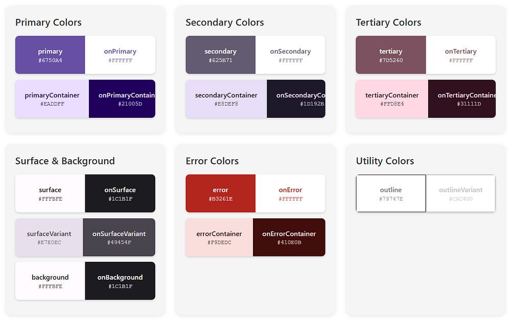
Here’s where Material 3 gets really interesting. Instead of thinking in terms of “primary,” “secondary,” and “tertiary” colors alone, the Material 3 colorScheme introduces color roles.
Think of color roles as jobs that colors perform in your UI. Let’s break down the main players:
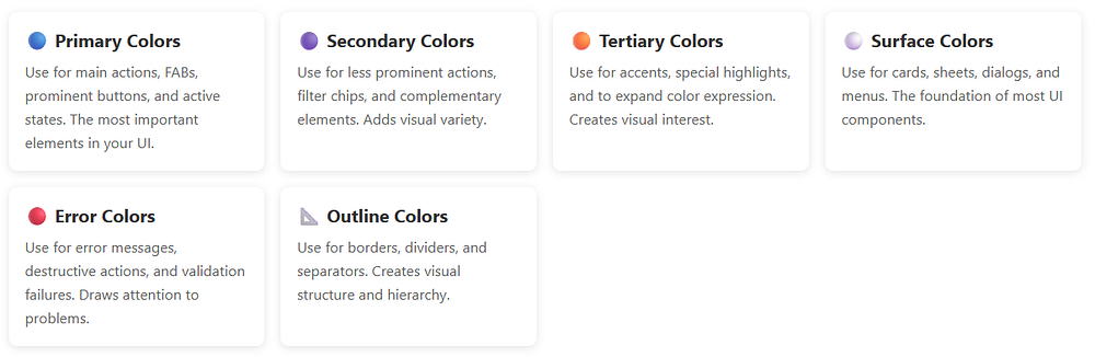
Primary Colors
Primary: This is your brand color, the star of the show. It appears on prominent buttons and active states.
OnPrimary: Text and icons that sit on top of the primary color. The Material 3 colorScheme ensures this has enough contrast to be readable.
PrimaryContainer: A lighter (or darker in dark mode) version used for less prominent components.
OnPrimaryContainer: Text that appears on primary containers.
Secondary Colors
Secondary: Provides visual variety and highlights less prominent components.
OnSecondary: You guessed it — text on secondary colors.
SecondaryContainer: For chips, cards, and other contained elements.
OnSecondaryContainer: Text on those containers.
Tertiary Colors
Tertiary: Adds even more variety, often used for accents and special highlights.
OnTertiary, TertiaryContainer, OnTertiaryContainer: Following the same pattern.
Surface and Background Colors
Surface: The background color for cards, sheets, and menus.
OnSurface: Text and icons on surfaces.
SurfaceVariant: Alternative surface with subtle differences.
OnSurfaceVariant: Text with lower emphasis.
Background: The main background of your app.
OnBackground: Primary text on the background.
Error Colors
Error: For error states and destructive actions.
OnError: Text on error colors.
ErrorContainer: Background for error messages.
OnErrorContainer: Text in error containers.
Special Roles
Outline: Borders and dividers.
OutlineVariant: Subtle borders.
Scrim: Semi-transparent overlays.
InverseSurface, InverseOnSurface, InversePrimary: For high-contrast elements like tooltips.
SurfaceTint: Used for elevation overlays in Material 3.
Phew! That’s a lot of colors, right..?
But here’s the magic: the Material 3 colorScheme generates all of these automatically, ensuring they work harmoniously together.
In short, a typical Material 3 colorScheme includes:
primary – main brand color
onPrimary – content placed on primary
secondary – supporting color
tertiary – optional accent color
background – app background
surface – cards and sheets
error – error states
onSurface – text/icons on surfaces
Each color has a paired onColor to guarantee readability.
This pairing is key to accessibility.
Setting Up Your Kotlin Project
Before we dive into code, let’s make sure your Android project is ready for Material 3.
Adding Dependencies
First, add the necessary dependencies to your build.gradle.kts (Module level):
Kotlin
dependencies {// Jetpack Compose BOM (Bill of Materials)implementation(platform("androidx.compose:compose-bom:2024.02.00"))// Material 3implementation("androidx.compose.material3:material3")// Other Compose dependenciesimplementation("androidx.compose.ui:ui")implementation("androidx.compose.ui:ui-tooling-preview")implementation("androidx.activity:activity-compose:1.8.2")// Core KTXimplementation("androidx.core:core-ktx:1.12.0")// Lifecycleimplementation("androidx.lifecycle:lifecycle-runtime-ktx:2.7.0")}
Problem: Compose previews show incorrect or default colors.
Solution: Always wrap preview content in your theme:
Kotlin
@Preview@ComposablefunMyComposablePreview() {MyAppTheme { // Never forget the theme wrapper!MyComposable() }}
Issue 4: System Bars Not Matching Theme
Problem: Status bar and navigation bar don’t match app theme.
Solution: Update system bars in your theme composable:
Kotlin
val view = LocalView.currentif (!view.isInEditMode) {SideEffect {val window = (view.context as Activity).window// Set status bar color window.statusBarColor = colorScheme.surface.toArgb()// Set navigation bar color window.navigationBarColor = colorScheme.surface.toArgb()// Adjust icon colors WindowCompat.getInsetsController(window, view).apply { isAppearanceLightStatusBars = !darkTheme isAppearanceLightNavigationBars = !darkTheme } }}
Issue 5: Gradle Build Errors
Problem: Cannot resolve Material 3 symbols.
Solution: Ensure you have the correct dependencies:
Kotlin
dependencies {// Use BOM for version managementimplementation(platform("androidx.compose:compose-bom:2024.02.00"))implementation("androidx.compose.material3:material3")// Or specify version explicitlyimplementation("androidx.compose.material3:material3:1.2.0")}
val colorScheme = MaterialTheme.colorScheme// Primary colorscolorScheme.primary // Main brand colorcolorScheme.onPrimary // Text on primarycolorScheme.primaryContainer // Lighter primary variantcolorScheme.onPrimaryContainer // Text on primary container// Secondary colorscolorScheme.secondary // Secondary accentcolorScheme.onSecondary // Text on secondarycolorScheme.secondaryContainer // Lighter secondarycolorScheme.onSecondaryContainer // Text on secondary container// Tertiary colorscolorScheme.tertiary // Third accent colorcolorScheme.onTertiary // Text on tertiarycolorScheme.tertiaryContainer // Lighter tertiarycolorScheme.onTertiaryContainer // Text on tertiary container// Surface and backgroundcolorScheme.surface // Card/sheet backgroundcolorScheme.onSurface // Text on surfacescolorScheme.surfaceVariant // Alternative surfacecolorScheme.onSurfaceVariant // Text on surface variantcolorScheme.background // Main app backgroundcolorScheme.onBackground // Text on background// Error colorscolorScheme.error // Error state colorcolorScheme.onError // Text on errorcolorScheme.errorContainer // Error message backgroundcolorScheme.onErrorContainer // Text in error messages// Utility colorscolorScheme.outline // Borders and dividerscolorScheme.outlineVariant // Subtle borderscolorScheme.surfaceTint // Elevation tint (usually primary)colorScheme.scrim // Semi-transparent overlays// Inverse colors (for tooltips, snackbars)colorScheme.inverseSurface // High-contrast surfacecolorScheme.inverseOnSurface // Text on inverse surfacecolorScheme.inversePrimary // Primary color on inverse surface
The Material 3 colorScheme is a game-changer for Android app theming. It takes the complexity out of color design and gives you a robust, accessible, and beautiful color system right out of the box.
Here’s what we’ve covered:
Understanding: The Material 3 colorScheme generates complete, harmonious palettes from seed colors or wallpaper
Color Roles: Semantic color names ensure accessibility and visual consistency
Implementation: Simple Kotlin setup with Jetpack Compose and dynamic color support
Dynamic Color: Apps automatically match user wallpapers on Android 12+ for personalized experiences
Best Practices: Use semantic colors, test both themes, provide fallbacks, and optimize performance
Real Examples: Production-ready Kotlin code you can use in your projects immediately
Troubleshooting: Solutions to common issues developers face
The beauty of the Material 3 colorScheme is that it makes professional color design accessible to everyone. You don’t need to be a color theory expert to create stunning, accessible Android apps.
Getting Started Today
Start your next Android project by:
Adding Dependencies: Include Material 3 in your build.gradle.kts
Creating Your Theme: Set up lightColorScheme() and darkColorScheme() in Theme.kt
Enabling Dynamic Color: Support Android 12+ wallpaper theming
Using Semantic Colors: Reference MaterialTheme.colorScheme throughout your composables
Testing Thoroughly: Preview in both light and dark modes
The Material 3 colorScheme handles the complexity of color science, accessibility, and harmonization so you can focus on building amazing user experiences. And that’s what makes it so powerful.
Diagrams are essential in software development. They help explain system architecture, workflows, data flow, and logic in ways plain text cannot. But traditional diagram tools can be slow, visual-only, and hard to maintain.
Mermaid is a text-based diagramming language that lets developers create diagrams using simple, readable syntax. Instead of dragging boxes and arrows, you write text. Mermaid turns that text into clean, professional diagrams automatically.
In this guide, you’ll learn what Mermaid is, how it works, why developers love it, and how to start using it with real examples.
What Is Mermaid?
Mermaid is an open-source JavaScript-based diagramming and charting tool that allows you to generate diagrams from plain text.
You describe a diagram using Mermaid syntax, and Mermaid renders it as a visual diagram.
In simple terms:
Text in → Diagram out
Mermaid is widely used by developers, technical writers, DevOps engineers, and product teams because it fits naturally into code-driven workflows.
Why Developers Prefer Mermaid
Mermaid solves many problems that traditional diagram tools create.
1. Diagrams as Code
With Mermaid, diagrams live next to your code. That means:
You can store diagrams in Git
Track changes with version control
Review diagrams in pull requests
Update diagrams as easily as text
No more outdated architecture diagrams.
2. Simple and Readable Syntax
Mermaid syntax is designed to be easy to read, even if you’ve never used it before.
Here’s a basic example:
Mermaid
graphTDA[User]-->B[Web App]B -->C[Database]
Even without knowing Mermaid, you can understand what this diagram does.
3. Works Everywhere Developers Work
Mermaid integrates with many popular tools, including:
Markdown files
GitHub
GitLab
Notion
Obsidian
VS Code
Documentation platforms
If you already write Markdown, you’re halfway there.
How Mermaid Works
Mermaid follows a simple process:
You write Mermaid syntax
The Mermaid engine parses the text
The diagram is rendered visually
The source remains readable text, which makes Mermaid ideal for long-term documentation.
Common Diagram Types Supported by Mermaid
Mermaid supports a wide range of diagram types used in real-world development.
Let’s go through the most popular ones.
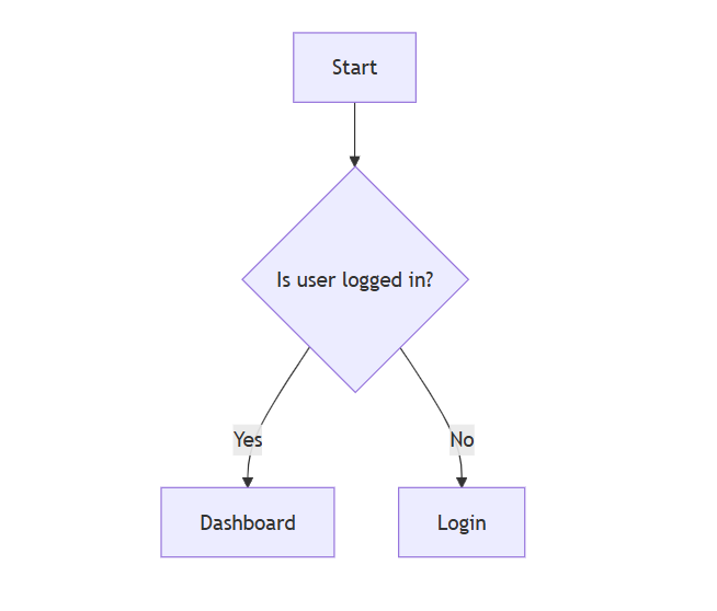
Flowcharts in Mermaid
Flowcharts are one of the most common uses of Mermaid.
Basic Flowchart
Mermaid
flowchartTDStart -->Check{Is user logged in?}Check -->|Yes|DashboardCheck -->|No|Login
flowchart TD means top-to-bottom layout
Curly braces {} define a decision
|Yes| and |No| label arrows
This makes Mermaid perfect for explaining logic and user flows.
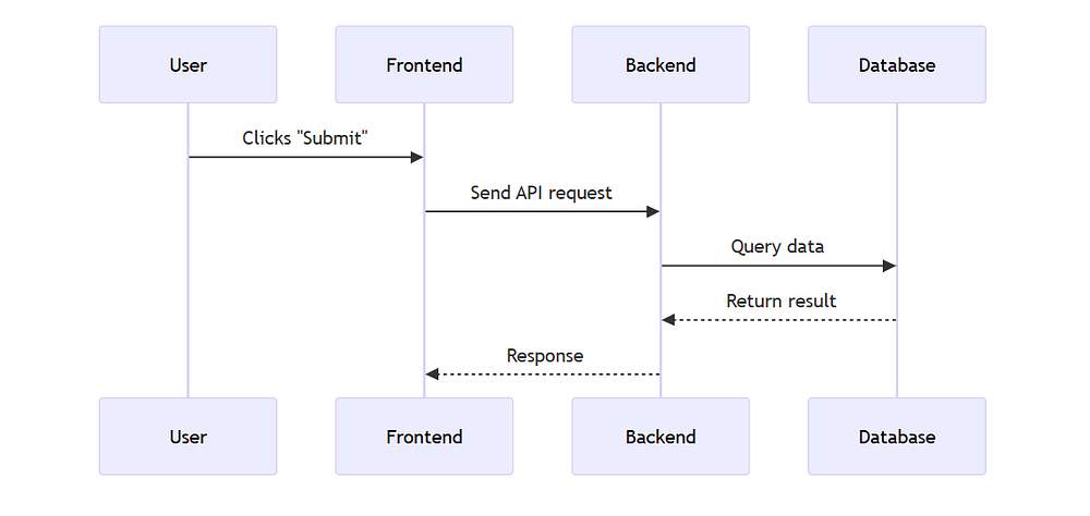
Sequence Diagrams in Mermaid
Sequence diagrams show how different systems interact over time.
API Request Flow
Mermaid
sequenceDiagramUser->>Frontend:Clicks "Submit"Frontend->>Backend:Send API requestBackend->>Database:Query dataDatabase-->>Backend:Return resultBackend-->>Frontend:Response
Arrows show communication
->> is a request
-->> is a response
Mermaid sequence diagrams are excellent for backend and API documentation.
Class Diagrams in Mermaid
Class diagrams are useful in object-oriented design.
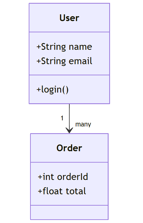
Simple Class Diagram
Mermaid
classDiagramclassUser{+Stringname+Stringemail+login()}classOrder{+intorderId+floattotal} User "1" --> "many" Order
Classes are defined with attributes and methods
Relationships are easy to read
Works well for system design docs
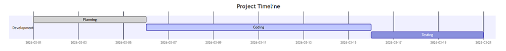
State Diagrams in Mermaid
State diagrams show how something changes over time.
This is useful for lightweight planning directly inside documentation.
Where You Can Use Mermaid
Mermaid works in many real-world environments.
Popular Platforms That Support Mermaid
GitHub Markdown
GitLab README files
Notion
Obsidian
VS Code (with extensions)
Static site generators
Internal documentation tools
This makes Mermaid ideal for teams that value documentation quality.
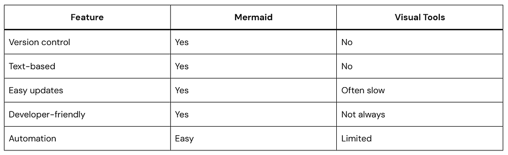
Mermaid vs Traditional Diagram Tools
Mermaid wins when documentation needs to stay accurate and maintainable.
Best Practices for Using Mermaid
To get the most out of Mermaid, follow these tips:
Keep diagrams simple and focused
Use clear labels
Avoid overloading one diagram
Store Mermaid diagrams close to related code
Treat diagrams as part of the development process
Is Mermaid Hard to Learn?
Not at all.
Most developers learn Mermaid basics in under an hour. Since the syntax is readable, you can often understand diagrams without knowing Mermaid at all.
That’s one reason Mermaid adoption keeps growing.
Why Mermaid Aligns with Modern Documentation Standards
Mermaid fits naturally into modern documentation practices, including:
Docs-as-code workflows
Developer experience (DX)
Agile and DevOps practices
AI-assisted documentation
Search-friendly, structured content
Because Mermaid diagrams are text-based, they integrate seamlessly with version-controlled documentation and are more accessible to AI tools than image-based diagrams. This makes them better suited for indexing, analysis, and automated summarization within modern documentation workflows.
Conclusion
Mermaid changes how developers think about diagrams.
Instead of treating diagrams as static images, Mermaid makes them living documentation. They evolve with your code, stay accurate, and remain easy to maintain.
If you care about clean documentation, team collaboration, and long-term clarity, Mermaid is worth learning.
Once you start using Mermaid, it’s hard to go back.
If you’re building Android apps with Jetpack Compose, chances are you’ve already used Compose Preview. Or at least clicked the little Preview tab in Android Studio and hoped it would magically show your UI.
Sometimes it does. Sometimes it doesn’t.
In this blog, we’ll break down Compose Preview, covering everything from core mechanics to practical tips. You’ll learn:
What Compose Preview actually is
How it works under the hood
Why it matters for real-world development
Where it struggles and why
When to trust it and when not to
Let’s start with the basics.
What Is Compose Preview?
Compose Preview is a design-time tool in Android Studio that lets you see your Jetpack Compose UI without running the app on a device or emulator.
It renders composable functions directly inside the IDE.
That means:
Faster feedback
No APK install
No waiting for Gradle every time you tweak padding or text size
In short, Compose Preview helps you design UI faster.
@Preview tells Android Studio: Render this composable
showBackground = true adds a white background so text is readable
GreetingPreview() supplies sample data ("Android")
This preview function is not used in production. It exists only for design-time visualization.
That’s an important detail many beginners miss.
How Compose Preview Works Behind the Scenes
Compose Preview does not run your full app.
Instead, Android Studio:
Compiles the composable function
Runs it in a special design-time environment
Skips most Android framework components
Renders the UI using sample data
That’s why previews are fast.
And that’s also why they’re limited.
Why Compose Preview Matters So Much
1. Faster UI Iteration
With Compose Preview, you can:
Adjust spacing
Change colors
Try different text styles
Experiment with layouts
All without touching an emulator.
For UI-heavy screens, this saves hours over time.
2. Encourages Smaller, Cleaner Composables
Compose Preview works best with small, focused composables.
That naturally pushes you toward:
Better separation of concerns
Reusable UI components
Clearer code structure
This directly improves long-term maintainability.
3. Better Design Collaboration
Designers and developers can:
Review UI changes quickly
Compare states side by side
Validate layouts early
Compose Preview becomes a shared visual language.
Advanced Compose Preview Features You Should Know
Beyond basic previews, several advanced features make Compose Preview even more powerful.
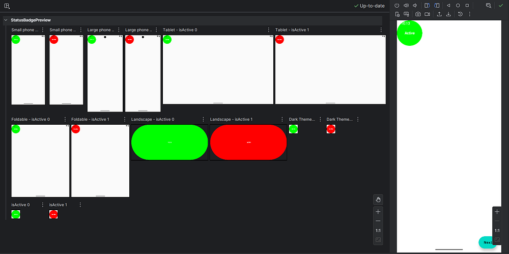
Preview with Different Device Configurations
The @Preview annotation accepts parameters that let you simulate different devices, screen sizes, and system settings.
Kotlin
@Preview( name = "Small phone", device = Devices.PIXEL_3A, showSystemUi = true)@Preview( name = "Large phone", device = Devices.PIXEL_7_PRO, showSystemUi = true)@Preview( name = "Tablet", device = Devices.PIXEL_TABLET, showSystemUi = true)@Preview( name = "Foldable", device = Devices.FOLDABLE, showSystemUi = true)@Preview( name = "Landscape", device = Devices.PIXEL_7_PRO, widthDp = 891, heightDp = 411)@Preview( name = "Dark Theme", uiMode = Configuration.UI_MODE_NIGHT_YES, showBackground = true)@Preview(showBackground = true)@ComposablefunResponsiveLayoutPreview() {MaterialTheme {Surface( modifier = Modifier.fillMaxSize(), tonalElevation = 4.dp ) {Column( modifier = Modifier .fillMaxSize() .padding(24.dp), verticalArrangement = Arrangement.spacedBy(20.dp) ) {// HeaderText( text = "Responsive UI", style = MaterialTheme.typography.headlineMedium, fontWeight = FontWeight.Bold )Text( text = "Adaptive layouts across form factors", style = MaterialTheme.typography.bodyMedium, color = MaterialTheme.colorScheme.onSurfaceVariant )Divider()Column( verticalArrangement = Arrangement.spacedBy(12.dp) ) {FeatureRow("Phones", "Compact & large screens")FeatureRow("Tablets", "Expanded content layouts")FeatureRow("Foldables", "Posture-aware UI")FeatureRow("Themes", "Light & Dark mode ready") } } } }}@ComposableprivatefunFeatureRow( title: String, subtitle: String) {Column {Text( text = title, style = MaterialTheme.typography.titleMedium, fontWeight = FontWeight.SemiBold )Text( text = subtitle, style = MaterialTheme.typography.bodySmall, color = MaterialTheme.colorScheme.onSurfaceVariant ) }}
Let me break down what’s happening here:
device = Devices.PIXEL_7_PRO: This tells Compose Preview to render your composable as if it’s running on a Pixel 7 Pro device, matching that specific screen size and dimensions.
showSystemUi = true: This parameter displays the system UI elements like the status bar and navigation bar, giving you a more realistic preview of how your app will look.
uiMode = Configuration.UI_MODE_NIGHT_YES: This simulates dark mode, letting you verify that your colors and themes work properly in both light and dark settings.
You can stack multiple @Preview annotations on the same function to see all these variations simultaneously.
Preview Parameters for Dynamic Content
Sometimes you want to test your composables with different data sets. The @PreviewParameter annotation helps with this.
Kotlin
classUserStateProvider : PreviewParameterProvider<Boolean> {overrideval values = sequenceOf(true, false)}@Preview(showBackground = true)@ComposablefunStatusBadgePreview(@PreviewParameter(UserStateProvider::class) isActive: Boolean) {Box( modifier = Modifier .size(100.dp) .background( color = if (isActive) Color.Green else Color.Red, shape = CircleShape ), contentAlignment = Alignment.Center ) {Text( text = if (isActive) "Active"else"Inactive", color = Color.White, fontWeight = FontWeight.Bold ) }}
Here,
The UserStateProvider class implements PreviewParameterProvider<Boolean>, which means it provides a sequence of Boolean values for previewing. The values property returns both true and false.
When you use @PreviewParameter(UserStateProvider::class) on the isActive parameter, Compose Preview automatically generates two separate previews—one for each value in the sequence. You get both the active and inactive states without writing separate preview functions.
This approach is incredibly useful when testing with lists of data, different user types, or various configuration options.
Interactive Preview Mode
Recent versions of Android Studio introduced interactive preview mode, which lets you click buttons, scroll lists, and interact with your UI directly in the preview pane. This feature brings you even closer to the actual app experience without leaving the IDE.
To enable it, look for the interactive mode toggle in the preview pane toolbar. Keep in mind that interactions are limited to the composable being previewed — you can’t navigate to other screens or trigger real network calls.
Where Compose Preview Falls Short
Compose Preview is helpful, but it’s not perfect.
Let’s talk honestly about its limitations.
1. No Real Runtime Logic
Compose Preview does not handle:
Network calls
Database access
ViewModel state from real sources
Dependency injection (Hilt, Koin)
If your composable depends on runtime data, preview will break.
That’s why preview-friendly composables should take simple, deterministic parameters that can be easily mocked in previews, rather than ViewModels.
2. Limited Interaction Support
You can’t:
Click buttons meaningfully
Trigger navigation
Test animations properly
Simulate gestures accurately
Compose Preview shows how things look, not how they behave.
For behavior, you still need:
Emulators
Physical devices
UI tests
3. Can Be Slow in Large Projects
As your project grows:
Previews may take longer to render
IDE memory usage increases
Sometimes previews just refuse to refresh
This isn’t your fault. It’s a known trade-off.
4. Not a Replacement for Testing
Compose Preview is not a test.
It won’t catch:
Crashes
Logic bugs
Edge-case states
Performance issues
Think of it as a design aid, not a quality gate.
Best Practices for Using Compose Preview
To get the most out of Compose Preview:
Keep Preview Functions Simple and Focused
Your preview functions should be straightforward and serve a single purpose. Don’t overcomplicate them with business logic or complex data transformations.
Kotlin
// Good: Simple and clear@Preview(showBackground = true)@ComposablefunLoadingButtonPreview() {LoadingButton( text = "Loading", isLoading = true, onClick = { } )}// Avoid: Too much logic in preview@Preview(showBackground = true)@ComposablefunComplicatedPreview() {val viewModel = remember { MyViewModel() }val state by viewModel.uiState.collectAsState()// This won't work well in preview..!}
The first preview is clean and predictable. The second tries to instantiate a ViewModel, which likely depends on dependency injection, context, or other resources that aren’t available in preview mode.
Use Preview Groups for Organization
When you have many related previews, organize them into preview groups for better navigation.
By creating a custom annotation like @ComponentPreviews and applying it alongside your @Preview annotations, you can filter and group previews in Android Studio. This becomes invaluable when working on large projects with hundreds of composables.
Create Preview Fixtures for Common Data
Maintain a separate file with preview fixtures — sample data objects you can reuse across multiple previews.
Kotlin
// PreviewFixtures.ktobjectPreviewFixtures {val sampleUser = UserData( name = "Amol Pawar", email = "[email protected]", joinDate = "March 2022" )val sampleMessages = listOf(MessageData("Hello there!", "Amol", "9:00 AM"),MessageData("How are you?", "Rutuja", "9:05 AM"),MessageData("Doing great!", "Amol", "9:10 AM") )val longText = """ This is a longer text sample that helps us test how our UI handles content that spans multiple lines. It's useful for checking text wrapping, overflow behavior, and spacing. """.trimIndent()}
These edge case previews help you catch layout issues before they reach production. Does your text truncate properly? Do your empty states look intentional rather than broken?
The Future of Compose Preview
The Compose Preview tool continues to evolve with each Android Studio release. Recent improvements include better performance, enhanced animation support, and more sophisticated interactive capabilities.
Looking ahead, we can expect:
Deeper integration with design tools: Better collaboration between designers and developers through improved Figma integration and design token support.
AI-assisted previews: Automated generation of preview functions based on your composable parameters and common usage patterns.
Enhanced debugging: More powerful inspection tools for understanding why your UI renders the way it does.
Cloud-based previews: The ability to share interactive previews with team members without requiring them to open Android Studio.
The Android development community actively shapes these improvements through feedback, so don’t hesitate to file feature requests or bug reports.
Conclusion
Despite its limitations, Compose Preview is an essential part of modern Android development. The speed and convenience it offers make it ideal for rapid UI iteration and component-level design work.
The key is knowing when to use it. Compose Preview works best for visual validation and layout refinement, while emulators or real devices are still necessary for testing interactions, animations, and real data flows.
When used with preview-friendly composables and best practices, Compose Preview significantly improves development speed and feedback. It turns UI work into a more iterative, design-driven process rather than a cycle of long builds and guesswork.


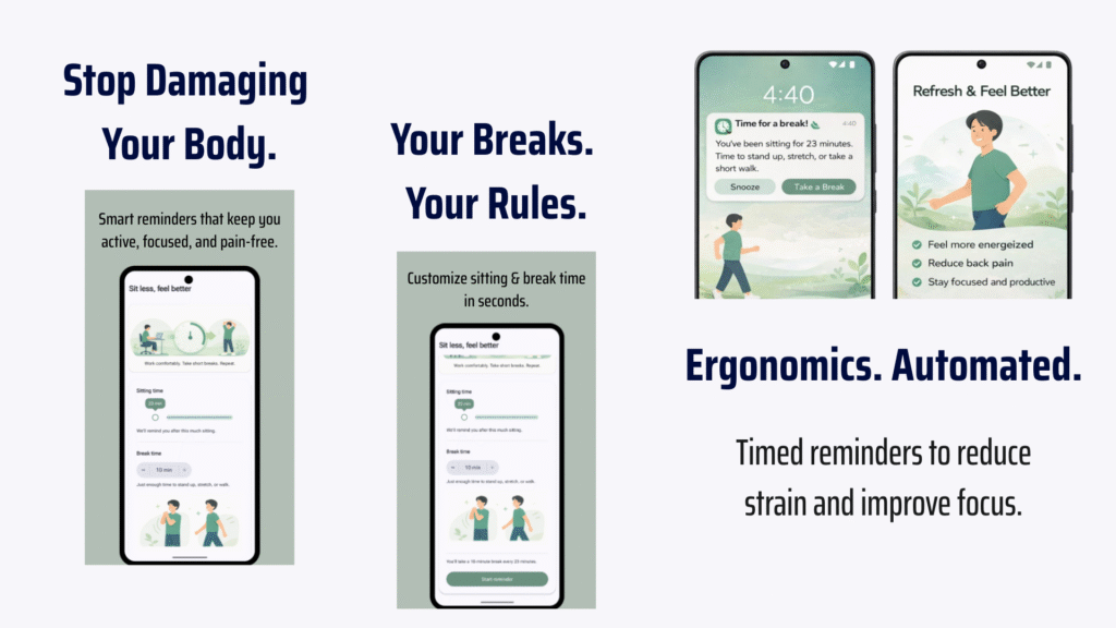
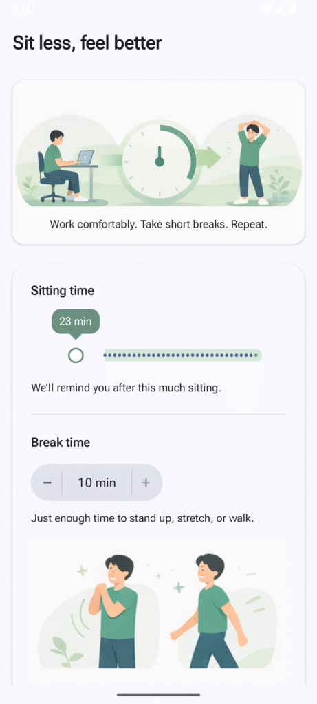
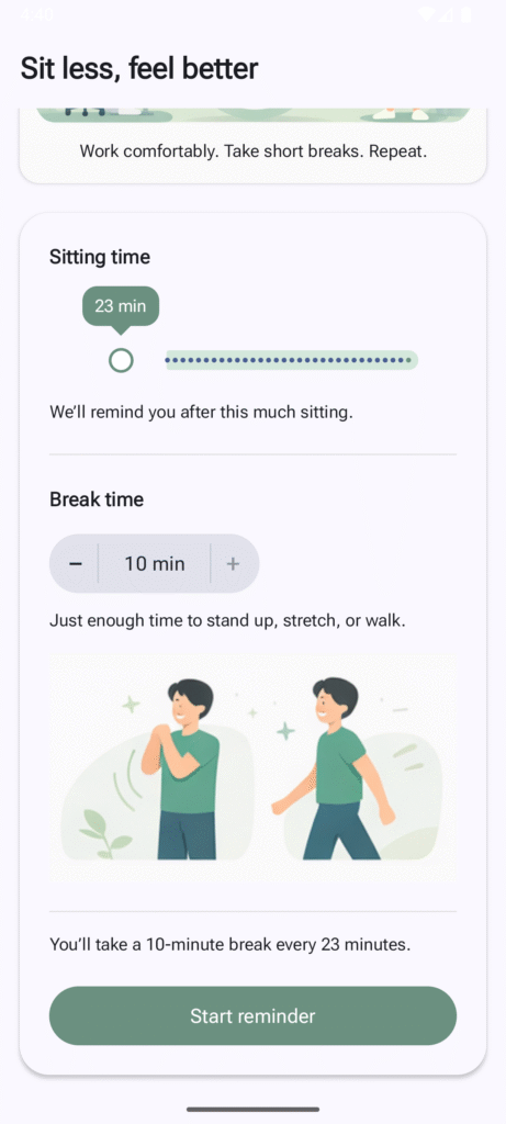