
Modern Android apps run on phones, tablets, foldables, Chromebooks, and even desktop environments. If your layout only looks good on one screen size, users will notice.
That’s where BoxWithConstraints in Jetpack Compose becomes powerful.
In this guide, you’ll learn what it is, when to use it, how it works internally, and how to build truly responsive layouts with practical examples.
What Is BoxWithConstraints in Jetpack Compose?
BoxWithConstraints in Jetpack Compose is a layout composable that gives you access to the size constraints of its parent during composition.
It lets you know how much space is available so you can change your UI dynamically.
Instead of guessing screen size or using hardcoded breakpoints, you can read:
maxWidthmaxHeightminWidthminHeight
And build your layout accordingly.
Why It Matters for Responsive UI
Responsive design is no longer optional.
Your app may run on:
- Compact phones
- Large tablets
- Foldables in multi-window mode
- Desktop mode
If you rely only on Modifier.fillMaxWidth() or fixed sizes, your UI may stretch or break.
BoxWithConstraints in Jetpack Compose helps you:
- Adapt layout based on width
- Switch between column and row layouts
- Show or hide content conditionally
- Change typography and spacing dynamically
This is real responsiveness, not just resizing.
How BoxWithConstraints Works
Here’s the basic structure:
@Composable
fun ResponsiveExample() {
    BoxWithConstraints {
        if (maxWidth < 600.dp) {
            Text("Compact Screen")
        } else {
            Text("Large Screen")
        }
    }
}
Inside BoxWithConstraints, you can directly access maxWidth.
The important thing to understand:
- The values are
Dp - They represent the constraints passed from the parent
- The composable recomposes if constraints change
So your UI reacts automatically.
Example 1: Switching Between Column and Row Layout
This is a common real-world case.
On small screens → stack items vertically
On large screens → place items side by side
@Composable
fun ProfileSection() {
    BoxWithConstraints(
        modifier = Modifier.fillMaxSize()
    ) {
        val isCompact = maxWidth < 600.dp

    if (isCompact) {
            Column(
                modifier = Modifier.padding(16.dp)
            ) {
                Avatar()
                Spacer(modifier = Modifier.height(16.dp))
                UserInfo()
            }
        } else {
            Row(
                modifier = Modifier.padding(24.dp)
            ) {
                Avatar()
                Spacer(modifier = Modifier.width(24.dp))
                UserInfo()
            }
        }
    }
}- We check if width is less than 600dp.
- If true → vertical layout.
- If false → horizontal layout.
- Spacing is adjusted accordingly.
This approach is clean and easy to scale.
Example 2: Dynamic Card Grid
Let’s build a responsive grid without using a predefined grid layout.
@Composable
fun ResponsiveGrid() {
    BoxWithConstraints(
        modifier = Modifier.fillMaxWidth()
    ) {
        val columns = when {
            maxWidth < 600.dp -> 1
            maxWidth < 840.dp -> 2
            else -> 3
        }

    LazyVerticalGrid(
            columns = GridCells.Fixed(columns),
            contentPadding = PaddingValues(16.dp)
        ) {
            items(20) { index ->
                Card(
                    modifier = Modifier
                        .padding(8.dp)
                        .fillMaxWidth()
                ) {
                    Text(
                        text = "Item $index",
                        modifier = Modifier.padding(16.dp)
                    )
                }
            }
        }
    }
}- We calculate column count dynamically.
- Grid adapts to available width.
- No device-specific logic.
- No hardcoded “tablet mode.”
This is flexible and future-proof.
Accessing Constraints in Pixels
Sometimes you need pixel-level calculations.
Inside BoxWithConstraints in Jetpack Compose, you can convert Dp to pixels:
@Composable
fun WidthInPixelsExample() {
    BoxWithConstraints {
        val widthInPx = with(LocalDensity.current) {
            maxWidth.toPx()
        }

        Text("Width in pixels: $widthInPx")
    }
}
Use this carefully. Most of the time, Dp is enough.
When Should You Use BoxWithConstraints?
Use it when:
- Layout changes based on available width
- You need responsive breakpoints
- Parent constraints matter for child composition
- You’re building adaptive layouts
Avoid using it:
- For simple static UI
- When Modifier constraints are enough
- When you only need screen size (use
LocalConfigurationinstead)
Think of BoxWithConstraints in Jetpack Compose as a precision tool, not a default choice.
Common Mistakes Developers Make
1. Confusing Screen Size with Available Space
BoxWithConstraints gives you parent constraints, not the entire screen size.
In split-screen mode, constraints may be smaller than the device width.
This is good. It makes your UI adaptive.
2. Overusing Nested BoxWithConstraints
Nesting multiple constraint readers increases complexity and recomposition cost.
Keep it simple.
3. Hardcoding Too Many Breakpoints
Instead of:
maxWidth < 400.dp
maxWidth < 500.dp
maxWidth < 600.dp
Stick to meaningful layout breakpoints like:
- Compact
- Medium
- Expanded
This keeps logic maintainable.
Performance Considerations
Is BoxWithConstraints in Jetpack Compose expensive?
Not really. But:
- It introduces recomposition when constraints change.
- Complex logic inside it can slow composition.
Best practice:
Keep heavy calculations outside or memoize using remember.
Example:
val isCompact = remember(maxWidth) {
    maxWidth < 600.dp
}
This ensures efficient re-composition.
Real-World Pattern: Adaptive Master-Detail Layout
Classic example:
Phone → single column
Tablet → list + details side by side
@Composable
fun MasterDetailLayout() {
    BoxWithConstraints(
        modifier = Modifier.fillMaxSize()
    ) {
        val isTablet = maxWidth >= 840.dp

         if (isTablet) {
            Row {
                Box(modifier = Modifier.weight(1f)) {
                    MasterList()
                }
                Box(modifier = Modifier.weight(2f)) {
                    DetailPane()
                }
            }
        } else {
            MasterList()
        }
    }
}
This pattern is widely used in email apps, dashboards, and productivity tools.
Box vs BoxWithConstraints
You might wonder:
Why not just use Box?
Here’s the difference:
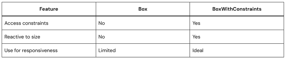
If you don’t need constraint info, stick with Box.
How It Aligns with Modern Android Best Practices
Google encourages:
- Adaptive layouts
- Multi-device support
- Foldable readiness
BoxWithConstraints in Jetpack Compose supports all of this naturally.
It works well alongside:
- Window size classes
- Material 3 adaptive design
- Large screen guidelines
You’re building future-ready UI when you use it correctly.
Quick FAQ
What is BoxWithConstraints in Jetpack Compose?
It is a layout composable that exposes parent layout constraints like maxWidth and maxHeight, allowing dynamic and responsive UI decisions during composition.
When should I use BoxWithConstraints?
Use it when your layout must change depending on available space, such as switching from column to row or adjusting grid columns.
Does BoxWithConstraints affect performance?
It can trigger recomposition when constraints change, but it is generally efficient when used correctly.
Is BoxWithConstraints better than LocalConfiguration?
They serve different purposes.
LocalConfigurationgives device configuration.BoxWithConstraintsgives parent layout constraints.
Conclusion
Mastering BoxWithConstraints in Jetpack Compose changes how you think about UI design.
Instead of designing for fixed screens, you design for available space.
That shift makes your apps:
- More adaptive
- More professional
- More future-proof
Start simple. Add breakpoints thoughtfully. Test in multi-window mode. Resize your emulator. Observe how your UI behaves.
Responsive design is not about bigger screens. It’s about flexible thinking.
And BoxWithConstraints in Jetpack Compose is one of your best tools to make that happen.