
If you’re building Android apps with Jetpack Compose, chances are you’ve already used Compose Preview. Or at least clicked the little Preview tab in Android Studio and hoped it would magically show your UI.
Sometimes it does.
Sometimes it doesn’t.
In this blog, we’ll break down Compose Preview, covering everything from core mechanics to practical tips. You’ll learn:
- What Compose Preview actually is
- How it works under the hood
- Why it matters for real-world development
- Where it struggles and why
- When to trust it and when not to
Let’s start with the basics.
What Is Compose Preview?
Compose Preview is a design-time tool in Android Studio that lets you see your Jetpack Compose UI without running the app on a device or emulator.
It renders composable functions directly inside the IDE.
That means:
- Faster feedback
- No APK install
- No waiting for Gradle every time you tweak padding or text size
In short, Compose Preview helps you design UI faster.
A Simple Compose Preview Example
Let’s start with a basic example.
@Composable
fun Greeting(name: String) {
    Text(text = "Hello, $name!")
}
This composable works, but Android Studio can’t preview it yet. Why?
Because Greeting needs a parameter.
That’s where Compose Preview comes in.
Adding a Preview Function
@Preview(showBackground = true)
@Composable
fun GreetingPreview() {
    Greeting(name = "Android")
}@Previewtells Android Studio: Render this composableshowBackground = trueadds a white background so text is readableGreetingPreview()supplies sample data ("Android")
This preview function is not used in production.
It exists only for design-time visualization.
That’s an important detail many beginners miss.
How Compose Preview Works Behind the Scenes
Compose Preview does not run your full app.
Instead, Android Studio:
- Compiles the composable function
- Runs it in a special design-time environment
- Skips most Android framework components
- Renders the UI using sample data
That’s why previews are fast.
And that’s also why they’re limited.
Why Compose Preview Matters So Much
1. Faster UI Iteration
With Compose Preview, you can:
- Adjust spacing
- Change colors
- Try different text styles
- Experiment with layouts
All without touching an emulator.
For UI-heavy screens, this saves hours over time.
2. Encourages Smaller, Cleaner Composables
Compose Preview works best with small, focused composables.
That naturally pushes you toward:
- Better separation of concerns
- Reusable UI components
- Clearer code structure
This directly improves long-term maintainability.
3. Better Design Collaboration
Designers and developers can:
- Review UI changes quickly
- Compare states side by side
- Validate layouts early
Compose Preview becomes a shared visual language.
Advanced Compose Preview Features You Should Know
Beyond basic previews, several advanced features make Compose Preview even more powerful.
Preview with Different Device Configurations
The @Preview annotation accepts parameters that let you simulate different devices, screen sizes, and system settings.
@Preview(
    name = "Small phone",
    device = Devices.PIXEL_3A,
    showSystemUi = true
)
@Preview(
    name = "Large phone",
    device = Devices.PIXEL_7_PRO,
    showSystemUi = true
)
@Preview(
    name = "Tablet",
    device = Devices.PIXEL_TABLET,
    showSystemUi = true
)
@Preview(
    name = "Foldable",
    device = Devices.FOLDABLE,
    showSystemUi = true
)
@Preview(
    name = "Landscape",
    device = Devices.PIXEL_7_PRO,
    widthDp = 891,
    heightDp = 411
)
@Preview(
    name = "Dark Theme",
    uiMode = Configuration.UI_MODE_NIGHT_YES,
    showBackground = true
)
@Preview(showBackground = true)
@Composable
fun ResponsiveLayoutPreview() {
    MaterialTheme {
        Surface(
            modifier = Modifier.fillMaxSize(),
            tonalElevation = 4.dp
        ) {
            Column(
                modifier = Modifier
                    .fillMaxSize()
                    .padding(24.dp),
                verticalArrangement = Arrangement.spacedBy(20.dp)
            ) {

                // Header
                Text(
                    text = "Responsive UI",
                    style = MaterialTheme.typography.headlineMedium,
                    fontWeight = FontWeight.Bold
                )

                Text(
                    text = "Adaptive layouts across form factors",
                    style = MaterialTheme.typography.bodyMedium,
                    color = MaterialTheme.colorScheme.onSurfaceVariant
                )

                Divider()

                Column(
                    verticalArrangement = Arrangement.spacedBy(12.dp)
                ) {
                    FeatureRow("Phones", "Compact & large screens")
                    FeatureRow("Tablets", "Expanded content layouts")
                    FeatureRow("Foldables", "Posture-aware UI")
                    FeatureRow("Themes", "Light & Dark mode ready")
                }
            }
        }
    }
}

@Composable
private fun FeatureRow(
    title: String,
    subtitle: String
) {
    Column {
        Text(
            text = title,
            style = MaterialTheme.typography.titleMedium,
            fontWeight = FontWeight.SemiBold
        )
        Text(
            text = subtitle,
            style = MaterialTheme.typography.bodySmall,
            color = MaterialTheme.colorScheme.onSurfaceVariant
        )
    }
}
Let me break down what’s happening here:
- device = Devices.PIXEL_7_PRO: This tells Compose Preview to render your composable as if it’s running on a Pixel 7 Pro device, matching that specific screen size and dimensions.
- showSystemUi = true: This parameter displays the system UI elements like the status bar and navigation bar, giving you a more realistic preview of how your app will look.
- uiMode = Configuration.UI_MODE_NIGHT_YES: This simulates dark mode, letting you verify that your colors and themes work properly in both light and dark settings.
You can stack multiple @Preview annotations on the same function to see all these variations simultaneously.

Preview Parameters for Dynamic Content
Sometimes you want to test your composables with different data sets. The @PreviewParameter annotation helps with this.
class UserStateProvider : PreviewParameterProvider<Boolean> {
    override val values = sequenceOf(true, false)
}

@Preview(showBackground = true)
@Composable
fun StatusBadgePreview(
    @PreviewParameter(UserStateProvider::class) isActive: Boolean
) {
    Box(
        modifier = Modifier
            .size(100.dp)
            .background(
                color = if (isActive) Color.Green else Color.Red,
                shape = CircleShape
            ),
        contentAlignment = Alignment.Center
    ) {
        Text(
            text = if (isActive) "Active" else "Inactive",
            color = Color.White,
            fontWeight = FontWeight.Bold
        )
    }
}
Here,
The UserStateProvider class implements PreviewParameterProvider<Boolean>, which means it provides a sequence of Boolean values for previewing. The values property returns both true and false.
When you use @PreviewParameter(UserStateProvider::class) on the isActive parameter, Compose Preview automatically generates two separate previews—one for each value in the sequence. You get both the active and inactive states without writing separate preview functions.
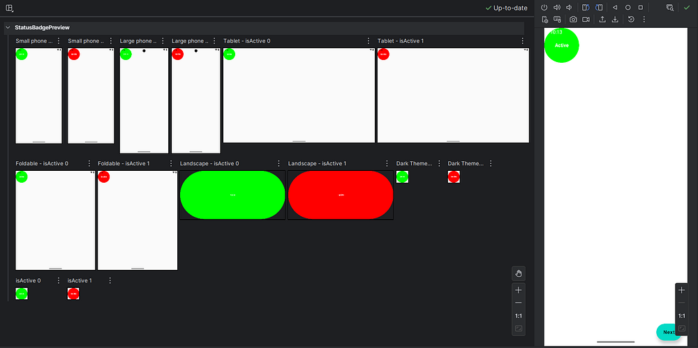
This approach is incredibly useful when testing with lists of data, different user types, or various configuration options.
Interactive Preview Mode
Recent versions of Android Studio introduced interactive preview mode, which lets you click buttons, scroll lists, and interact with your UI directly in the preview pane. This feature brings you even closer to the actual app experience without leaving the IDE.
To enable it, look for the interactive mode toggle in the preview pane toolbar. Keep in mind that interactions are limited to the composable being previewed — you can’t navigate to other screens or trigger real network calls.
Where Compose Preview Falls Short
Compose Preview is helpful, but it’s not perfect.
Let’s talk honestly about its limitations.
1. No Real Runtime Logic
Compose Preview does not handle:
- Network calls
- Database access
- ViewModel state from real sources
- Dependency injection (Hilt, Koin)
If your composable depends on runtime data, preview will break.
That’s why preview-friendly composables should take simple, deterministic parameters that can be easily mocked in previews, rather than ViewModels.
2. Limited Interaction Support
You can’t:
- Click buttons meaningfully
- Trigger navigation
- Test animations properly
- Simulate gestures accurately
Compose Preview shows how things look, not how they behave.
For behavior, you still need:
- Emulators
- Physical devices
- UI tests
3. Can Be Slow in Large Projects
As your project grows:
- Previews may take longer to render
- IDE memory usage increases
- Sometimes previews just refuse to refresh
This isn’t your fault. It’s a known trade-off.
4. Not a Replacement for Testing
Compose Preview is not a test.
It won’t catch:
- Crashes
- Logic bugs
- Edge-case states
- Performance issues
Think of it as a design aid, not a quality gate.
Best Practices for Using Compose Preview
To get the most out of Compose Preview:
Keep Preview Functions Simple and Focused
Your preview functions should be straightforward and serve a single purpose. Don’t overcomplicate them with business logic or complex data transformations.
// Good: Simple and clear
@Preview(showBackground = true)
@Composable
fun LoadingButtonPreview() {
    LoadingButton(
        text = "Loading",
        isLoading = true,
        onClick = { }
    )
}

// Avoid: Too much logic in preview
@Preview(showBackground = true)
@Composable
fun ComplicatedPreview() {
    val viewModel = remember { MyViewModel() }
    val state by viewModel.uiState.collectAsState()
    // This won't work well in preview..!
}
The first preview is clean and predictable. The second tries to instantiate a ViewModel, which likely depends on dependency injection, context, or other resources that aren’t available in preview mode.
Use Preview Groups for Organization
When you have many related previews, organize them into preview groups for better navigation.
annotation class ComponentPreviews

@ComponentPreviews
@Preview(name = "Small Button", widthDp = 100)
@Preview(name = "Medium Button", widthDp = 200)
@Preview(name = "Large Button", widthDp = 300)
@Composable
fun ButtonSizePreview() {
    Button(onClick = { }) {
        Text("Click Me")
    }
}
By creating a custom annotation like @ComponentPreviews and applying it alongside your @Preview annotations, you can filter and group previews in Android Studio. This becomes invaluable when working on large projects with hundreds of composables.
Create Preview Fixtures for Common Data
Maintain a separate file with preview fixtures — sample data objects you can reuse across multiple previews.
// PreviewFixtures.kt
object PreviewFixtures {
    val sampleUser = UserData(
        name = "Amol Pawar",
        email = "[email protected]",
        joinDate = "March 2022"
    )

    val sampleMessages = listOf(
        MessageData("Hello there!", "Amol", "9:00 AM"),
        MessageData("How are you?", "Rutuja", "9:05 AM"),
        MessageData("Doing great!", "Amol", "9:10 AM")
    )

    val longText = """
        This is a longer text sample that helps us test how our UI
        handles content that spans multiple lines. It's useful for
        checking text wrapping, overflow behavior, and spacing.
    """.trimIndent()
}
Then use these fixtures in your previews:
@Preview(showBackground = true)
@Composable
fun UserProfileWithFixturePreview() {
    UserProfile(
        userId = "sample",
        getUserData = { PreviewFixtures.sampleUser }
    )
}
This approach keeps your preview code DRY (Don’t Repeat Yourself) and makes it easier to maintain consistency across previews.
Test Edge Cases in Previews
Don’t just preview your happy path. Create previews for edge cases like empty states, error states, and extreme data conditions.
@Preview(name = "Empty List", showBackground = true)
@Composable
fun EmptyListPreview() {
    MessageList(messages = emptyList())
}

@Preview(name = "Very Long Name", showBackground = true)
@Composable
fun LongNamePreview() {
    ProfileCard(
        name = "Soundarya Bhagayalaxmi Venkateshwari Basapa Rao",
        isOnline = true,
        profileImageUrl = null
    )
}

@Preview(name = "Single Character", showBackground = true)
@Composable
fun SingleCharPreview() {
    ProfileCard(
        name = "X",
        isOnline = false,
        profileImageUrl = null
    )
}
These edge case previews help you catch layout issues before they reach production. Does your text truncate properly? Do your empty states look intentional rather than broken?
The Future of Compose Preview
The Compose Preview tool continues to evolve with each Android Studio release. Recent improvements include better performance, enhanced animation support, and more sophisticated interactive capabilities.
Looking ahead, we can expect:
- Deeper integration with design tools: Better collaboration between designers and developers through improved Figma integration and design token support.
- AI-assisted previews: Automated generation of preview functions based on your composable parameters and common usage patterns.
- Enhanced debugging: More powerful inspection tools for understanding why your UI renders the way it does.
- Cloud-based previews: The ability to share interactive previews with team members without requiring them to open Android Studio.
The Android development community actively shapes these improvements through feedback, so don’t hesitate to file feature requests or bug reports.
Conclusion
Despite its limitations, Compose Preview is an essential part of modern Android development. The speed and convenience it offers make it ideal for rapid UI iteration and component-level design work.
The key is knowing when to use it. Compose Preview works best for visual validation and layout refinement, while emulators or real devices are still necessary for testing interactions, animations, and real data flows.
When used with preview-friendly composables and best practices, Compose Preview significantly improves development speed and feedback. It turns UI work into a more iterative, design-driven process rather than a cycle of long builds and guesswork.
Happy previewing..!