Web

CDN (Content Delivery Network)

What Is a CDN in Web Development? A Complete Beginner’s Guide

When it comes to building fast, secure, and scalable websites, one term you’ll hear over and over again is CDN. Short for Content Delivery Network, a CDN is a critical part of modern web infrastructure — and it plays a big role in keeping your site lightning-fast, even for users on the other side of the globe.

But what exactly is a CDN? How does it work? And why should you care as a developer, designer, or site owner?

Let’s break it all down 

Understanding the Basics: What Is a CDN?

At its core, a Content Delivery Network (CDN) is a globally distributed network of servers that deliver web content — like images, videos, CSS files, JavaScript, and even entire HTML pages — to users based on their geographical location.

The idea is simple: rather than making every user fetch content from a single central server (which could be thousands of miles away), a Content Delivery Network stores copies of your content on multiple edge servers that are strategically placed around the world.

So when someone in Tokyo loads your website, they’ll receive the content from a server located in or near Tokyo — not from your origin server in, say, New York.

Why Does That Matter?

The internet is fast, but distance still affects performance. If users have to connect to a faraway server, it can lead to:

  • Slower page loads
  • Increased latency (the delay before a transfer begins)
  • Poorer overall user experience

A Content Delivery Network solves this by bringing your content closer to your audience, wherever they are.

Everyday Analogy: Think of It Like a Pizza Chain

Let’s make it even simpler with a relatable analogy.

Imagine you run a famous pizza restaurant in New York, and someone in Mumbai places an order. If you had to cook and ship that pizza from New York, it would take ages to arrive, and it’d be cold and soggy by the time it got there.

Now, imagine you’ve opened branches in Mumbai, London, and Tokyo. When someone in Mumbai places an order, they get their pizza fresh and fast — from the nearest location.

That’s exactly what a Content Delivery Network does for your website’s static assets. It serves them from the closest available “branch,” known as an edge server.

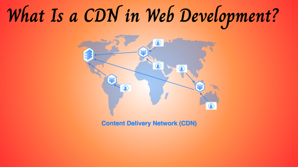
How a CDN Works: A Simple Diagram

Here’s a quick overview of how a CDN fits into the picture:

PHP
                    +---------------------+
                    |   Origin Server     |
                    | (Your Web Hosting)  |
                    +---------------------+
                              |
              -------------------------------------------
              |               |                         |
   +----------------+ +----------------+ +----------------+
   | CDN Edge - USA | | CDN Edge - UK  | | CDN Edge - Asia |
   +----------------+ +----------------+ +----------------+
              |                 |                  |
            Users             Users              Users
          (America)          (Europe)            (Asia)

Whenever a user requests your site:

  1. The request is routed to the nearest CDN edge server.
  2. If the content is cached, it’s delivered instantly.
  3. If not, the edge server fetches it from the origin, caches it, and then serves it.

Key Benefits of Using a Content Delivery Network

Here’s why developers and businesses love CDNs:

1. Faster Load Times

By serving content closer to the user, CDNs drastically reduce latency. Faster sites lead to better engagement and conversions.

2. Global Reach

You can deliver a consistent experience to users across continents without setting up servers everywhere.

3. Enhanced Security

Many Content Delivery Network providers offer built-in DDoS protection, firewalls, and TLS/SSL encryption to safeguard your site.

4. Reduced Server Load

Instead of all users hitting your origin server, the load is distributed across multiple edge servers — saving bandwidth and server resources.

5. Improved Uptime

Even if your origin server goes down temporarily, cached content from edge servers can keep your site online.

Common Use Cases

CDNs are widely used in all sorts of web projects. Here are some popular scenarios:

  • E-commerce websites: Faster load times improve sales.
  • Media-heavy blogs or portfolios: Smoothly deliver high-resolution images or video.
  • Web applications and SPAs: Ensure fast JS and CSS delivery.
  • Corporate or news sites: Handle traffic spikes without crashing.

Popular Content Delivery Network Providers

There are plenty of Content Delivery Network providers out there. Here are some of the most widely used:

ProviderHighlights
CloudflareFree tier, security features, global reach
AkamaiEnterprise-grade, great for large-scale traffic
Amazon CloudFrontDeep AWS integration, flexible pricing
FastlyGreat for dynamic content and real-time control
Google Cloud CDNTightly integrated with Google Cloud services

Real-Life Example: Using a CDN for jQuery

You might already be using a Content Delivery Network without even knowing it. Consider this HTML snippet:

Kotlin
<script src="https://softaai.com/wp-content/litespeed/localres/aHR0cHM6Ly9jZG5qcy5jbG91ZGZsYXJlLmNvbS8=ajax/libs/jquery/3.6.0/jquery.min.js"></script>

This line loads jQuery from Cloudflare’s CDN, not your own server. The browser fetches it from the nearest Cloudflare edge node — fast and efficient!

Do You Need a Content Delivery Network?

Short answer: Probably, yes — especially if you serve users beyond a single region or host rich media.

For small static sites, a Content Delivery Network is still helpful for speed. For dynamic web apps or eCommerce platforms, it’s often essential.

If you’re using WordPress, many caching or optimization plugins offer CDN support (like Jetpack, WP Rocket, or Cloudflare). If you’re building with modern stacks (React, Next.js, etc.), many hosting providers like Vercel and Netlify have CDN baked right in.

Conclusion

A CDN isn’t just a nice-to-have — it’s a performance and reliability multiplier for websites of all sizes. Whether you’re running a simple blog or a full-scale eCommerce platform, a Content Delivery Network ensures your content loads fast, stays secure, and remains available even under heavy traffic.

So the next time someone asks, “What’s a CDN and why do I need one?”, just tell them it’s like getting a pizza from the nearest branch — hot, fresh, and on time.

QUIC.cloud for WordPress

Complete Guide to QUIC.cloud for WordPress: Unlocking Speed and Security

In the age of lightning-fast websites and ever-growing user expectations, every second counts. If you’re running a WordPress site, especially with dynamic content like eCommerce or membership platforms, you need more than just a basic CDN. You need something smarter, faster, and built for the future. Enter QUIC.cloud.

In this comprehensive guide, we’ll cover everything you need to know about QUIC.cloud — what it is, why it matters, and how to set it up the right way to supercharge your website performance. Whether you’re a beginner or a seasoned developer, this article has something for you.

What is QUIC.cloud?

QUIC.cloud is a cutting-edge content delivery network (CDN) and website optimization service designed to work seamlessly with the LiteSpeed Web Server and LiteSpeed Cache plugin (LSCache). What makes it unique is that it supports dynamic page caching, meaning it can serve even your dynamic WordPress pages from edge servers around the world.

It’s the first and only CDN service that can cache both static and dynamic content generated by WordPress, thanks to its native integration with LiteSpeed technologies.

Why Use QUIC.cloud?

1. Dynamic CDN for WordPress

Most traditional CDNs only cache static assets like images, CSS, and JS files. QUIC.cloud takes it a step further by caching dynamic content, like your homepage, product pages, blog posts, or anything powered by PHP.

2. Global Content Delivery

QUIC uses a network of globally distributed edge servers, meaning your site is delivered to visitors from the nearest server to them. This drastically reduces latency and load time.

3. Image Optimization

With QUIC, you can automatically compress images and convert them to next-gen formats like WebP, reducing load time without sacrificing quality.

4. Critical CSS Generation

It creates critical CSS for each page, ensuring faster paint and layout times, especially on mobile devices.

5. Minification & Combination

You can minify and combine CSS, JavaScript, and HTML directly through the LiteSpeed Cache plugin settings, streamlining page loading.

6. HTTP/3 Support via QUIC Protocol

Built on the QUIC protocol (which is the basis for HTTP/3), QUIC.cloud offers more secure and faster data transmission than older protocols.

7. Security Features

QUIC adds extra layers of protection including:

  • DDoS Mitigation
  • Geo IP blocking
  • reCAPTCHA integration

8. Works Seamlessly with LiteSpeed Hosting

If you’re using a LiteSpeed-powered web host, you get access to more features and increased optimization credits at no additional cost.

Who Should Use It?

  • WordPress site owners using LiteSpeed Cache
  • WooCommerce or eCommerce sites
  • Membership or LMS platforms
  • Anyone looking for top-tier site speed and global performance

How to Set Up QUIC.cloud for WordPress

Here’s how to get QUIC.cloud up and running on your WordPress site:

Step 1: Install LiteSpeed Cache Plugin

Go to your WordPress admin dashboard:

  • Navigate to Plugins → Add New
  • Search for LiteSpeed Cache
  • Install and activate it

Step 2: Request a Domain Key

This key connects your site to the QUIC.cloud platform.

  • Go to LiteSpeed Cache → General → General Settings
  • Click Request Domain Key

Wait a few minutes for the domain key to be generated and verified.

Step 3: Link Your Site to QUIC.cloud

Once the domain key is validated:

  • Click the Link to QUIC.cloud button
  • Log in or create a my.quic.cloud account
  • Your site will now appear in the QUIC.cloud dashboard

Step 4: Enable CDN

From your QUIC.cloud dashboard:

  • Select your site
  • Navigate to CDN → Enable CDN
  • You will be given a CNAME record (e.g., yourdomain.quic.cloud)

Step 5: Update DNS Settings

Log in to your domain registrar or DNS manager (e.g., Cloudflare, GoDaddy):

  • Replace your current A record with the provided CNAME
  • Save and apply changes

DNS changes may take a few minutes to a few hours to propagate globally.

Step 6: Verify CDN Status

Once DNS is updated:

  • Go back to the QUIC.cloud dashboard
  • Check that your site is now being served via QUIC.cloud CDN

Fine-Tuning for Performance

After setup, you can dig into the LiteSpeed Cache settings to unlock more performance:

  • Page Optimization: Minify/Combine CSS, JS, and HTML; Load CSS Asynchronously
  • Media Optimization: Enable image compression and WebP conversion
  • Critical CSS: Turn on automatic critical CSS generation
  • Database Cleanup: Remove post revisions, spam comments, and transient options
  • Crawler: Enable cache warm-up for better first-load experience

Free vs. Paid: What’s the Difference?

Free Plan Includes:

  • 10 GB CDN Bandwidth per month
  • Basic image optimization and CSS services

Paid Plans Add:

  • More CDN bandwidth
  • Higher optimization credits
  • Prioritized support

Hosting on a LiteSpeed server? You may be eligible for additional free credits. Eligibility may change from time to time, so for the most up-to-date information, please visit the official QUIC.cloud website and documentation.

Conclusion

Absolutely — especially if you’re already using LiteSpeed Cache. It brings together CDN performance, image optimization, HTTP/3 support, and enhanced security, all in one tightly integrated package.

By following the steps above, your WordPress site will load faster, rank better in search engines, and offer a smoother experience for your users.

If you’re serious about site performance and future-proofing your online presence, QUIC.cloud is a no-brainer.

CSS Image Sprites

How CSS Image Sprites Improve Website Performance: A Complete Guide

In today’s fast-paced digital world, the speed and efficiency of your website aren’t just nice to have — they’re essential. Whether you’re aiming to climb higher in Google rankings or deliver a seamless experience to your users, optimizing every part of your site matters. One classic but still highly effective technique to enhance your website’s loading performance is CSS Image Sprites.

In this guide, we’ll walk you through what CSS Sprites are, why they matter in modern web development, and exactly how to use them — with clear examples. Plus, you’ll understand how they fit into today’s best practices for SEO Core Web Vitals, and AI-powered content optimization.

What Are CSS Image Sprites?

In simple terms, a CSS Image Sprite is a single image that contains multiple smaller graphics. Instead of loading dozens of individual images (like icons, buttons, or small decorative visuals) separately, you load just one — and use CSS to show only the part of the image you need at a specific spot.

Think of it like a collage poster: all your images are placed together neatly, and you simply “frame” the part you want to display.

Why Use CSS Image Sprites?

Here’s where it gets interesting. Using CSS Sprites can solve several major performance problems at once:

1. Reduce HTTP Requests

Each image on a webpage normally requires a separate HTTP request. More requests = longer load times.
With a sprite, all those images come in one file.
Result? Fewer server requests, faster loading.

2. Improve Website Speed

By cutting down on unnecessary requests, your page displays faster — which directly impacts your site’s Core Web Vitals like Largest Contentful Paint (LCP) and First Contentful Paint (FCP).
 Speed is also a key ranking factor for Google.

3. Better Bandwidth Efficiency

Downloading one slightly larger image is often much lighter than downloading twenty smaller ones individually (due to reduced header and connection overhead).

4. Easier Maintenance

Managing a single sprite is cleaner than juggling dozens of small icons across your server.

5. Contribute to AI-Optimized Delivery

While CSS Sprites are not an AI technology themselves, they indirectly support AI-optimized delivery by improving site speed, Core Web Vitals, and user experience — all of which are factors that AI-driven search algorithms prioritize. They help your content be more efficiently served, discovered, and ranked in AI-powered environments like Google’s Search Generative Experience (SGE).

How CSS Sprites Work: Step-by-Step

Let’s make it real with a clear example.

Imagine you have these four icons:

  • Home
  • User
  • Settings
  • Logout

Before: Without Sprites

Your typical HTML would look like:

CSS
<img src="home.png" alt="Home">
<img src="user.png" alt="User">
<img src="settings.png" alt="Settings">
<img src="logout.png" alt="Logout">

Simple but inefficient: Each <img> triggers a new server request.

After: With Sprites

You bundle all four icons into one image file (say, icons-sprite.png).

HTML:

CSS
<span class="sprite icon-home"></span>
<span class="sprite icon-user"></span>
<span class="sprite icon-settings"></span>
<span class="sprite icon-logout"></span>

CSS:

CSS
.sprite {
  background-image: url('icons-sprite.png');
  background-repeat: no-repeat;
  display: inline-block;
  width: 32px;
  height: 32px;
}

/* Adjust background-position for each icon */
.icon-home { background-position: 0 0; }
.icon-user { background-position: -32px 0; }
.icon-settings { background-position: -64px 0; }
.icon-logout { background-position: -96px 0; }

What’s happening here?

  • The .sprite class defines the shared styles: loading the big image, setting size.
  • Specific classes like .icon-home shift the view window using background-position.
  • Only the piece you want becomes visible!

Real-World Example: Before vs. After Optimization

Here’s a quick visual breakdown:

Before OptimizationAfter Optimization
Four separate <img> filesOne <span> with background positioning
Four HTTP requestsOnly one HTTP request
Slower load timeMuch faster page load
Harder to style consistentlyCentralized, easy CSS control

In short: Fewer requests + faster load time + easier maintenance = happy users and happier Googlebot.

When Should You Use CSS Sprites?

Great for:

  • Static websites
  • Sets of icons, badges, small images
  • Projects where images don’t change often
  • Improving Core Web Vitals and SEO

Not ideal for:

  • Highly dynamic or user-customized image content
  • Responsive websites needing different icon sets for mobile/desktop
  • When using modern SVGs (more on that later)

CSS Sprites vs. Modern Alternatives

In 2025, many developers prefer SVG sprites or icon fonts for scalability and sharpness across screen sizes. However, for raster images (like PNG or JPEG icons), CSS Sprites still have a valuable role — especially when dealing with legacy projects, bitmap-heavy sites, or low-bandwidth environments.

Final Thoughts: Should You Still Care About CSS Sprites?

Absolutely — when used smartly, CSS Sprites remain a powerful, SEO-friendly, performance-enhancing technique.

By applying this classic strategy today, you’re not just speeding up your website — you’re aligning with Google’s focus on better user experience (UX), stronger Core Web Vitals, and faster, AI-optimized delivery.
 Whether you’re aiming for better rankings, happier users, or faster performance scores, mastering CSS Image Sprites is a simple win you shouldn’t overlook.


If you want an even faster workflow, there are free tools like SpritePad or CSS Sprite Generator that help you build sprites and generate the CSS automatically.

!important in CSS

What Does !important Do in CSS? A Clear Explanation

If you’ve spent any time writing CSS, you’ve probably come across the !important rule. It might seem like a magic wand that makes styles work instantly when nothing else does. But what exactly does !important do in CSS, and when should you use it?

Let’s break it down with practical examples.

What Is !important in CSS?

In CSS, the !important keyword is used to give a style declaration the highest priority. When you apply !important to a CSS rule, it overrides other declarations—even inline styles and rules with higher specificity.

In short: if there’s a styling conflict, !important wins.

Syntax

CSS
selector {
  property: value !important;
}

Here’s a quick real example:

CSS
p {
  color: red !important;
}

This forces all <p> elements to display red text, no matter what other styles might say.

How CSS Normally Resolves Conflicts

Before we get into why !important exists, let’s look at how CSS usually handles multiple rules that apply to the same element.

Specificity

CSS uses specificity to decide which styles to apply when multiple rules target the same element. Specificity is based on the type of selector:

  • Type selectors (e.g., div, p) have low specificity.
  • Class selectors (e.g., .btn) are stronger.
  • ID selectors (e.g., #main) are stronger still.
  • Inline styles are stronger than all of these.

When there’s a tie, the rule that appears last in the stylesheet wins.

Example Without !important

CSS
<p class="highlight" id="main">This is a paragraph.</p>

p {
  color: blue;
}

.highlight {
  color: green;
}
#main {
  color: orange;
}

The paragraph will be orange, because the ID selector #main has the highest specificity.

Now watch what happens with !important:

CSS
p {
  color: blue !important;
}

Now the paragraph will be blue, even though #main has more specificity. That’s the power of !important.

When Should You Use !important?

Good Use Cases

  • Utility classes: Frameworks like Tailwind or Bootstrap sometimes use !important in utility classes to enforce consistent styles.
  • Third-party overrides: If you’re working with third-party styles and can’t edit them directly, !important can help you override their rules.
  • Quick fixes: In debugging or prototyping, it can help you force a style temporarily.

When to Avoid It

  • Overusing !important can create a mess. Once you start using it everywhere, you lose control over the natural flow of CSS. It becomes harder to track which rule is actually being applied.
  • Troubleshooting becomes a nightmare. If multiple rules have !important, the one defined last wins. You end up in a cascade of overrides that’s tough to untangle.
  • It breaks maintainability. Other developers working on your code won’t know why something isn’t styling correctly because !important is secretly hijacking the rule.

Pro Tip

Before using !important, ask yourself: Can I make this work with better specificity or restructuring my CSS? If yes, skip the !important.

Better Alternatives to !important

Instead of reaching for !important right away, try these first:

  • Refactor your selectors to increase specificity.
  • Use CSS variables for better control.
  • Organize your stylesheets so the cascade works for you, not against you.
  • Use tools like BEM (Block Element Modifier) naming to write more predictable CSS.

TL;DR

  • !important overrides all other conflicting CSS rules.
  • It beats inline styles and high specificity.
  • Use it only when absolutely necessary.
  • Avoid overuse to keep your code clean and maintainable.

Conclusion

The !important rule in CSS is a powerful tool, but with great power comes great responsibility. Use it sparingly, understand why you need it, and always consider if there’s a better way to achieve your goal.

Think of !important like a fire extinguisher: great in an emergency, but not something you want to use every day.

By mastering when and how to use !important, you’ll write cleaner, more manageable, and more professional CSS.

Types of CSS

What Are the 3 Types of CSS? Inline, Internal, and External Explained

If you’re just stepping into web development, one of the first things you’ll hear about is CSS. Short for Cascading Style Sheets, CSS is what gives your HTML pages their look and feel. But did you know there are 3 types of CSS? Yep — Inline, Internal, and External.

Each type has its own use case, pros, and quirks. In this post, we’ll break them down in simple language, show real examples, and help you understand when to use which type. Let’s get into it.

Why Do We Use CSS?

Before jumping into the types of CSS, let’s quickly cover why CSS is important. HTML structures the content of a page, but CSS styles it. That means fonts, colors, layouts, spacing, and responsiveness all come from CSS.

Without CSS, every webpage would look like a plain Word document.

The 3 Types of CSS

When people talk about “types of CSS,” they’re referring to how CSS is applied to HTML. You can apply styles directly inside HTML tags, within the <head> of your HTML document, or in a separate file altogether.

Let’s walk through each one.

1. Inline CSS

Inline CSS is when you add styles directly to an HTML element using the style attribute.

HTML
<p style="color: red; font-size: 18px;">This is a red paragraph.</p>

Here,

  • The style is written inside the tag.
  • Useful for quick fixes or one-off changes.
  • Not ideal for managing styles across a whole site.

When to Use Inline CSS:

  • You need a fast, temporary tweak.
  • You’re testing or debugging.
  • You’re styling emails (some email clients only support inline styles).

Downsides:

  • Hard to maintain.
  • Breaks separation of concerns (HTML should structure, CSS should style).
  • Makes your code messy and repetitive.

2. Internal CSS

Internal CSS means placing your styles within a <style> tag in the <head> section of your HTML document.

HTML
<!DOCTYPE html>
<html>
<head>
  <style>
    p {
      color: blue;
      font-size: 16px;
    }
  </style>
</head>
<body>
  <p>This is a blue paragraph.</p>
</body>
</html>
  • Styles are defined in one place, at the top of the HTML file.
  • Affects all matching elements in that document.

When to Use Internal CSS:

  • You’re building a single-page website.
  • You want quick, page-specific styling.
  • You’re prototyping something quickly.

Downsides:

  • Styles don’t apply across multiple pages.
  • Hard to manage if your project grows.

3. External CSS

External CSS means writing your styles in a separate .css file and linking to it from your HTML.

style.css

CSS
p {
  color: green;
  font-size: 14px;
}

index.html

HTML
<!DOCTYPE html>
<html>
<head>
  <link rel="stylesheet" href="style.css">
</head>
<body>
  <p>This is a green paragraph.</p>
</body>
</html>
  • Styles live in their own file.
  • Keeps HTML clean and focused.
  • Ideal for large or multi-page websites.

When to Use External CSS:

  • You’re working on a website with more than one page.
  • You want reusable, scalable styles.
  • You care about site performance (external CSS can be cached by browsers).

Downsides:

  • Requires another HTTP request (though caching minimizes this).
  • Slightly more complex setup for beginners.

Which Type of CSS Should You Use?

Here’s a quick breakdown:

TypeBest ForNot Great For
InlineSmall tweaks, testing, emailsLarge or consistent styling
InternalSingle-page apps or quick demosMulti-page sites
ExternalScalable, maintainable websitesVery small, one-off projects

Most professional websites rely primarily on external CSS because it keeps things organized and efficient. But knowing all types of CSS gives you flexibility.

Conclusion 

Understanding the types of CSS is a must for anyone who wants to write clean, maintainable, and scalable front-end code. While all three have their place, external CSS is usually the go-to for serious web development.

Start by experimenting with each one. Try adding some inline styles, then move to internal, and finally separate your styles out with external CSS. You’ll get a feel for which approach works best in different scenarios.

What Is CSS Minification

What Is CSS Minification and Why Does It Boost Website Speed?

If you’re trying to speed up your website, you’ve probably come across the term CSS Minification. It’s a simple yet powerful optimization trick that can make your site load faster, especially on slower connections. But what is it exactly? And how does it actually improve performance?

Let’s break it down.

What Is CSS Minification?

CSS Minification is the process of removing all unnecessary characters from a CSS file without affecting how the styles work. That includes:

  • Whitespace
  • Comments
  • Line breaks
  • Extra semicolons
  • Unused code

The goal is to reduce the file size so that it loads faster when someone visits your site.

Here’s a quick before-and-after example:

Original CSS

CSS
body {
    background-color: white;
    color: #333;
    font-family: Arial, sans-serif;
}

Minified CSS

CSS
body{background-color:white;color:#333;font-family:Arial,sans-serif}

Functionally, they do the same thing. But the minified version is smaller and faster to download.

Why Does CSS Minification Matter?

Every time someone visits your website, their browser has to download all your CSS files. The bigger those files are, the longer it takes. Especially on mobile networks or slower connections, that delay can be noticeable.

CSS Minification helps by cutting down the size of those files. Smaller files = faster downloads = better performance.

Benefits of CSS Minification:

  • Faster page load times
  • Improved user experience
  • Lower bounce rates
  • Better scores on tools like Google PageSpeed Insights
  • Potential SEO boost

Google and other search engines factor in page speed when ranking sites. So a faster site isn’t just better for users — it’s better for your visibility, too.

How To Minify CSS

You can minify CSS manually, but that’s not practical for large or frequently updated stylesheets. Thankfully, there are tools and plugins that handle it automatically.

Online Tools:

Build Tools:

  • Webpack (with css-minimizer-webpack-plugin)
  • Gulp (with gulp-clean-css)
  • Parcel (built-in minification in production mode)

WordPress Plugins:

  • Autoptimize
  • W3 Total Cache

These tools strip out all the unneeded characters and give you a compact CSS file ready for production.

Best Practices for CSS Minification

While minification is great, it shouldn’t be the only step in your optimization process. Combine it with other practices for the best results:

  1. Use external stylesheets: Avoid inline CSS where possible.
  2. Combine CSS files: Fewer HTTP requests = faster load.
  3. Use caching: Once downloaded, browsers can store your minified CSS.
  4. Optimize delivery: Load critical CSS first, defer the rest.
  5. Keep code clean: Start with clean, modular CSS so minification is smooth.

Does Minification Break CSS?

Not if it’s done correctly. Minifiers are built to preserve the functionality of your code. However, issues can arise if your CSS has syntax errors or relies on uncommon hacks. Always validate your styles before minifying.

Quick tip:

Use tools like W3C CSS Validator to check your code.

Conclusion

CSS Minification is one of those “quick wins” in web performance optimization. It doesn’t take much effort, but the payoff can be big. Faster load times, better SEO, and a smoother experience for your visitors.

In today’s fast-paced, mobile-first world, every kilobyte counts. Minify your CSS, and you’ll be one step closer to a faster, more efficient website.

How JavaScript Works

How JavaScript Works Behind the Scenes: Explained with Simple Examples

If you’re learning JavaScript, you’ve probably wondered what’s really happening when your code runs. What does the browser do with your console.log()? How does JavaScript know what to execute — and when? This post will break it all down in a simple way.

We’ll answer the big question: How JavaScript works behind the scenes

What Is JavaScript?

JavaScript is a high-level, interpreted programming language. It’s mostly used in web development to add interactivity — like animations, popups, and dynamic content — to websites.

It runs in the browser (like Chrome or Firefox) using something called a JavaScript engine. Every major browser has its own engine:

  • Chrome uses V8
  • Firefox uses SpiderMonkey
  • Safari uses JavaScriptCore

JavaScript Is Single-Threaded

This is one of the most important things to understand.

JavaScript can only do one thing at a time. That’s what “single-threaded” means.

Think of it like a to-do list. JavaScript goes through it from top to bottom, step by step. If one item takes a while, the rest have to wait. This is why asynchronous code is so important in JavaScript — but we’ll get to that shortly.

The JavaScript Engine

So, how does JavaScript actually run?

JavaScript code runs in a specific process inside the browser. Here’s the simplified flow:

  1. Parsing: The engine reads your code and turns it into a structure called an Abstract Syntax Tree (AST).
  2. Compilation: JavaScript is compiled using something called Just-In-Time (JIT) compilation.
  3. Execution: The compiled code is then executed, line by line.

Let’s walk through a basic example.

JavaScript
function greet() {
  console.log("Hello!");
}

greet();

What’s going on here:

  • The engine sees the greet function and stores it.
  • When it reaches greet(), it calls the function.
  • Inside the function, it runs console.log("Hello!") and prints it to the console.

Behind the scenes, the engine has parsed, compiled, and executed all of this.

JavaScript Building Blocks

To understand how JavaScript works, you need to know its foundational components:

1. Memory Heap

This is where JavaScript stores data like variables, objects, and functions. It’s a general-purpose memory pool.

JavaScript
let user = { name: "amol" };

Here, the object { name: "amol" } is stored in the heap.

2. Call Stack

This tracks which functions are currently being run. Think of it like a stack of dishes — you add one on top, and remove the top one when it’s done.

JavaScript
function sayHi() {
  console.log("Hi");
}

function start() {
  sayHi();
}

start();

Call stack process:

  1. start() is added to the stack.
  2. Inside it, sayHi() is added.
  3. Inside sayHi, console.log() is added.
  4. As each function finishes, it’s removed from the stack.

If something keeps calling itself and never finishes, the stack overflows.

How JavaScript Handles Asynchronous Code

Even though JavaScript runs one thing at a time, it can still handle tasks that take time — like waiting for a server response or a timer.

So how does JavaScript stay non-blocking?

The Event Loop

This is the key component that manages async operations.

Here’s how it works:

  • The browser provides Web APIs like setTimeout or fetch.
  • Once an async task finishes, its callback is placed into a queue.
  • The event loop keeps checking if the call stack is empty. If it is, it pulls the next task from the queue and runs it.
JavaScript
console.log("Start");

setTimeout(() => {
  console.log("Timeout finished");
}, 2000);
console.log("End");

Output:

JavaScript
Start
End
Timeout finished

Even though setTimeout appears in the middle of the code, it runs last. Why? Because it’s asynchronous and handled by the browser in the background.

Behind the Scenes: JavaScript Runtime Environment

So far we’ve talked about engines. But there’s more to the story.

The JavaScript Runtime includes:

  • The JavaScript engine (like V8)
  • Web APIs (like setTimeout, DOM, fetch)
  • Callback queue (tasks waiting to be run)
  • Event loop (decides what runs next)

JavaScript itself doesn’t know how to wait or handle time. The browser (or Node.js) provides those abilities.

Full Example: Microtasks vs Macrotasks

Let’s look at how JavaScript prioritizes tasks.

JavaScript
console.log("1");

setTimeout(() => {
  console.log("2");
}, 0);
Promise.resolve().then(() => {
  console.log("3");
});
console.log("4");

Output:

JavaScript
1
4
3
2

Why?

  • console.log("1") and console.log("4") run immediately.
  • Promise.then() uses the microtask queue, which runs before the callback queue.
  • setTimeout goes into the callback queue (macrotask) and waits its turn.

This shows how JavaScript prioritizes tasks — synchronous first, then microtasks (promises), then callback tasks (timeouts, events). The event loop gives microtasks priority over macrotasks.

Final Thoughts: How JavaScript Works

Understanding how JavaScript works under the hood helps you write better, faster, and safer code. Here’s a quick recap:

  • JavaScript runs one thing at a time (single-threaded).
  • It uses a call stack to track function calls.
  • Async tasks are handled using Web APIs, callback queues, and the event loop.
  • Modern engines use JIT compilation for speed.
  • Knowing how memory and the stack work helps prevent bugs and optimize performance.

FAQs

Q: Why is JavaScript single-threaded?
 Because it was originally designed for simple web interactions. A single thread avoids complex race conditions and keeps the user experience smooth.

Q: What’s the difference between microtasks and macrotasks?
 Microtasks (like promises) run before macrotasks (like setTimeout). They go into different queues, and the event loop checks microtasks first.

Q: Is JavaScript the same in Node.js and browsers?
 The language is the same, but the runtime environment is different. Node.js uses V8 too, but its APIs are server-focused.

Conclusion

Now that you understand how JavaScript works behind the scenes, you’ll find it easier to debug, optimize, and write more efficient code. Whether you’re working in the browser or with Node.js, these principles are the foundation of how JavaScript runs your code.

If this helped clear things up, share it with a friend who’s still puzzled by setTimeout() delays and stack overflows 😉

Minify CSS

Minify CSS Without Breaking Your Layout: Best Practices Explained

If you’ve ever minified your CSS and then noticed your layout suddenly falling apart, you’re not alone. While minifying CSS is essential for speeding up your site, doing it wrong can cause more harm than good. In this guide, we’ll break down the best practices to minify CSS without breaking your layout. We’ll keep it simple, clear, and practical.

What Is CSS Minification?

CSS minification is the process of removing unnecessary characters from your CSS files. These include spaces, comments, line breaks, and sometimes even shortening property names. Basically the goal is reduce file size so your site loads faster.

Before Minification:

CSS
/* Navigation Styles */
.navbar {
  background-color: #ffffff;
  padding: 20px;
  margin: 0 auto;
}

After Minification:

CSS
.navbar{background-color:#fff;padding:20px;margin:0 auto;}

Notice how the minified version is more compact. But if done improperly, it can break your layout.

Why Minify CSS at All?

Speed matters. Google considers page speed a ranking factor. A smaller CSS file means faster loading, better user experience, and improved SEO. Especially on mobile networks, every kilobyte counts.

But here’s the catch: CSS can be fragile. Mistakes in minification can cascade (pun intended) into broken layouts, missing styles, or worse.

Best Practices to Minify CSS Without Breaking Your Layout

1. Always Keep a Backup of the Original CSS

Before you touch anything, save a copy of your unminified CSS. This gives you a safety net in case anything goes wrong.

2. Use Reliable Minification Tools

Avoid shady online tools that might corrupt your code. Instead, use trusted tools like:

  • CSSNano
  • CleanCSS
  • Terser (when bundled with JavaScript tools like Webpack)
  • Build tools like Gulp, Webpack, or Vite

3. Validate Your CSS Before Minifying

Run your CSS through a validator like W3C CSS Validator. If your CSS has errors before minifying, it might get worse after.

4. Avoid Combining Incompatible CSS Files

Don’t mash together CSS files for unrelated components. A reset.css file and your theme.css file might have conflicting styles that are fine separately, but break once combined and minified.

5. Use Source Maps (When Possible)

If you’re working in a development environment, use source maps. They let you see your original CSS in dev tools even after minification.

6. Don’t Minify Inline CSS in HTML

Inline styles can be tricky. Many minifiers don’t handle them well. It’s safer to keep them as-is or move them to an external stylesheet.

7. Keep Critical CSS Separate

Critical CSS is the minimal CSS required to render the above-the-fold content. Minify this carefully and separately from the rest. It helps avoid layout shifts during page load.

8. Test After Minification

This might sound obvious, but always test your site thoroughly. Open it in different browsers and screen sizes. Look out for misaligned buttons, broken grids, or missing colors.

Bonus Tip: Automate Your Workflow

If you’re managing a large project, automate minification using tools like Gulp or Webpack:

Example with Gulp:

CSS
const gulp = require('gulp');
const cleanCSS = require('gulp-clean-css');

gulp.task('minify-css', () => {
  return gulp.src('src/styles/*.css')
    .pipe(cleanCSS({compatibility: 'ie11'}))
    .pipe(gulp.dest('dist/styles'));
});

This way, you can minify CSS consistently without manual errors.

Common Pitfalls to Watch For

  • Missing Semicolons: These can confuse minifiers and break rules.
  • Using !important excessively: Can interfere with cascade logic post-minification.
  • Complex media queries: Ensure they’re well-formed or risk layout bugs.

Conclusion

Minifying CSS doesn’t have to be scary. With the right tools and a careful approach, you can reduce file size without wrecking your layout. Stick to best practices, test thoroughly, and keep your workflow clean.

Remember, performance and design go hand in hand. A fast site is great, but only if it still looks and works the way you intended.

Now go ahead and minify your CSS the smart way..!

Defer vs Async in JavaScript

Defer vs Async in JavaScript: What’s the Best Way to Load Scripts?

When it comes to optimizing website performance, how you load JavaScript files can make a big difference. One of the most common questions developers ask is: Defer vs Async — which should I use to load scripts? In this guide, we’ll show you how both work, and help you choose the right one.

Why Script Loading Matters

JavaScript is powerful, but if it’s not loaded properly, it can slow down your site. When a browser encounters a <script> tag, it has to decide whether to load it immediately or continue parsing the HTML.

Traditionally, scripts block the rendering of the page. That means users wait longer to see content. This is where defer and async come in.

Understanding the Basics

There are three common ways to load external scripts in HTML:

HTML
<script src="script.js"></script>        <!-- Default behavior -->
<script src="script.js" defer></script>    <!-- Defer -->
<script src="script.js" async></script>    <!-- Async -->

Each one tells the browser something different about when and how to load the JavaScript.

Default Script Loading

Without any attribute, the browser stops parsing HTML, fetches the script, executes it, and then continues. This can block rendering and slow down the perceived load time.

What Is defer?

The defer attribute tells the browser to download the script in the background while parsing the HTML. Once the HTML is fully parsed, the script executes in the order it appears.

HTML
<script src="first.js" defer></script>
<script src="second.js" defer></script>

In this case, first.js will always run before second.js, even if it finishes downloading later.

Best used for: Scripts that need the HTML content to be fully loaded before they run, especially if they depend on specific elements on the page or must run in a certain order.

What Is async?

The async attribute tells the browser to download and execute the script as soon as it’s ready, without waiting for HTML parsing to finish.

HTML
<script src="analytics.js" async></script>

Scripts load independently and run as soon as they’re available. There’s no guaranteed order.

Good for: Independent scripts like analytics or ads that don’t interact with the DOM or other scripts.

Defer vs Async: Key Differences

Featuredeferasync
Download timingIn parallel with HTMLIn parallel with HTML
Execution timingAfter HTML is fully parsedAs soon as it’s downloaded
Order of executionPreservedNot guaranteed
Blocks HTML parsingNoNo
Use caseDOM-dependent scripts, multiple filesThird-party, standalone scripts

Code Example: Defer vs Async in Action

Here’s a simple HTML snippet to show how defer and async behave differently:

HTML
<!DOCTYPE html>
<html>
<head>
  <title>Defer vs Async</title>
  <script src="script1.js" defer></script>
  <script src="script2.js" defer></script>
</head>
<body>
  <h1>Hello, world!</h1>
</body>
</html>

With defer, both script1.js and script2.js are downloaded while the HTML is parsed, then executed in order after parsing completes.

Now with async:

HTML
<script src="script1.js" async></script>
<script src="script2.js" async></script>

These scripts may execute in any order once they’re downloaded. If one script depends on the other, things could break.

Best Practices: When to Use What

  • Use defer for scripts that manipulate the DOM or depend on other scripts.
  • Use async for scripts that run independently, like Google Analytics or ad networks.
  • Avoid mixing defer and async for scripts that are interdependent.

SEO and Performance Considerations

Google recommends using defer to improve page speed without delaying content rendering. Since search engines now render pages like a browser, optimizing script loading helps both user experience and SEO.

Tools like Lighthouse and PageSpeed Insights will flag render-blocking scripts. Using defer or async resolves these issues.

Conclusion: Defer vs Async — What’s the Best Way?

There’s no one-size-fits-all answer, but here’s the quick takeaway:

  • Use defer when script order matters or DOM is involved.
  • Use async when script independence is guaranteed.

In the defer vs async debate, it really comes down to what your script is doing. Understand their behavior, and you’ll write faster, more efficient websites.

Need more speed? Combine defer/async with script minification, bundling, and lazy loading for even better performance.

Critical CSS Explained

Critical CSS Explained: The Key to Faster Page Loads

If you’re aiming for a faster website, better SEO rankings, and a smoother user experience, you can’t afford to ignore Critical CSS. This often-overlooked technique can make a real difference in how fast your pages load — especially on mobile. But what is Critical CSS, and how can you use it to your advantage? Let’s break it...

Membership Required

You must be a member to access this content.

View Membership Levels

Already a member? Log in here
error: Content is protected !!