
Jetpack Compose continues to evolve, and one of the most interesting updates is the new Ripple API. If you’ve been building modern Android UIs, you’ve probably used ripple effects to give users visual feedback when they tap on buttons, cards, or other interactive elements. That subtle wave animation plays a big role in making interactions feel responsive and intuitive.
With the latest updates, Google has refined how ripple indications work in Compose. The new approach makes ripple effects more efficient, more customizable, and better aligned with Material Design 3.
In this article, we’ll explore what changed, why these updates matter, and how you can start using the new Ripple API in Jetpack Compose in your apps.
What’s Covered in This Guide
We’ll walk through:
- What ripple effects are in Jetpack Compose
- Why the ripple API was updated
- How the new Ripple API works
- How to implement it using Kotlin
- Best practices for customizing ripple behavior
By the end, you’ll have a clear understanding of how the new ripple system works and how to apply it effectively in your Compose UI.
What Is Ripple in Jetpack Compose?
Ripple is the touch feedback animation shown when a user taps or presses a UI component.
For example:
- Buttons
- Cards
- List items
- Icons
- Navigation items
When the user taps an element, a circular wave spreads from the touch point.
This animation improves:
- User experience
- Accessibility
- Visual feedback
- Interaction clarity
In Material Design, ripple is the default interaction effect.
In Jetpack Compose, ripple is typically used with clickable modifiers.
Modifier.clickable { }By default, this modifier automatically adds ripple feedback.
Why the Ripple API Changed
For a long time, ripple effects in Jetpack Compose were implemented through the Indication system, typically using rememberRipple(). While this approach worked well, it came with a few limitations.
Composition overhead:
Since rememberRipple() was a composable function, it participated in the recomposition cycle. In some cases, this introduced unnecessary overhead for something that should ideally remain lightweight.
Memory usage:
Each usage created new state objects, which could increase memory usage when ripple effects were applied across many UI components.
Tight coupling with Material themes:
The implementation was closely tied to Material 2 and Material 3. This made it less flexible for developers building custom design systems or UI frameworks.
To address these issues, the ripple implementation has been redesigned using the Modifier.Node architecture. This moves ripple handling closer to the rendering layer, allowing it to be drawn more efficiently without triggering unnecessary recompositions.
As a result, the updated API makes ripple behavior:
- More performant
- More consistent with Material 3
- Easier to customize
- Better aligned with the modern Indication system
Overall, this change simplifies how ripple effects are handled while improving performance and flexibility for Compose developers.
Old Ripple Implementation (Before the Update)
Before the New Ripple API in Jetpack Compose, developers often used rememberRipple().
Modifier.clickable(
    indication = rememberRipple(),
    interactionSource = remember { MutableInteractionSource() }
) {
    // Handle click
}- indication → defines the visual feedback
- rememberRipple() → creates ripple animation
- interactionSource → tracks user interactions (press, hover, focus)
Although this worked well, it required extra setup for customization.
The New Ripple API in Jetpack Compose
The New Ripple API in Jetpack Compose simplifies ripple creation and aligns it with Material3 design system updates.
The ripple effect is now managed through Material ripple APIs and better indication handling.
In most cases, developers no longer need to manually specify ripple.
Default Material components automatically apply ripple.
Button(onClick = { }) {
    Text("Click Me")
}
This button already includes ripple.
However, when working with custom layouts, you may still need to configure ripple manually.
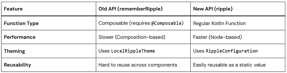
Key Changes from Old to New
Key changes in Compose Ripple APIs (1.7+)
rememberRipple()is deprecated. Useripple()instead.
The old API relied on the legacyIndicationsystem, whileripple()works with the new node-based indication architecture.RippleThemeandLocalRippleThemeare deprecated.
Material components no longer readLocalRippleTheme. For customization useRippleConfiguration/LocalRippleConfigurationor implement a custom ripple.- Many components now default
interactionSourcetonull, allowing lazy creation ofMutableInteractionSourceto reduce unnecessary allocations. - The indication system moved to the Modifier.Node architecture.
Indication#rememberUpdatedInstancewas replaced byIndicationNodeFactoryfor more efficient rendering.
Key Differences at a Glance:
Basic Example Using the New Ripple API
Let’s start with a simple example by creating a clickable Box with a ripple effect. This demonstrates how touch feedback appears when a user interacts with a UI element.
Before looking at the new approach, here’s how ripple was typically implemented in earlier versions of Compose.
Old implementation (Deprecated):
Box(
    modifier = Modifier.clickable(
        onClick = { /* action */ },
        interactionSource = remember { MutableInteractionSource() },
        indication = rememberRipple()
    )
) {
    Text("Tap me!")
}
The previous implementation relied on rememberRipple(), which has now been replaced by the updated ripple API.
Using the New Ripple API:
Here’s how you can implement the same behavior using the updated ripple system.
@Composable
fun RippleBox() {
    val interactionSource = remember { MutableInteractionSource() }  // Or pass null to lazy-init

    Box(
        modifier = Modifier
            .size(120.dp)
            .background(Color.LightGray)
            .clickable(
                interactionSource = interactionSource,
                indication = ripple(), // From material3 or material
                onClick = {}
            )
    ){
      Text("Tap me!")
    }
}
In many cases you can simply pass interactionSource = null, which allows Compose to lazily create it only when needed.
Understanding the Key Components
MutableInteractionSource
val interactionSource = remember { MutableInteractionSource() }MutableInteractionSource emits interaction events such as:
- Press
- Focus
- Hover
- Drag
Indications like ripple observe these events to trigger animations.
clickable modifier
Modifier.clickable()This makes the composable interactive and triggers ripple on tap.
ripple()
indication = ripple()ripple() is the new ripple API in Jetpack Compose and replaces the deprecated rememberRipple() implementation.
By default:
- The ripple color is derived from
MaterialTheme - The ripple originates from the touch point
- The ripple is bounded within the component by default
Unlike the previous API, ripple() is not a composable function and works with the newer Modifier.Node-based indication system, which reduces allocations and improves performance.
Benefits of the New Ripple API
The updated API offers several improvements:
- Simpler API — fewer concepts to manage
- Better performance — avoids unnecessary recompositions
- Cleaner syntax — easier to read and maintain
- More flexibility for modern Compose UI architectures
Customizing Ripple in Jetpack Compose
One advantage of the New Ripple API in Jetpack Compose is easier customization.
You can modify:
- color
- radius
- bounded/unbounded ripple
Example: Changing Ripple Color
.clickable(
    interactionSource = interactionSource,
    indication = ripple(
        color = Color.Red
    ),
    onClick = {}
)
Here we customize the ripple color.
When the user taps the component, the ripple will appear red instead of the default theme color.
Example: Unbounded Ripple
By default, ripple is bounded, meaning it stays inside the component.
If you want ripple to spread outside the element:
indication = ripple(
    bounded = false
)
Use Cases
Unbounded ripple works well for:
- floating action buttons
- icon buttons
- circular elements
Example: Setting Ripple Radius
You can also control ripple size.
indication = ripple(
    radius = 60.dp
)
The radius defines how far the ripple spreads from the touch point.
This can help match custom UI designs.
Advanced Customization: RippleConfiguration
If you want to change the color or the alpha (transparency) of your ripples globally or for a specific part of your app, the old LocalRippleTheme is out (deprecated). Instead, we use LocalRippleConfiguration.
The modern approach uses RippleConfiguration and LocalRippleConfiguration. This allows you to customize ripple appearance for a specific component or subtree of your UI.
Example: Custom Ripple
val myCustomRippleConfig = RippleConfiguration(
    color = Color.Magenta,
    rippleAlpha = RippleAlpha(
        pressedAlpha = 0.2f,
        focusedAlpha = 0.2f,
        draggedAlpha = 0.1f,
        hoveredAlpha = 0.4f
    )
)

CompositionLocalProvider(
    LocalRippleConfiguration provides myCustomRippleConfig
) {
    Button(onClick = { }) {
        Text("I have a Magenta Ripple!")
    }
}
RippleConfiguration
A configuration object that defines the visual appearance of ripple effects.
RippleAlpha
Controls the ripple opacity for different interaction states:
pressedAlphafocusedAlphadraggedAlphahoveredAlpha
CompositionLocalProvider
Wraps a section of UI and provides a custom ripple configuration to all child components that read LocalRippleConfiguration.
Disabling Ripple
You can disable ripple effects completely:
CompositionLocalProvider(LocalRippleConfiguration provides null) {
    Button(onClick = {}) {
        Text("No ripple")
    }
}
When You Do NOT Need to Use Ripple Manually
With the new ripple API in Jetpack Compose, many Material components already include ripple feedback by default. This means you usually don’t need to manually specify indication = ripple().
Examples include:
ButtonCard(clickable version in Material3)ListItemIconButtonNavigationBarItem
These components internally handle interaction feedback using the ripple system.
Card(
    onClick = { }
) {
    Text("Hello")
}
In Material3, providing onClick automatically makes the Card clickable and displays the ripple effect.
No manual ripple indication is required.
Best Practices for Using the New Ripple API in Jetpack Compose
1. Prefer Default Material Components
Material components already include ripple behavior.
This keeps UI consistent with Material Design.
2. Avoid Over-Customizing Ripple
Too much customization can create inconsistent UX.
Stick with theme defaults unless necessary.
3. Use interactionSource = null Unless You Need It
In modern Compose versions, you usually do not need to create a MutableInteractionSource manually.
Modifier.clickable(
    interactionSource = null,
    indication = ripple(),
    onClick = { }
)
Passing null allows Compose to lazily create the interaction source only when required.
Create your own MutableInteractionSource only if you need to observe interaction events.
4. Keep Ripple Bounded for Most UI
Bounded ripples keep the animation inside the component bounds and generally look cleaner.
This is the default behavior for most Material components.
Use unbounded ripple only when the design specifically requires it.
Performance Improvements in the New Ripple API
The new ripple implementation in Jetpack Compose introduces several internal improvements.
Reduced allocations
Ripple now uses the Modifier.Node architecture, which reduces object allocations compared to the older implementation.
Improved rendering efficiency
Ripple drawing is handled through node-based modifiers, making the rendering lifecycle more efficient.
Updated Indication system
Ripple is now implemented using IndicationNodeFactory, which replaces the older Indication implementation that relied on rememberUpdatedInstance.
Common Mistakes Developers Make
Using old rememberRipple()
Many developers still use:
rememberRipple()This API is now deprecated.
Use the modern API instead:
ripple()Manually creating InteractionSource unnecessarily
Older examples often include:
interactionSource = remember { MutableInteractionSource() }In modern Compose versions, you can usually pass:
interactionSource = nullThis allows Compose to lazily create the interaction source only when needed.
Create your own MutableInteractionSource only when you need to observe interaction events.
Adding Ripple to Non-clickable UI
Ripple should be used only on interactive components such as buttons, cards, or clickable surfaces.
Using ripple on static UI elements can create confusing user experiences.
Migration Guide: Old API to New Ripple API
Old implementation:
Modifier.clickable(
    interactionSource = remember { MutableInteractionSource() },
    indication = rememberRipple(),
    onClick = {}
)
New implementation:
Modifier.clickable(
    interactionSource = null,
    indication = ripple(),
    onClick = {}
)
Key changes:
rememberRipple()→ replaced withripple()interactionSourcecan now be null, allowing Compose to lazily create it when needed
This simplifies the code and avoids unnecessary allocations.
If you need to observe interaction events, you can still provide your own MutableInteractionSource.
Conclusion
The New Ripple API in Jetpack Compose simplifies how developers implement touch feedback while improving performance and consistency.
Key takeaways:
- Ripple provides visual feedback for user interactions
- The new API replaces
rememberRipple()withripple() - Material components already include ripple by default
- Custom components can easily add ripple using
Modifier.clickable - The updated system improves performance and flexibility
If you build modern Android apps with Jetpack Compose, understanding the New Ripple API in Jetpack Compose is essential for creating responsive and user-friendly interfaces.